Speedy Keynote Charts: Fast-Track Pro Presentations


In the high-stakes sprint of architectural deadlines, where client revisions hit like curveballs, who has time for from-scratch charts? Our Perfect Speed Keynote Charts Template delivers 17 ready-to-rocket slides that slash prep time while skyrocketing impact. Optimized for Keynote's speed on Mac, this versatile set spans flow diagrams for process mapping to analytical bars for metric mastery - perfect for architects juggling site analyses, budget flows, and stakeholder updates in a single deck.
Inspired by agile design methodologies from IDEO, these charts prioritize efficiency without sacrificing style: Modern layouts in soothing blues and grays evoke calm precision, while eye-catching graphics nod to structural elegance. Import your SketchUp metrics or Excel forecasts effortlessly, with seamless PowerPoint compatibility for hybrid teams. It's more than slides - it's a velocity booster, helping you craft polished pitches that convey clarity and command respect, whether unveiling a parametric facade or streamlining a renovation timeline.
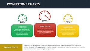
Visualize a flow chart animating approval workflows, nodes lighting up as bottlenecks dissolve, or an analysis pie segmenting material sourcing for sustainability audits. Pros at firms like Perkins&Will swear by such tools for 50% faster deck builds, turning frantic Fridays into confident closes. With downloadable convenience, you're enhancing visuals in minutes, not hours - because in architecture, speed designs success.
Why Speed Matters in Architectural Visualization
Time is your scarcest resource; our template multiplies it. Covering sales pipelines (adaptable to project bids), marketing funnels (for firm branding), and finance trackers (cost variances), these 17 slides are a Swiss Army knife for pros. Stunning appeal? Check - gradients and icons that scale flawlessly, adhering to WCAG for accessible designs. A Vancouver studio zipped through a heritage retrofit pitch, using the line graph to speed-trace cost evolutions, nabbing the nod in under 30 slides.
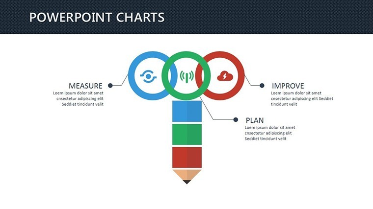
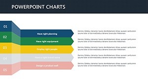
Versatility shines: Flow categories for sequencing entitlements, analysis for ROI dissections. Benefits? Time savings compound - pre-design means more ideation, less iteration.
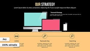
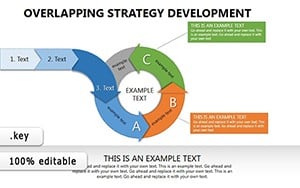
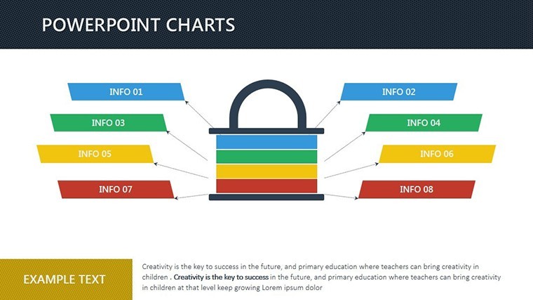
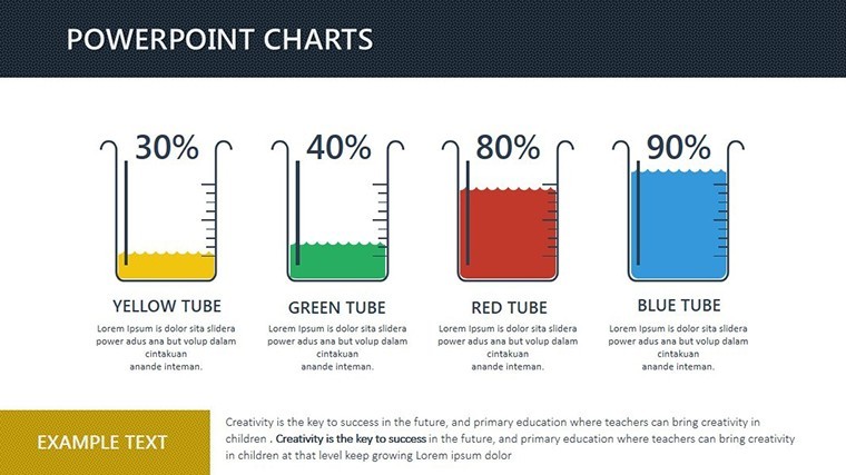
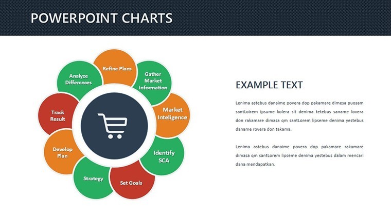
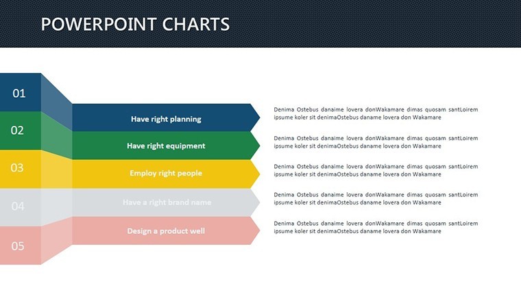
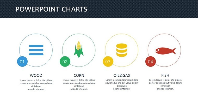
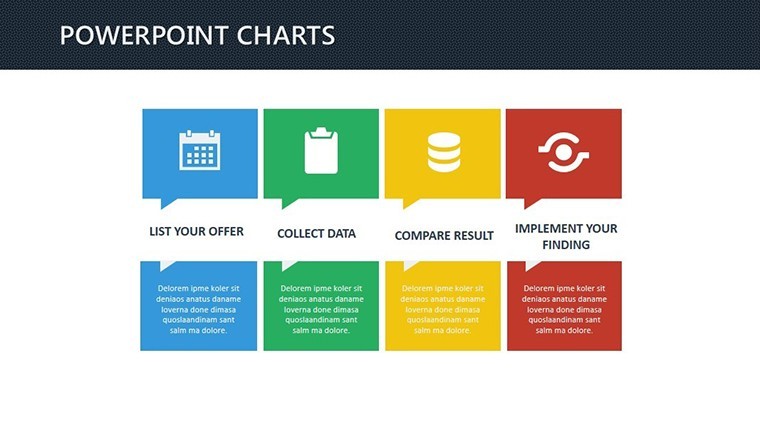
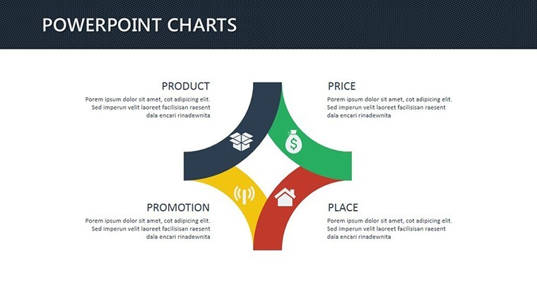
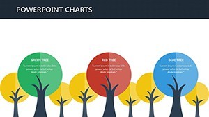
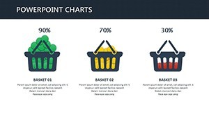
- Effortless Variety: 10+ chart types, from Sankey flows to donut breakdowns.
- Visual Polish: Auto-aligned elements, themeable colors for brand sync.
- Integration Magic: Drag-drop data, with formulas for live calcs.
It's the fast lane to presentations that perform.
Quick Customization for Deadline Warriors
Open, edit, export - done. Populate the org chart with team roles, watch hierarchies auto-balance. Hack: Use master slides for consistent footers like project codes. iWork-native ensures buttery performance; guide includes PowerPoint parity tips. At 4MB, it loads lightning-fast even on Airs.
Accelerating Wins: Targeted Use Cases
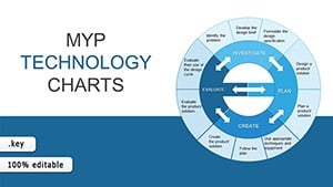
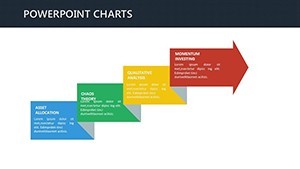
For a Miami firm, the combo chart sped up flood-risk analyses, bars rising with sea levels while lines dipped mitigation costs - clients hooked instantly. Or flow the construction sequence, arrows zipping through phases to flag delays. In academia, Yale's design labs turbo-charge critiques with radial menus for feedback loops.
Extend to interiors: Speed-map space allocations, or landscapes: Animate erosion models. Dual categories (flow/analysis) cover it all.
- Select & Load: Choose slide, feed data - placeholders guide you.
- Tweak & Animate: Adjust visuals; add subtle builds for emphasis.
- Launch: Present or PDF; iterate on-the-fly.
This triad turns chaos to velocity.
Outpace the Pack: Insights and Edges
Beats vanilla Keynote? Deeper presets, smarter autos. Vs. Canva? Pro-grade without subscriptions. Tip: Hyperlink charts to appendices for deep dives. One user: "Sped our RFP response - won the tower."
Gear up for glory? Download and dash to design dominance.
Propel Your Pitches into Overdrive
Speed without skimping - 17 slides to supercharge your story. Instant, intuitive, unbeatable. Hit download and hit the ground running.
Frequently Asked Questions
How versatile are these for architecture?
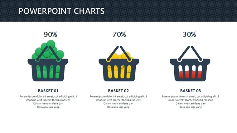
Highly - flows for processes, analyses for metrics like square footage or budgets.
Time savings realistic?
Users clock 70% faster builds; pre-design frees creative bandwidth.
PowerPoint friendly?
Yes - export retains 95% fidelity; tweaks covered in docs.
Visuals accessible?
Built-in alt-text prompts, high-contrast modes for inclusivity.
What's the slide variety?
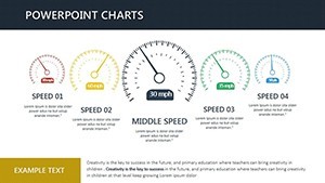
Flows (Gantt, Sankey), analyses (bars, pies), plus hybrids for depth.
Support for education use?
Absolutely - examples for studio critiques and thesis viz.