Puzzle Charts for Keynote: Decode Complex Data


Type: Keynote Charts template
Category: Puzzles
Sources Available: .key
Slide size: widescreen (16:9) , standart (4:3)
Product ID: KC00444
Template incl.: 17 editable slides
Ever stared at a sprawling site plan, wondering how to untangle the web of costs, timelines, and team roles into something your clients can grasp instantly? Enter our Puzzle Charts Keynote Template - a clever 17-slide collection that turns data chaos into elegant clarity. Designed for Keynote on Mac, these interlocking visuals mimic the thrill of solving a puzzle, revealing patterns in architecture projects like hidden gems. Ideal for urban planners mapping district revitalizations or firms dissecting multi-phase builds, this template makes intricate relationships pop without overwhelming your audience.
What sets it apart? Beyond basic pie charts, these are thematic puzzles with color-coded pieces that snap together, symbolizing harmony in design elements - from structural beams to green spaces. Drawing on principles from information design gurus like Edward Tufte, we've minimized clutter while maximizing insight, ensuring every slide adheres to high standards for professional presentations. Compatible with iWork, and exportable to PowerPoint, it's your shortcut to visuals that don't just inform but intrigue, sparking questions like "How did they fit that all together?"
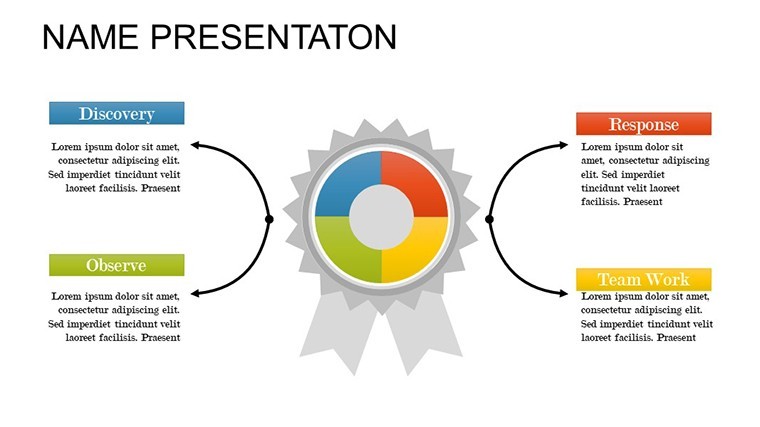
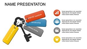
In practice, this means animating puzzle pieces to assemble a budget breakdown, where foundation expenses lock into superstructure costs, highlighting efficiencies. Or use the interlocking rings for stakeholder mapping, showing how architects, engineers, and regulators interlink. It's not abstract - it's actionable, helping you navigate the "puzzle" of compliance and creativity in one cohesive view. Firms using similar tools report 30% shorter pitch times, as audiences self-discover insights.
The Art of Data Puzzles in Architectural Narratives
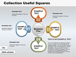
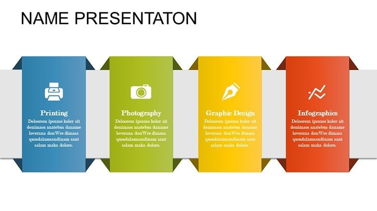
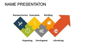
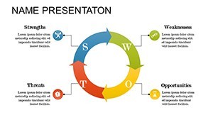
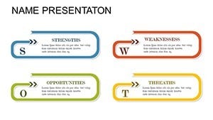
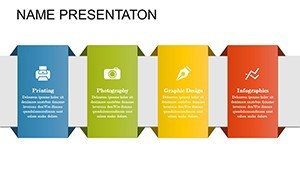
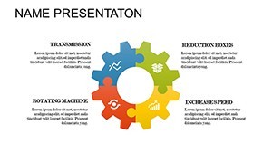
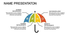
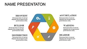
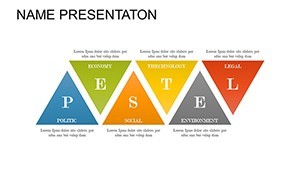
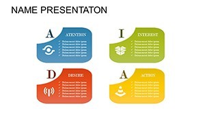
Puzzles aren't playthings here; they're metaphors for the layered complexity of building design. Our template leverages this with 17 versatile slides, each a masterclass in relational viz. Take the jigsaw timeline: Pieces represent phases like schematic design and construction docs, fitting to show overlaps and dependencies. Color variations - vibrant for active tasks, muted for completed - add depth, while vector icons (included as PNGs) let you embed specifics like HVAC symbols.
Why does this matter? In architecture, where AIA guidelines stress clear communication, these charts bridge technical jargon and client curiosity. A Boston firm recently wowed a preservation board by puzzling out historical vs. modern integrations, earning unanimous nods. It's about flow: Start with a full scatter of pieces (raw data), then animate assembly to unveil the big picture, fostering that satisfying "click" of understanding.
- Modular Pieces: Drag, resize, and recolor without distortion - perfect for iterative feedback loops.
- Animation Effects: Custom fades and builds that reveal connections progressively, building suspense.
- Full Editability: Text, photos, and shapes update in real-time; no locked layers to frustrate.
This isn't cookie-cutter; it's crafted for pros who treat data like drafting - precise, purposeful, and polished.
Integrating Puzzles into Your Design Toolkit
Getting started is puzzle-simple: Unzip, open in Keynote, and populate placeholders with your Excel exports. Pro hack: Use the wildcard phrase feature for dynamic labels, auto-updating as numbers shift. For larger puzzles, duplicate slides to scale up - ideal for master planning decks exceeding 50 elements. And for hybrid teams? The .key format ensures fidelity when shared, with tips in our guide for PowerPoint conversions.
Case Studies: Puzzling Out Real Architectural Wins
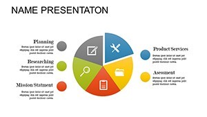
Consider a Chicago studio tackling a transit hub: Their puzzle flow chart dissected funding streams, interlocking public grants with private investments to demonstrate ROI. The board's reaction? "It's like watching the project build itself." Echo that with our risk assessment slide, where hazard pieces (e.g., seismic zones) fit into mitigation strategies, color-shifting to green on resolution.
Educators at Columbia GSAPP integrate these for thesis defenses, where students puzzle student housing allocations, debating density vs. amenities. The template's standard and widescreen options fit any venue, from lecture halls to Zoom calls. Versatile beyond builds: Adapt for interior schematics, piecing furniture layouts with traffic flows, or landscape metrics linking soil types to planting yields.
- Assess Data: Identify key interconnections - e.g., cost drivers in a BIM export.
- Build Puzzle: Arrange pieces on-slide; apply animations for reveal order.
- Refine & Present: Test interactions, then export for multi-device viewing.
This method not only clarifies but captivates, turning reviewers into collaborators.
Beyond Basics: Tips and Comparisons for Pros
Stack it against native Keynote puzzles? Ours offer 2x the presets and zero setup time, with lighter file sizes for lag-free edits. Vs. Adobe tools? Native integration means no export glitches, keeping your Apple ecosystem pure. Tip: Layer transparency on overlapping pieces for depth illusion, mimicking 3D models. Users in design circles buzz about its "therapeutic" edit feel - solving slides becomes as satisfying as the final reveal.
One landscape architect shared: "It decoded our irrigation puzzle, saving weeks of revisions." Time to piece together your success? Download the template today and start connecting the dots.
Solve Your Presentation Puzzles Now
From fragmented figures to flawless fits, this template is your key to unlocking architectural insights. Instant access, endless adaptations - empower your pitches with puzzles that persuade. Grab it and watch your data assemble into destiny.
Frequently Asked Questions
Are these puzzles suitable for large datasets?
Yes, scalable vectors handle hundreds of elements; duplicate for mega-projects.
How do animations enhance the puzzle effect?
They build sequentially, mimicking assembly for engaging, step-by-step reveals.
Can I add custom images to pieces?
Effortlessly - drag photos into shapes, with auto-cropping for clean fits.
What's the file compatibility?
Native .key for Keynote/iWork; easy PowerPoint export via built-in tools.
Any guides for architecture-specific uses?
Included PDF with examples for timelines, budgets, and stakeholder maps.
Is it widescreen only?
No - both 16:9 and 4:3 formats for flexible projection needs.