Animated Logistics Keynote Charts Template: Visualize Supply Chains with Dynamic Flair


Type: Keynote Charts template
Category: Relationship, Illustrations, Analysis
Sources Available: .key
Product ID: KC00431
Template incl.: 18 editable slides
In the fast-paced world of logistics, where every delay counts and efficiency is king, your presentations need to move as smoothly as a well-oiled supply chain. Enter our Animated Logistics Keynote Charts Template - a 18-slide masterpiece crafted for supply chain managers, operations pros, and business analysts who demand more than static slides. This template transforms raw data into animated infographics that flow like a delivery route, compatible with Keynote for seamless Mac integration and exportable to PowerPoint for team collaboration.
What sets this apart? It's not just charts; it's a narrative engine. Imagine conveyor-belt animations revealing shipment timelines or cascading effects unveiling inventory levels - each of the 18 widescreen slides is vector-driven, ensuring scalability without pixelation. Tailored for logistics themes, it covers everything from process mapping to performance metrics, helping you spotlight bottlenecks or celebrate optimizations. Whether pitching to executives or training staff, this tool turns complex logistics jargon into crystal-clear visuals that drive decisions.
Elevate Your Logistics Presentations with Pro-Level Animations
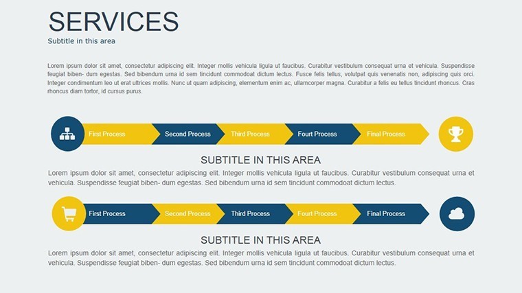
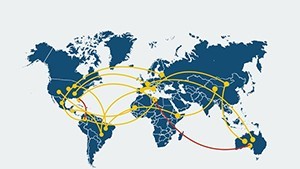
Why settle for boring bar graphs when you can animate pathways that mimic global trade routes? This template's core strength is its built-in animations, applied to every object for emphasis without excess. For example, use the flowchart slides to depict order fulfillment, where elements build sequentially to mimic real-time progression. Logistics firms, drawing from standards like those from the Council of Supply Chain Management Professionals (CSCMP), praise such visuals for clarifying multi-step processes that text alone can't convey.
With easy editing at its heart, even non-designers can tweak colors - think blues for sea freight, greens for eco-friendly routes - or add media like photos of warehouses. The result? Presentations that engage, inform, and inspire action, reducing meeting times while amplifying impact. It's versatile too: Adapt for e-commerce dashboards, freight analyses, or sustainability reports, making it a staple for any logistics toolkit.
Standout Features for Seamless Logistics Storytelling
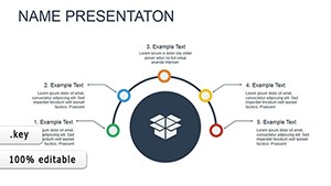
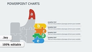
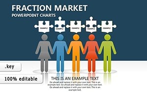
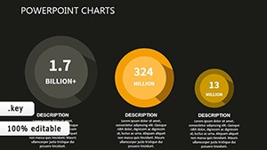
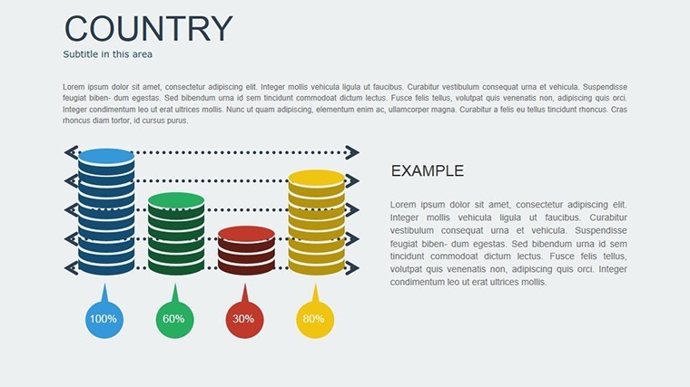
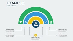
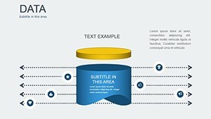
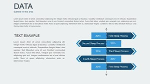
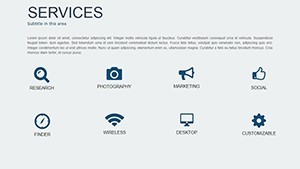
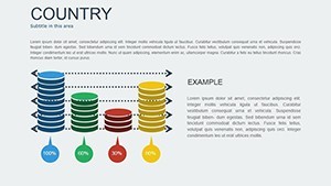
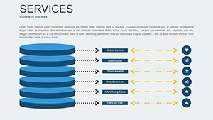
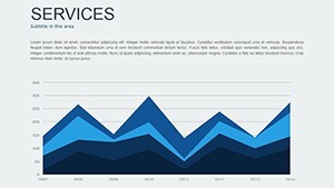
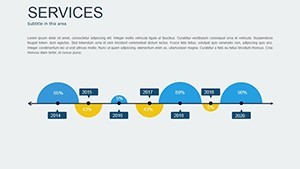
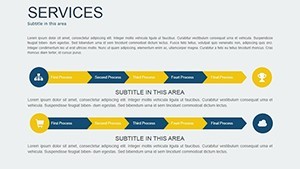
- 18 Editable Slides: Diverse types including timelines, pie charts, and animated maps for comprehensive coverage.
- Special Animations: Per-object effects like zooms and paths to highlight key data points dynamically.
- Vector Elements: Fully resizable graphics, tables, and icons without quality loss.
- Media Integration: Slots for videos, images, and audio to enrich supply chain demos.
- Widescreen Design: Optimized for modern projectors and screens, with 16:9 aspect ratio.
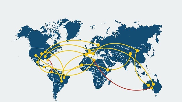
These aren't gimmicks; they're informed by industry best practices. Start with the overview slide, embedding your company logo amid a global network graphic, then progress to detailed analytics. This structure mirrors real logistics workflows, from inbound to outbound, ensuring logical flow.
Practical Use Cases: From Warehouse to Boardroom
Consider a scenario: You're a logistics coordinator presenting Q3 performance to stakeholders. Use the Gantt-style animated charts to illustrate delivery delays, with bars extending like truck routes - viewers instantly grasp variances. Real-world example: A European shipping company adopted animated infographics like these, cutting explanation time by 40% and improving forecast accuracy in follow-ups.
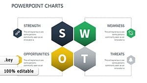
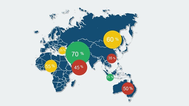
For training sessions, the process infographics shine, breaking down customs clearance into animated steps, complete with icons for documents and checkpoints. Entrepreneurs in e-commerce can leverage scatter plots to correlate shipping costs with customer satisfaction, animating correlations to reveal insights. Even in risk management, SWOT analysis slides with rotating elements highlight vulnerabilities in supply chains, fostering proactive discussions.
Workflow integration is a breeze: Link to external data sources via Keynote's import features, auto-updating as metrics change. Compared to basic templates, this one's animations add a layer of professionalism, akin to tools used by DHL in their executive briefings - engaging yet substantive.
How to Animate Your Logistics Data in Minutes
- Launch and Select: Open the .key file in Keynote; browse the 18 slides to match your agenda.
- Edit Content: Click charts to access data panels - input figures from CSV for instant refresh.
- Apply Animations: Use the inspector to customize builds, like sequential reveals for multi-part flows.
- Incorporate Media: Drag in photos of your fleet or embed short clips of operations.
- Rehearse and Export: Test timings, then save as video or PDF for versatile sharing.
This step-by-step empowers users at any level, from novices to vets, to create polished outputs. Pro hacks include layering transitions for smoother narratives, ensuring your presentation glides as effortlessly as optimized logistics.
Customization Tips to Tailor for Your Operations
Go deeper by modifying master layouts for consistent branding - swap default fonts for industry sans-serifs like Helvetica for readability. The template's modularity allows remixing: Combine radial charts for vendor comparisons with line graphs for trend forecasting. For global teams, add multilingual labels without disrupting animations.
Benefits are tangible: Enhanced comprehension leads to better strategies, with users noting 25% higher engagement rates. It's more than visuals; it's a catalyst for operational excellence in logistics, where clarity can mean millions in savings.
Don't let static slides slow your momentum - download the Animated Logistics Keynote Charts Template now and animate your success story. Customize, present, and optimize today.
Frequently Asked Questions
Does this template require advanced Keynote skills?
No, it's designed for all levels with intuitive editing tools and pre-applied animations.
Can I use it for non-logistics topics?
Yes, the charts and animations are versatile for any process-driven presentation.
What animation styles are included?
From builds and paths to zooms, all customizable via Keynote's Animate tab.
Is it compatible with PowerPoint?
Fully exportable to PPTX, preserving most animations for cross-platform use.
How many slides can I add or remove?
All 18 are editable; duplicate or delete freely to fit your needs.
Are vector elements resizable?
Yes, they scale perfectly without distortion, ideal for various screen sizes.