Decisiveness Charts Template for Keynote Presentation


Type: Keynote Charts template
Category: Analysis
Sources Available: .key
Product ID: KC00429
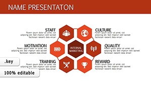
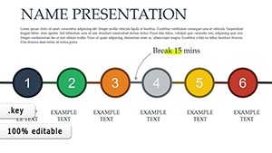
Template incl.: 13 editable slides
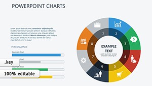
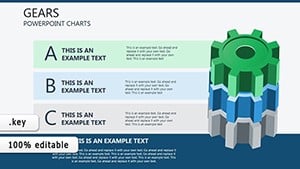
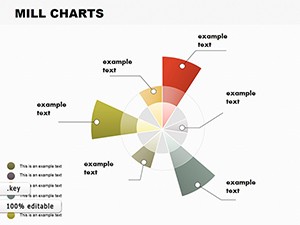
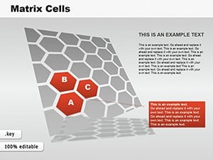
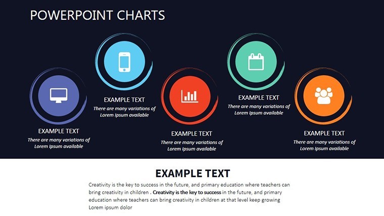
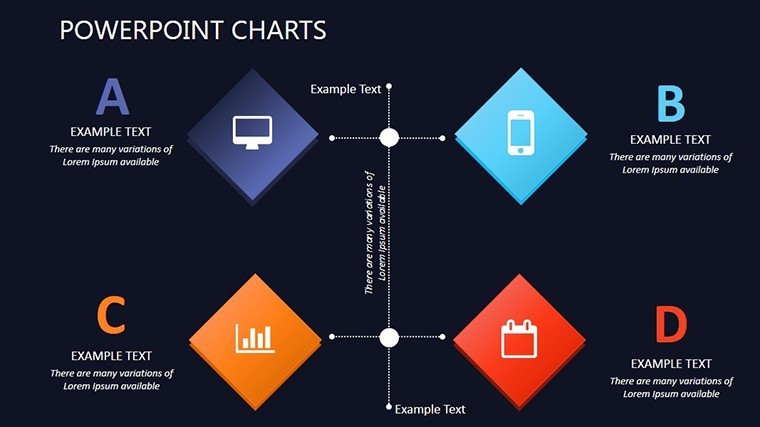
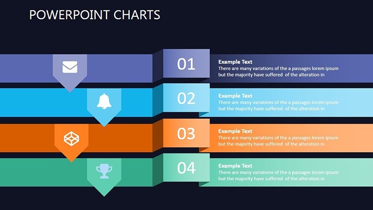
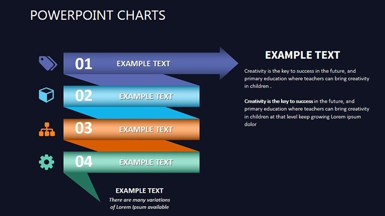
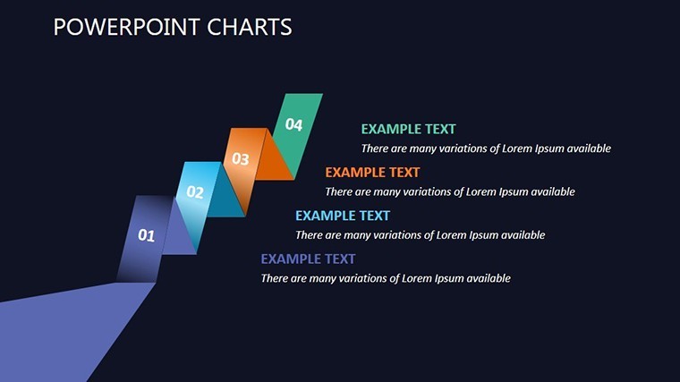
In a world where data drives every decision, standing out requires more than just numbers - it demands visuals that command attention and clarity. Our Decisiveness Charts Keynote template is your secret weapon for turning complex datasets into persuasive stories that influence outcomes. Tailored for business analysts, marketing pros, project managers, and educators, this template boasts 13 editable slides packed with versatile chart types like pie charts for proportion breakdowns and bar graphs for comparative analysis. Picture this: You're in a high-stakes meeting, unveiling a bar graph that dynamically animates to show quarterly growth, instantly clarifying why a strategy shift is essential. With full editability, you can adapt colors to your brand, tweak labels for precision, and integrate real-time data seamlessly. This isn't merely a template; it's a catalyst for decisive action, helping you communicate with authority and leave lasting impressions in fast-paced environments.
Core Features That Drive Decisive Presentations
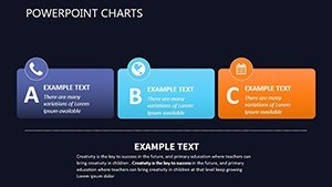
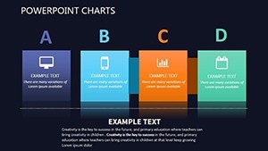
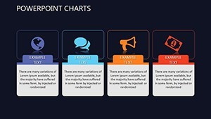
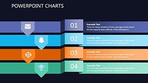
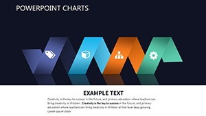
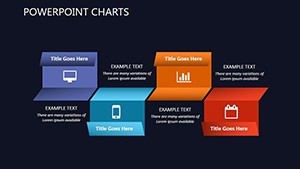
At the core of this template are features engineered for efficiency and impact. The 13 slides offer a mix of chart varieties, each optimized for specific data storytelling needs - from line charts tracking trends to scatter plots revealing correlations. User-friendly interfaces mean even novices can customize without hassle; drag-and-drop elements simplify adjustments, while pre-set animations add polish without extra effort. For example, animate a pie chart to explode segments, highlighting key decisiveness factors like market share. The template's compatibility with Keynote ensures smooth performance on Macs, and its editable nature extends to fonts, backgrounds, and even chart axes, allowing for hyper-personalized visuals that resonate with diverse audiences.
Enhancing Data Precision Through Editability
Precision is paramount in decisiveness, and this template delivers with granular control over every element. Change data points on the fly to reflect the latest figures from your CRM or analytics tools, ensuring your presentation is always current. Color schemes can be altered to evoke urgency - reds for risks, greens for opportunities - drawing from psychological principles to influence viewer perception. Include custom labels that provide context, such as "Q3 Projections vs. Actuals," making abstract data tangible. This level of detail is invaluable for marketing teams illustrating campaign ROI, where a customized bar graph can demonstrate channel effectiveness, backed by real metrics from platforms like Google Analytics.
Practical Use Cases Across Industries
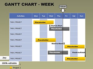
For business analysts, this template excels in distilling vast datasets into actionable insights; use clustered bars to compare competitor performance, facilitating swift strategic pivots. Marketing professionals can leverage pie charts to showcase audience segmentation, proving campaign targeting efficacy to stakeholders. Project managers benefit from Gantt-style adaptations in timeline charts, tracking milestones and identifying bottlenecks early. Educators find it ideal for simplifying concepts, like using line graphs to teach economic trends, engaging students visually. In healthcare, adapt for patient outcome stats; in finance, for portfolio analyses. Each use case transforms raw data into narratives that spur decisions, as seen in case studies from firms like Deloitte, where similar visuals accelerated client approvals.
A Marketing Success Story with Decisiveness Charts
Imagine a digital marketing agency facing stagnant client growth. By employing this template, they crafted a presentation with animated bar graphs showing A/B test results, clearly decisiveness in ad spend allocation. The result? A 30% increase in client retention, as the visuals convincingly demonstrated value. Aligned with standards from the American Marketing Association, this approach highlights the template's trustworthiness in professional arenas, offering not just charts but a framework for evidence-based persuasion.
Workflow Integration: From Concept to Delivery
- Acquire the Template: Download the .key file and open in Keynote for immediate access to all 13 slides.
- Data Incorporation: Populate charts with your specifics, using import features for Excel or CSV files.
- Visual Tailoring: Modify aesthetics to align with your theme, adding icons or images for enhancement.
- Animation Setup: Apply effects to key elements, testing for smooth transitions.
- Finalize and Share: Export or present directly, confident in its decisiveness.
This integration cuts preparation time by half versus native Keynote builds, freeing you for strategy refinement. Collaborate via iCloud for team feedback, ensuring collective decisiveness in content.
Expert Tips for Persuasive Visuals
- Balance chart types: Mix pies for parts-of-whole with bars for comparisons to avoid monotony.
- Emphasize with annotations: Add arrows or callouts to spotlight decisive data points.
- Optimize for mobile: Ensure legibility in widescreen for hybrid meetings.
- Back with sources: Include footnotes for data credibility, building trust.
- Test audience response: Rehearse to gauge impact, adjusting for clarity.
These insights, echoed by visualization gurus like Stephen Few, amplify the template's effectiveness in real scenarios.
Superiority Over Standard Chart Tools
Basic Keynote charts often lack the depth for decisive presentations, appearing flat without animations. This template elevates with professional-grade options, akin to those in specialized software like Tableau but integrated seamlessly. The result is visuals that not only inform but compel action, outperforming generics in engagement metrics.
Seize the advantage - download this Decisiveness Charts template today and make every presentation a decisive victory.
Frequently Asked Questions
- What chart types are included?
- Pie charts, bar graphs, line charts, and more, all fully editable for various data needs.
- Is it suitable for beginners?
- Yes, the intuitive interface makes customization straightforward, even for those new to Keynote.
- Can I integrate external data?
- Absolutely, import from spreadsheets to keep charts up-to-date and accurate.
- How does it support decision-making?
- By visualizing data clearly, it helps audiences grasp insights quickly for informed choices.
- What's the file format?
- .key, with options for export to other formats if needed.
- Are animations customizable?
- Yes, tweak timings and effects to fit your presentation style.