Development Indicators Charts - Fully Editable | ImagineLayout


Type: Keynote Charts template
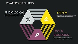
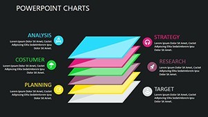
Category: Illustrations, Analysis
Sources Available: .key
Product ID: KC00387
Template incl.: 18 editable slides
18 Slides and Trend Lines: What You Get
18 editable slides arrive in a single .key file packed with trend line diagrams milestone trackers and sustainability benchmark visuals.
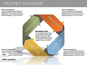
This one stands out from the Economic Analysis Keynote Charts Template and Real Estate Market Keynote Charts in the related section by delivering dedicated GDP growth trackers with built-in illustrations while neighbors stay general or sector-specific.
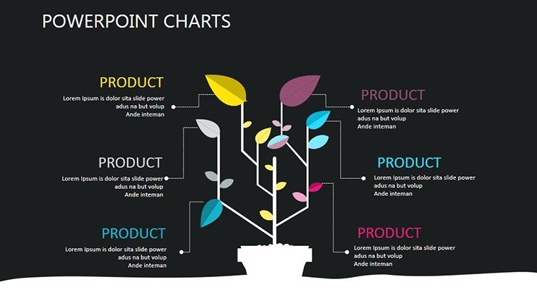
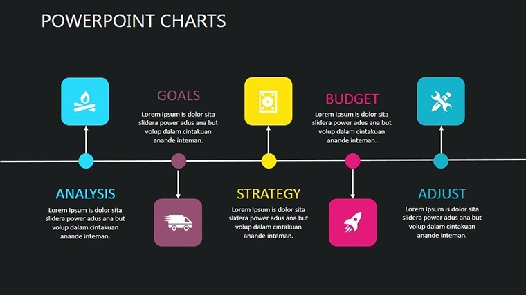
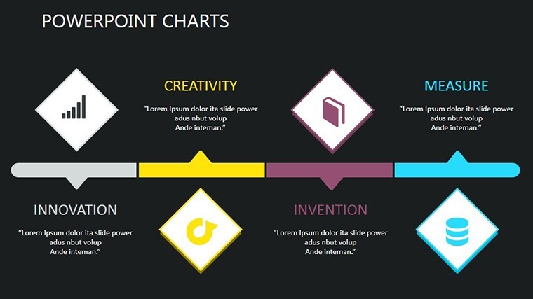
The diagrams use color-coded trend lines paired with professional illustrations for clean phase segmentation.
It works best for quarterly sustainability reporting inside consulting firms because the pre-built milestone trackers let users swap data without touching flow direction.
The paid version includes the complete set of 18 editable .key slides because no free version appears on the page.
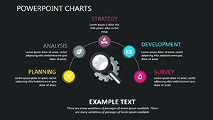
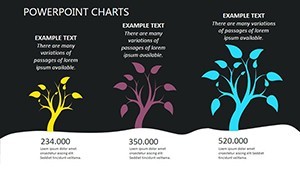
- 8 trend line diagrams for GDP tracking
- 5 milestone phase slides
- 5 benchmark comparison charts
Every element keeps proper diagram structure for immediate use in any strategy meeting.
Key Specifications
| Feature | Details |
|---|---|
| Slides included | 18 fully editable .key slides covering trend lines milestone trackers and benchmark diagrams |
| Diagram categories | GDP growth lines sustainability zones and project phase segmentation |
| Editable elements | text labels line weights color zones and icon placeholders resize independently |
| Aspect ratio | Standard 16:9 optimized for Keynote widescreen presentations |
| PowerPoint compatibility | Keynote native format only with PDF export option for distribution |
| Color themes | Compatible with Keynote slide master color palette for easy adjustments |
| Animation support | Basic transitions available on all slides |
| Icon layers | Illustrations replaceable without affecting layout composition |
These details support fast edits inside any consulting deck.
Typical Use Cases by Role
A sustainability consultant in environmental services inserted real GDP numbers into the trend line diagrams for a board briefing and cut deck preparation from 3 hours to 45 minutes.
A project manager at a consulting firm swapped color schemes across milestone slides for three client reports in one quarter and kept consistent visual hierarchy without extra work.
Download the template now to prepare your next strategy meeting in under an hour
Adapting the Template to Your Brand
Customization stays moderate difficulty and finishes in under 15 minutes.
- Open the .key file in Keynote (1 minute)
- Replace text and data points inside diagrams (4 minutes)
- Adjust brand colors through the slide master (2 minutes)
- Edit diagram connectors and labels (3 minutes)
- Preview flow direction then export (2 minutes)
Consultants often combine these development indicators with the Keynote Charts category for full coverage.
Why This Template, Not a Blank Slide
Creating matching trend lines manually takes over 2 hours per slide plus advanced skills and usually produces misaligned connectors plus poor information spacing.
Manual builds also create inconsistent color contrast that confuses viewers in investor decks.
Many slides bury labels inside shapes yet that hurts readability on projection screens while this layout keeps labels outside connected by thin lines.
Starting here delivers correct diagram structure immediately and saves time before any boardroom pitch.
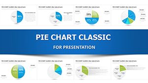
Many users pair it with the Pie Charts Keynote Template when adding distribution visuals.
Get the full editable file and start customizing today
Which Keynote versions support these charts?
The file opens in Keynote 12 and newer on Mac or iOS devices. Earlier versions may miss some editable shapes for complex trend lines. Open the file first to verify full diagram connector support. Current releases guarantee every color contrast and zone works without issues.
How do you change the color scheme?
Select any slide and open the Format sidebar on the right. Click the color well for each zone or line and choose from the slide master palette. Repeat once per diagram type to update the entire visual hierarchy. The change applies across all 18 slides in under 2 minutes.
What does the license allow for client work?
You may use the charts inside paid client presentations and consulting decks without extra fees. Resale of the original .key file or sublicensing remains prohibited. Internal team sharing inside one company is allowed after purchase. Review the full license on the site for exact client proposal rules.
What separates the paid version from any free options?
The paid download delivers the complete 18-slide .key file with every diagram and illustration unlocked. No free version or limited preview exists on the page. Full access arrives instantly without watermarks. This setup lets you start editing for the next investor deck immediately.
Which software is needed to open the file formats?
The .key format requires the official Keynote application from Apple. PowerPoint cannot open it natively although PDF export works for sharing. Install the latest Keynote to access every editable shape and icon layer. A free Keynote trial lets you test compatibility first.
What is the refund policy?
Refunds process within 7 days when the file fails to open correctly in your Keynote version or diagrams do not edit as expected. Submit a support ticket with proof of the compatibility issue. Approved cases complete quickly without further questions. The policy covers buyers who check technical details before purchase.