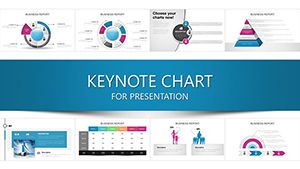
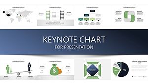
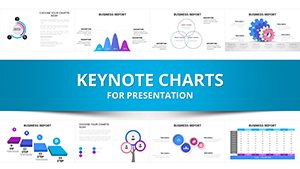
Technical Analysis Keynote Charts Template


Type: Keynote Charts template
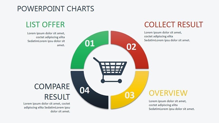
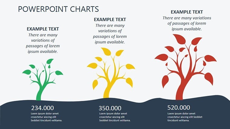
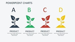
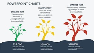
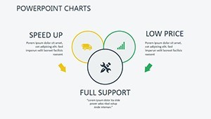
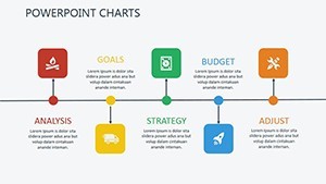
Category: Process, Tree, Illustrations
Sources Available: .key
Product ID: KC00386
Template incl.: 18 editable slides
In the fast-paced world of finance, where every tick of the market can signal opportunity or risk, having the right tools to visualize and interpret data is crucial. Our Technical Analysis Keynote Charts Template is designed specifically for traders, investors, and financial analysts who need to decode price patterns and predict future movements without getting bogged down in external factors like politics or economics. With 18 fully editable slides, this template empowers you to focus solely on price and volume data, turning complex historical trends into clear, compelling narratives. Whether you're preparing a report for stakeholders or refining your trading strategy, these charts help you spot patterns like head-and-shoulders formations or moving average crossovers with ease. Imagine presenting at a trading conference, where your slides not only display data but also inspire confidence through professional visuals that align with industry standards from bodies like the Chartered Market Technician (CMT) program. This isn't just a template - it's your shortcut to more informed decisions and persuasive presentations.
Unlocking the Power of Price Action with Editable Charts
Diving deeper into what makes this template indispensable, let's explore its core features. Each of the 18 slides is crafted with precision, incorporating elements from process flows, tree diagrams, and illustrative graphics to represent technical indicators seamlessly. For instance, you'll find dedicated slides for candlestick patterns, which allow you to highlight doji or engulfing candles that signal reversals. These aren't static images; everything is editable in Keynote, so you can adjust colors to match your brand - perhaps using red for bearish trends and green for bullish ones - or resize elements to emphasize key data points. This flexibility ensures your presentations aren't just informative but also visually engaging, reducing audience fatigue during long sessions.
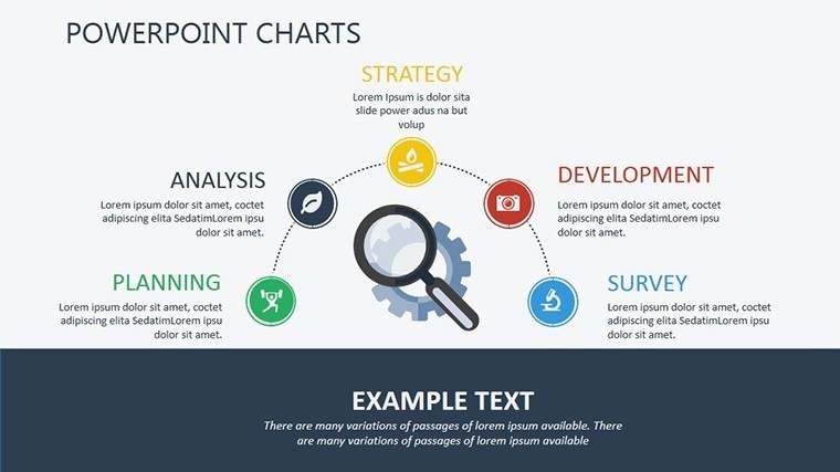
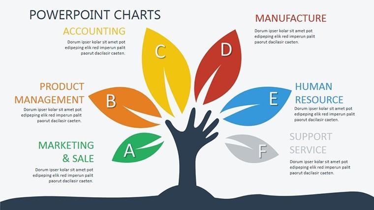
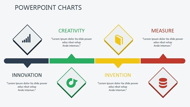
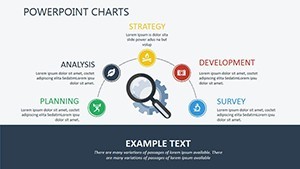
One standout benefit is the integration of tree structures for decision-making processes in trading. Picture a slide where a central node represents a stock's current price, branching out to various scenarios based on support and resistance levels. This visual aid helps in explaining complex strategies like Fibonacci retracements or Elliott Wave theory without overwhelming your viewers. Compared to basic Keynote tools, which might require hours of manual creation, this template saves time while delivering a polished look that screams expertise. Users often report that incorporating these charts has led to more successful pitches, such as securing investments by clearly demonstrating potential upside in commodity markets.
Key Features That Set This Template Apart
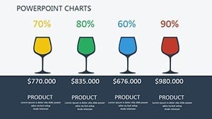
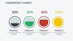
- Comprehensive Indicator Coverage: Slides dedicated to oscillators like RSI and MACD, complete with editable axes and data labels for precise customization.
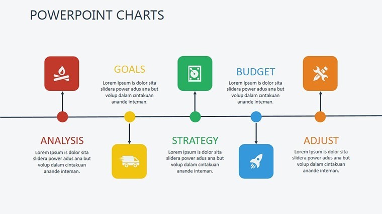
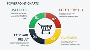
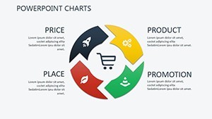
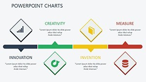
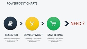
- Process-Oriented Layouts: Flowcharts that map out trading algorithms, ideal for algorithmic traders showcasing backtested results.
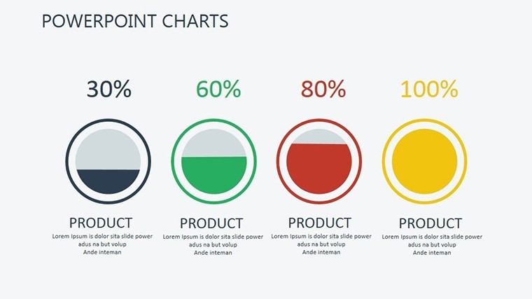
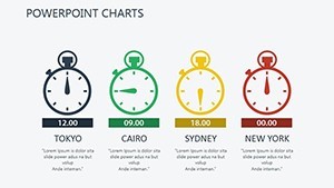
- Illustrative Elements: High-quality icons for volume spikes or trend lines, enhancing readability and professional appeal.
- Widescreen Compatibility: Optimized for 16:9 aspect ratio, ensuring seamless display on modern projectors or screens.
- Easy Data Integration: Placeholder tables where you can import CSV data directly, automating updates for real-time analysis.
Beyond features, the real value lies in how this template addresses common pain points. Financial professionals often struggle with cluttered slides that dilute their message. Here, clean designs prioritize clarity, adhering to design principles from experts like Edward Tufte, who emphasize data-ink ratio. By minimizing non-essential elements, your charts focus on what matters: the story behind the numbers.
Real-World Applications: From Trading Floors to Boardrooms
Let's bring this to life with targeted use cases. For a day trader analyzing forex pairs, start with Slide 1 - a basic line chart for historical prices. Customize it by adding Bollinger Bands to visualize volatility squeezes, then transition to Slide 5 for a comparative analysis of multiple currencies. In a real scenario, a currency trader might use this to present to a hedge fund, showing how EUR/USD patterns predicted a breakout, backed by historical data from sources like TradingView.
For stock market enthusiasts, Slides 8-10 offer pyramid structures to break down sector performance. Imagine an analyst at a brokerage firm using these to illustrate how tech stocks outperformed during a bull run, with editable segments for sub-sectors like semiconductors. This not only aids in internal strategy sessions but also in client meetings, where visual hierarchies make abstract concepts tangible.
In commodity trading, where volume plays a starring role, the template's illustration slides shine. Use Slide 12 to depict oil price fluctuations via a tree diagram, branching from supply disruptions to demand forecasts. A case study from the energy sector could involve an analyst who used similar visuals to advise on futures contracts, resulting in optimized hedging strategies that mitigated risks during volatile periods.
To integrate into your workflow, simply open the .key file in Keynote, replace placeholders with your data, and tweak as needed. Pro tip: Layer animations subtly - fade in trend lines to build suspense during your narrative. This approach has been praised in forums like Investopedia discussions, where users share how such templates elevated their technical reports.
Step-by-Step Guide to Customizing Your Charts
- Import your dataset into the placeholder tables on relevant slides.
- Select chart elements and use Keynote's inspector panel to adjust colors and styles.
- Add annotations for key insights, like marking a double bottom pattern.
- Test animations in presentation mode to ensure smooth transitions.
- Export as PDF for sharing or print for handouts.
Compared to starting from scratch, this saves hours, allowing more time for analysis. Versus competitors' templates, ours stands out with its focus on technical analysis specifics, avoiding generic designs that don't cater to financial nuances.
Why Choose This Template for Your Next Presentation?
In a field where accuracy and persuasion go hand in hand, our Technical Analysis Keynote Charts Template delivers both. It's not just about charts; it's about crafting stories that drive decisions. Backed by principles from renowned technicians like John Murphy, whose book "Technical Analysis of the Financial Markets" underscores the importance of visual tools, this template positions you as an authority. Whether you're forecasting crypto trends or equity movements, the editable nature ensures adaptability across markets.
Users in similar roles, such as those preparing for CFA exams, have found it invaluable for mock presentations. One anonymous reviewer noted how it helped secure a promotion by impressing executives with clear volatility breakdowns. With categories like process and tree, it covers diverse needs, from simple overviews to intricate models.
Ready to forecast with flair? Customize your template today and watch your presentations soar.
Frequently Asked Questions
How editable are these Keynote charts?
Every element, from colors to data points, is fully customizable in Keynote, allowing seamless integration with your branding.
Can I use this template for non-financial presentations?
While optimized for technical analysis, the versatile designs work for any data-driven topic, like project timelines.
What file format is provided?
The template comes in .key format, compatible with Apple Keynote on Mac, iPad, or iCloud.
Are there tutorials for advanced customizations?
Keynote's built-in help and online resources cover most edits, but our support team is available for specific queries.
Does it support real-time data updates?
Yes, link to external sources or manually update placeholders for current market data.
How does this compare to free alternatives?
Unlike free templates, ours offers professional-grade illustrations and structures tailored for technical depth.