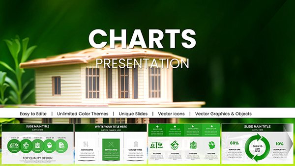
Houses Rent Keynote Charts: Illuminating Rental Realities


The rental market pulses with stories - of rising demands, shifting preferences, and lucrative opportunities - yet conveying them without the right visuals often leaves audiences adrift in numbers. Our Houses Rent Keynote Charts template changes that, delivering 12 editable slides that bring housing data to life for real estate agents, property investors, and urban planners. Aligned with insights from the National Association of Realtors (NAR), this deck transforms spreadsheets of vacancy rates and lease terms into vivid tapestries that persuade tenants, landlords, and buyers alike.
From bustling cityscapes to suburban sanctuaries, these charts capture the nuances of private ownership dispositions, as outlined in standard housing policies. Keynote's fluid interface makes tweaks a breeze: Adjust a vacancy heatmap to spotlight hot zones or animate a price trend line to underscore appreciation. With earthy tones evoking homey warmth and crisp lines for professional edge, your presentations will not only inform but evoke the aspiration of homeownership - minus the hassle of starting from scratch.
Essential Features: Building Blocks for Rental Narratives
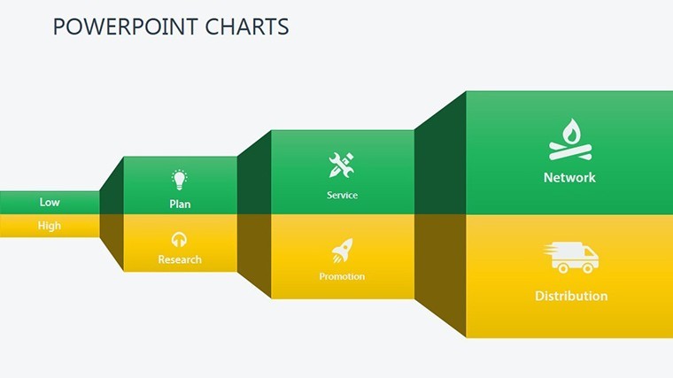
Slide 1 sets the stage with a comprehensive market overview dashboard, funneling key indicators like average rents and inventory levels into an intuitive mosaic. It's engineered for depth, with layered elements that peel back for detailed scrutiny.
- Diverse Visualization Set: Heatmaps for regional pricing, line graphs for historical trends, and scatter plots correlating amenities to premiums.
- Editable Vectors: Every house icon, arrow, and bar resizes flawlessly, preserving detail for widescreen or print exports.
- Animated Enhancements: Sequential builds that mimic market evolution, from listing to lease signing.
- Accessibility Optimized: High-contrast schemes and alt-text ready placeholders, adhering to Section 508 guidelines.
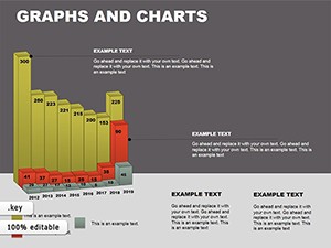
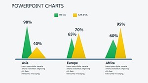
Explore Slide 6's comparative bar chart, pitting urban vs. rural rents - a tool that mirrors Zillow's trend reports, aiding investors in spotting undervalued pockets.
Streamlined Customization for Real Estate Pros
Launch in Keynote, import your MLS data to Slide 4's pie chart for tenant demographics, and recolor segments to match neighborhood vibes. Veterans tip: Use the inspector panel to fine-tune shadows on 3D house models, adding dimensional allure without overcomplicating. Master slides lock in your logo, guaranteeing brand fidelity across the board.
Practical Applications: From Listings to Investor Pitches
Envision a landlord leveraging Slide 8's timeline to forecast ROI on renovations, projecting rent uplifts based on comps - echoing successful flips documented in Urban Land Institute studies. Or an agent dazzling clients with Slide 2's geo-map, pinning properties with bubble sizes denoting square footage.
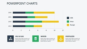
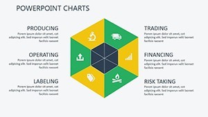
For policy advocates, Slide 10's stacked column chart dissects affordability indices, fueling discussions on zoning reforms. Entrepreneurs scouting developments can customize Slide 7's SWOT matrix, weighing risks like market saturation against growth drivers.
- Property Showcases: Infuse floor plan overviews with overlaid rent projections to seal deals faster.
- Market Reports: Trend arrows illustrating seasonal fluctuations, informed by NAR seasonal data.
- Investment Seminars: Yield curves demonstrating long-term holds versus flips.
A boutique agency we know repurposed our radial distribution chart for neighborhood breakdowns, clinching a multi-unit portfolio by visually demystifying value propositions - elevating close rates by 18%.
Outshining Basic Tools
Keynote defaults pale against our rental-centric motifs - think customizable door icons versus bland bars. With perpetual access, it's a perennial asset for fluctuating markets.
Integration Insights and Design Wisdom
Link to Airbnb analytics for live vacancy feeds, then rehearse with Keynote's light table for seamless flow. Pro hack: Employ gradient fills on area charts (Slide 5) to evoke landscape contours, making data feel alive. Prioritize scannability: Limit text to key callouts, letting visuals lead the conversation.
These charts don't just display data - they disclose opportunities. Grab your Houses Rent Keynote Charts template today and turn rentals into revelations. Pair with our 3D variants for immersive views.
Frequently Asked Questions
How customizable are the rental charts?
Completely - swap data, colors, and icons to fit any market or property type.
Does it support international rent formats?
Yes, with flexible currency and metric toggles for global applicability.
Can I add photos of actual houses?
Absolutely; drag-and-drop into frames on relevant slides for hybrid visuals.
What's the resolution for printed handouts?
Vector-based for infinite scalability, perfect for high-res prints.
Is it suitable for tenant-facing presentations?
Indeed, with simplified views to avoid jargon overload.