Decision Making Charts Keynote Template


Type: Keynote Charts template
Category: Puzzles
Sources Available: .key
Product ID: KC00356
Template incl.: 12 editable slides
Every week, I find myself in high-stakes meetings where the air thickens with uncertainty - executives weighing merger paths, product leads dissecting feature trade-offs, or educators guiding students through ethical quandaries. Without the right visuals, these moments drag into frustration. But flip open this decision making charts Keynote template, and suddenly, clarity emerges. It`s a 12-slide powerhouse I`ve relied on to cut through noise, turning abstract debates into actionable insights that stick.
Crafted for Keynote users who demand precision, this pack draws from frameworks I`ve deployed in client workshops, like multi-criteria scoring for venture picks or funnel visuals for talent acquisition. Vector elements ensure scalability, while subtle animations guide the eye - pros materializing before cons, or lines tracing radar perimeters to underscore strengths. It`s not just slides; it`s a toolkit for consensus-building, ready for your brand`s palette and data drops.
The Power of Visuals in Cutting Through Indecision
Imagine presenting to a skeptical board: Instead of bullet-point overload, a bar graph rises to compare acquisition costs against long-term gains, instantly spotlighting the frontrunner. That`s the edge this template delivers. For marketers prioritizing ad platforms or project managers vetting timelines, these charts transform "what ifs" into "here`s why." I`ve watched teams pivot faster, from supply reroutes in logistics to curriculum overhauls in academia, all because the visuals made complexities digestible.
Speed is baked in - import spreadsheets directly, adjust weights on pies for balanced views, and preview in presenter mode. No fumbling with alignments or recoloring drudgery; the masters handle that, leaving you free to refine your pitch.
Slide-by-Slide: Mapping Choices to Conclusions
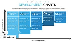
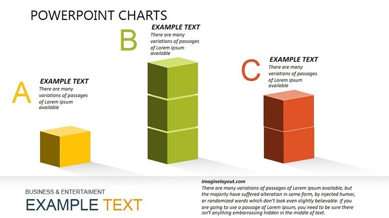
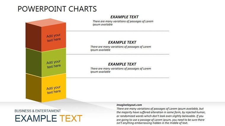
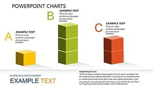
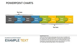
Slide 1 kicks off with a comparative bar setup, ideal for juxtaposing vendor quotes or campaign metrics. Bars stack vertically, animating from base to peak, with labels that hover for deeper dives - perfect for investment decks where ROI tells the tale.
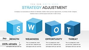
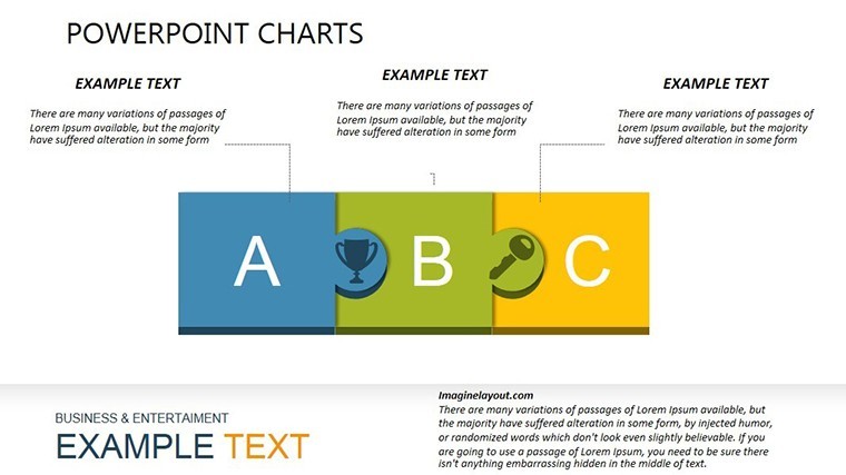
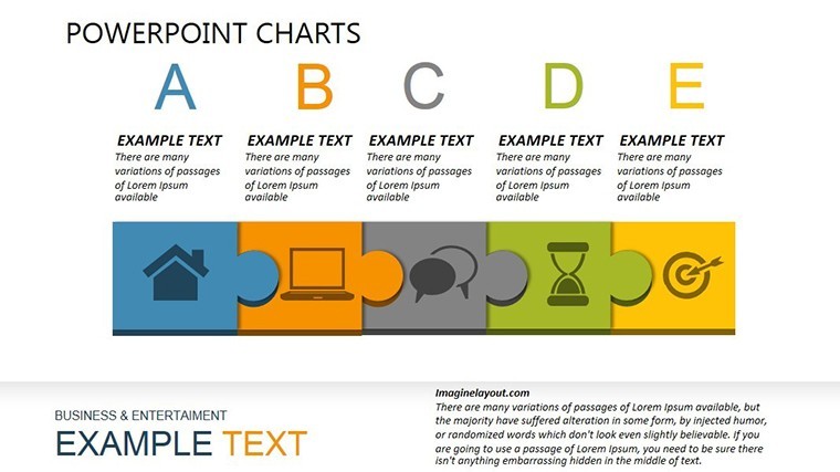
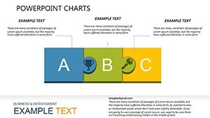
Slides 2-3 shift to pros-cons layouts, grid-based with intuitive icons (checkmarks for upsides, alerts for risks). Each quadrant expands on tap, revealing layered details like integration hurdles or scalability boosts. I`ve leaned on these for software audits, where quick scans reveal hidden gems.
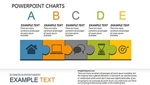
The grid comparator in Slide 4 lays options horizontally across criteria bands - budget, speed, fit - using shaded cells to flag mismatches. Think roadmap debates: In-house vs. partner paths, color-coded for at-a-glance verdicts.
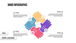
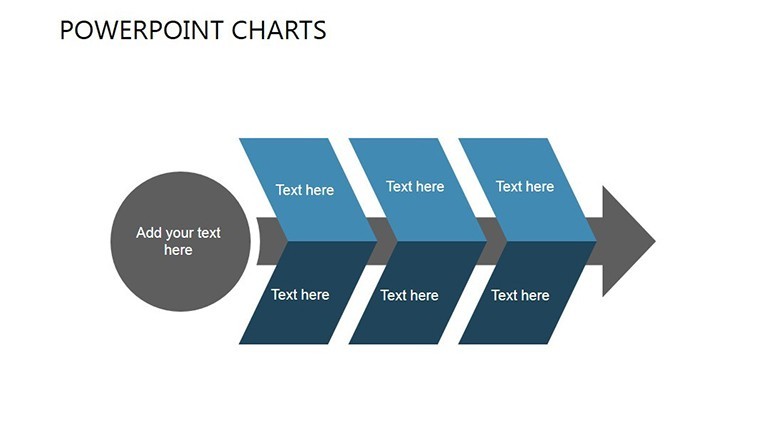
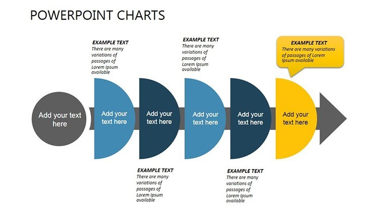
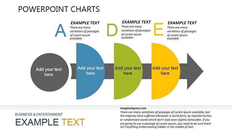
Slide 5`s funnel narrows the field, a cascading shape that funnels broad ideas downward through filters like viability and alignment. Animations simulate flow, dropping underperformers like sediment - I`ve used it in hiring flows to illustrate why certain profiles advance.
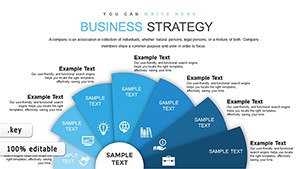
Weighted pies dominate Slides 6-7, slices resizing as you dial in priorities (say, 35% on innovation, 25% on cost). They spin into view, emphasizing the lead, and pair seamlessly with score inputs for feature backlogs in dev sprints.
Slide 8`s radar plots multi-angle views, spokes radiating for traits like agility or compliance, with overlaid polygons showing overlaps and gaps. Essential for tech evals, where one option`s "spiderweb" engulfs rivals, I`ve pulled this for client security reviews.
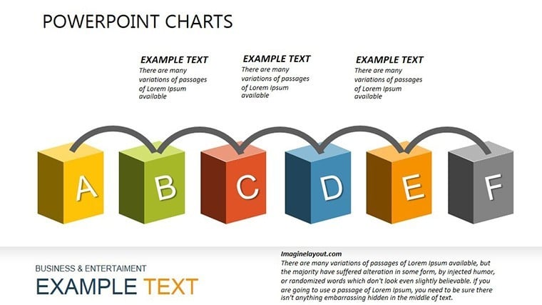
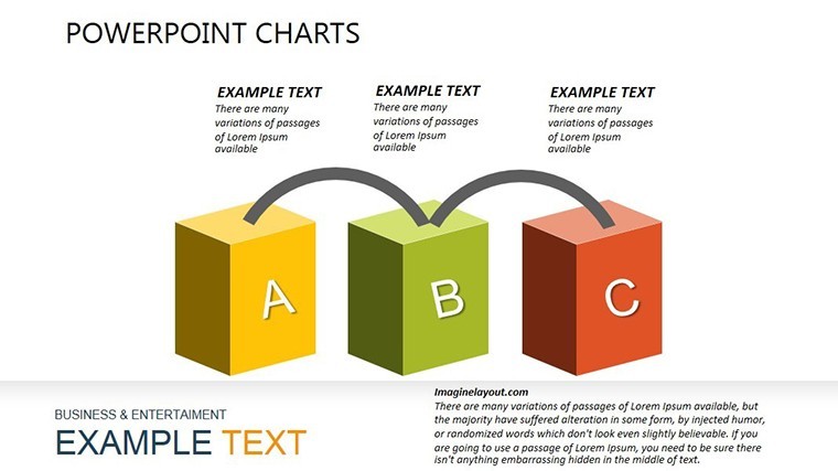
Closing with Slides 9-12: Ranked lists with reorderable cards, summary diamonds for rationales, and a capstone slide framing the verdict with next-action prompts. Speaker notes weave in facilitation tips, like "Probe here on assumptions."
From Boardrooms to Breakouts: Proven Applications
Last month, a fintech startup I advised used the radar to dismantle funding myths - polygons exposed low-yield traps, securing a cleaner term sheet. Or consider a university team I supported: Funnels streamlined grant focuses, channeling efforts to high-impact bids over scattered ones.
Nonprofits thrive here too, scoring initiatives by reach and feasibility to allocate scarce funds wisely. Even solo consultants like me repurpose grids for client option papers, exporting to interactive PDFs for remote feedback loops. Collaboration shines via Keynote`s share links, with real-time edits keeping remote squads synced.
Tailor It to Your Flow Seamlessly
With 50+ icons - from gears to targets - swap to evoke your sector, be it healthcare metrics or creative briefs. Fonts scale intuitively, transitions tweak via sliders, and accessibility toggles ensure color-blind friendly contrasts. It`s built to evolve with you, duplicating slides for deeper dives without breaking stride.
Launch in Keynote and shape your next win - decisions await their diagram.
Frequently Asked Questions
Does this template work beyond Keynote for cross-platform teams?
Native to Keynote on macOS 10.15+, it syncs via iCloud for seamless access. For PowerPoint or Google Slides users, export as .pptx or PDF - charts remain editable, though some animations adapt during conversion.
How quickly can I populate charts with my metrics?
Under 20 minutes typically: Copy-paste from Google Sheets into Keynote`s data pane, and charts auto-update. Pies and radars respond live to value changes for instant previews.
Can I adjust chart styles to fit my company`s look?
Fully - vectors let you recolor gradients, swap icon sets, and resize without distortion. The build-in theme editor applies global shifts, aligning with your palette in a few clicks.
Is it suitable for expanding to more complex decisions?
Yes, the modular design supports scaling - clone funnels for extra stages or add radar axes for nuanced criteria, handling up to 10+ factors cleanly.
How does it support inclusive presentations?
Incorporates WCAG-compliant contrasts, resizable text, and logical tab orders. Add descriptive notes for screen readers, ensuring all participants grasp the visuals equally.
What if my scenario needs unique chart types?
Core types cover 80% of needs, but mix in Keynote`s native tools or duplicate bases to craft hybrids - like combining grids with custom Sankey flows for resource allocations.