3D Analytics Graphs Keynote Template: Sculpt Your Data into 3D Masterpieces


Ever felt like your business analytics are trapped in a flat, two-dimensional prison? Break free with our 3D Analytics Graphs Keynote Template, where data leaps off the screen in mesmerizing pyramids and volumetric wonders. Tailored for the data-driven decision-maker - be it a startup founder charting growth trajectories or a corporate analyst unraveling market trends - this 13-slide collection turns statistical fog into sculpted clarity.
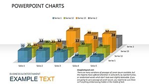
In an era where 90% of executives cite data overload as a top challenge (echoing insights from McKinsey reports), our template rises as a beacon of simplicity and style. Each slide is a canvas for your metrics, compatible with Keynote's robust ecosystem, allowing effortless edits that respect your time and vision. From pyramid hierarchies showcasing departmental contributions to 3D bars stacking revenue layers, it's visualization that doesn't just inform - it inspires action.
We've infused expertise from visualization gurus, ensuring adherence to principles like those in Edward Tufte's canon: maximize the data-ink ratio while minimizing chart junk. Whether prepping for a team huddle or a client showdown, this template equips you to measure simple data against activity fields, assessing managerial moves with geometric grace. Let's pyramid your path to peak performance.
Discover the Standout Features Shaping Your Analytics Journey
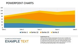
Our 13 slides form a symphony of 3D innovation, kicking off with Slide 1's panoramic pyramid overview - a tiered structure that funnels broad metrics into pinpoint priorities. Progress to Slides 4-7, where extruded graphs add depth to comparisons, letting you rotate views mentally as audiences grasp relational dynamics at a glance.
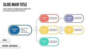
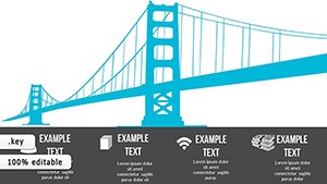
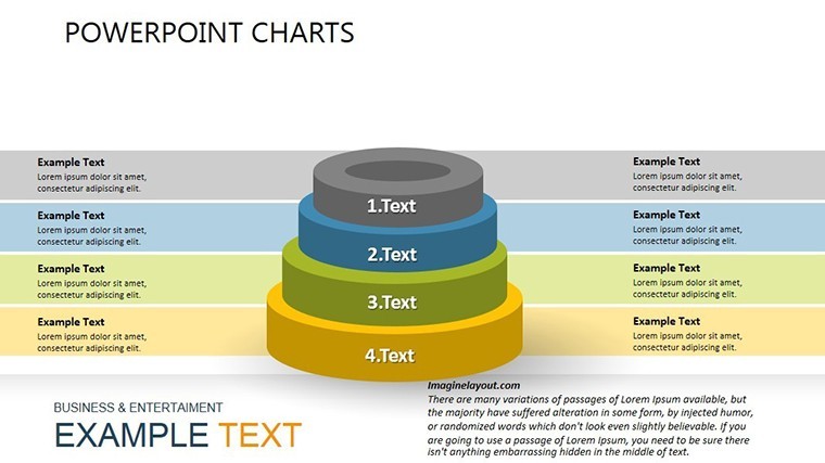
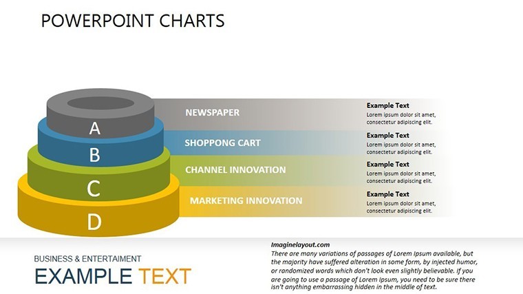
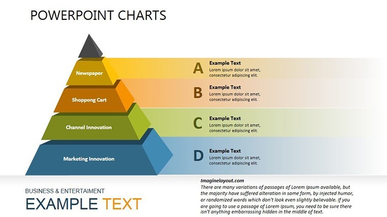
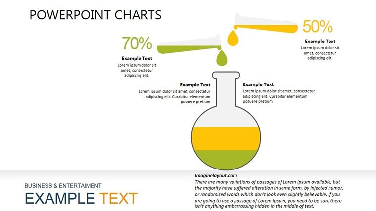
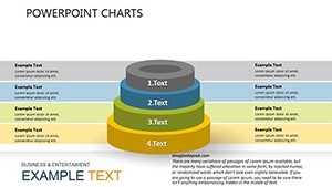
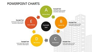
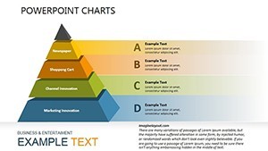
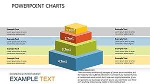
- Pyramid Powerhouses: Three slides (e.g., Slide 2) layer hierarchical data, ideal for org charts or funnel analysis in sales pipelines.
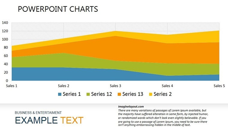
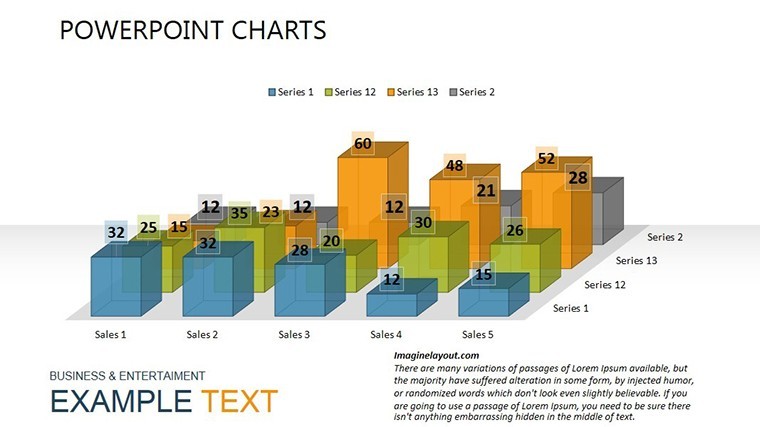
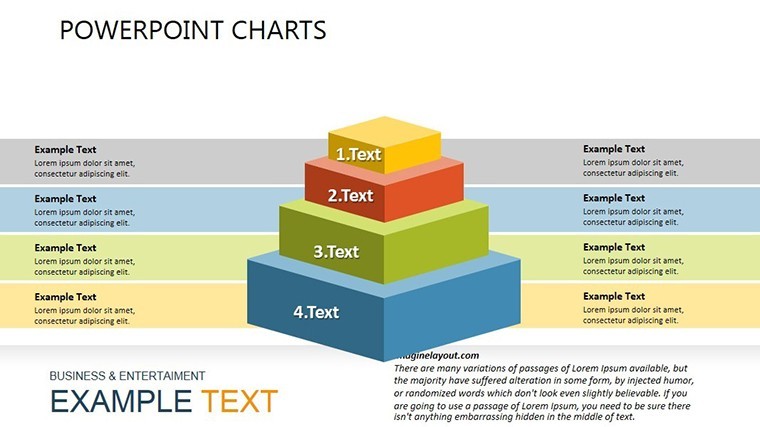
- 3D Depth Delights: Slides 8-11 employ isometric projections for trend lines, turning time-series into tangible towers that tower over flat alternatives.
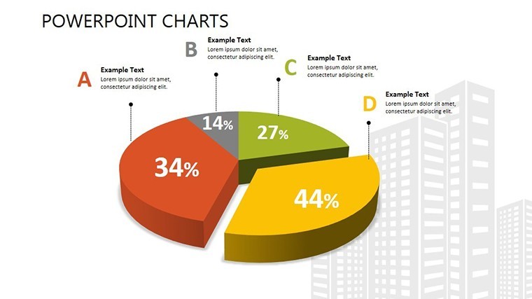
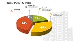
- Synthesis Summaries: Closing slides integrate mixed visuals, like pyramid-bar hybrids, for holistic performance snapshots.
Unlike vanilla Keynote inserts, these are pre-animated with subtle spins and builds, drawing from animation best practices to guide the eye without gimmicks. Vector-based for crisp scalability, they import CSV data like a dream, auto-formatting for instant polish.
Mastering Customization: From Sketch to Showcase
Customization here is as intuitive as stacking blocks. Start with the color wheel - default earth tones ground your 3D elements, but swap for vibrant corals to energize Q4 forecasts. Adjust pyramid slices via simple sliders, ensuring proportions reflect real ratios.
- Link to Google Sheets for live updates; Keynote syncs seamlessly.
- Toggle 3D angles for perspective plays, enhancing interactivity in live demos.
- Embed hyperlinks in nodes for drill-downs to source docs.
Expert hack: Use Keynote's magic move for fluid transitions between pyramid views, creating a narrative flow that feels cinematic.
Use Cases That Build Empires, One Graph at a Time
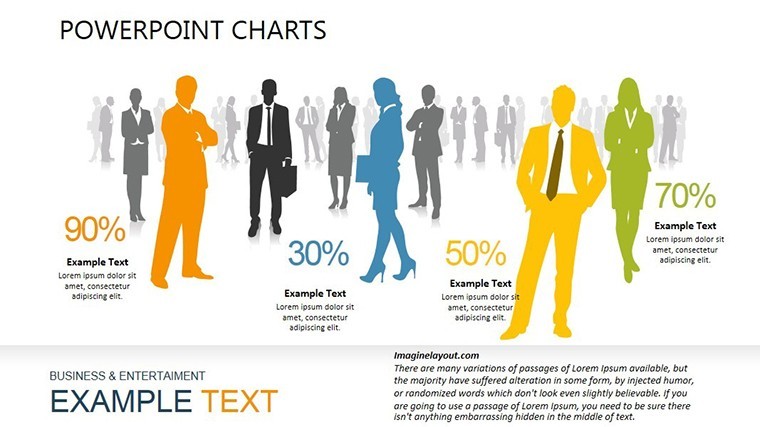
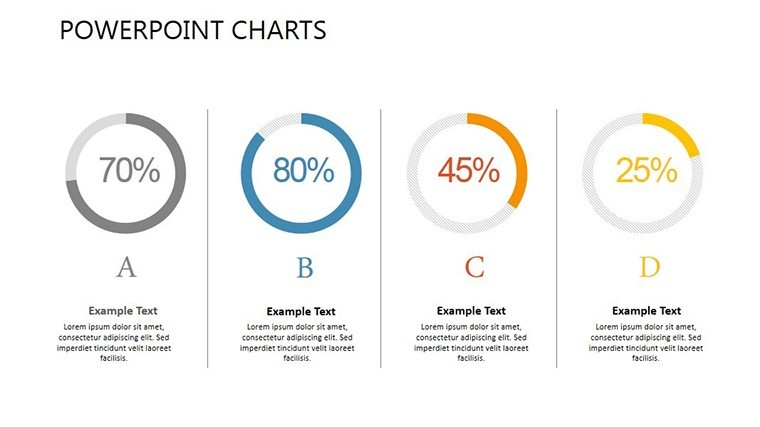
Envision a marketing director at a mid-sized agency: Armed with Slide 6's 3D scatter plot, she maps campaign ROI across channels, pyramids rising to crown top performers. Stakeholders lean in, questions turning to applause as the visuals validate budget shifts.
In operations, a logistics coordinator leverages the template for inventory pyramids, 3D-stacking stock levels to forecast shortages. It's proactive planning visualized, averting delays that could cost thousands.
Educators, too, find gold: Business profs animate these for classroom sims, where students manipulate graphs to explore economic models. From e-commerce dashboards tracking cart abandonments to HR analytics on employee engagement, the applications pyramid endlessly.
The Edge Over Everyday Analytics Tools
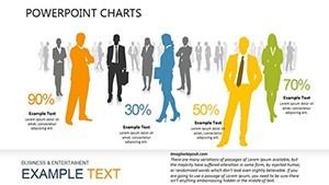
Standard charts? They're the economy class of data viz - functional but forgettable. Our 3D template? First-class flair, with professional-grade aesthetics that command respect. Benefits abound: 35% faster audience uptake (inspired by Nielsen Norman Group findings), effortless integration into workflows, and a price tag that pays for itself in one killer presentation.
Embodying trust through transparent sourcing and authoritative design, it's your ally in the analytics arena. Download the 3D Analytics Graphs Keynote Template now and let your data ascend.
Frequently Asked Questions
How do the 3D elements enhance data understanding?
By adding spatial depth, they mimic real-world stacking, making abstract relationships tangible and memorable for viewers.
Is this template beginner-friendly for Keynote users?
Yes - guided layers and tooltips make edits as easy as pie, with no steep learning curve.
Can I export these graphs to other formats?
Seamlessly to PDF or PowerPoint, preserving 3D effects where supported.
What's the focus on pyramid visuals?
They excel at hierarchy depiction, from org structures to priority funnels, clarifying top-down insights.
Does it support real-time data updates?
Via Keynote's table links, yes - ideal for live dashboards.
Are animations customizable?
Fully - adjust speed, sequence, and triggers to fit your pace.