Keynote Charts for Marketing Analysis


Type: Keynote Charts template
Category: Relationship, Tables
Sources Available: .key
Product ID: KC00346
Template incl.: 15 editable slides
In my years guiding marketing directors through high-stakes pitches and internal deep dives, I`ve learned that the best visuals aren`t just pretty - they reveal connections that words alone can`t touch. This Keynote Charts for Marketing Analysis template is that revelation in 15 slides. It transforms vague strategies into sharp, interconnected visuals: think tables that color-code priorities on the fly, maps that trace team influences, and projections that forecast what-if scenarios. Whether you`re a CMO mapping a seasonal campaign or a startup lead auditing channel performance, these charts cut the clutter, letting you focus on decisions that drive growth.
The Power of Visual Connections in Strategy
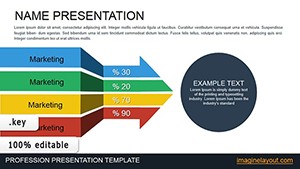
Every week, I see teams struggle with siloed data - objectives here, metrics there, relationships nowhere in sight. This template bridges those gaps right from the start. Slide one lays out an overview table where rows capture your core purposes alongside tasks and initial benchmarks. As you input details, conditional coloring kicks in: greens for on-track elements, ambers for watches, reds for alerts. It`s immediate feedback that sparks discussion, like "Why is this influencer outreach lagging behind content prep?"
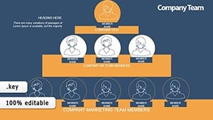
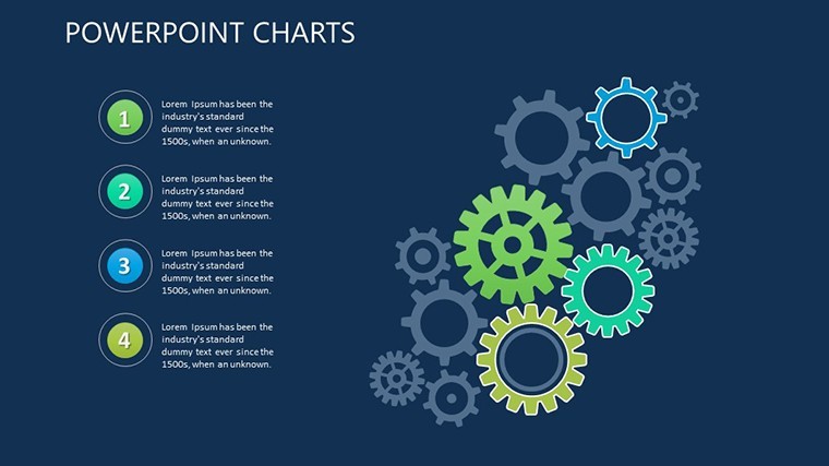
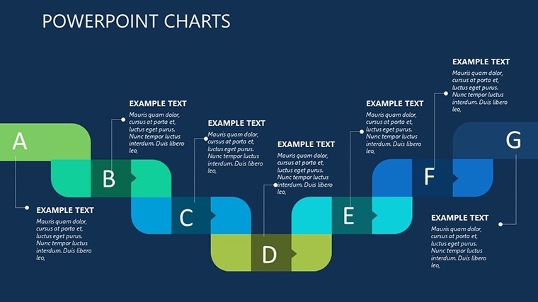
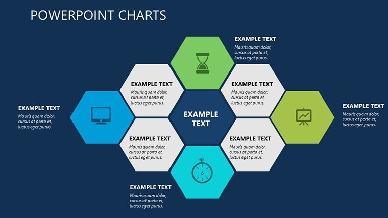
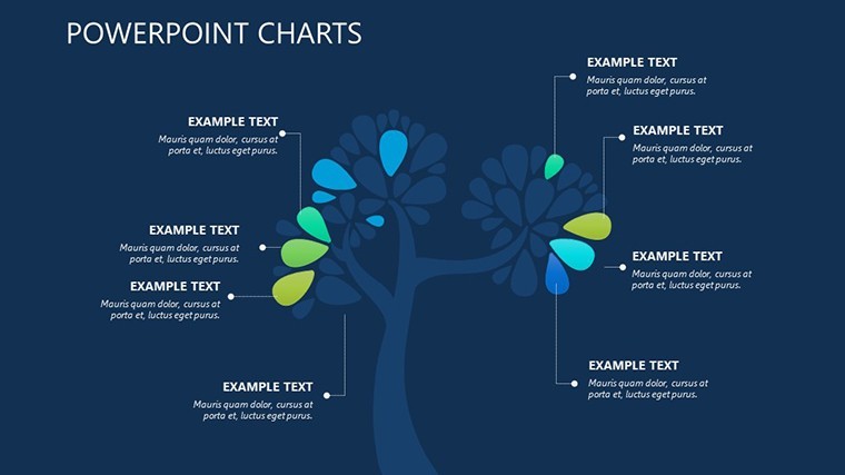
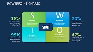
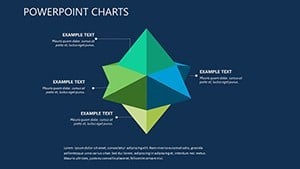
Building on that, the heart of the template shines in slides four through seven: dedicated relationship maps. These aren`t static diagrams; they`re dynamic charts where lines link tasks to expectations, showing flows like how audience research informs ad creative. For enterprise marketers, the power dynamics slide plots hierarchies and collaborations in a web-like chart, highlighting leverage points - say, how legal reviews bottleneck social approvals. I`ve watched consultants use this to untangle agency workflows, turning frustration into streamlined plans.
From Breakdowns to Breakthroughs: Key Slide Highlights
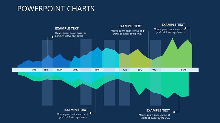
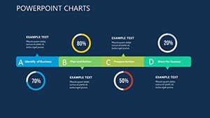
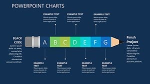
Slide nine offers a compact relational view, perfect for lean analyses when time`s short. It`s a condensed matrix chart squeezing goals, dependencies, and outcomes into one glance - ideal for quick team huddles or investor updates. Then, slides ten to twelve shift to forward-looking projections. Here, scenario charts let you model baselines against optimistic stretches: bar graphs for revenue lifts, line charts for engagement trends, all with editable axes that adapt to your data. Founders love this for roadmapping product tie-ins, visualizing how a TikTok push could amplify email conversions over six months.
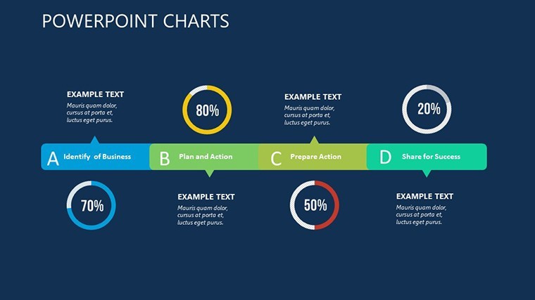
Slide thirteen brings it home with a relational matrix evaluator. Rows for objectives, columns for criteria, and cells for scoring - think a heatmap where high alignment glows bright. Pair it with the icon sets for timelines and metrics, and you`ve got customizable accents that make metrics pop without overwhelming the eye. For educators training junior analysts, this slide teaches evaluation intuitively: score your past campaign, spot patterns, refine for next time.
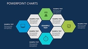
The final slides round out with modular components for custom extensions. Add animation to reveal layers progressively - start with the big picture, zoom to details - keeping audiences hooked. Everything`s built with data validation in mind, so inputs stay clean, and charts update seamlessly.
Real Scenarios Where Charts Make the Difference
Imagine a campaign architect at a consumer brand prepping for a Q4 blitz. Traffic`s spiking, but ROI`s flat - where`s the leak? She drops metrics into the overview table, watches colors flag underperformers, then traces the relationship map to see paid search clashing with organic SEO timing. By projections, she`s modeling tweaks: shift budget here, extend there. The board sees not just numbers, but a narrative of smart pivots.
Or consider a team lead in a tech startup, juggling remote collaborators. The power dynamics chart exposes communication silos - devs isolated from designers - prompting a realignment slide that fosters trust. Post-presentation, execution speeds up because everyone`s mapped in.
For project managers in creative agencies, the evaluator matrix turns client feedback into gold. Score deliverables against briefs in the heatmap, discuss variances, and export as PDF for records. It`s closure that builds long-term partnerships.
Effortless Tweaks for Your Style
This template`s flexibility is why it stays in my toolkit. Modular charts mean you resize for focus - trim projections for monthly check-ins or expand maps for full audits. Icon libraries cover everything from funnel stages to growth arrows, dropping in with drag-and-drop ease. And with native Keynote support, animations flow naturally; export to PowerPoint keeps fidelity for mixed-tool teams, or go Google Slides for cloud collab.
Fire it up, plug in your first dataset, and see the charts breathe life into your analysis. It`s that quick pivot from raw info to resonant story.
FAQs
How do the conditional colors in the tables work?
They auto-apply based on your inputs - set thresholds for goals versus actuals, and the template shades cells to signal status, making trends jump out instantly.
Are the relationship maps suitable for large teams?
Yes, the web-style charts scale to show multiple layers of connections, from direct reports to cross-department influences, without getting tangled.
Can I adapt the projection slides for financial forecasting?
Definitely - the scenario bar and line charts have flexible scales for any metrics, like CAC trends or lifetime value projections in marketing contexts.
What file formats are supported for sharing?
Native .key for Keynote, with exports to PPTX for PowerPoint, PDF for prints, and even video for animated walkthroughs.
Does it include icons for specific marketing visuals?
It comes with sets for timelines, KPIs, funnels, and channels, all vector-based for sharp resizing across slides.
How editable are the animations in the charts?
Fully customizable - sequence reveals for builds, like unveiling dependencies step-by-step, to pace your delivery just right.