Hourglass Charts Keynote - Fully Editable | ImagineLayout


Type: Keynote Charts template
Category: Matrix, Illustrations
Sources Available: .key
Product ID: KC00331
Template incl.: 22 editable slides
What's Inside the Download
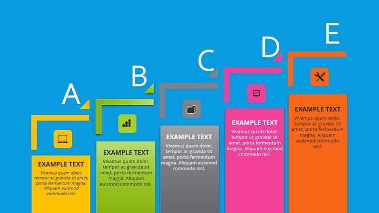
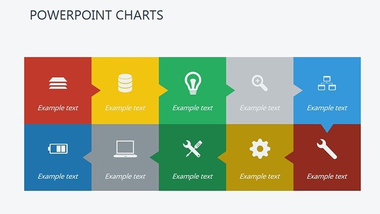
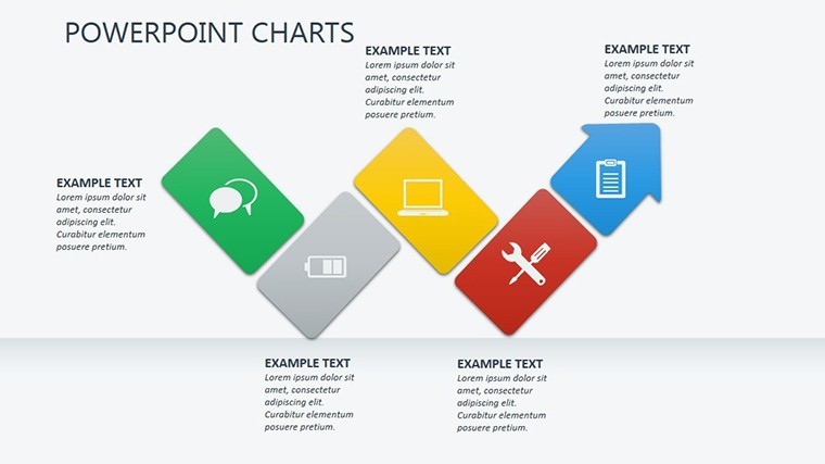
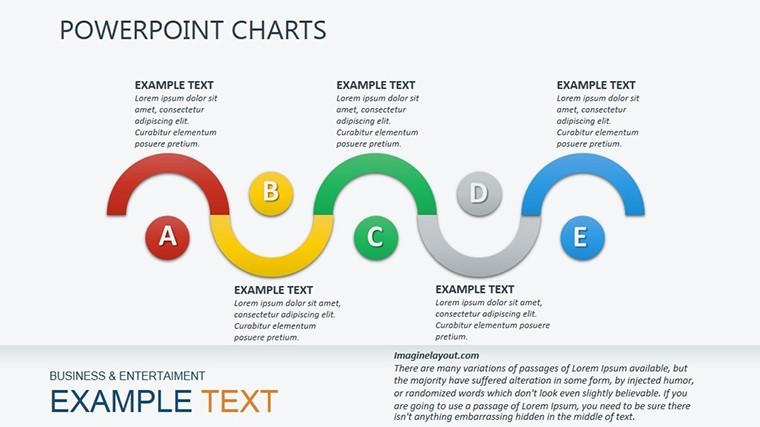
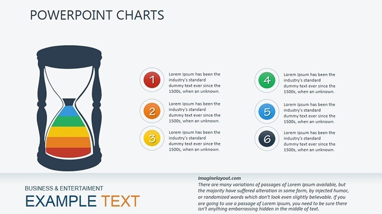
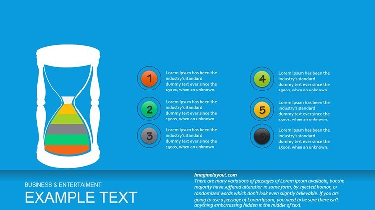
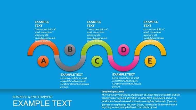
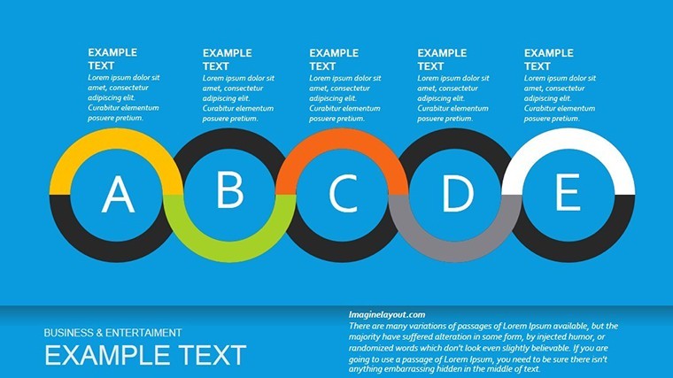
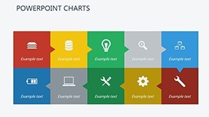
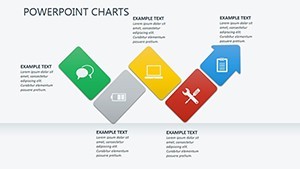
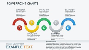
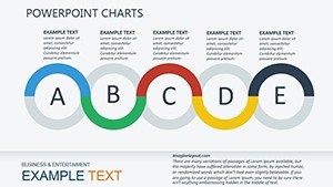
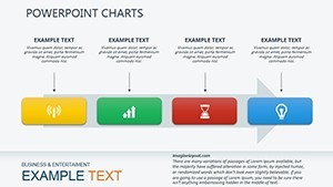
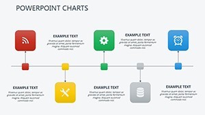
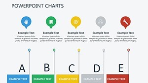
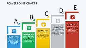
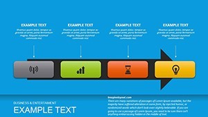
22 editable slides include funnel charts plus layered timelines.
Warm-to-cool gradient palettes provide the color schemes.
The single .key file format opens directly.
Editing Capabilities at a Glance
| Feature | Details |
|---|---|
| Slides included | 22 with diagram categories for time flow |
| Editable elements | shapes resize independently and text placeholders update without regrouping |
| Aspect ratio | standard 16:9 compatible with Keynote slide master |
| Color themes | gradient palettes adjust via theme palette |
| Diagram connectors | arrows change direction and weight freely |
| Icon layers | replaceable without layout shift |
Short sentence here.
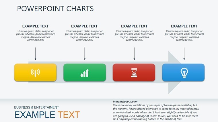
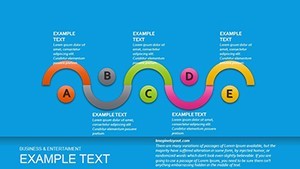
Medium length follows with flow direction detail.
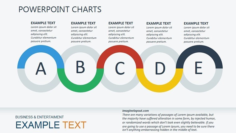
Longer sentence explains how zone segmentation in diagram structure improves information spacing for any business presentation without extra effort.
Typical Use Cases by Role
A project manager in construction tracked milestone phases with the timelines and cut deck preparation from 3 hours to 45 minutes.
An educator in training programs mapped student progress using funnel charts and reused the file across three reports by swapping color schemes.
Download the Hourglass Charts Keynote Template now.
Customization in 4 Steps
- Open the .key file in Keynote (1 minute)
- Replace placeholder text labels (3 minutes)
- Adjust gradient colors via palette (2 minutes)
- Export as PDF for distribution (1 minute)
Moderate difficulty suits moderate skill levels.
Short.
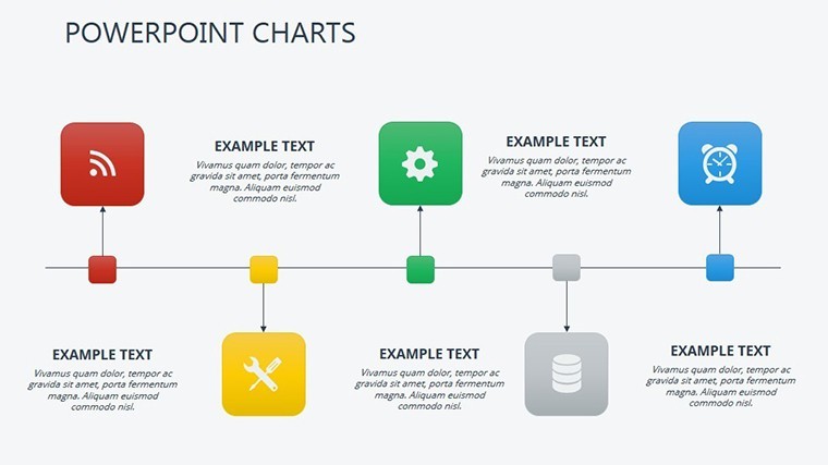
Medium sentence here with editing features.
Why This Template, Not a Blank Slide
Many presentations place labels directly inside diagram shapes.
That approach works on laptops but becomes harder to read on large projection screens.
This layout keeps labels outside the shapes and connects them with thin lines.
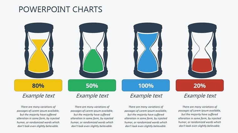
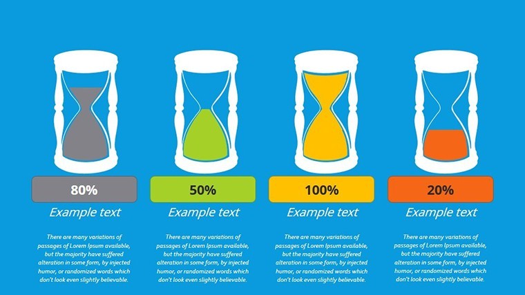
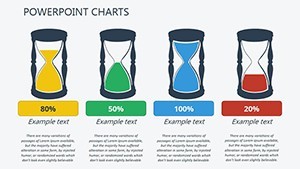
The hourglass motif with sand-cascading animations sets this apart from the Interactive Keynote Charts Template and other related options.
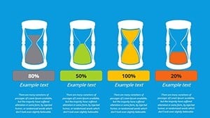
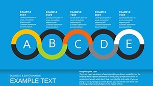
Funnel charts with gradient palettes stand out as the specific visual characteristic.
Project management progress tracking works best here because the flow direction matches timeline logic better than neighbors.
The paid version includes the full 22 slides and animations since no free version appears on the page.
Consultants often combine this with a timeline slide from the category when presenting project phases in client proposals.
Financial analysts reach for the Real Estate Market Keynote Charts Template as a complementary option for market data alongside time tracking.
Get the template and present today.
Which Keynote versions open this file?
Keynote 12 and newer versions open the .key file without conversion. Older versions may require export to an earlier format first. Test on your device before the deadline to confirm compatibility. The file uses native elements so no third-party plugins are needed.
How do you change the color scheme?
Select the slide master in Keynote. Click the color palette icon. Choose one of the warm-to-cool gradients already built in. Apply to all slides at once through the theme settings. Recolor individual shapes manually if needed in 30 seconds.
What does the license allow for client work?
You may use the template in paid client presentations and consulting decks. Resale or sublicensing of the original file is not permitted. Modify and deliver the final deck to clients freely. Keep the source file for your own reuse only.
What happens if the file does not work?
Contact support within 30 days of purchase for a full refund if the .key file fails to open in your Keynote version. Provide the exact error message. Refunds process within 48 hours once verified. No questions asked beyond the compatibility issue.
Are animations supported and how to apply them?
Sand-cascading animations are built in for the hourglass elements. Select the object and open the Animate tab. Choose the preset or build a custom fade sequence. Apply to multiple slides at once via copy-paste. Export to PDF disables animations automatically.