Development Ecology Keynote Charts


Type: Keynote Charts template
Category: Illustrations
Sources Available: .key
Product ID: KC00310
Template incl.: 15 editable slides
In an era where sustainability drives corporate success, presenting environmental data effectively is crucial for gaining stakeholder buy-in. Picture this: You're leading a team on a green initiative, and instead of dense reports, you unveil visually compelling charts that map out ecological impacts and project developments. Our Development Ecology Keynote Charts Template delivers exactly that with 15 editable slides focused on environmental documentation and reporting. Designed for enterprises tackling eco-projects, it incorporates illustrations that bring abstract concepts like biodiversity assessments or carbon footprint analyses to life, all in a .key format for seamless Keynote compatibility.
This isn't your average template - it's a strategic tool that addresses the challenges of conveying complex environmental data without overwhelming your audience. From regulatory compliance to internal strategy sessions, these charts help visualize progress in areas like waste management or renewable energy adoption. Optimized for widescreen, the slides feature intuitive layouts that promote clarity, drawing from best practices in environmental communication as outlined by organizations like the EPA.
Essential Features for Eco-Focused Presentations
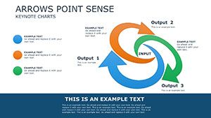
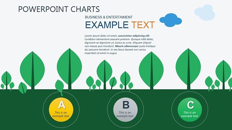
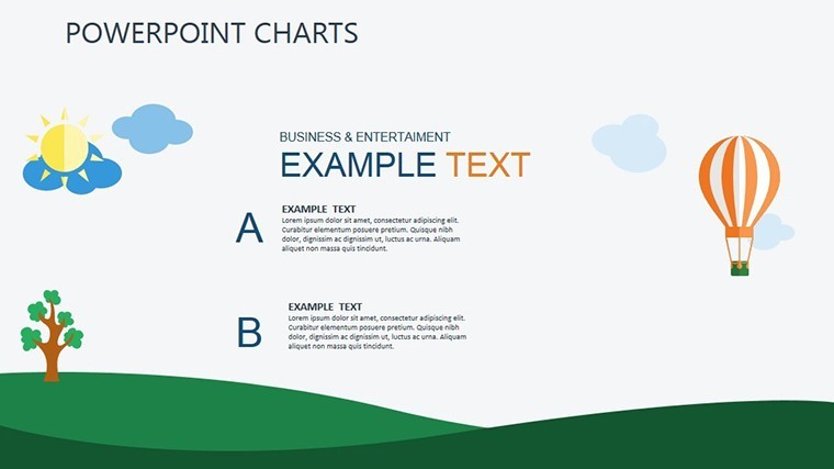
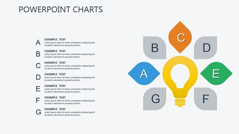
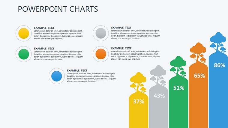
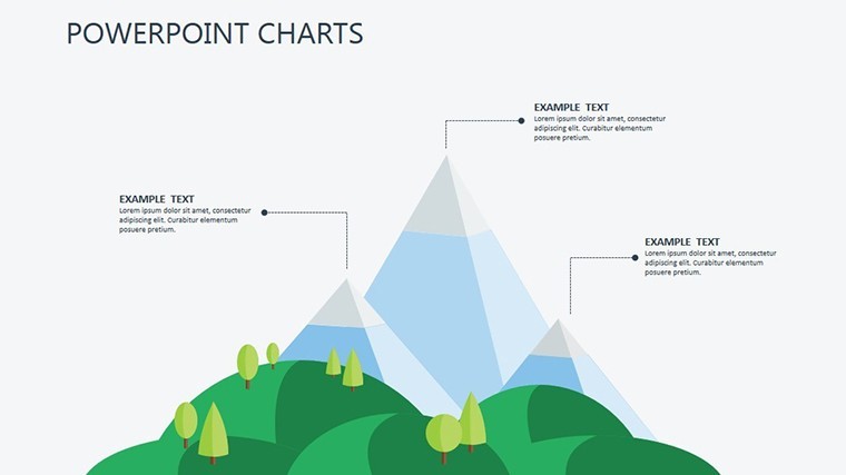
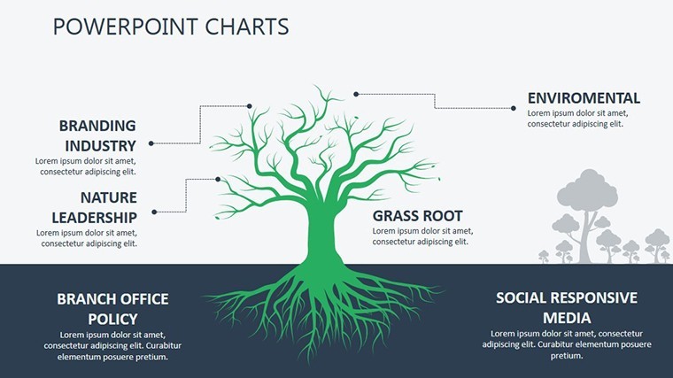
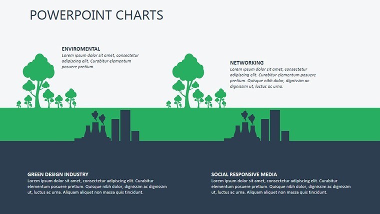
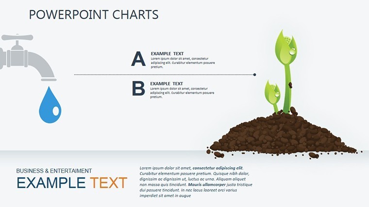
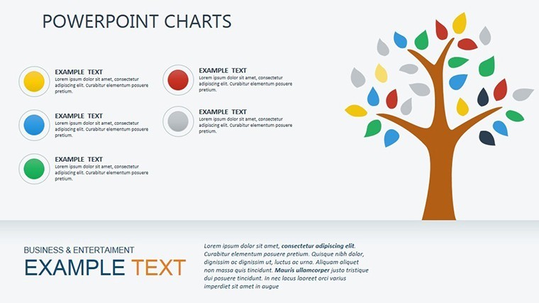
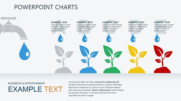
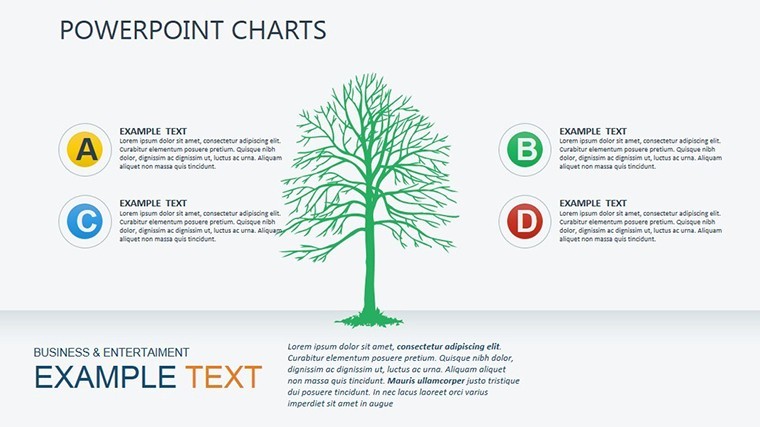
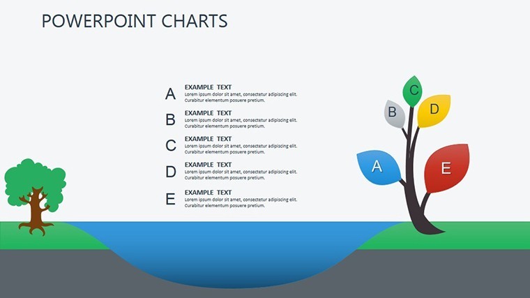
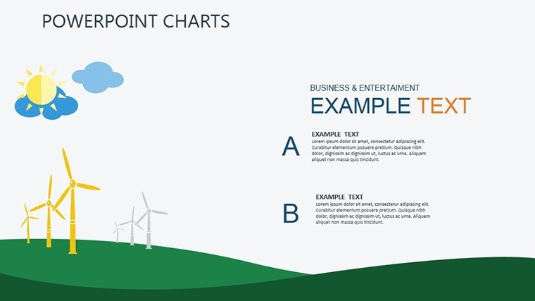
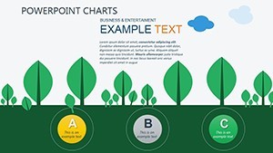
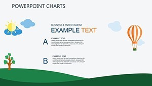
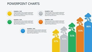
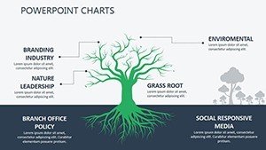
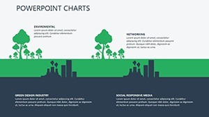
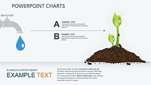
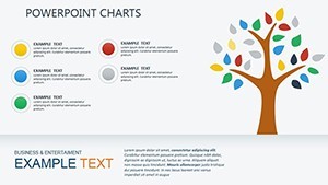
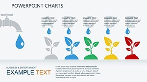
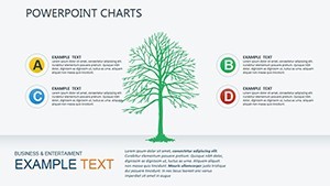
The template's illustrations are its standout, offering editable visuals for ecosystems, timelines of project phases, and metric trackers. Each slide allows full customization, from resizing elements to altering colors to align with your branding.
- Editable Illustrations: Depict environmental processes with modifiable graphics.
- Project-Specific Layouts: Tailored for documentation like impact assessments.
- Scalable Designs: Maintain quality across devices or prints.
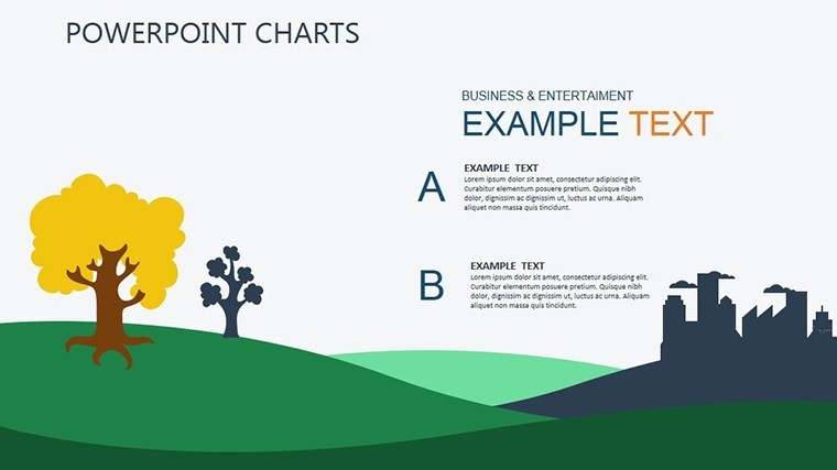
- Integrated Themes: Cohesive green-toned aesthetics for eco-relevance.
Unlike standard Keynote tools that demand extensive setup, this provides ready frameworks, saving time while ensuring professional output. Environmental consultants, per insights from GreenBiz reports, leverage such visuals to demonstrate compliance, enhancing credibility.
Slide-by-Slide Exploration
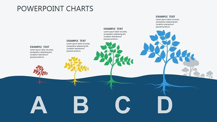
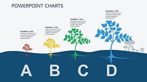
Slide 1 offers an overview canvas for project summaries, with spaces for key metrics like emission reductions. Subsequent slides delve into specifics: timelines for development stages, charts for resource allocation, and illustrative maps for site impacts. End with reporting summaries that compile data into digestible formats. Pro tip: Use Keynote's shape tools to overlay custom icons, like trees for forestry projects, amplifying relevance.
For integration, import data from tools like GIS software, then refine in these slides for a polished narrative.
Diverse Applications in Environmental Work
Enterprises use this for varied purposes. In corporate sustainability reports, charts illustrate ESG goals, aligning with standards from the Global Reporting Initiative. For non-profits, it aids grant proposals by visualizing conservation efforts.
Step-by-step for an eco-project pitch: Load the template, select a timeline slide, input phases like 'Planning' to 'Implementation.' Add illustrations for each, customize colors for urgency (e.g., red for risks), and present with confidence. This method clarifies timelines, fostering team alignment.
Other uses: Government agencies for policy briefs, or educators teaching sustainability, adapting slides to include real data from sources like World Bank environmental indicators. Its versatility supports hybrid workflows, blending with apps like Tableau for advanced analytics.
Workflow Optimization and Value
Streamline your process by collaborating via shared Keynote files, iterating on feedback. Benefits include heightened engagement - audiences retain 65% more from visuals, per studies - and cost savings on design services. A case akin to those in Harvard Business Review: A firm used ecology charts to secure funding for a reforestation project, by clearly mapping benefits.
Practical Tips for Success
- Prioritize data integrity: Source from reliable eco-databases.
- Customize thoughtfully: Align visuals with audience expertise.
- Add interactivity: Use hyperlinks to detailed reports.
- Ensure accessibility: Include alt text for illustrations.
- Review for impact: Test presentations for flow.
These elevate your eco-narratives from informative to transformative.
Advance your environmental advocacy - secure this template and lead with visual excellence now.
Frequently Asked Questions
How editable are the ecology illustrations?
Completely customizable, including sizes, colors, and positions.
Is it suited for regulatory reporting?
Yes, designed for environmental documentation compliance.
What file type is included?
.key for direct Keynote use.
Can it handle complex data?
Absolutely, with layouts for metrics and timelines.
Are there pre-set color schemes?
Green-themed, but fully adjustable.
How does it aid sustainability projects?
By visualizing progress and impacts clearly.