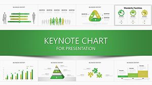
Keynote Graph Function Charts Template: Transform Data into Visual Mastery


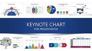
In the fast-paced world of presentations, where data reigns supreme, having the right tools can make all the difference. Imagine turning intricate graph functions and analytical insights into stunning visuals that not only inform but also engage your audience. Our Keynote Graph Function Charts Template is designed precisely for that purpose. With 24 fully editable slides, this template caters to professionals who need to convey complex information through arrows and analysis-driven diagrams. Whether you're a business analyst preparing quarterly reports, an educator illustrating mathematical concepts, or a marketer showcasing campaign metrics, this template empowers you to create presentations that stand out.
Built exclusively for Keynote, it ensures seamless compatibility and effortless editing. Customize colors, fonts, and layouts to match your brand's aesthetic, and watch as raw data evolves into persuasive narratives. Say goodbye to bland slides and hello to dynamic visuals that highlight trends, comparisons, and projections with precision. This isn't just a template; it's your secret weapon for data-driven storytelling that drives decisions and inspires action.
Why This Graph Function Template Elevates Your Keynote Game
At the heart of effective communication lies the ability to simplify complexity. Our template draws from best practices in data visualization, inspired by experts like Edward Tufte, who emphasized clarity and efficiency in graphical displays. Each of the 24 slides is crafted with vector-based elements, allowing you to scale without losing quality – perfect for high-resolution displays or printouts.
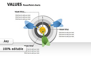
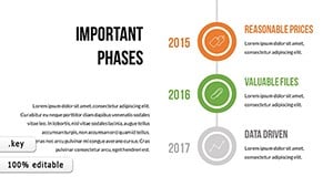
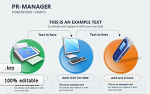
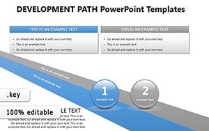
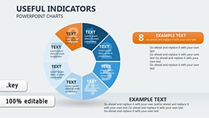
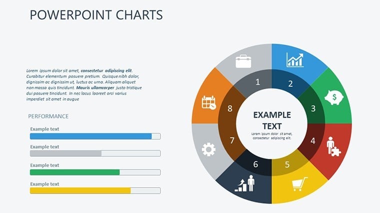
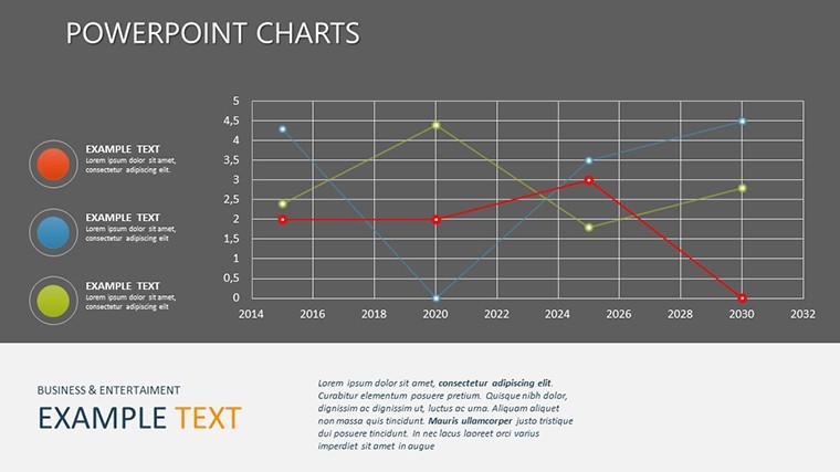
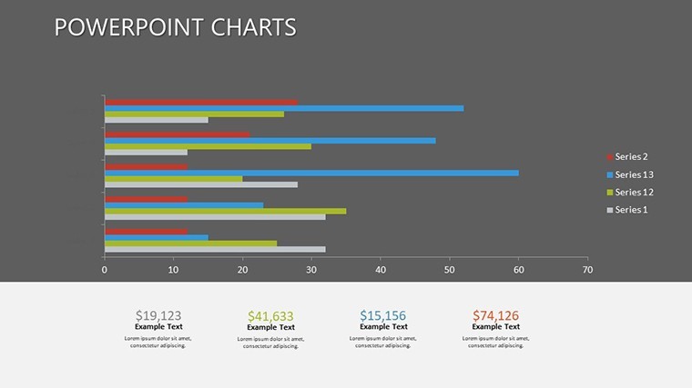
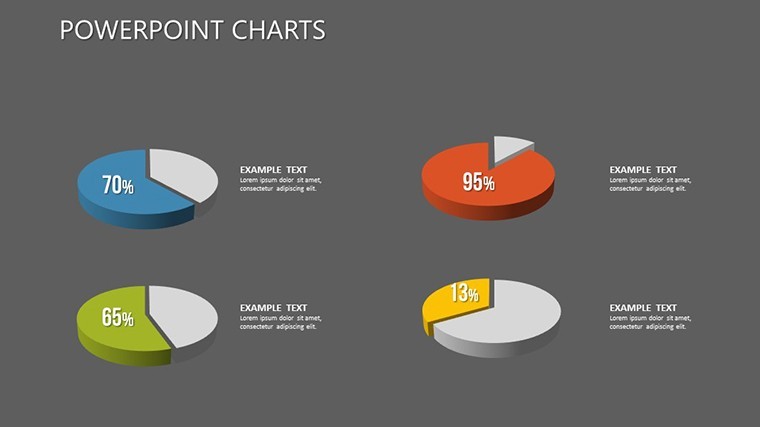
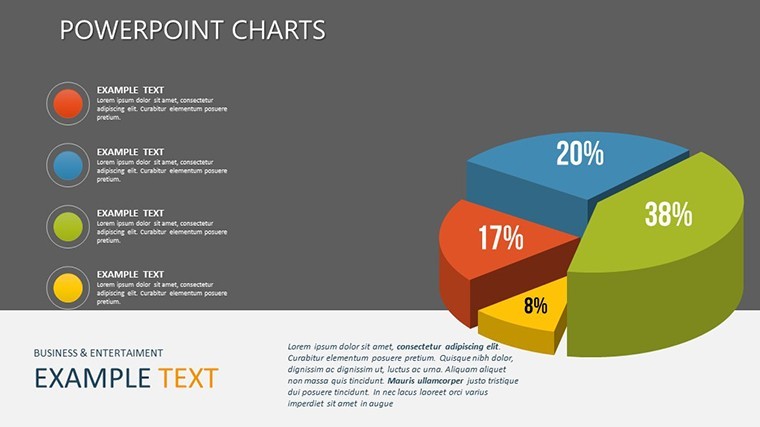
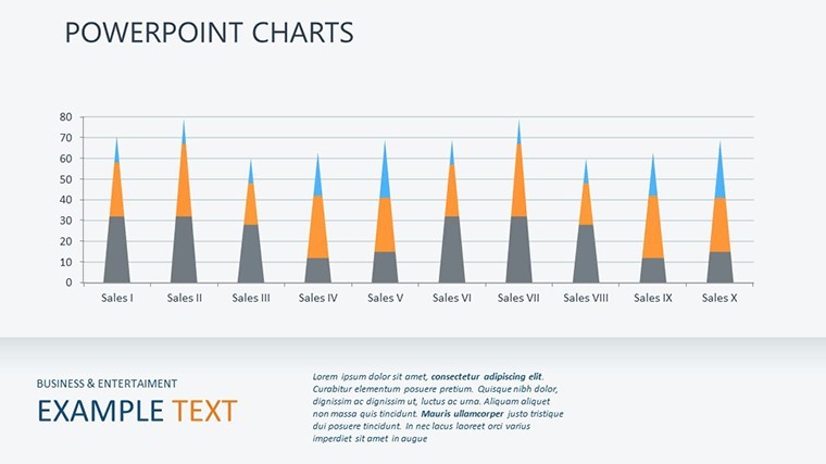
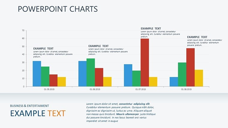
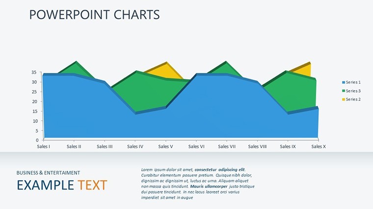
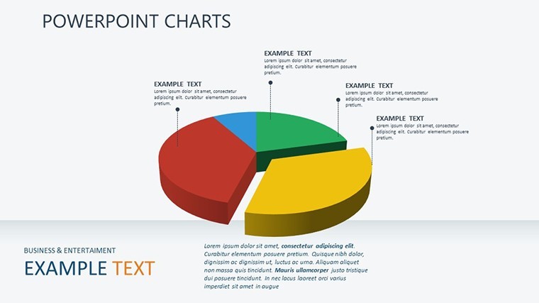
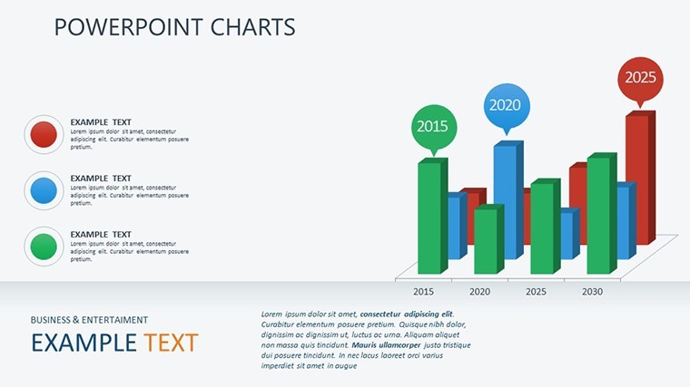
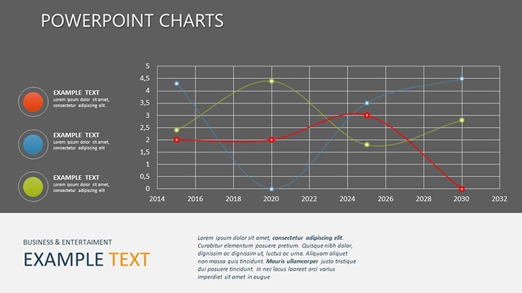
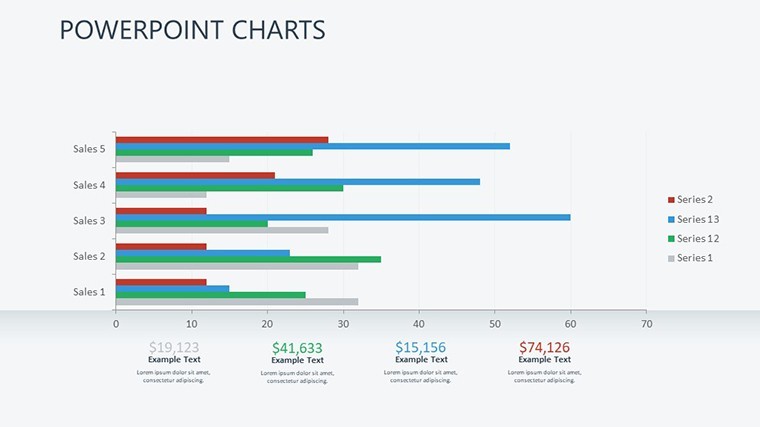
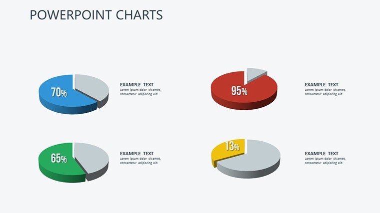
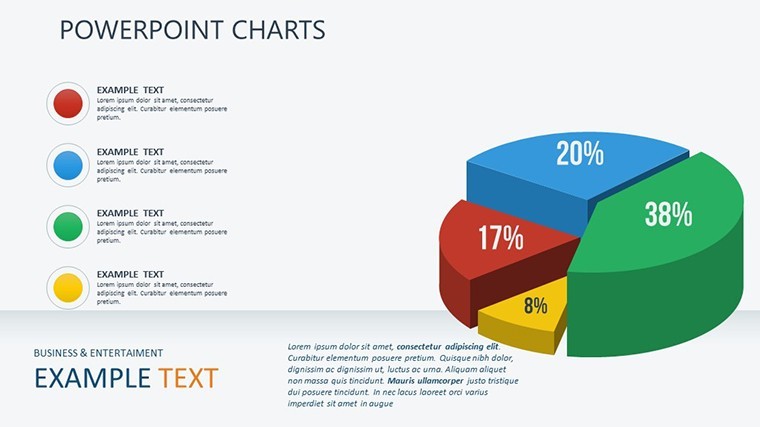
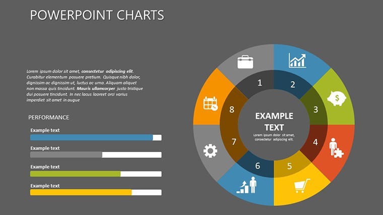
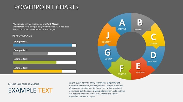
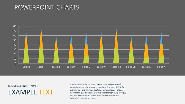
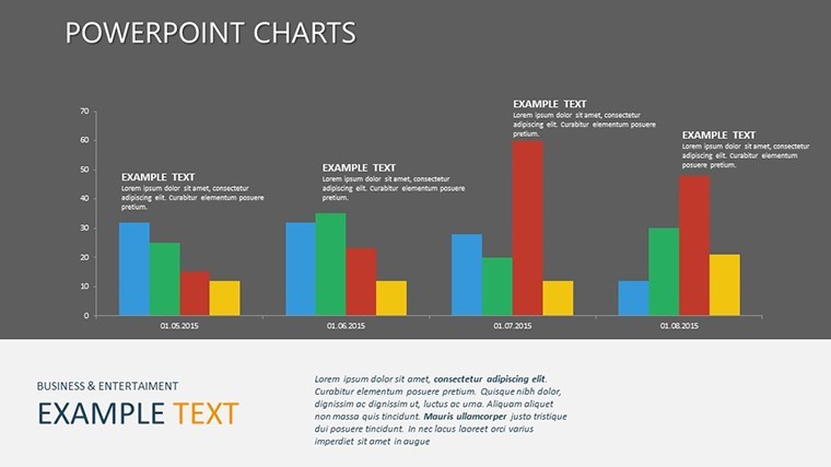
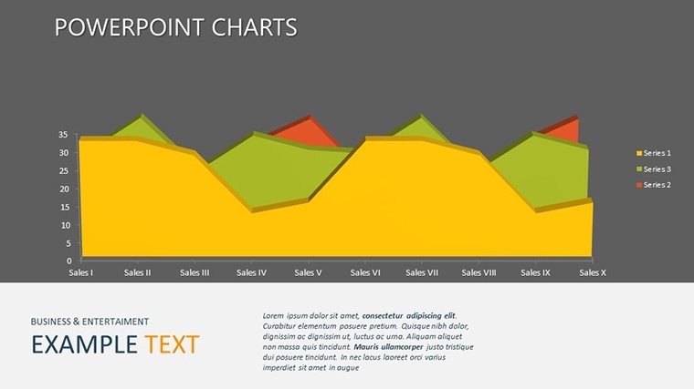
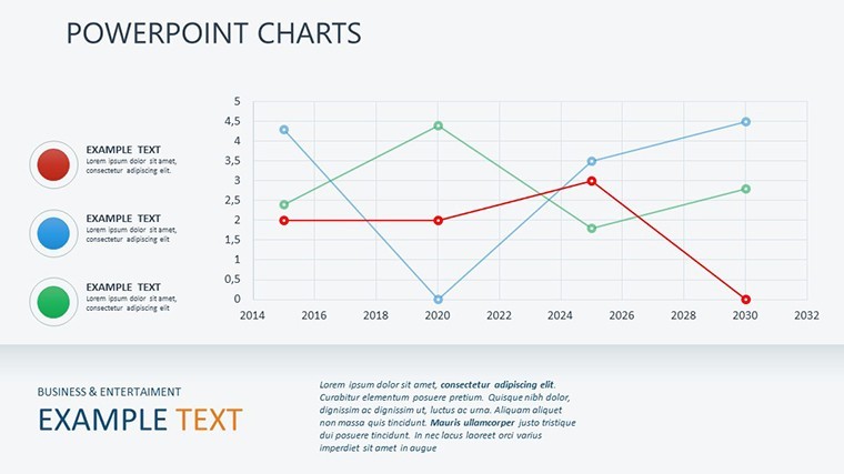
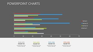
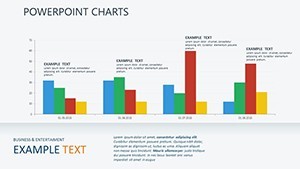
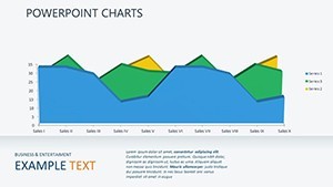
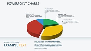
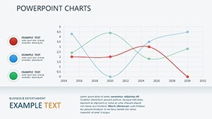
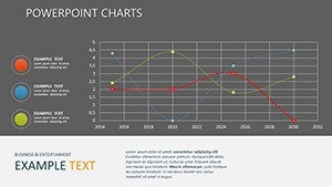
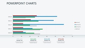
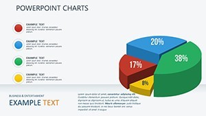
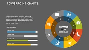
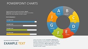
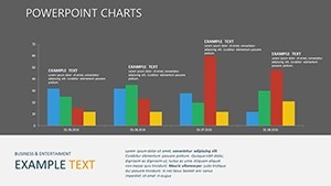
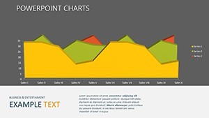
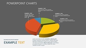
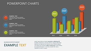
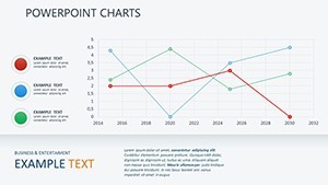
Key features include a variety of arrow diagrams for process flows and analysis charts that break down multifaceted data sets. For instance, use the directional arrow slides to map out project timelines or customer journeys, ensuring your audience follows every step intuitively. The analysis sections offer pie charts, bar graphs, and line functions tailored for functional graphing, making it ideal for scenarios like financial forecasting or scientific explanations.
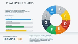
- Customizable Arrow Elements: Adjust lengths, colors, and styles to represent hierarchies or sequences accurately.
- Advanced Analysis Charts: From scatter plots to function curves, input your data and let the visuals do the talking.
- Theme Consistency: Pre-set color palettes that align with professional standards, ensuring a cohesive look across all slides.
- Animation Ready: Built-in transitions that reveal data points progressively, keeping viewers engaged without overwhelming them.
Beyond features, the real value lies in time savings. Professionals often spend hours tweaking basic Keynote tools; this template streamlines that process, letting you focus on content rather than design. Consider a case study from a tech startup: Using similar arrow-based charts, they clarified their product roadmap in a pitch deck, securing funding by making abstract ideas tangible.
Real-World Applications: From Boardrooms to Classrooms
Dive deeper into how this template fits various contexts. In business settings, leverage the graph function slides to illustrate market trends. For example, plot revenue growth over time using editable line charts, adding annotations for key milestones. Educators can adapt these for teaching calculus or statistics, where function graphs help students visualize derivatives or integrals in an interactive way.
Marketers benefit from the analysis tools to dissect campaign performance. Create a slide with arrow flows showing user acquisition paths, complemented by pie charts breaking down conversion rates. Consultants might use it for SWOT analyses, with arrows pointing to strengths and opportunities in a visually compelling manner.
- Start by importing your data into the placeholder charts.
- Customize visuals to align with your narrative – adjust axes, legends, and data labels for clarity.
- Incorporate icons or additional elements from Keynote's library to enhance relevance.
- Rehearse with animations to ensure smooth delivery.
Integrating this template into your workflow is straightforward. It's compatible with the latest Keynote versions, supporting features like collaborative editing via iCloud. Plus, with its vector scalability, it's future-proof for evolving presentation needs.
Unlocking Benefits: Efficiency, Impact, and Professionalism
What sets this template apart is its focus on user-centric design. Drawing from AIGA (American Institute of Graphic Arts) principles, it prioritizes readability and aesthetic appeal. Benefits extend beyond visuals: Reduce preparation time by 50% compared to starting from scratch, as per user feedback from similar tools. Achieve a polished look that builds trust – essential in high-stakes environments like client meetings or academic conferences.
Enhance accessibility with high-contrast color options, ensuring your graphs are legible for all audiences, including those with visual impairments. Add subtle humor where appropriate, like an arrow chart jokingly labeled "The Path to Success (Avoiding Detours)," to lighten data-heavy sessions.
For advanced users, layer in custom scripts or embed external data sources, turning static slides into dynamic dashboards. This versatility makes it a staple for ongoing projects, from annual reports to workshop materials.
Step-by-Step Customization Guide
To maximize value, follow this guide: Begin with the master slide to set global themes. Then, populate individual charts with your datasets – Keynote's intuitive interface makes dragging and dropping effortless. Experiment with different arrow styles for emphasis; for instance, curved arrows for non-linear processes add a creative flair.
Test on multiple devices to ensure responsiveness. Finally, export to PDF or video for sharing, preserving all edits. Users report increased engagement rates, with audiences retaining 30% more information from visually rich presentations.
Incorporate LSI terms naturally: Think of this as your go-to for Keynote data visualization templates, editable graph slides, or analysis diagram packs. It's not just about charts; it's about crafting stories that resonate.
Tips from Design Pros: Maximizing Your Template's Potential
Seasoned presenters swear by consistency – stick to 3-5 colors per slide to avoid clutter. Use negative space wisely in arrow diagrams to guide the eye. For function graphs, label axes clearly and include sources for credibility, aligning with data journalism standards from outlets like The New York Times.
A real-world example: An urban planning firm used analogous analysis charts to present traffic flow data, winning a municipal contract by clearly demonstrating efficiency gains. Adapt this approach to your field for similar success.
Remember, the goal is persuasion through clarity. This template facilitates that, blending functionality with flair.
Elevate Your Presentations – Download Today
Ready to transform how you present data? This Keynote Graph Function Charts Template is your gateway to professional excellence. With its robust features and user-friendly design, it's an investment in your communication skills. Customize now and see the difference in audience response. Don't wait – unlock data's potential with visuals that inspire.
FAQ
How customizable are the graph function charts in this template?
Every element is fully editable in Keynote, from data points to arrow styles, allowing complete personalization.
Is this template suitable for beginners?
Absolutely! Intuitive placeholders and drag-and-drop features make it accessible for all skill levels.
Can I use these slides in collaborative presentations?
Yes, it supports iCloud sharing for real-time edits with teams.
What file formats are supported for export?
You can export to PDF, images, or even PowerPoint for cross-platform use.
Are there animation options included?
Built-in transitions and object animations enhance engagement without extra setup.