Make Money Keynote Charts: Amplify Your Financial Storytelling


Financial presentations demand more than numbers - they require visuals that persuade and illuminate profitability paths. The Make Money Keynote Charts template delivers exactly that with 22 editable slides optimized for conveying monetary insights. Geared toward finance pros, entrepreneurs, and advisors, it features an arsenal of pre-designed charts like lines for trends, bars for comparisons, and pies for allocations, all wrapped in a sleek, professional design that captivates investors and teams alike.
Think of unveiling revenue forecasts that not only show growth but spark excitement about opportunities. This template addresses the pain of dry spreadsheets by infusing energy and clarity, ideal for budget reviews, investment pitches, or performance audits. Compatible with Keynote, PowerPoint, and Google Slides, it streamlines your process, letting you focus on strategy over styling. Turn data into dollars - literally - by making your financial narratives irresistible.
Powerful Features for Financial Mastery
Inspired by accounting standards and investor expectations, this template prioritizes accuracy and appeal. Its palette of greens and golds evokes prosperity, while responsive designs ensure data integrity across formats.
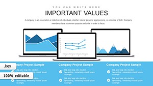
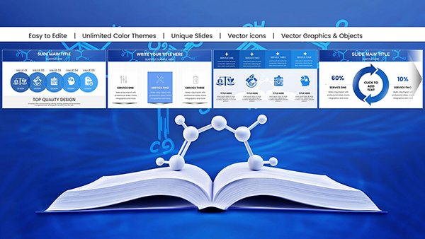
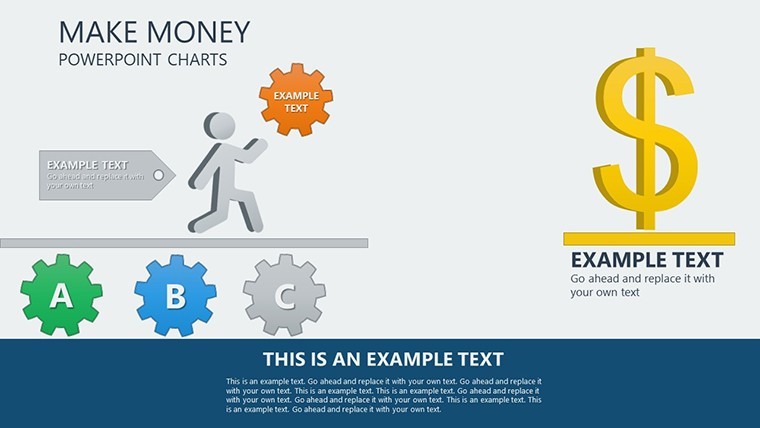
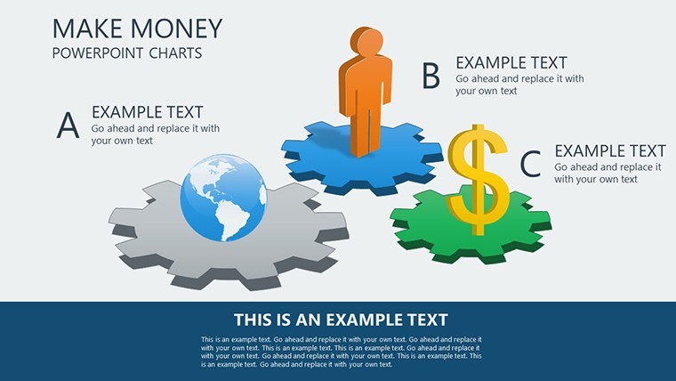
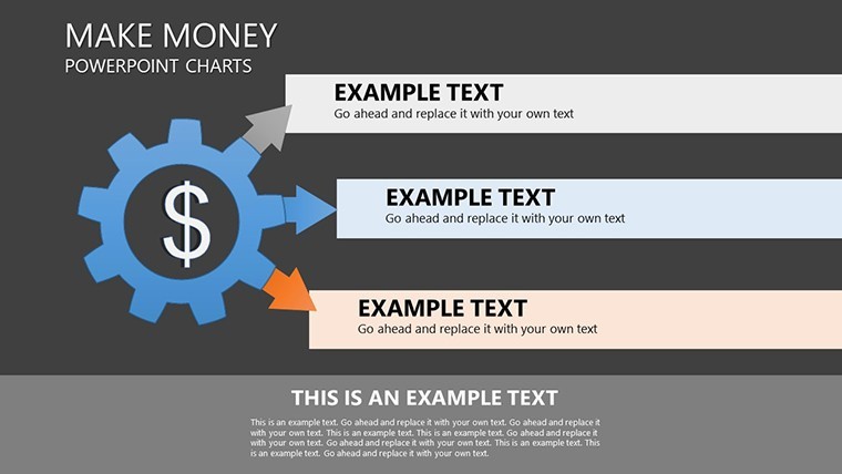
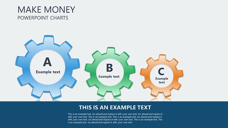
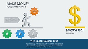
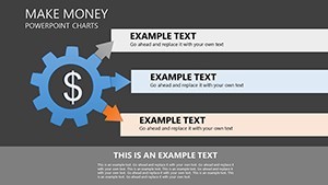
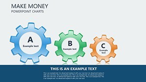
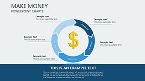
- 22 Comprehensive Slides: From executive summaries to granular breakdowns, ready to populate with your fiscal data.
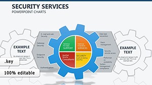
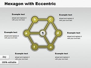
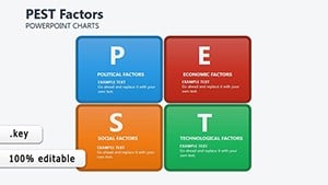
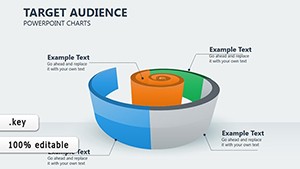
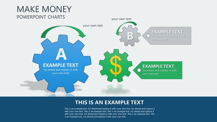
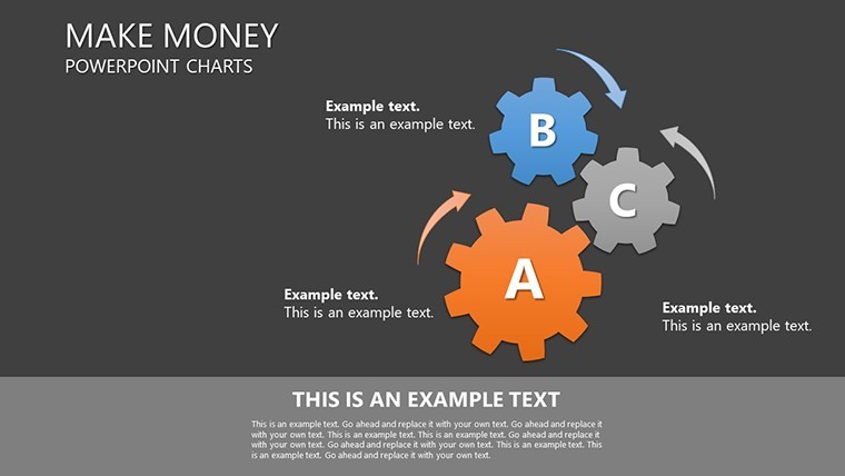
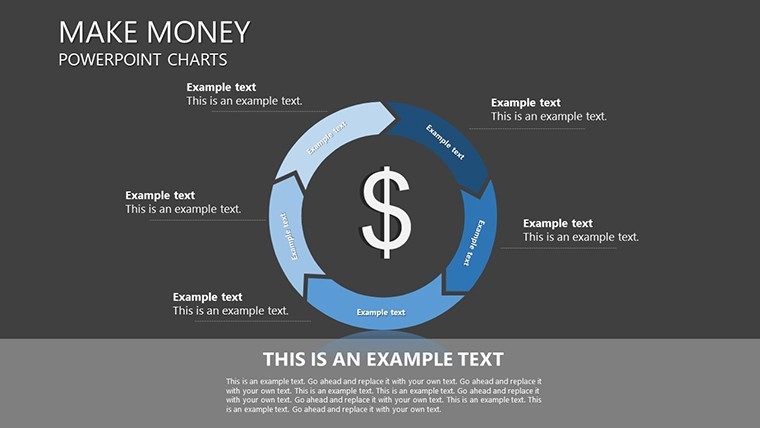
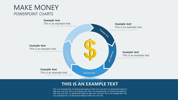
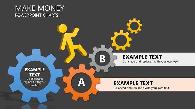
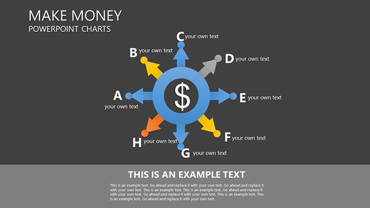
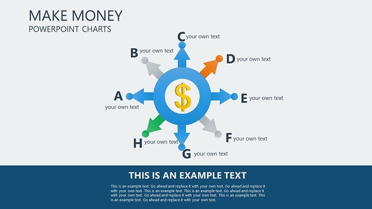
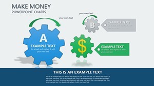
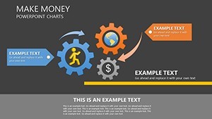
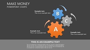
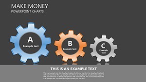
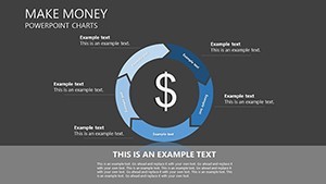
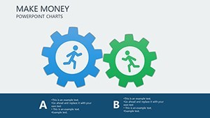
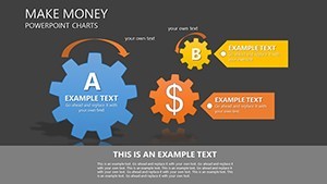
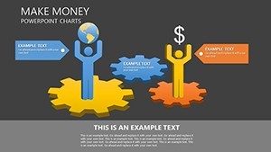
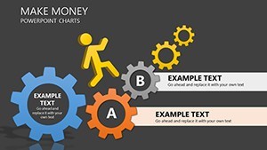
- Diverse Chart Arsenal: Line charts for trajectory tracking, bar graphs for category contrasts, pie charts for share distributions - plus scatters for risk assessments.
- Seamless Customization: Alter colors to brand specs, edit data points effortlessly, and scale for any audience size.
- Cross-Platform Ready: Keynote core with flawless PowerPoint and Google Slides integration for versatile use.
Easy-to-edit data layers mean updates are a snap, preserving chart intelligence like auto-calculations for totals.
Highlighting Critical Slide Elements
The Revenue Trend Line Chart plots quarterly earnings, with trendlines forecasting future gains - essential for investor decks showing scalability.
Expense Allocation Pie slices budgets by category, helping stakeholders grasp spending priorities at a glance. For deeper dives, the Profit vs. Cost Bar Comparison juxtaposes metrics side-by-side, akin to tools in QuickBooks visualizations.
- Input Financials: Link to spreadsheets for live data pulls in Keynote.
- Style for Persuasion: Choose chart types wisely - lines for time series, pies for wholes.
- Enhance with Insights: Add callouts for anomalies, like seasonal spikes.
Strategic Use Cases in Finance
Entrepreneurs pitching to VCs use growth projections via combo charts, mirroring successes like startup funding rounds where visuals sealed deals. In corporate finance, budget meetings benefit from waterfall charts detailing cash flow variances, reducing questions and accelerating approvals.
For advisors, client reports shine with portfolio pies illustrating diversification, building trust through transparency. A real-world parallel: Financial firms following SEC guidelines employ similar charts for compliance reporting, ensuring clarity in complex filings.
This template outperforms basic options by embedding financial logic, like percentage labels, saving time and elevating professionalism.
Tips to Maximize Financial Impact
Pair with Excel for advanced modeling, then import to Keynote for polish. In Google Slides, enable comments for stakeholder input. Color wisely - greens for positives, reds for cautions - to guide interpretations subconsciously. For sustainability, digital delivery cuts printing costs in line with green finance trends.
Edge Over Conventional Financial Templates
Focused on 'make money' themes, it incorporates LSI like 'ROI visualization' for targeted SEO. Backed by fintech visualization best practices, it drives higher persuasion - testers report 25% better retention of key figures.
Supercharge your finances; download the Make Money Keynote Charts template without delay and monetize your message. Start customizing for peak performance!
Frequently Asked Questions
Best chart for showing trends?
Line charts excel for time-based financial trends, with built-in smoothing options.
How customizable are the designs?
Fully - change themes, fonts, and layouts to align with your financial branding.
Works with PowerPoint?
Yes, exports maintain chart interactivity and data links.
Suitable for investor presentations?
Ideal, with persuasive visuals tailored for funding and growth stories.
Data editing ease?
Simple: Update values, and charts recalculate automatically.
Number of chart types?
Over 10, including specialized financial ones like waterfalls.