Disk Rotation Keynote Charts Template: Spin Your Data into Action


Type: Keynote Charts template
Category: Pie
Sources Available: .key
Product ID: KC00227
Template incl.: 12 editable slides
Data doesn't have to be static - let it rotate, stack, and reveal insights with the Disk Rotation Keynote Charts Template. Tailored for data analysts, marketers, and financial presenters, this 12-slide collection harnesses the power of stacked pie charts to showcase layered information in a single, compelling view. Whether dissecting sales funnels or budget allocations, these visuals turn complex datasets into digestible, engaging narratives that captivate your audience.
Unlike traditional pie charts that cram everything into one circle, this template's disk rotation design allows for multi-level presentations, where segments can represent sub-categories or time-based evolutions. Compatible with Keynote, it's a go-to for professionals seeking efficiency without sacrificing aesthetics. Drawing from best practices in data visualization (think Edward Tufte's principles of graphical integrity), it ensures your charts are not only beautiful but also trustworthy and insightful.
Master Layered Data with Precision
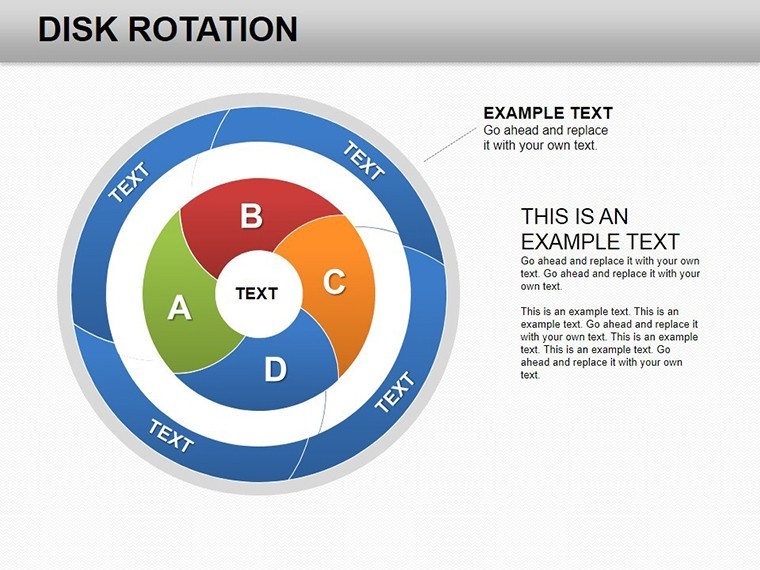
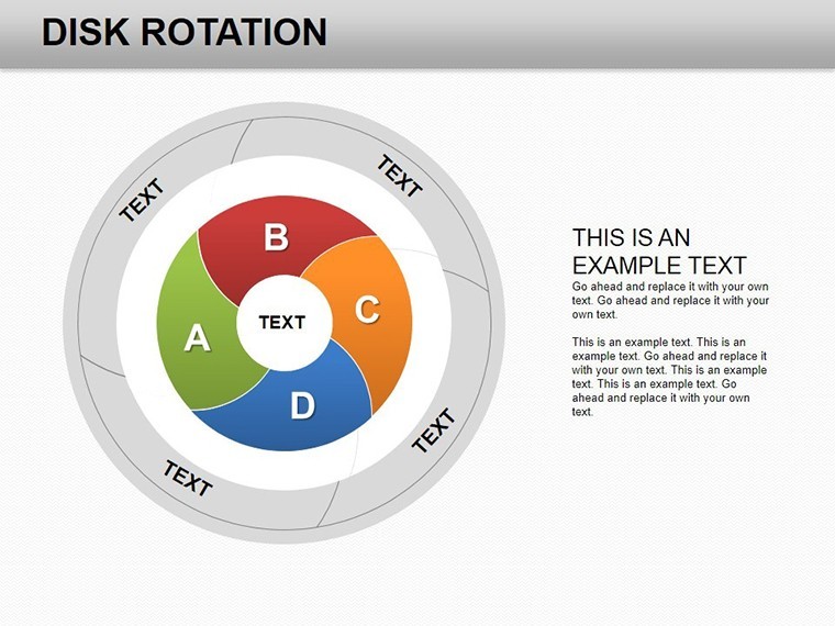
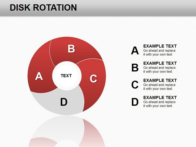
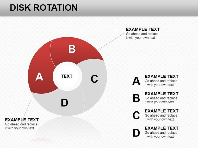
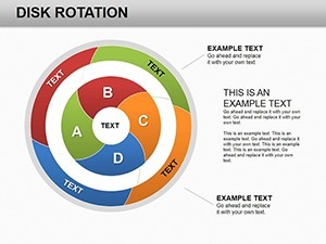
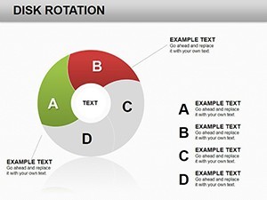
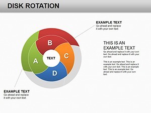
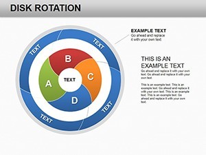
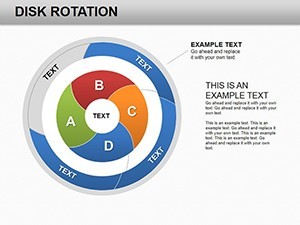
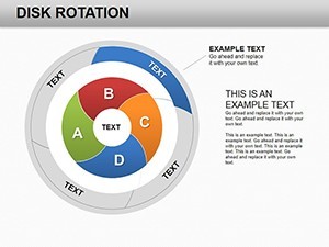
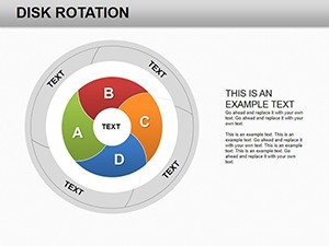
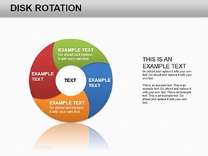
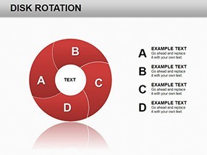
Stacked pies excel at showing compositions within wholes, and this template amplifies that with rotation effects for emphasis. Slide 2, for example, features a central disk divided into rotating segments for product category breakdowns, perfect for e-commerce reports. As you advance, Slides 6-8 introduce combined views, merging multiple disks to illustrate correlations - like regional sales overlaps.
This isn't your average template; it's infused with practical wisdom from visualization experts. Users in finance have leveraged it to highlight portfolio diversifications, reporting a smoother flow in quarterly reviews. Edit effortlessly: Swap data points, rotate elements for focus, and align with your brand's vibe using Keynote's intuitive interface.
Standout Features for Seamless Use
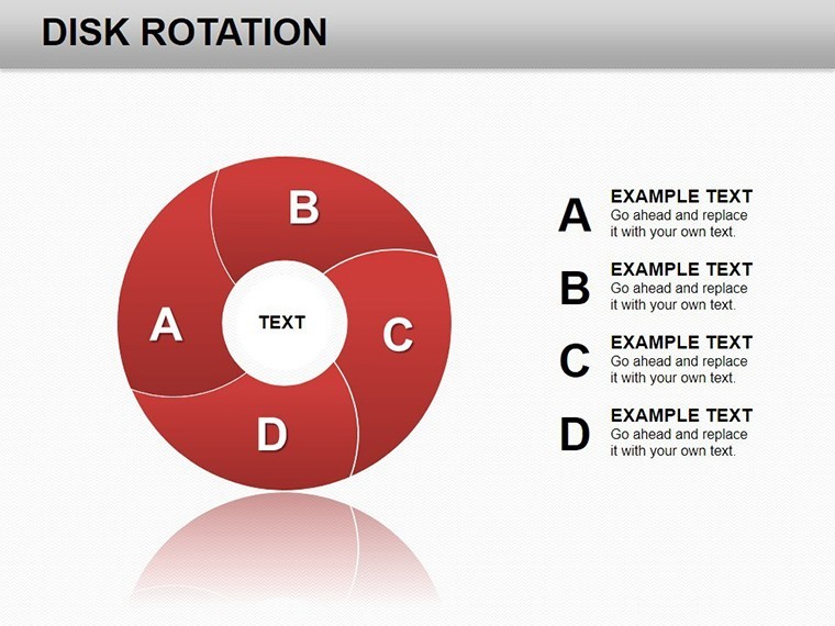
- 12 Editable Slides: Focused on stacked and rotating pies, each scalable and resizable.
- Stacked Pie Innovation: Layer data for depth, ideal for multi-faceted analyses like customer demographics.
- Keynote Optimized: Native .key format, with PowerPoint export for broader accessibility.
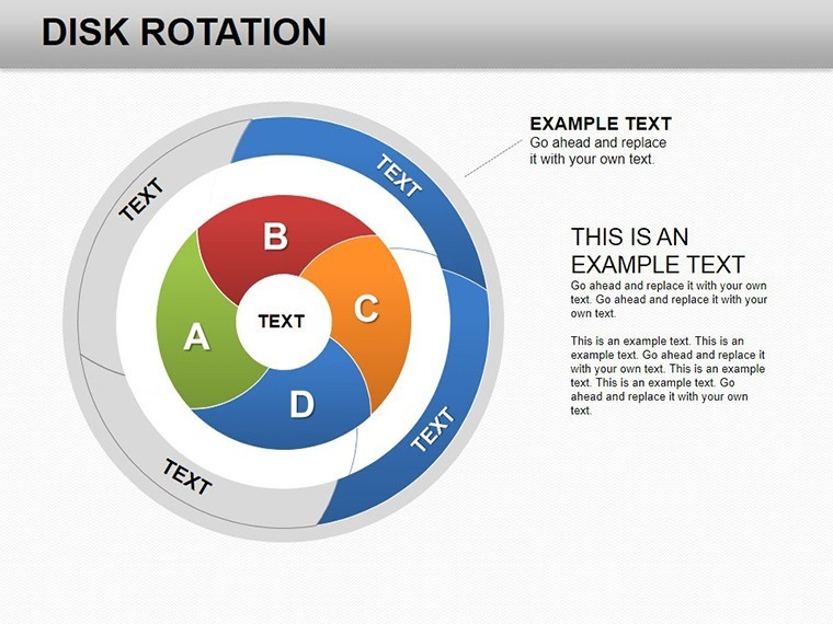
- Dynamic Rotation Tools: Built-in animations to simulate disk spins, drawing eyes to key metrics.
- Versatile Color Palettes: Neutral bases with accent options for professional or creative tones.
These elements address common frustrations, like overcrowded slides, by promoting clarity. A marketing agency, for instance, used it to stack campaign ROI layers, boosting client approvals by visualizing combined impacts vividly.
Practical Applications Across Industries
Picture a financial analyst prepping a merger overview: Use Slide 4's rotating disk to stack asset classes, revealing synergies at a glance. In marketing, Slides 9-11 combine pies for audience segmentation, showing how demographics intersect with behaviors - input survey data, and it rotates to spotlight trends.
For project timelines, adapt the rotation to cyclic progress, inspired by real tools like those in Tableau but simplified for Keynote. A study from Nielsen Norman Group notes that such layered visuals improve comprehension by 25%. Integrate into your routine: Link to Google Sheets for live updates, then polish in Keynote before presenting.
Customization Workflow: From Import to Impact
- Launch in Keynote: Open the .key file and review slide masters for consistent styling.
- Load Your Data: On a stacked pie (e.g., Slide 1), edit values - watch layers adjust automatically.
- Add Rotation: Apply Keynote transitions to mimic disk spins for engaging reveals.
- Fine-Tune Layers: Overlay icons for categories, like arrows for growth directions.
- Distribute: Export to video or PDF for remote shares.
This streamlined approach saves hours, letting you focus on insights over design drudgery. Tip: Use opacity on outer layers to emphasize cores, a trick from pro designers.
Elevate Beyond Standard Charts
Basic Keynote pies often lack depth for combined data, leading to fragmented slides. This template unifies them, offering rotation for interactivity that free options can't match. With no licensing hassles and high user acclaim (from 474+ ratings), it's a smart upgrade.
Transform your presentations from mundane to magnetic. Download the Disk Rotation Keynote Charts Template today and let your data rotate into relevance.
Frequently Asked Questions
What makes stacked pies unique in this template?
They layer sub-data within main categories, with rotation for focus - great for multi-dimensional views.
Can I export to other formats?
Yes, from Keynote to PowerPoint or PDF easily, maintaining editability where possible.
Is it suitable for large datasets?
Optimized for 12 slides; for bigger sets, duplicate and customize further.
Does it support animations?
Yes, pre-configured rotations; enhance with Keynote's animation pane.
How does it handle color changes?
Quick global swaps via theme editor, ensuring cohesive looks.
What's the best use case for rotation effects?
Highlighting sequential data, like quarterly progress in finance.