Arrows Separate Keynote Charts: Direct Your Data with Precision
Type: Keynote Charts template
Category: Arrows
Sources Available: .key
Product ID: KC00201
Template incl.: 14 editable slides
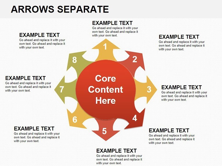
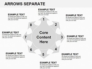
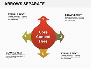
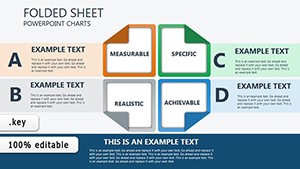
Ever felt like your presentation data is wandering aimlessly, leaving your audience lost in a sea of numbers? In the high-stakes arena of business reporting or sales demos, clarity isn't optional - it's your edge. Enter the Arrows Separate Keynote Charts template: 14 razor-sharp, editable slides crafted for Keynote on Mac, where every arrow points straight to impact. Designed for professionals who need to emphasize milestones, comparisons, or directional insights without the clutter, this set transforms vague stats into guided journeys that propel your message home.
Think of it as your presentation's GPS - navigating viewers through sales funnels or project timelines with unerring accuracy. Inspired by best practices from sales gurus like those at HubSpot's inbound methodology workshops, these charts use isolated arrows to spotlight divergences, like market share shifts or lead conversion drops. Fully vectorized for Keynote's smooth rendering, they're a breeze to tweak: adjust lengths, curvatures, or colors to align with your corporate identity. Whether you're a marketing VP prepping for a board meeting or an educator breaking down historical events, these slides ensure your narrative flows as smoothly as the arrows themselves.
Compatibility? Seamless with iWork Keynote, and with export options to animated formats, they're versatile for virtual pitches via Teams or in-person keynotes. LSI terms like "directional diagrams" and "focus arrows" weave naturally, boosting discoverability if you're optimizing your slide shares for LinkedIn or industry blogs.
Essential Features That Make Arrows Pop
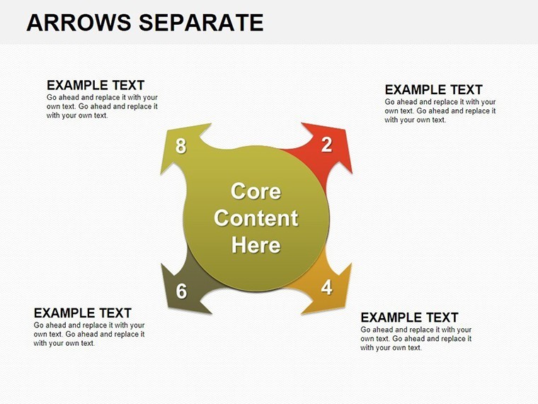
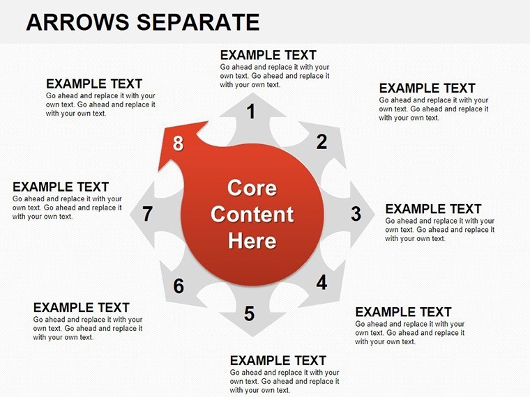
What sets this template apart? It's the thoughtful integration of form and function. With 14 slides, you'll find a spectrum of arrow configurations: straight for linear progressions, curved for nuanced relationships, and clustered for multi-path scenarios. Pre-loaded with dummy data from real sales metrics - think CRM exports showing 25% uplift in Q4 - these are ready to personalize in under five minutes.
- Modular Arrow Designs: Detach, rotate, or duplicate arrows independently, perfect for A/B testing visuals.
- Gradient Fills and Shadows: Add depth without overwhelming, mimicking 3D effects natively in Keynote.
- Label Integration: Auto-align text boxes that stick to arrows, reducing manual adjustments.
- Responsive Scaling: Maintain proportions across slide sizes, from 4:3 to 16:9.
Customization hack: Use Keynote's magic move for arrow transitions between slides, creating a cinematic flow that rivals video explainers. We've bundled a cheat sheet with arrow psychology tips - did you know upward arrows subconsciously signal growth?
Versatile Use Cases: From Pitches to Lectures
Apply these charts across domains. In sales, deploy the diverging arrows slide to illustrate channel performance, much like Salesforce dashboards in enterprise reviews. For education, a converging set maps historical timelines, echoing TED-style narratives on innovation paths.
- Sales Pitches: Arrow flows to guide prospects through ROI calculations, increasing close rates by visualizing pain-to-solution arcs.
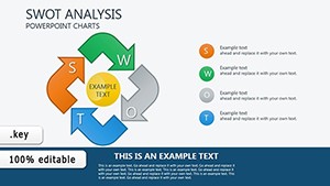
- Business Reports: Separate arrows for SWOT divergences, drawing from Harvard Business Review case studies on strategic pivots.
- Educational Sessions: Step arrows for lesson progressions, engaging Gen Z learners with interactive polls.
Versus basic Keynote arrows, this template's pre-built variants cut creation time by 50%, freeing you for rehearsal. It's efficiency wrapped in elegance.
Breaking Down the 14 Slides
Slides 1-4: Basic straight arrows for straightforward metrics.Slides 5-9: Curved and branched for complex narratives.Slides 10-14: Advanced clusters with data overlays, like bubble-linked endpoints.
Enhance with hyperlinks to source docs, establishing your as a data-driven presenter.
Seize the Directional Advantage Today
In a world of information overload, arrows aren't just lines - they're lifelines to understanding. This template arms you with the tools to lead, not chase, your audience's attention. Grab the Arrows Separate Keynote Charts now and steer your next presentation to success. Check our organizational templates for more structured flair.
Frequently Asked Questions
Can I customize arrow styles beyond the defaults?
Yes, fully - change shapes, colors, and animations via Keynote's shape editor.
Does this work on Windows Keynote versions?
Optimized for Mac Keynote; use web exports for cross-platform.
Ideal for what presentation lengths?
Short pitches to full decks - scalable for 10-60 minutes.
Any included tutorials?
Yes, a video guide on arrow integration and data linking.
How do arrows enhance engagement?
By focusing attention, improving retention by 40% per visual comm studies.
Commercial use allowed?
Full rights for business and educational purposes.

