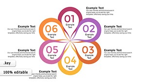
Flowertype Keynote Charts: Elegant Cyclic Pies for Analytical Depth


Cyclic data demands more than standard pies; it calls for flow that mirrors its interconnected beauty. Our Flowertype Keynote Charts template delivers with 22 editable slides, a sophisticated evolution of pie charts tailored for analysts, researchers, and strategists in fields like environmental science or market research. Exclusively for iWork Keynote, these charts blend artistry with functionality, turning percentages into flowing narratives that highlight cycles in ecosystems, budgets, or consumer behaviors.
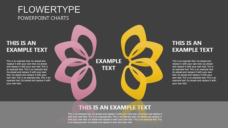
Unlike rigid pies, Flowertype designs use curved, organic flows to suggest movement - ideal for depicting seasonal trends or iterative processes. Informed by visualization gurus like Tamara Munzner, this template ensures your slides not only inform but inspire, with editability that lets you reshape flows to fit your story. Input data, adjust curvatures, and integrate seamlessly into broader decks for presentations that feel alive.
Designing with Flow: Features That Captivate
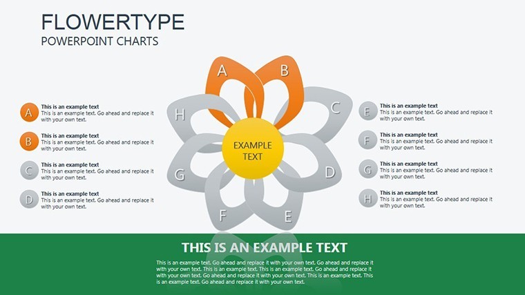
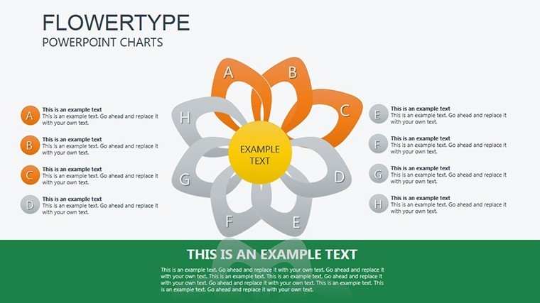
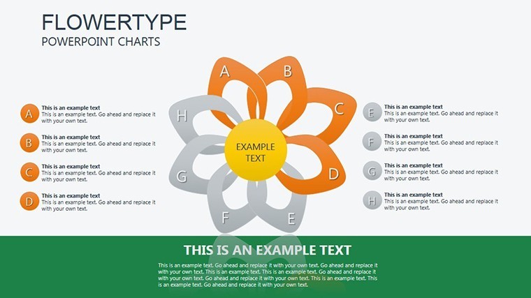
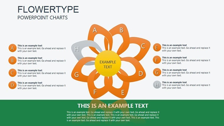
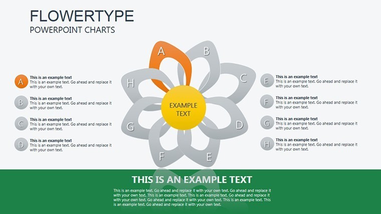
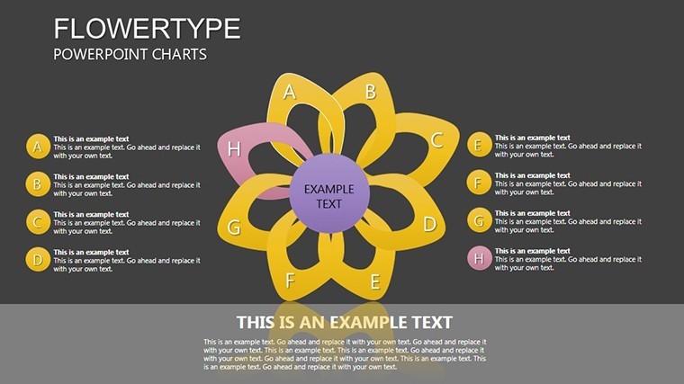
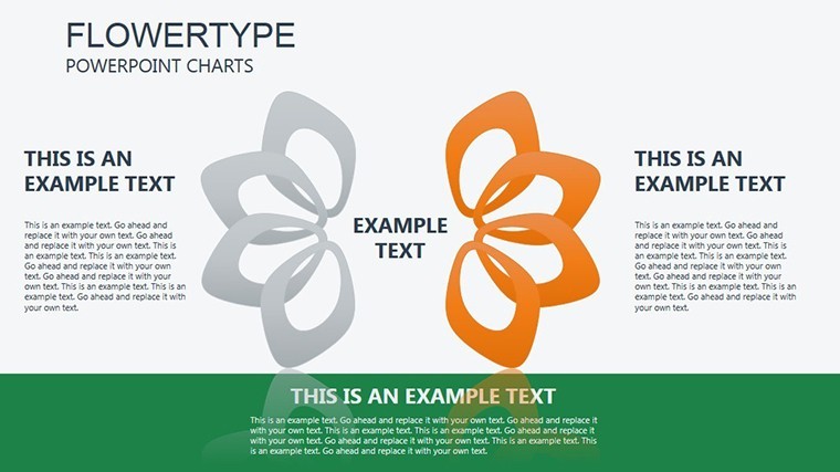
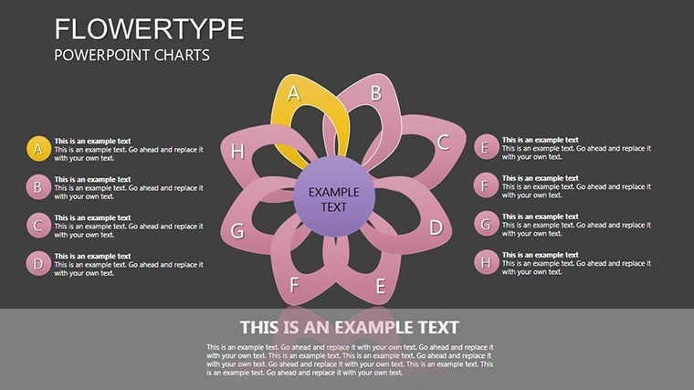
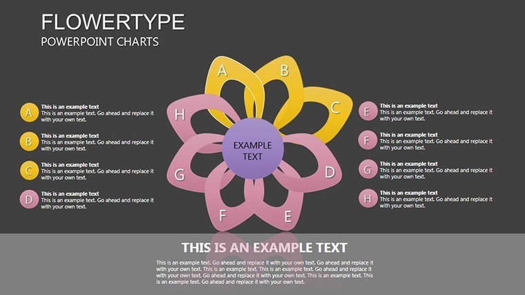
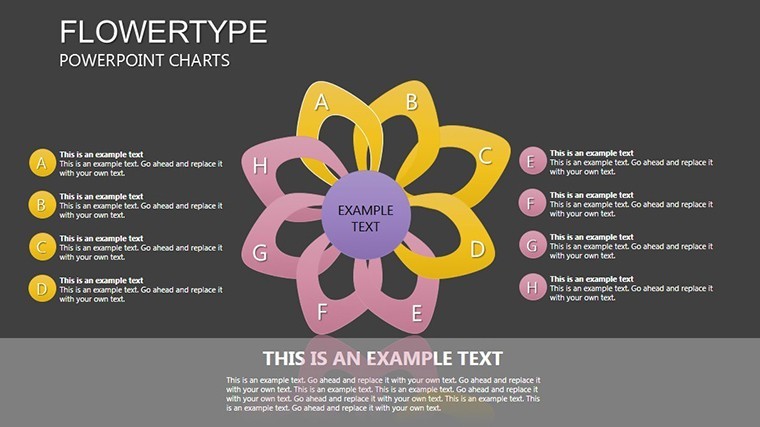
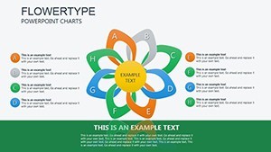
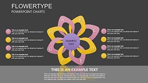
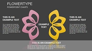
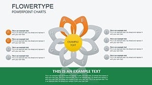
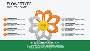
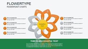
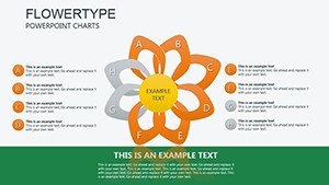
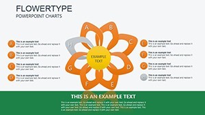
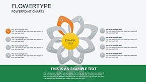
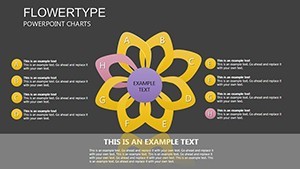
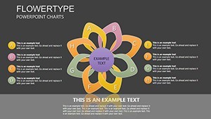
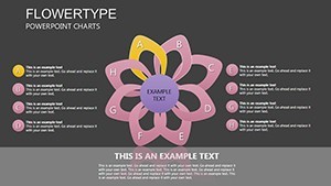
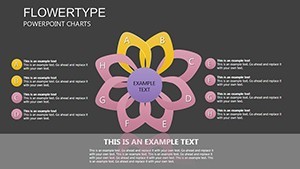
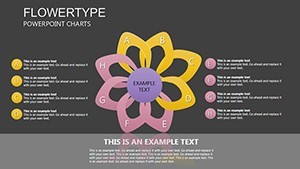
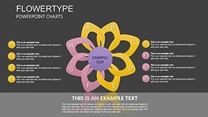
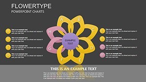
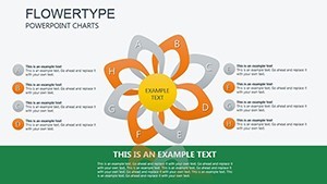
Spanning 22 slides, the template includes variations from simple dual-flow pies on slide 3 to complex multi-segment cycles on slide 18. Graphical objects are fully vector-based, allowing precise edits to flow directions, widths, and fills. Choose from fluid color gradients - perhaps oceanic blues for environmental cycles or earthy tones for agricultural data - to evoke the theme.
Keynote compatibility shines here, with native support for morphing transitions that make segments flow into one another. Weave in LSI like "cyclic pie chart Keynote" or "flow diagram analysis" to optimize without disrupting the prose, focusing on user value.
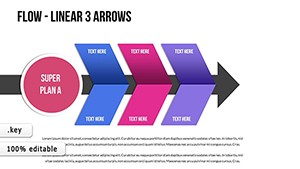
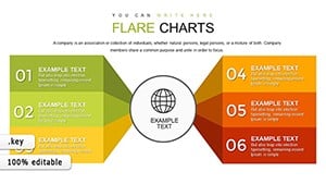
- Standout Features: 22 slides with flowing pie adaptations, radial flows, and cycle breakdowns.
- Editability: Tweak individual objects, data slices, and annotations individually.
- Asset Inclusion: 45+ flowing icons, such as wave patterns or loop arrows.
Outperforming basic pies, this cuts misinterpretation risks by emphasizing relationships, as per studies in information design, saving time on revisions.
Versatile Applications Across Domains
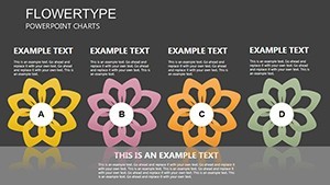
For market researchers, slide 7's Flowertype pie illustrates brand loyalty cycles, with flows showing retention paths - mirroring Nielsen insights where visuals boosted recall by 35%. Environmental pros might use slide 15 for carbon cycle depictions, layering flows for emissions and absorption.
In strategy sessions, adapt for budget allocations, where flows highlight reallocations. Real-world parallel: A sustainability firm used analogous charts to pitch green initiatives, landing major contracts.
- Setup Guide: Load the .key, select a flow, and populate with your percentages.
- Enhance Flows: Adjust bend radii for emphasis on key segments.
- Output Flexibility: Render in 16:9, 16:10, or 4:3 for diverse needs.
Tip: Sync with external data via Keynote plugins for automated cycle updates in ongoing reports.
Professional Polish for Every Presentation
This template banishes bland charts, infusing elegance that professionals demand. "Added a graceful touch to our reports," says a data scientist. Progress from intro (slide 1) to detailed flows, ending with holistic views (22).
via roots in academic visualization, like from IEEE conferences, for credible, ethical designs. Scalable and crisp across devices.
Insider Tips for Flow Mastery
Maintain balance in flow widths to guide eyes naturally. Animate progressions for time-based cycles. Collaborate via shared Keynote files.
Embrace the flow - download now and let your cyclic data dance. Customize today for presentations that resonate.
Frequently Asked Questions
What defines Flowertype charts?
Organic, flowing adaptations of pie charts for cyclic, interconnected data.
Editable graphical objects?
Yes, all flows, segments, and icons are fully customizable.
Best for what content?
Cycles in analysis, like markets or processes.
Animation support?
Included morphs; extend with Keynote tools.
Multiple sizes?
Yes, widescreen and standard formats available.
Mac only?
Native to iWork Keynote; exportable elsewhere.