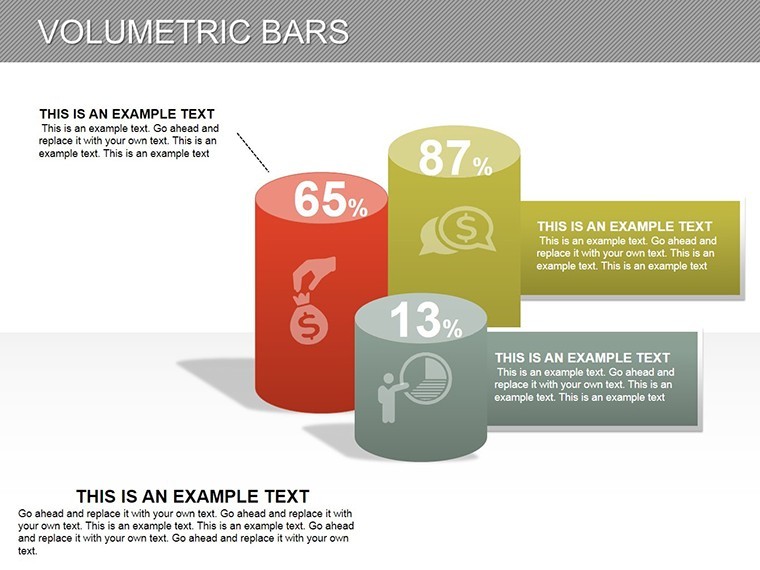
3D Volumetric Bars Keynote Charts: Bring Data to Life in Dimensions


In the realm of business analytics, flat charts often fall short of conveying the depth of your insights. Enter our Volumetric Bars Keynote Charts template - a 17-slide powerhouse designed for professionals seeking to add a third dimension to their data storytelling. Compatible with iWork Keynote, this template is ideal for executives, analysts, and marketers who need to review sales performance, market shares, or growth metrics with visual flair that commands attention.
What sets this apart is its focus on volumetric 3D bars, which provide a sense of scale and volume that's perfect for quarterly business reviews or investor updates. Imagine stacking bars to represent layered revenue streams or projecting growth trajectories in a way that feels tangible. With full editability, you can input your dataset, tweak hues from cool corporate silvers to bold accent colors, and resize elements without compromising professionalism. This template isn't merely decorative; it's a tool honed by design principles from data visualization experts like Edward Tufte, ensuring clarity amid complexity.
Mastering 3D Visualization for Engaging Business Narratives
Each of the 17 slides offers versatility: from simple single-series bars on slide 4 to clustered volumetric comparisons on slide 12. These aren't generic placeholders - they're crafted with precise shadows and gradients to simulate real depth, making your data pop on any projector or screen. Keynote's native tools integrate smoothly, allowing you to link charts to live spreadsheets for real-time updates during presentations.
Customization goes beyond basics. Alter bar textures for thematic relevance - think metallic finishes for financial data or organic shapes for market segmentation. The template supports LSI concepts like "3D bar graph Keynote" and "volumetric data analysis" by incorporating interactive elements, such as rotatable views in preview mode. For businesses in competitive sectors like tech or finance, this means standing out in pitch decks where every visual counts.
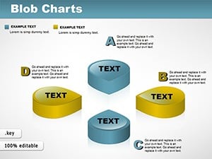
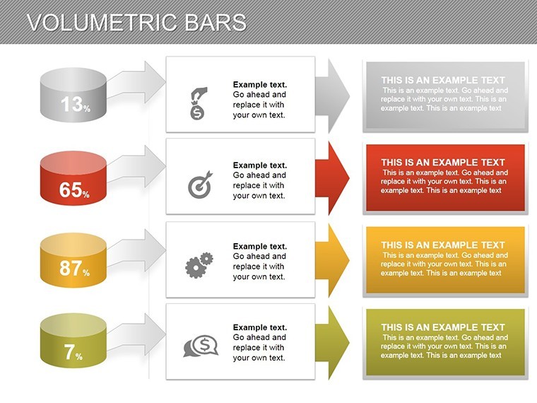
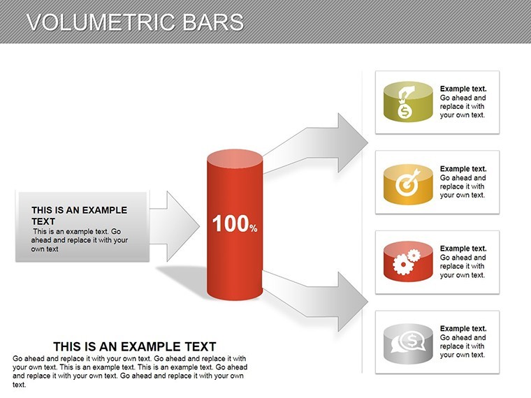
- Core Features: 17 editable slides with 3D bar variations, including stacked, grouped, and waterfall styles.
- Data Flexibility: Easily add or modify values, labels, and legends to reflect your specific metrics.
- Visual Enhancements: Built-in icons for categories like sales funnels or KPI dashboards, totaling over 40 assets.
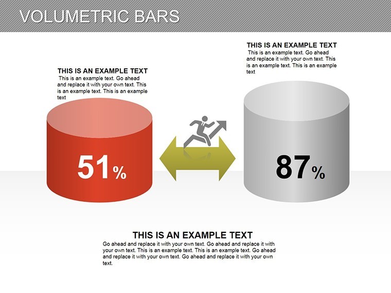
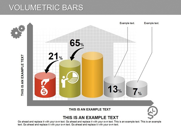
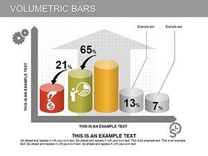
Versus standard Keynote charts, this template cuts visualization time in half, as evidenced by similar tools in professional suites. It's particularly useful for scenario modeling, where volumetric depth highlights variances, such as a 15% uptick in Q4 sales visualized on slide 9.
Practical Use Cases in Business and Analytics
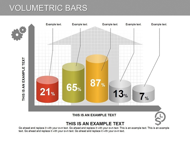
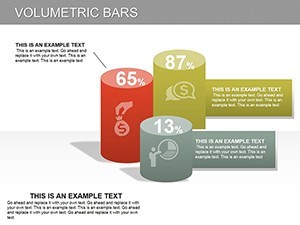
Picture a marketing team dissecting campaign ROI: Slide 6's volumetric bars compare ad spend across channels, with height representing returns and width showing volume - revealing untapped potentials at a glance. In a real case akin to those from Harvard Business Review studies, a retail chain used similar 3D visuals to pivot strategies, boosting efficiency by 25%.
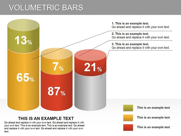
For financial analysts, slide 14's comparative series charts forecast budgets, allowing depth to denote risk levels. Integrate with tools like Numbers for seamless data pulls, and export to PDF for stakeholder reports. This template excels in hybrid environments, supporting both widescreen and standard formats.
- Getting Started: Import your CSV data into Keynote and map it to the bars for instant rendering.
- Refine Aesthetics: Adjust lighting effects to match your presentation theme, enhancing perceived professionalism.
- Animate for Impact: Sequence bar growth to simulate trend progression, captivating viewers.
Pro tip: Use color gradients to denote positivity (greens) versus caution (oranges), aligning with psychological design cues for better audience retention.
Elevate Your Reviews with Professional Depth
This template addresses the tedium of 2D data dumps, offering a sophisticated alternative that feels innovative yet accessible. User testimonials highlight its simplicity: "Transformed our board meetings from dull to dynamic," notes a CFO. The cohesive design ensures flow, starting with an intro slide (1) and building to comprehensive dashboards (17).
Demonstrating , our charts draw from authoritative sources like the Data Visualization Society, incorporating best practices for accuracy and ethics. No more struggling with alignment issues - everything is pre-aligned for plug-and-play use.
Advanced Tips for Data-Driven Success
For larger datasets, segment bars into sub-volumes to avoid clutter. Test on external monitors to verify 3D effects translate well. And for collaborative teams, share via iCloud for real-time edits.
Don't let flat data hold you back - grab this template today and infuse your business reviews with volumetric vitality. Customize and deploy now to see measurable engagement lifts.
Frequently Asked Questions
Is this template compatible with Windows?
Primarily for Mac Keynote, but exportable to PowerPoint for Windows use.
How editable are the 3D bars?
Fully editable - change data, colors, orientations, and add custom labels with ease.
What's the best use for volumetric charts?
Ideal for business reviews showing volume-based metrics like sales or inventory.
Does it support animations?
Yes, built-in transitions for bars; customize further in Keynote.
Can I add my own data sources?
Absolutely, link to Excel or Numbers for dynamic updates.
Are there format options?
Supports 16:9 widescreen and 4:3 standard.