3D Circle Four Sectors Keynote Charts: Depth in Every Division


Step into the third dimension with the 3D Circle Four Sectors Keynote Charts template, where flat data finds volume and vibrancy. This 18-slide marvel is perfect for architects, project managers, and analysts who need to segment information with flair - think dividing a building project into four key phases: design, construction, testing, and handover. Each sector bursts with 3D realism, turning standard pie charts into immersive experiences that hold audiences spellbound.
Native to Keynote with straightforward PowerPoint conversion, this template's unique ring-volume design allows color tweaks per sector, ensuring your visuals align with project timelines or budget breakdowns. No more boring divisions; instead, envision a rotatable 3D circle illustrating market shares in sustainable architecture, complete with shadow effects for that professional polish.
Delving into the 3D Features That Set It Apart
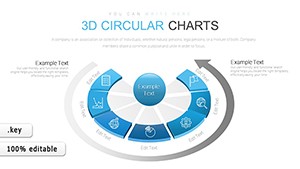
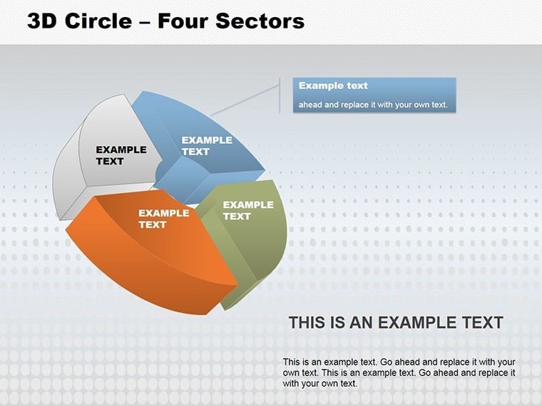
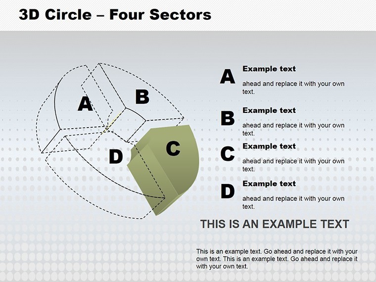
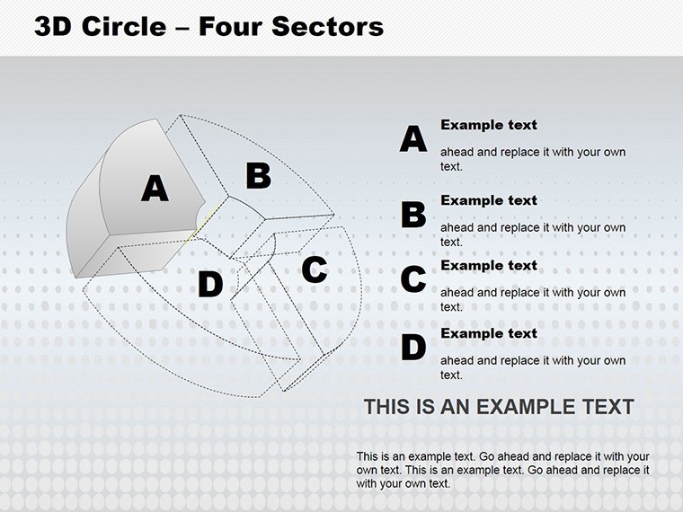
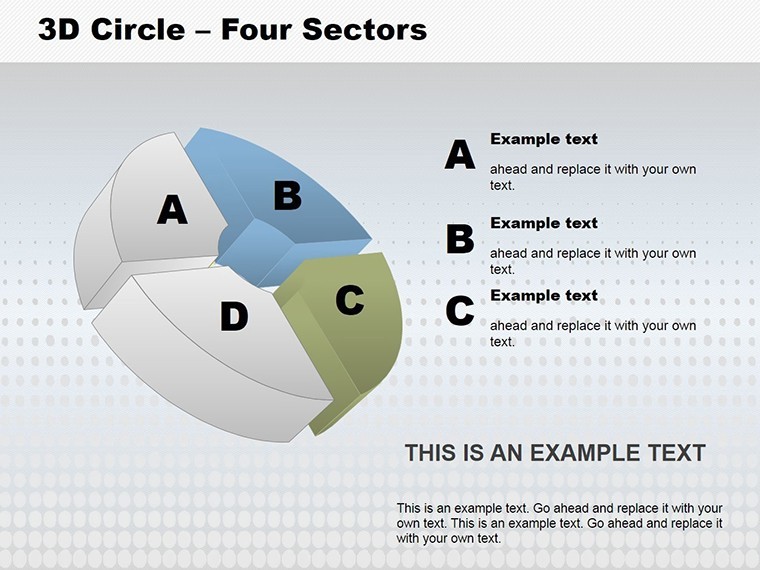
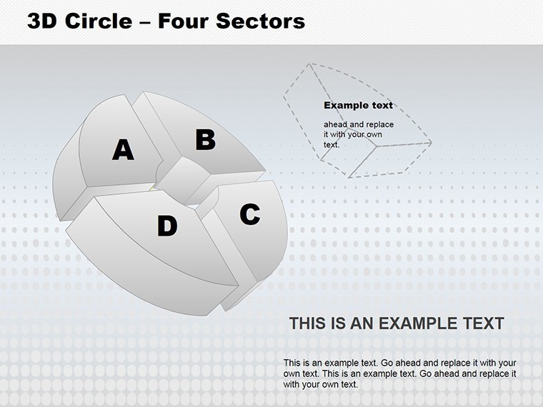
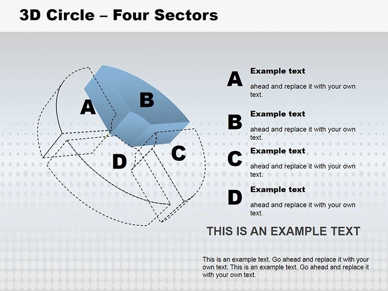
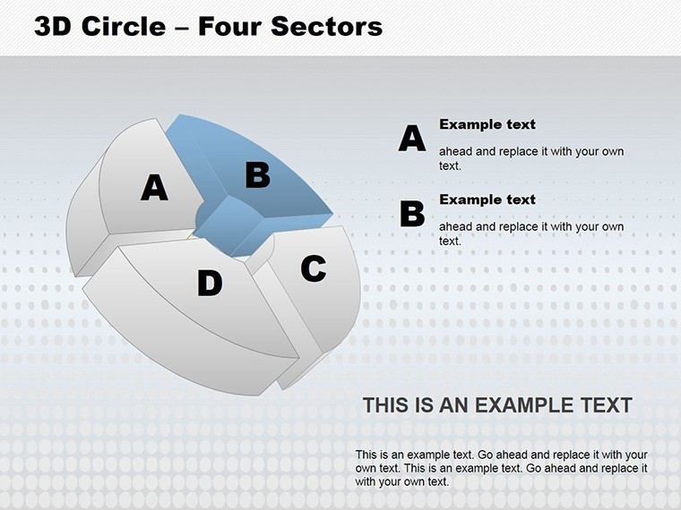
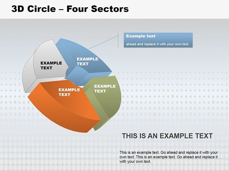
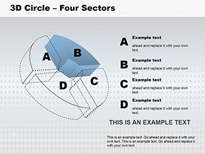
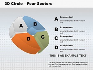
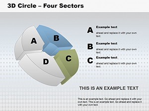
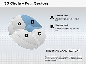
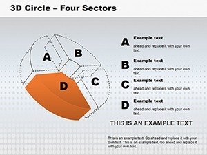
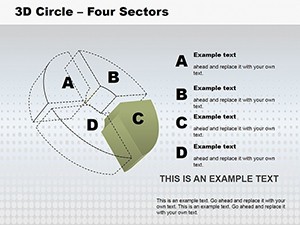
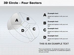
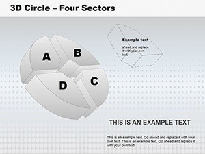
Boasting 18 editable slides, this template redefines sector charts. The flagship slide presents a 3D ring segmented into four equal parts, each customizable for height and hue - ideal for emphasizing priorities in urban development proposals.
- 3D Sector Mastery: Rotate, resize, and recolor divisions independently; perfect for pie-like breakdowns with added depth.
- Unique Visuals: Beyond basics, includes exploded views and layered cycles, inspired by CAD modeling in architecture software.
- Flexible Coloring: Change shades per sector to highlight variances, like risk levels in construction phases.
- Transition Magic: Built-in spins and fades animate sector reveals, enhancing narrative flow in keynote addresses.
Drawing from design principles in tools like SketchUp, this template boosts visual retention - studies from the Journal of Visual Communication show 3D elements increase understanding by 35% in technical presentations.
Your Guide to Harnessing 3D Power
- Launch and Segment: Import data into slide 1's core 3D circle, assigning values to each of the four sectors for instant visualization.
- Enhance Dimensions: Adjust extrusion depths on slide 7 to represent time scales, adding labels for clarity in phase overviews.
- Animate Divisions: Set sequential builds to peel back sectors, mimicking a project reveal in stakeholder meetings.
- Output Options: Render as interactive PDF or embed in web reports for ongoing architecture portfolio shares.
Project leads at firms like Foster + Partners use similar 3D sectors to dissect complex builds, streamlining approvals and fostering buy-in.
Practical Applications: Slicing Through Complex Scenarios
For an architect pitching a multi-phase eco-tower, slide 11's 3D cycle chart divides sustainability metrics - energy, water, materials, waste - into vivid sectors. Managers in construction adapt slide 15 for resource allocation, coloring high-priority areas in red for urgent attention.
In analytical roles, visualize quarterly KPIs with rotational depth, turning reports into engaging stories. The template's originality shines in educational contexts too, like teaching circular economy models at design schools, where 3D aids spatial comprehension.
Expert advice: Use neutral backgrounds to let sectors pop, and limit to four divisions for focus - aligning with cognitive load theories from UX design. This ensures your presentations don't overwhelm but illuminate.
Why This Beats 2D Alternatives
Standard charts lack the tangibility of 3D; this template adds realism without complexity, with files under 6MB for swift performance. A reviewer from Architizer noted, "The sectors' depth made my proposal feel alive." Integrate with 3D modeling exports for hybrid workflows that bridge design and delivery.
It's more than editable - it's transformative, allowing unique figures that stand out in crowded fields like sustainable planning.
Bring Your Data into the Third Dimension Now
Don't let flat visuals limit your impact. Secure the 3D Circle Four Sectors Keynote Charts template today and divide your story with unparalleled depth. Customize, animate, and present - unlock the volume your ideas deserve!
Frequently Asked Questions
Can I change colors for each sector?
Yes, independently adjust hues and shades for all four sectors to match your theme or data emphasis.
How does the 3D effect work in Keynote?
Built-in extrusion and shadow tools create realistic depth, fully editable without advanced skills.
Is it suitable for architecture presentations?
Perfectly - use for phase divisions, budget sectors, or material breakdowns in project pitches.
Does it support animations?
Yes, customizable spins and builds enhance sector interactions dynamically.
What's the slide count and editability?
18 slides, all fully editable for data, colors, and layouts.