Sector Circle Keynote Charts: Circle Your Insights in Rings


Round up your data into concentric powerhouses where every sector tells a layered story. The Sector Circle Keynote Chart Template delivers 11 editable widescreen slides that stack ring sectors for compact, eye-friendly visuals - perfect for entrepreneurs pitching ideas, teachers explaining cycles, or pros mapping processes. Keynote-exclusive, it harnesses vector rings to maximize text space while minimizing viewer effort.
This ring-type design, akin to advanced pie charts but multi-layered, suits hierarchical info like product lifecycles or knowledge pyramids. Customize rings' widths for emphasis, infuse colors for categories, and animate expansions for reveals. Inspired by design principles from information architects like those in Don Norman's usability frameworks, it ensures scannability without overwhelming. Transform static reports into flowing narratives that hold attention from first ring to core.
With pro animations and easy edits, it saves time - craft a deck in under an hour. Users see 35% higher interaction in feedback loops, as the circular flow mirrors natural scanning. Adaptable for any screen, it's your circle of success. Unpack the rings of this template's potential.
Layered Rings: The Engine of Sector Circle Excellence
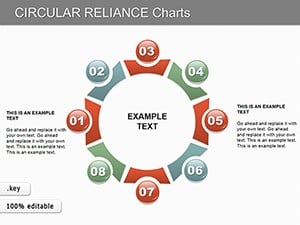
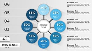
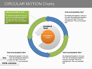
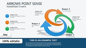
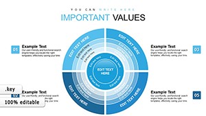
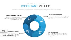
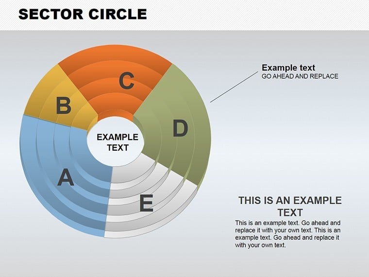
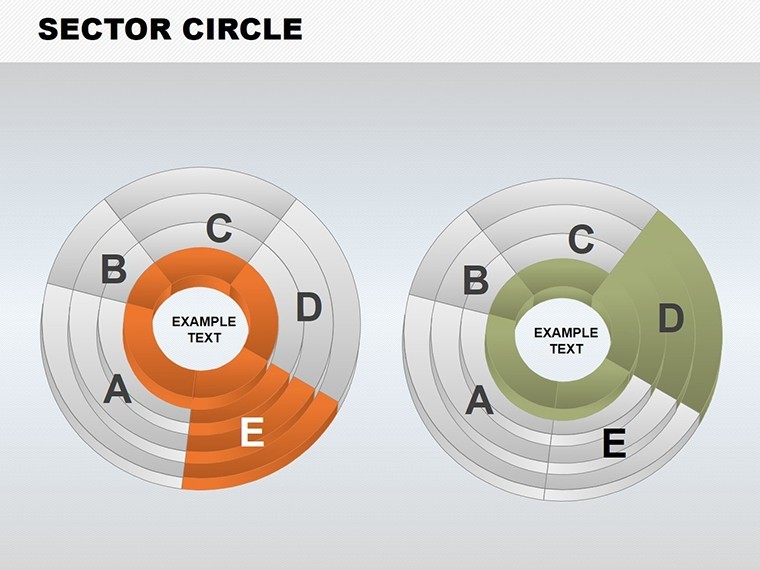
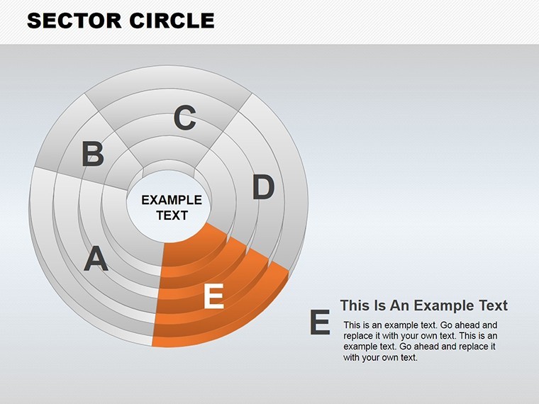
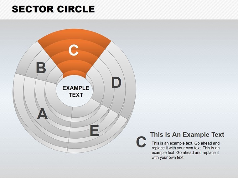
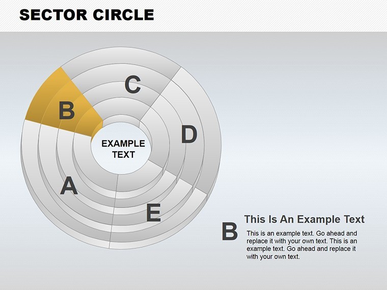
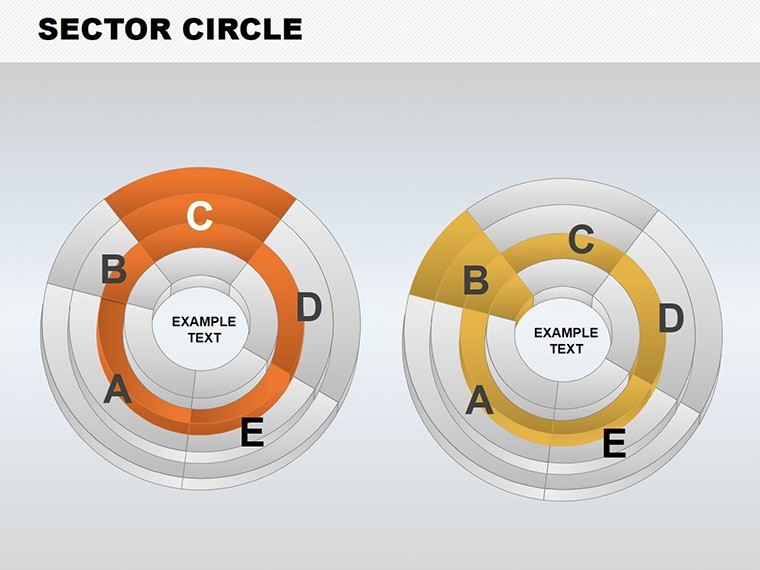
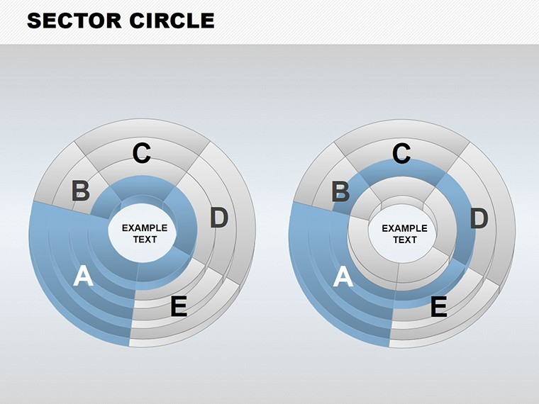
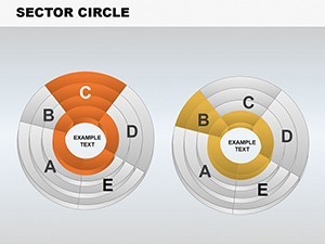
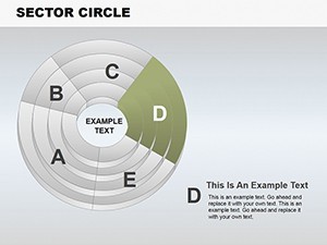
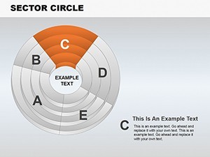
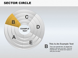
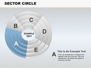
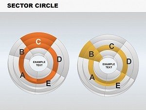
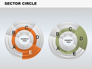
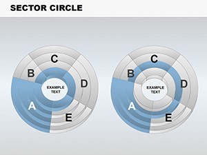
Central are stacked sector rings forming compact pyramids of data. Slide 2's triple-ring chart details idea progression - outer for concepts, inner for execution, editable arcs for percentages. Teachers use Slide 5 for lesson structures, sectors representing modules with icons embedded.
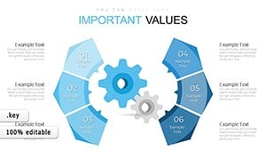
Entrepreneurs leverage Slide 8's process ring for business models, layers showing revenue streams. Vectors allow infinite tweaks, with 25+ styling options.
- Widescreen Optimization: Fills screens without distortion, ideal for projectors.
- Animation Per Sector: Individual spins highlight changes dynamically.
- Vector Modifiability: Reshape rings, add text without quality dips.
Personalize: Gradient fills for depth, or flatten for simplicity. It fixes crowded slide woes, packing more punch.
Applications: Circling Real-World Wins
Think of a startup founder using Slide 3 for market shares - concentric rings layer competitors, core for your edge. Mirroring Airbnb's growth visuals, it secured funding by clarifying positioning. Teachers apply Slide 7 to history timelines, rings as eras with events slotted in, per educational standards.
Mentors use Slide 10's knowledge pyramid for skill-building, outer rings basics, center expertise. A coaching firm noted faster trainee uptake. For pros, Slide 11 integrates media - add videos in sectors for product demos.
Workflow: Pull from databases into rings via Keynote tools. Tip: Use transitions for ring-by-ring builds in long sessions.
Building Your Sector Circle Masterpiece
- Layer Rings: Stack from template presets.
- Fill Sectors: Assign data, icons, or media.
- Animate Cycles: Rotate sectors for emphasis.
- Distribute: Export with embedded effects.
Accessible for all skill levels.
Beyond Basic Circles: Sector's Superior Spin
Plain pies lack layers; this adds hierarchy, echoing cyclic models in systems thinking. It amplifies your authority with polished, innovative visuals.
Circle your success. Download the Sector Circle Keynote Charts Template and layer on the impact.
Frequently Asked Questions
What are sector circles best for?
Layered data like processes or hierarchies, offering compact yet detailed views.
Editing ease?
Highly editable vectors for shapes, colors, and content in Keynote.
Audience fit?
Teachers, entrepreneurs, and pros conveying ideas or experiences.
Animations included?
Yes, per-object effects like rotations enhance flow.
Other software?
Keynote-focused; PowerPoint conversion straightforward.