Speedometer Charts Keynote Template - Fully Editable | Instant Download


Type: Keynote Charts template
Category: Pie, Illustrations
Sources Available: .key
Product ID: KC00127
Template incl.: 12 editable slides
12 fully editable Speedometer Keynote charts for KPI visualization, performance tracking, and metric dashboards. Vector graphics with customizable needles, scales, and animations. Instant .key download for Apple Keynote.
What's Included
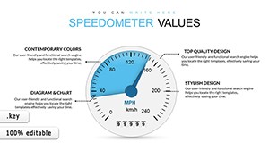
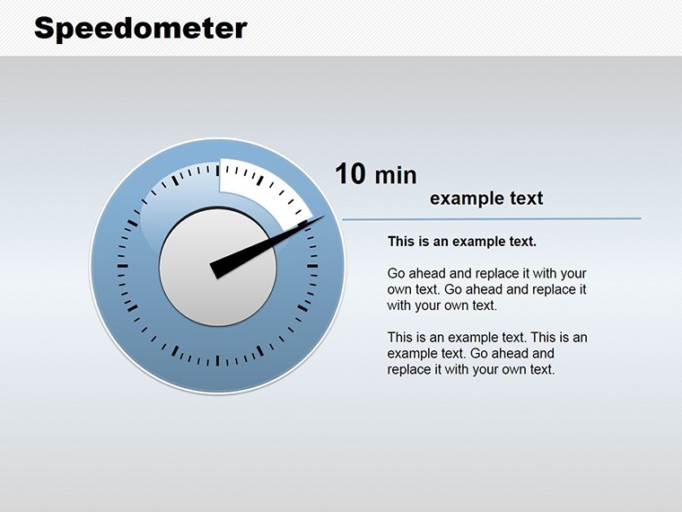
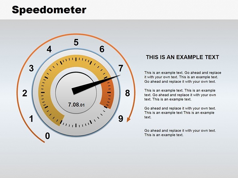
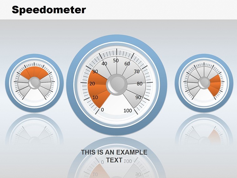
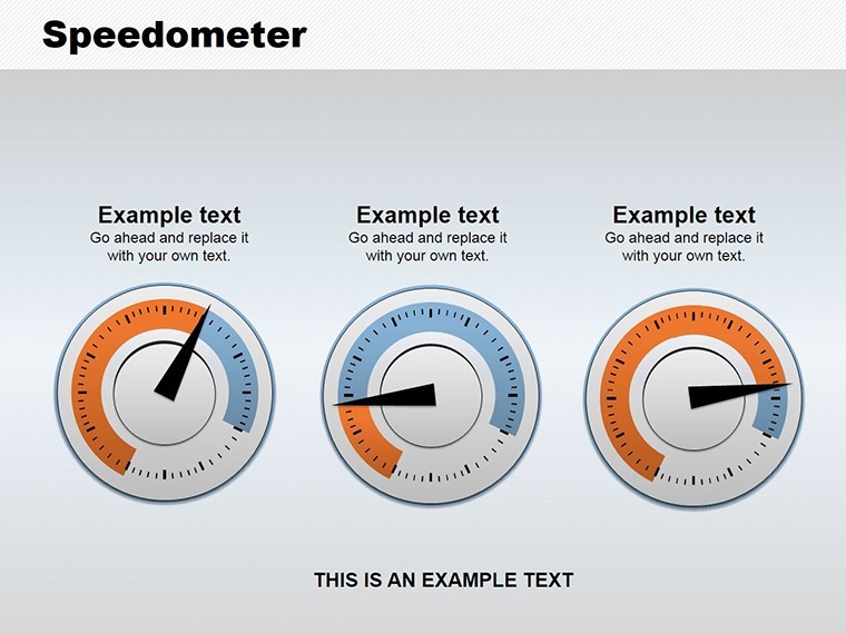
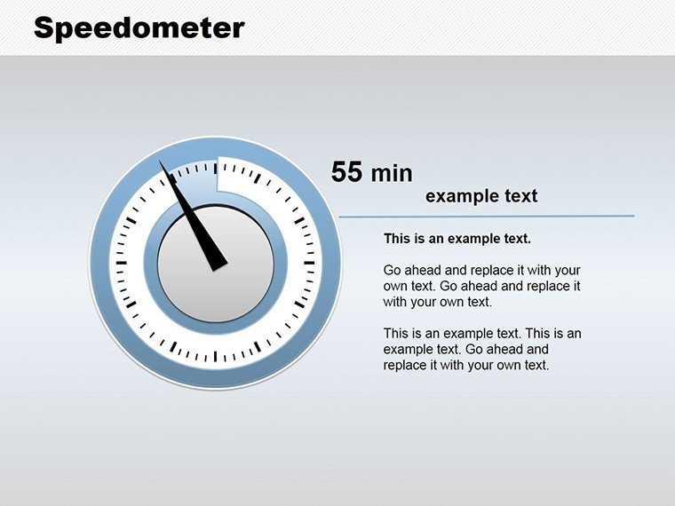
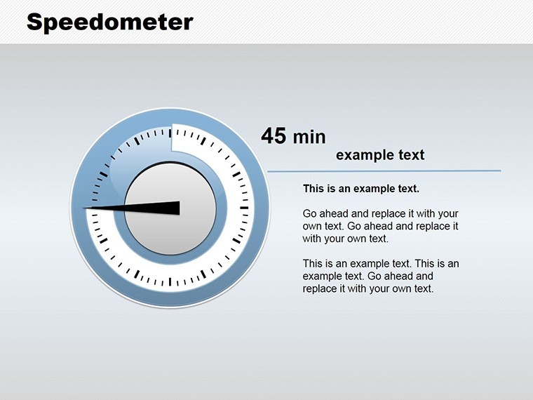
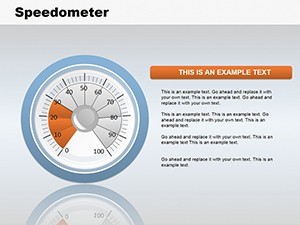
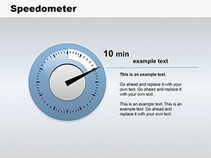
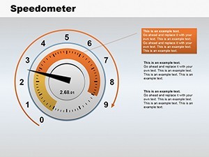
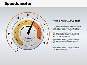
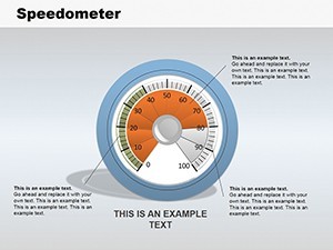
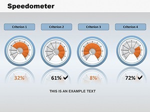
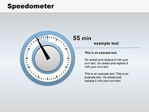
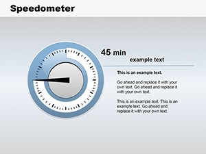
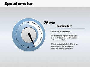
The Speedometer Keynote Charts template includes exactly 12 fully editable slides in .key format. Slide 1 delivers a classic single speedometer for single-metric focus such as quarterly revenue growth or customer satisfaction. Slide 4 provides multi-dial setups for comparative analysis - ideal for benchmarking multiple KPIs on one slide. Every speedometer features customizable arrows, numeric scales, segmented dials, shaded segments, glow effects, and themed icons including gear symbols for operations. All graphics are vector-based, fully scalable, and optimized for Retina displays. The template works seamlessly with Keynote on Mac, iPad, and iPhone.
You also receive built-in smooth animations for needle sweeps and arc highlights that make your metrics feel dynamic and engaging.
Key Features
Customizable Visual Elements
Change needle color, scale ranges, and segment colors instantly via Keynote`s inspector. Use vibrant reds for urgent metrics or cool blues for steady growth. Add or remove ticks and labels with one click. High-contrast versions meet WCAG standards for accessibility.
Professional Animations
Built-in spin and reveal animations on needles create a "revving up" effect that captures attention during live presentations.
Professional Use Cases
Marketing Manager - Campaign ROI
A marketing manager at a retail brand used Slide 1 to show post-optimization engagement speed rising from 42% to 88%. The needle sweep instantly communicated success to the CMO, resulting in a 35% budget increase for the next quarter.
Project Lead - Agile Velocity
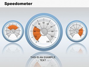
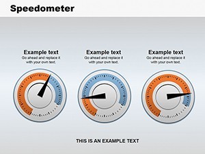
A project lead tracked sprint velocity across four teams with Slide 4`s multi-dial layout. Green-zone needles for on-track sprints led to immediate resource reallocation and early project delivery.
Retail Executive - Quarterly Revenue
A retail executive presented revenue growth with the single speedometer; the needle movement from "slow" to "accelerating" convinced stakeholders to approve expansion plans.
How to Customize
Download - open in Keynote - select speedometer - edit values in Chart pane (numbers update the needle automatically) - adjust colors via Fill panel - add animation via Animate tab - export as PDF, video, or image. Total workflow under 8 minutes. Data can be linked directly from Excel via Keynote`s live data import.
Why Choose This Template
Compared to building speedometers from scratch (which typically takes 1.5 - 3 hours per slide and results in inconsistent alignment), this template gives you 12 polished, tested designs instantly. The automotive dashboard metaphor, chosen specifically for its universal familiarity, makes abstract metrics immediately intuitive. Shaded segments and glow effects add depth without clutter, exactly what professional presenters need to keep audiences focused on the story, not the chart.
FAQ
Is this compatible with the latest Keynote versions?
Fully compatible with Keynote 10+ on macOS, iPadOS, and iOS. The template also opens in Keynote 9 and earlier with all editable elements intact. Animations and vector quality remain perfect across platforms. You can export to PDF or PowerPoint while preserving the speedometer appearance.
Can I edit the speedometer needles and scales?
Yes - every needle position updates automatically when you change the numeric value in the data editor. You can modify min/max ranges, tick intervals, and add custom labels. Segment colors and glow intensity are fully adjustable, allowing complete brand matching in seconds.
What is the commercial licensing?
Unlimited commercial use included. Present in client meetings, internal all-hands, investor pitches, or training materials. No attribution required. You may modify and use the designs in derivative works without restriction, except reselling the original template files.
How many slides and variations are there?
Exactly 12 slides: 6 single-speedometer layouts (Slide 1 classic example) and 6 multi-dial combinations (Slide 4 perfect for comparisons). Each offers different needle styles, color palettes, and icon placements to cover every KPI storytelling scenario you encounter.
Do you offer refunds if I`m not satisfied?
Yes - full refund within 14 days if the template does not meet your expectations. Simply email support with your receipt and we process the refund immediately. Our goal is 100% customer satisfaction with every purchase.