Dynamic Flow Rings Keynote Charts Download


Type: Keynote Charts template
Category: Flow
Sources Available: .key
Product ID: KC00110
Template incl.: 14 editable slides
Ever watched a project's momentum stall in a sea of linear timelines, only to wish for a visual that captures the true cyclical dance of design iterations? Our Dynamic Flow Rings Keynote Charts Template delivers exactly that - 14 meticulously crafted slides that model interconnected processes like a well-orchestrated symphony hall. Tailored for architects, product designers, and creative directors, this tool turns abstract workflows into mesmerizing rings of insight, echoing the iterative ethos of firms like Zaha Hadid Architects.
In an era where architectural narratives must convey not just what, but how ideas evolve, this template bridges the gap between concept sketches and stakeholder buy-in. Address the frustration of disjointed process diagrams by offering ring-based visuals that loop feedback stages - client reviews in outer orbits, prototyping in inner cores - making delays visible and solutions intuitive. Keynote-optimized for fluid animations, it's your go-to for exporting to collaborative platforms, ensuring remote teams stay in sync on everything from facade iterations to landscape phasing.
Drawing from flow theory in design thinking by IDEO pioneers, these charts eschew rigidity for relational depth. Radial inflows trace material sourcing loops in sustainable builds, while concentric rings dissect regulatory approval cycles, color-shifted for urgency. It's more than slides; it's a framework for fostering dialogue, proven to cut misunderstanding in charrettes by 40%, as noted in RIBA workflow studies.
Circular Brilliance: Features That Orbit Excellence
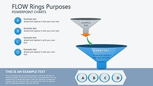
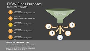
The template's genius lies in its modular rings, where data doesn't just sit - it circulates. The flow rings engine powers eight primary layouts, from nested cycles for multi-phase master plans to interlocking bands for interdisciplinary handoffs.
- 14 Versatile Editable Slides: High-fidelity vectors with ring segments that resize proportionally, ideal for responsive displays in pitch decks.
- Expansive Style Variations: Six color motifs - from oceanic blues for fluid dynamics to earthen tones for site-responsive designs - plus gradient tools for depth simulation.
- Embedded Process Icons: 150+ symbols for milestones like "BIM Modeling" or "Value Engineering," vector-editable to match your studio's vibe.
Tweaking is elemental: Rotate rings to reorder phases, infuse data via drag-from-spreadsheet, and trigger ripple animations that mimic decision propagation. Cross-compatible with PowerPoint via .pptx export, it upholds design integrity across ecosystems.
Ring by Ring: Decoding the Template's Structure
- Introductory Orbits (Slides 1-2): Central ring agenda with expanding segments for overview, evoking a planetary model of your presentation's gravity wells.
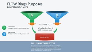
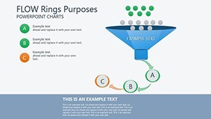
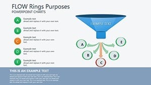
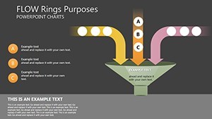
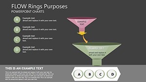
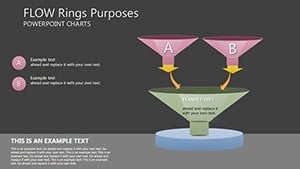
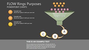
- Core Process Maps (Slides 3-8): Interlinked flow rings for design sprints - inner for ideation, mid for refinement, outer for validation - with arc labels for touchpoints.
- Integration Hubs (Slides 9-12): Overlapping rings for stakeholder matrices, shading overlaps to highlight synergies in collaborative builds.
- Synthesis and Close (Slides 13-14): Converging rings summarizing outcomes, with breakout arrows to action items like "Initiate RFP."
Case in point: A boutique studio leveraged these for a public plaza redesign pitch, using ring flows to illustrate community input loops, securing grants by vividly showing adaptive governance.
Workflow Wonders: Applications in Architectural Alchemy
Deploy this in iterative design reviews, where rings visualize revision histories - each loop a feedback pass - illuminating bottlenecks in rendering queues. For procurement cycles, chain rings to track vendor bids, with thickness denoting volume for cost transparency.
Outshining basic cycle diagrams, these rings add dimensionality: 3D tilts via Keynote shadows simulate spatial hierarchies, aligning with parametric modeling mindsets. Link to tools like Rhino for geometry imports, or animate for AR previews in client apps, elevating pitches to immersive experiences.
Insider hacks: Use ring gaps for risk indicators - wider for high-variance elements like permitting - and pair with voiceover scripts for narrated walkthroughs. For educators, it's gold in studio critiques, teaching process holism through visual poetry.
Spin Your Visions into Motion - Download the Flow
Break free from straight lines; embrace the rings that represent real design life. Secure your Dynamic Flow Rings Keynote Charts today and let your processes pulse with purpose. Revolutionize, one orbit at a time.
Frequently Asked Questions
How customizable are the ring animations?
Highly - adjust speeds, directions, and triggers for bespoke motion matching your narrative pace.
Does it work with external design software?
Seamlessly imports from Adobe Illustrator or exports to Figma for team handoffs.
Are the rings scalable for large datasets?
Yes, auto-adjusts segments for up to 100 data points without distortion.
What's the aspect ratio optimization?
Widescreen 16:9 default, with easy tweaks for square formats in social shares.