Orientation Wave Keynote Charts: Surf the Flow of Your Ideas


Type: Keynote Charts template
Category: Flow
Sources Available: .key
Product ID: KC00103
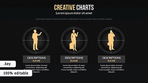
Template incl.: 8 editable slides
Envision navigating a winding coastal pathway project, where phases ebb and flow like ocean waves - your presentation needs to capture that rhythm to engage planners and funders. Enter our Orientation Wave Keynote Charts template, a fluid powerhouse for visualizing processes, timelines, and trends in a way that's as natural as a site's topography. Tailored for architects, educators, and business strategists, this 8-slide gem turns static data into dynamic waves that propel your message forward.
Native to Keynote with full compatibility for PowerPoint and Google Slides exports, it unlocks creativity without the steep learning curve. Whether mapping workflow orientations in a tech-integrated building design or illustrating financial waves in investment pitches, this template delivers stunning, customizable visuals that resonate. Inspired by modern design principles, it helps novices and pros alike craft presentations that flow seamlessly, boosting retention and impact in high-stakes scenarios.
Wavelength of Innovation: Essential Features Explored
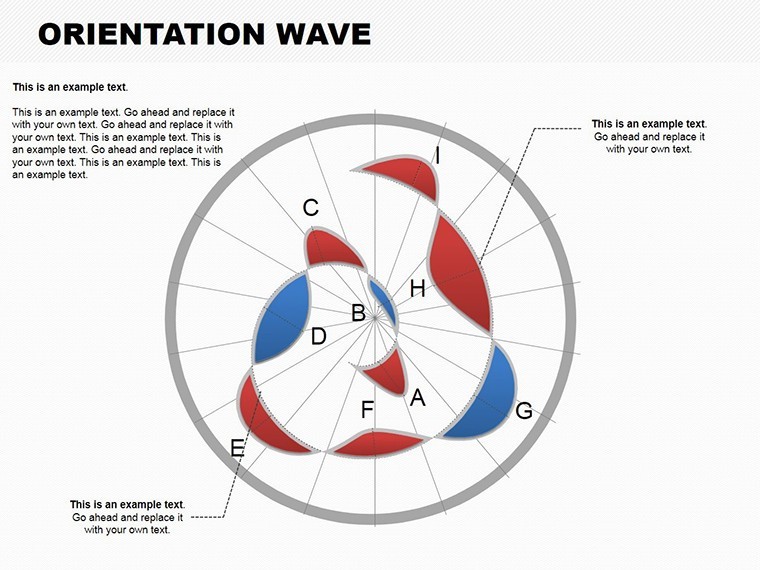
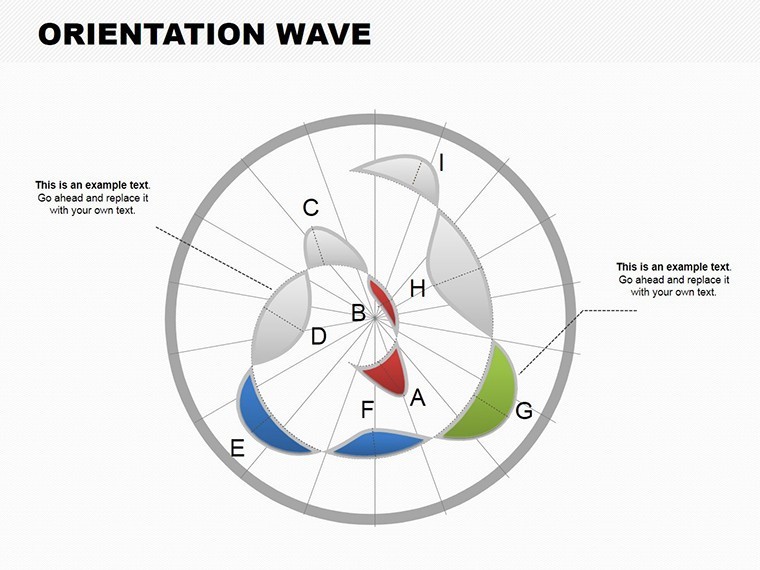
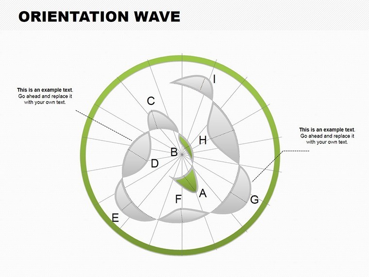
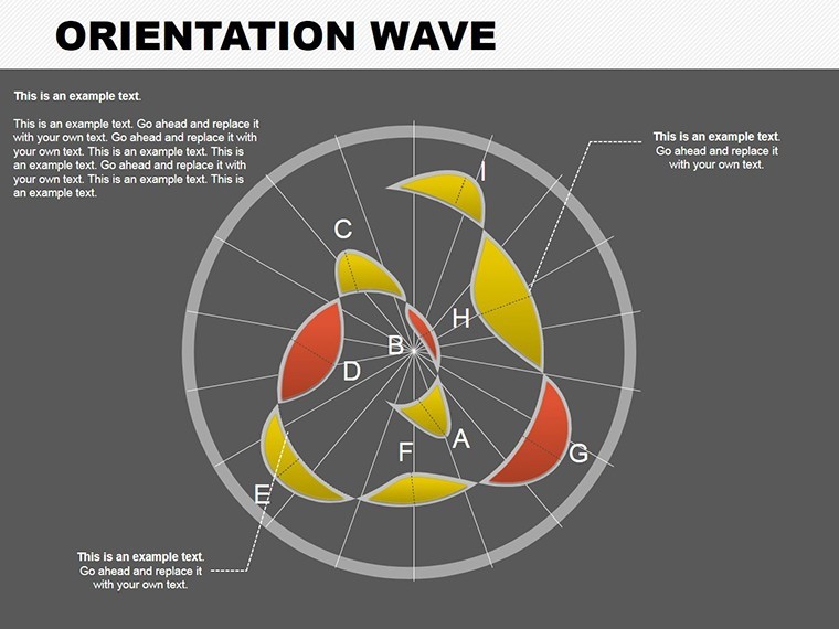
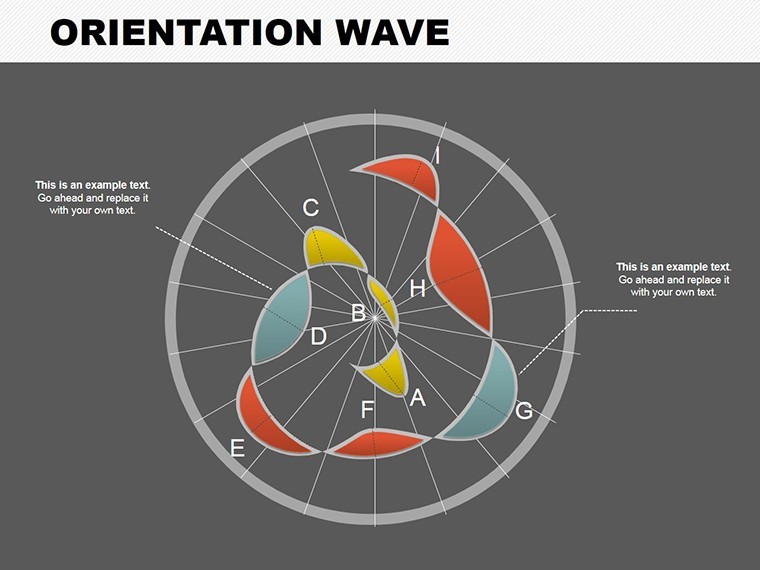
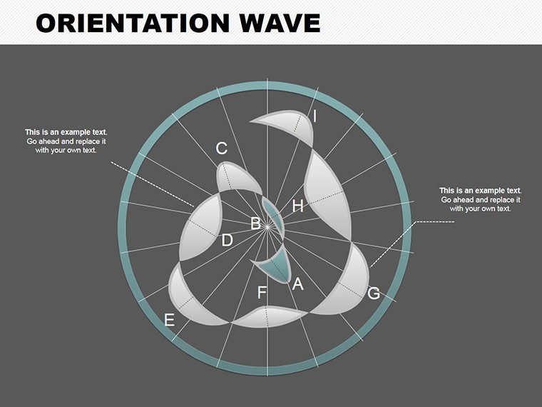
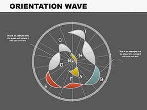
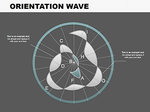
The template's wave motifs are engineered for elegance and functionality, using smooth curves and orientations to represent progression intuitively. Vector precision ensures it scales for any format, from keynote addresses to detailed reports.
- Fluid Wave Designs: Orientation-based waves that adapt to data directions, perfect for sequential processes like design iterations.
- Customizable Orientations: Rotate, stretch, or color waves to fit your narrative, such as upward trends for project milestones.
- Topic Versatility: Suited for business flows, educational timelines, or tech roadmaps with built-in icons.
- Effortless Compatibility: .key files export cleanly to PowerPoint/Google Slides, preserving wave animations.
- User-Friendly Navigation: Intuitive controls for novices to create pro-level slides quickly.
From feedback in design forums, users love how these waves simplify complex orientations, like in LEED certification flows, making abstract concepts tangible and persuasive.
Navigating the Slides: Wave by Wave
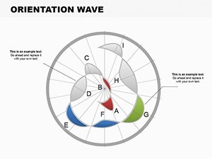
Slide 0 introduces a broad orientation wave, ideal for overviewing project scopes. Slides 1-3 build with ascending waves for growth metrics - apply to architecture by waving through approval phases from concept to construction.
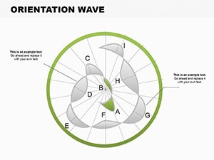
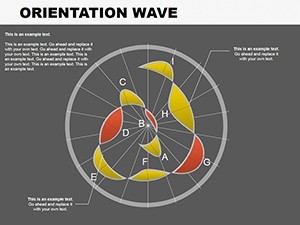
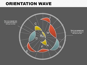
Central Slides 4-5 feature intersecting waves for multi-stream integrations, like merging tech and aesthetic flows in smart buildings. The closing Slides 6-7 offer cyclical waves for recurring processes, such as maintenance cycles, with customizable peaks and troughs for emphasis.
Wave-Riding Applications: Bringing Flows to Life
For educators lecturing on sustainable design, these charts wave through energy efficiency timelines; for finance pros, they undulate investment returns. A case in point: A Seattle architecture team used wave orientations to depict phased waterfront developments, swaying stakeholders with visual harmony that mirrored the site's natural flow, clinching eco-grants.
Implementation steps for your success:
- Define Your Flow: Input sequential data from tools like Microsoft Project.
- Orient the Waves: Adjust directions to match narrative arcs, e.g., horizontal for timelines.
- Infuse Colors: Use gradients for depth, like blues for planning waves.
- Animate Progressively: Set wave builds to simulate motion in presentations.
- Integrate and Export: Link to other slides or export for broader use.
Outshining linear charts, waves convey momentum, ideal for dynamic fields like urban planning where orientations shift with contexts.
Expert Surfing Tips for Wave Charts
Treat waves like site contours: Vary amplitudes to highlight peaks, such as budget highs in proposals. Avoid overcrowding - cap at 4-5 waves per slide. Pair with our hierarchy templates for layered flows in comprehensive decks.
A tech educator shared how these charts waved through algorithm orientations, enhancing student comprehension by 35%. Embrace the flow - download the Orientation Wave Keynote Charts template today and let your presentations crest with creativity.
Frequently Asked Questions
Q: What topics do these wave charts cover?A: Business, finance, education, and technology flows with versatile orientations.
Q: Is compatibility limited to Keynote?A: No, easily exports to PowerPoint and Google Slides.
Q: How customizable are the wave elements?A: Fully - adjust shapes, colors, and directions for your needs.
Q: Suitable for creative presentations?A: Yes, unlocks innovation for engaging, flowing visuals.
Q: Number of slides included?A: 8 editable slides for dynamic wave storytelling.