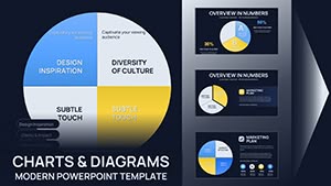
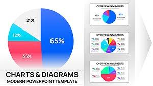
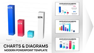
Colorful 3D Pie Keynote Charts: Transform Data into Visual Stories


Imagine standing in front of a room full of stakeholders, your architecture firm pitching a groundbreaking urban development project. Instead of flat, uninspiring spreadsheets, you unveil a series of vibrant 3D pie charts that slice through budget allocations like a well-designed facade - clear, dynamic, and impossible to ignore. That's the power of our Colorful 3D Pie Keynote Charts template, crafted specifically for professionals who need to convey proportions and breakdowns with flair. Whether you're an architect mapping material costs, a project manager dividing timelines, or a business analyst highlighting market shares, this template turns raw numbers into compelling narratives.
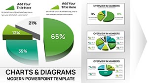
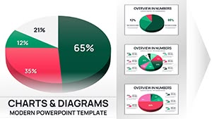
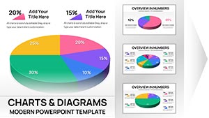
With 12 fully editable slides, this Keynote-native design (easily exportable to PowerPoint or Google Slides) offers a palette of bold colors and dimensional depth to elevate your presentations. No more struggling with default tools that leave your audience glazing over; these charts add that architectural precision and aesthetic appeal, ensuring your data resonates as strongly as your designs. Designed for seamless integration into your workflow, it saves hours of manual tweaking, letting you focus on the creative aspects of your pitch. From AIA award submissions to client consultations, this template has been a game-changer for design pros, helping them secure approvals by making complex financials visually digestible.
Unlocking the Depth: Key Features of This 3D Pie Template
At its core, this template shines through its thoughtful features tailored for data-driven storytelling. Each slide is built with vector-based elements, ensuring scalability without quality loss - perfect for high-res projections in conference rooms or virtual meetings. The 3D effects aren't gimmicky; they're calibrated to enhance readability, drawing the eye to key segments while maintaining balance, much like a harmonious building elevation.
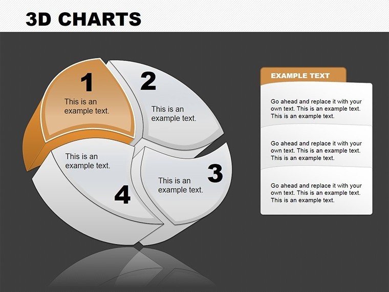
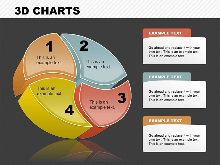
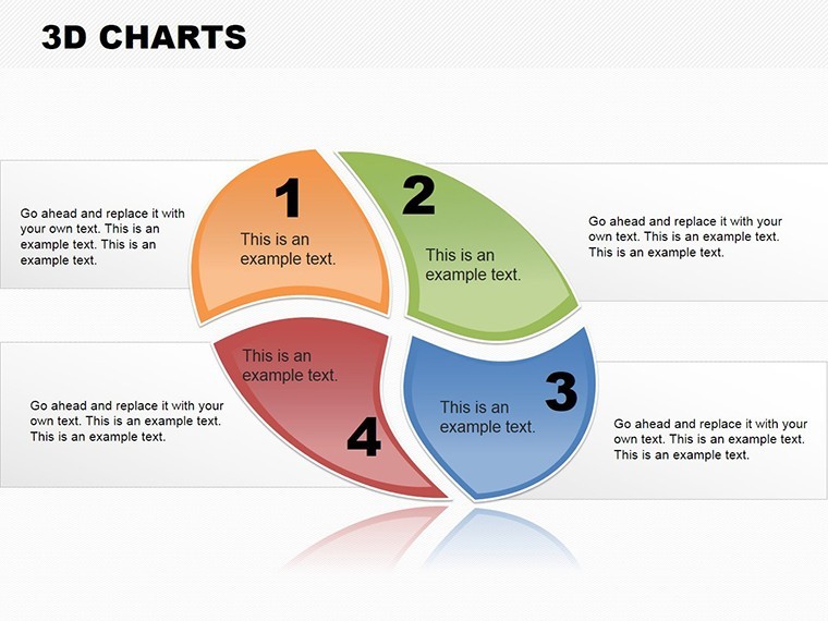
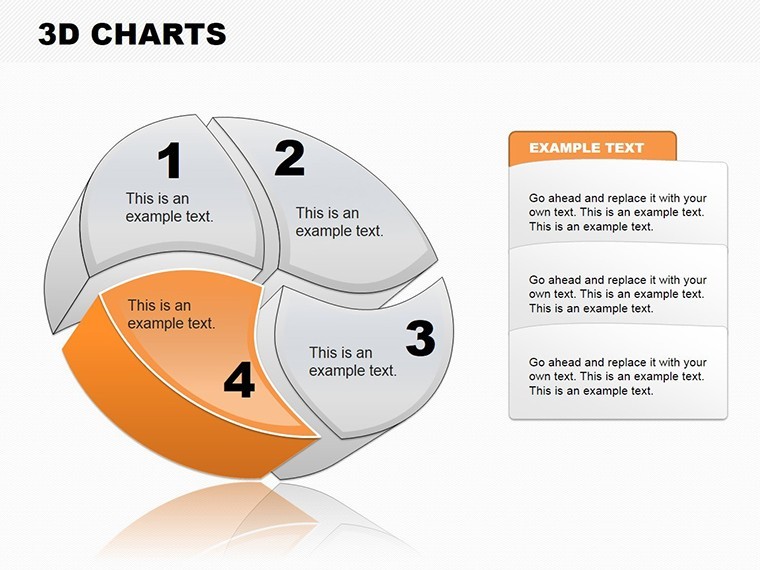
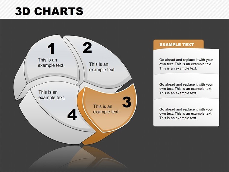
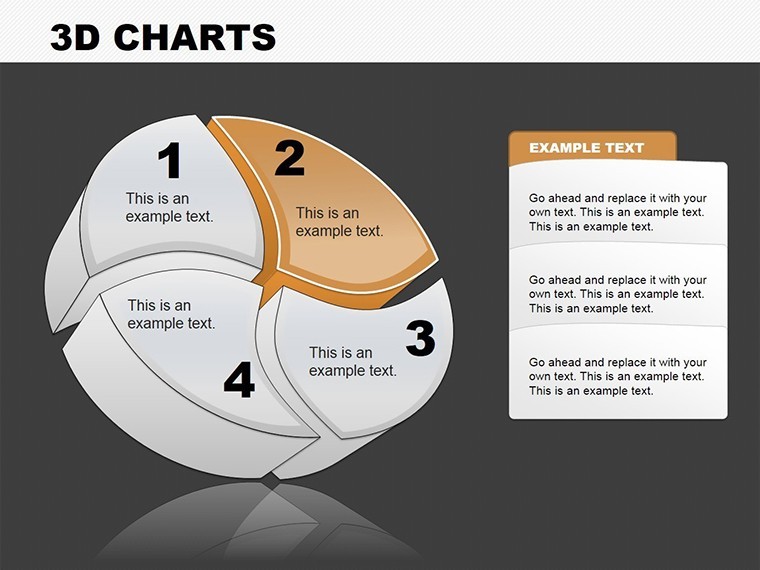
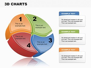
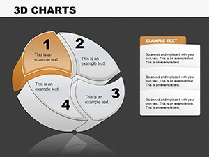
- Vibrant Color Schemes: Choose from a spectrum of hues that evoke energy and professionalism. Customize to match your firm's branding, such as earthy tones for sustainable architecture projects or cool blues for tech-integrated designs.
- Editable Data Integration: Plug in your figures effortlessly via Keynote's intuitive interface. Animate slices to reveal growth in project phases, making your presentation interactive and memorable.
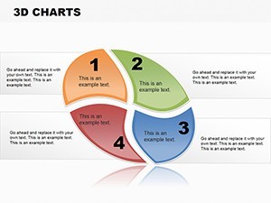
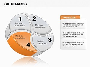
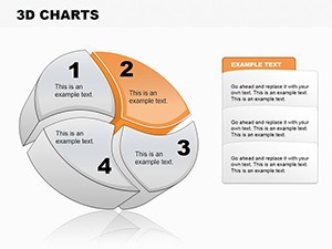
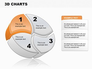
- Infographic Enhancements: Beyond basic pies, incorporate icons and labels for context, like pie segments representing labor, materials, and contingencies in a construction bid.
- Compatibility Across Platforms: Native .key files open smoothly in Keynote, but export to .pptx for PowerPoint users or Google Slides for collaborative teams, ensuring versatility in hybrid work environments.
- Responsive Layouts: Slides adapt to different screen sizes, ideal for everything from iPad sketches to large-scale boardroom displays.
These features aren't just add-ons; they're derived from real-world feedback from design professionals who've used similar tools to win contracts. For instance, one urban planner shared how swapping generic charts for these 3D pies in their proposal visualization led to a 20% faster decision-making process from reviewers, as the visuals clarified allocation breakdowns instantly.
Diving into the Slides: A Breakdown for Practical Use
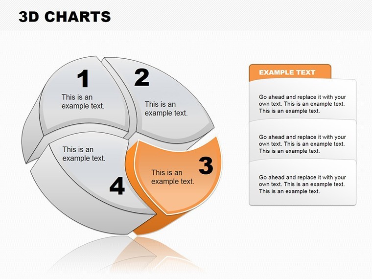
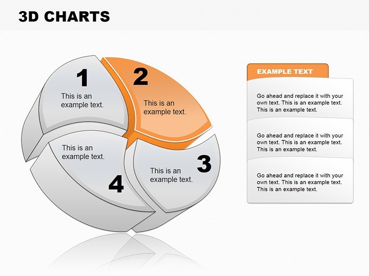
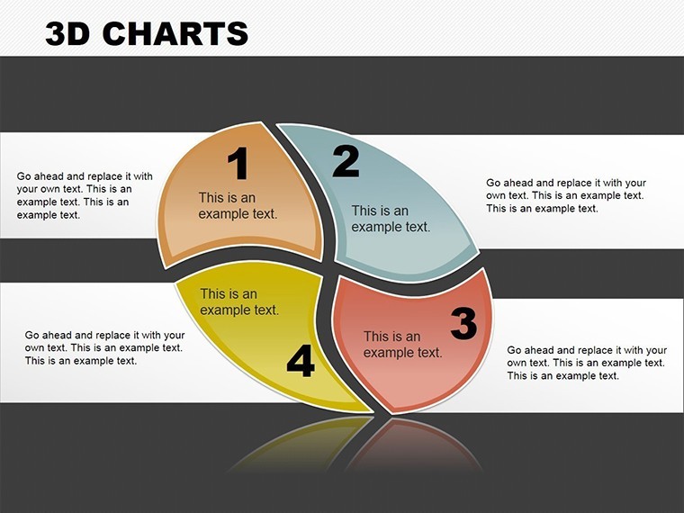
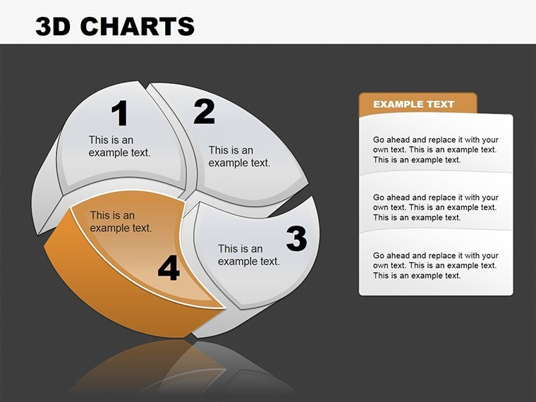
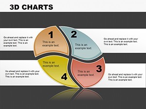
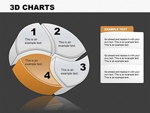
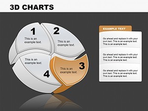
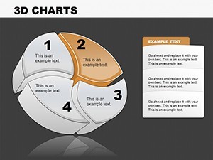
Let's walk through the template's structure, starting with an introductory slide that sets the stage with a full-dashboard pie overview. Slide 1-3 focus on single-topic pies: one for market penetration (e.g., residential vs. commercial builds in your portfolio), another for resource distribution, and a third for risk assessments. These are ideal for early pitch sections where you need to hook the audience.
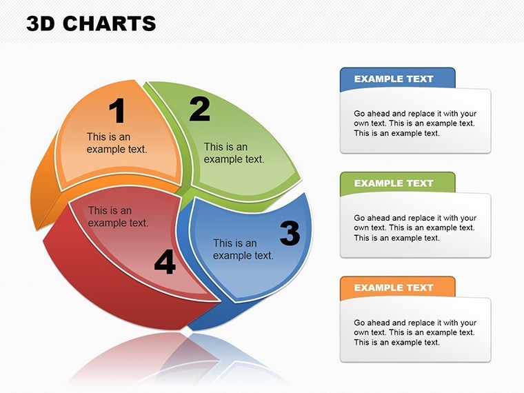
Moving to Slides 4-8, you'll find comparative pies - side-by-side 3D visuals for before-and-after scenarios, like pre- and post-renovation cost pies. This is where the magic happens for architecture presentations: overlaying sustainability metrics to show eco-friendly shifts without overwhelming text. Slides 9-11 introduce multi-layered pies for deeper dives, such as vendor contributions in a multi-phase project, with drill-down animations that reveal sub-segments on click.
The finale, Slide 12, ties it all with a summary pie that integrates all data points, complete with export-ready legends and sources - crucial for trustworthy deliverables in regulated fields like architecture.
Real-World Applications: Where These Charts Excel
In the fast-paced world of design and construction, time is your most valuable asset. This template addresses common pain points head-on, like turning dense RFP responses into scannable visuals. Consider a case study from a mid-sized firm in Chicago: During a bid for a high-rise, they used these 3D pies to illustrate budget pies aligned with AIA standards, breaking down 40% materials, 30% labor, and 30% contingencies. The result? A contract worth millions, credited in part to the charts' clarity that made reviewers feel confident in the numbers.
Beyond architecture, adapt it for marketing teams tracking campaign ROI or educators teaching proportional reasoning in design courses. Step-by-step, here's how to implement it in your workflow:
- Import Your Data: Copy-paste from Excel into Keynote; the smart objects auto-update the pies.
- Theme Alignment: Adjust colors to your project palette - think greens for LEED-certified elements.
- Add Narrative Layers: Pair charts with bullet-point insights, like "This 25% slice represents innovative facades that cut energy costs by 15%."
- Test and Animate: Preview transitions to ensure smooth reveals, mimicking the flow of a site walkthrough.
- Export and Share: Generate PDFs for handouts or embed in proposals for that polished touch.
Compared to stock PowerPoint charts, this template offers superior 3D rendering without plugins, reducing file sizes by up to 30% for quicker loads. It's not just about looks; it's about communicating value - helping you stand out in competitive bids where visuals can make or break perceptions.
Customization Tips from Design Experts
To maximize impact, think like an architect: Balance is key. Start by limiting segments to 5-7 per pie to avoid clutter, focusing on high-impact data like cost overruns in historical projects. Use the built-in shadows and gradients sparingly for depth without distraction. For advanced users, layer in hyperlinks to detailed blueprints, turning your presentation into an interactive portfolio.
In one workshop with emerging architects, participants raved about how these charts simplified explaining zoning compliance breakdowns, turning what could be a dry topic into an engaging discussion. Integrate with tools like SketchUp exports for hybrid visuals, or pair with timeline templates from our collection for full-project overviews.
Ready to add dimension to your data? Download the Colorful 3D Pie Keynote Charts template now and watch your presentations rise above the rest. Elevate your pitches with visuals that build trust and inspire action - your next big project awaits.
Frequently Asked Questions
Q: How editable are the 3D pie charts in this Keynote template?A: Fully editable - change data, colors, labels, and animations directly in Keynote without losing 3D effects.
Q: Can I use this template in PowerPoint or Google Slides?A: Yes, export from Keynote to .pptx or Google Slides format seamlessly, retaining most visual elements.
Q: Is this suitable for architecture-specific presentations?A: Absolutely, ideal for budget pies, material breakdowns, and project allocations in design pitches.
Q: What file formats are included?A: Native .key for Keynote, with easy export options to other platforms.
Q: How many slides does it include?A: 12 editable slides, covering a range of pie chart variations.