Venn Diagram Keynote Charts - Fully Editable


Type: Keynote Charts template
Category: Relationship, Venn
Sources Available: .key
Product ID: KC00098
Template incl.: 18 editable slides
Files and Formats Included
18 editable Venn diagram slides download as one .key file.
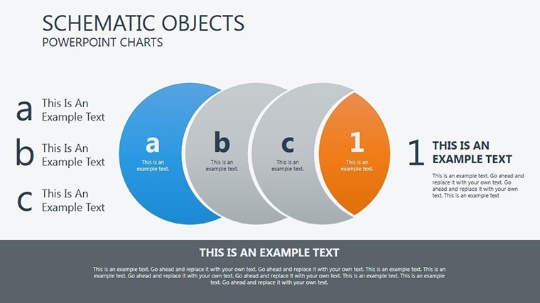
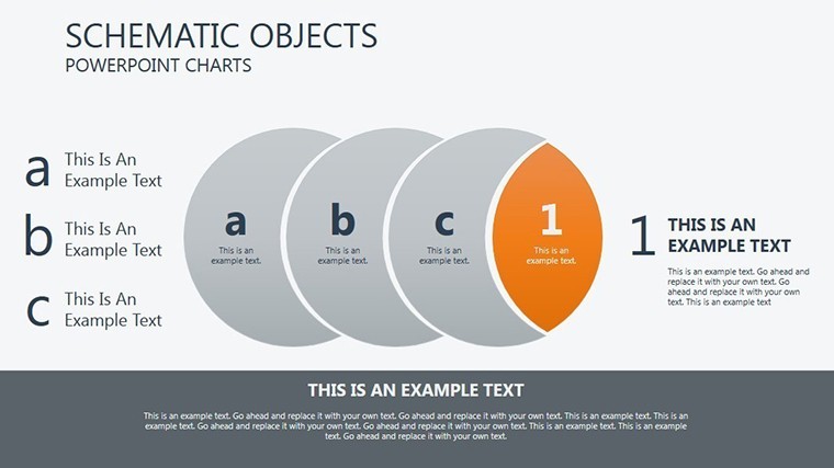
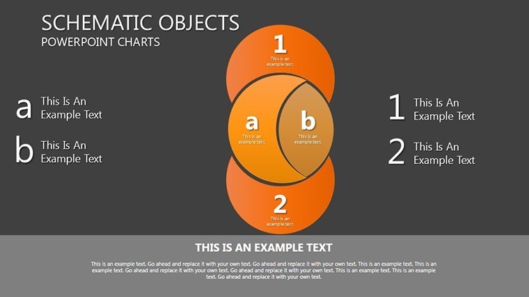
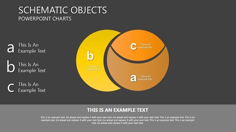
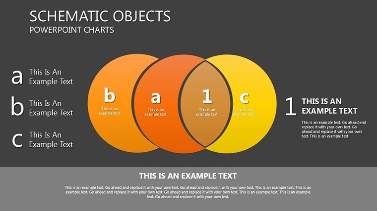
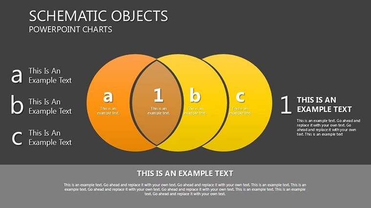
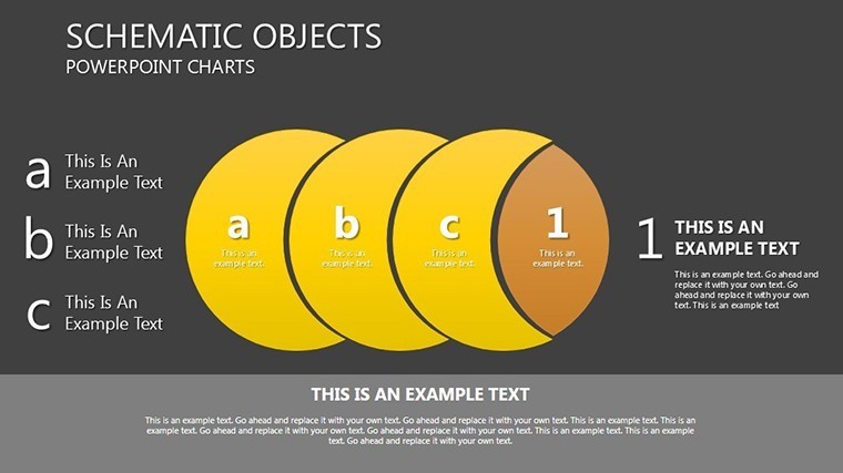
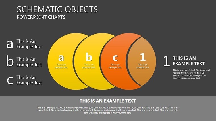
Configurations range from two-circle to multi-set with sequential animations included.
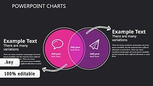
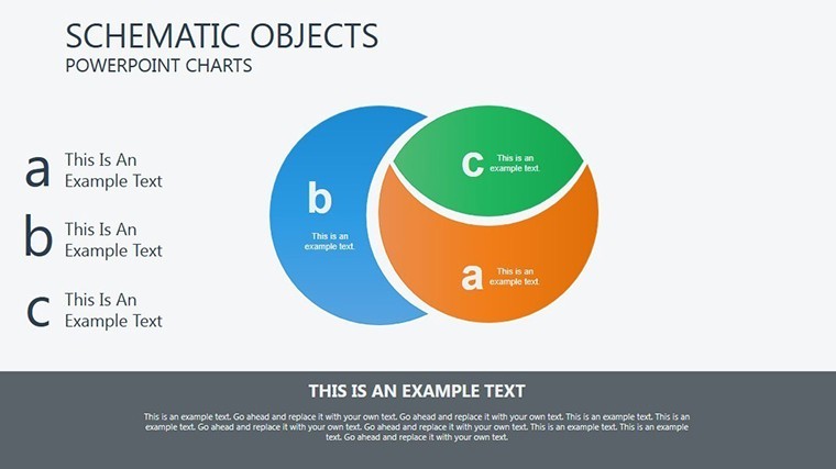
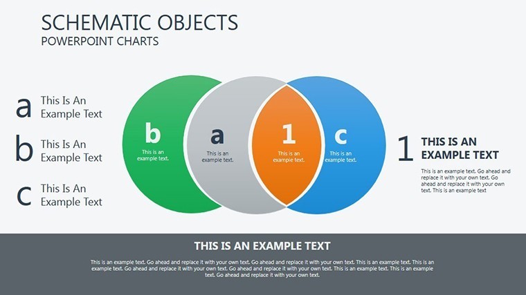
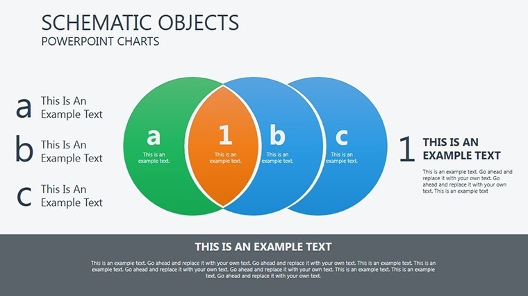
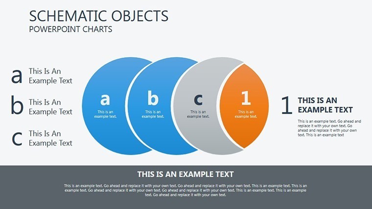
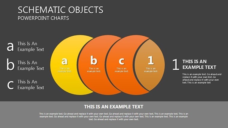
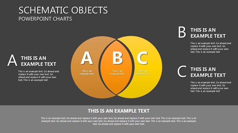
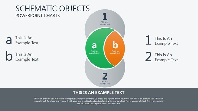
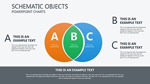
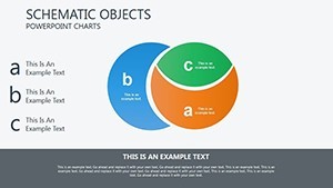
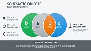
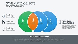
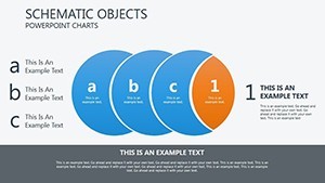
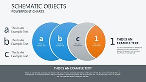
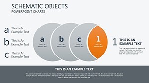
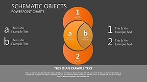
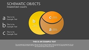
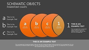
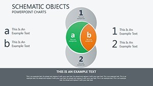
- Two-circle overlaps
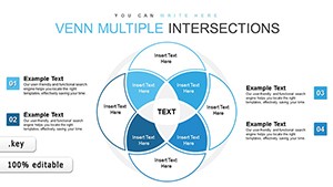
- Three-set and four-set variants
- Animated reveal sequences
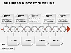
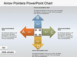
Unlike the linear timelines or directional arrows listed in related products these focus on intersection zones.
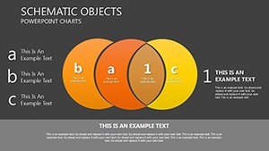
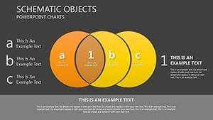
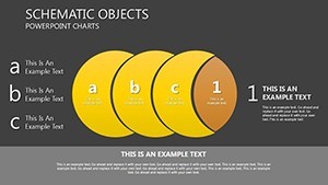
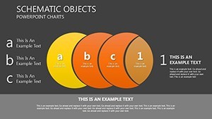
One specific visual characteristic is the use of transparent overlapping fills.
This template works best for comparing market segments in investor decks because neighbors like puzzle charts emphasize assembly instead.
The paid version includes the complete animation sequences and editable layers as no free version details appear on the page.
Editing Capabilities at a Glance
| Feature | Details |
|---|---|
| Slides included | 18 Venn diagrams in .key format |
| Diagram categories | overlap sets from 2 to 4 circles |
| Editable elements | shapes resize and recolor independently |
| Aspect ratio | 16:9 standard |
| Keynote compatibility | version 12+ with animation support |
| Color themes | adjustable via shape fills |
| Animation support | sequential on click |
| File formats | .key only |
Who Reaches for This Template
A marketing manager in the consumer goods industry has an investor meeting in two days and no time to build overlaps from scratch.
Marketing Manager, Consumer Goods
She reused the Venn slides across three pitch decks by swapping color schemes.
Deck preparation cut from 3 hours to 45 minutes.
Entrepreneur in Startup Sector
He mapped competitor intersections for a board briefing.
Flow direction clarified shared market space without redesign.
Download and adapt for your next strategy meeting.
How to Make It Yours in Under 20 Minutes
The customization workflow requires moderate skill level for Keynote users.
1. Open the .key file in Keynote 12+ (1 minute).
2. Replace placeholder text and labels (3 minutes).
3. Adjust brand colors via shape fill tools (2 minutes).
4. Fine-tune diagram connectors and animation timing (4 minutes).
5. Export as PDF for sharing or keep for live edit (1 minute).
Why This Template, Not a Blank Slide
Building equivalent Venn diagrams from scratch demands advanced Keynote grouping skills and 2 hours minimum.
Common issue arises when labels sit inside shapes.
This layout keeps labels outside shapes connected by thin lines improving clarity during live meetings.
Zone segmentation with color contrast divides phases clearly for better visual hierarchy.
Get the file now and skip the manual work.
Will this open in my version of Keynote?
The file opens in Keynote 12 and newer versions on Mac or iPad. Earlier versions may lack full animation features. Export to PowerPoint 365 works seamlessly for cross-platform sharing. Test the download right after purchase to confirm your setup.
How do I change the color scheme?
Select any shape or zone in Keynote. Use the fill tool to apply your brand colors directly. Update the slide master once to propagate changes across all slides. This process takes under 2 minutes and requires no external designer.
Am I allowed to use this in paid client work?
Yes the license permits use in client projects and paid deliverables. Resale or sublicensing of the original file remains prohibited. Attribution is not required for end presentations. Contact support for any custom license questions.
What does the paid version include that the free version does not?
The paid version delivers the complete .key file with all 18 slides and animations. No free version details appear on the page so only the full download is available. Preview images on the site show limited views only. Full editable layers and export options come exclusively with purchase.
What software is required and what about refunds?
Keynote app on Mac or iPad is required to open the .key file. Refunds are available within 30 days if the file fails to open in your version. Contact support with your order ID for processing. No questions asked beyond compatibility proof.