Asset Management Keynote Charts Template: Visualize Wealth with Precision


Type: Keynote Charts template
Category: Matrix, Business Models
Sources Available: .key
Product ID: KC00074
Template incl.: 16 editable slides
In the high-stakes world of finance, where numbers tell stories worth millions, clarity can make or break a deal. Enter our Asset Management Keynote Charts Template, a powerhouse of 16 editable slides crafted exclusively for Keynote to illuminate portfolios, trends, and forecasts. Targeted at financial analysts, investment managers, and executives, this template distills complex data into compelling visuals that drive decisions and inspire confidence. From quarterly reviews to investor roadshows, it's your ally in crafting narratives that resonate.
Financial presentations demand more than spreadsheets - they require storytelling that aligns with SEC guidelines and captivates diverse audiences. This template, available for purchase at an accessible price, leverages Keynote's robust features for responsive, high-impact designs. With dynamic charts that adapt to your data, it's not just a tool; it's a strategic asset. Delve into its capabilities and see how it can transform your fiscal discourse.
Elevating Financial Narratives Through Keynote Charts
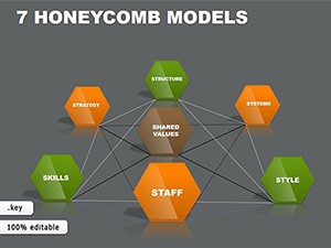
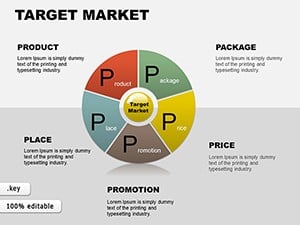
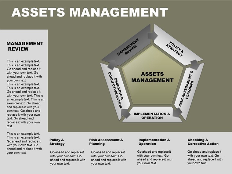
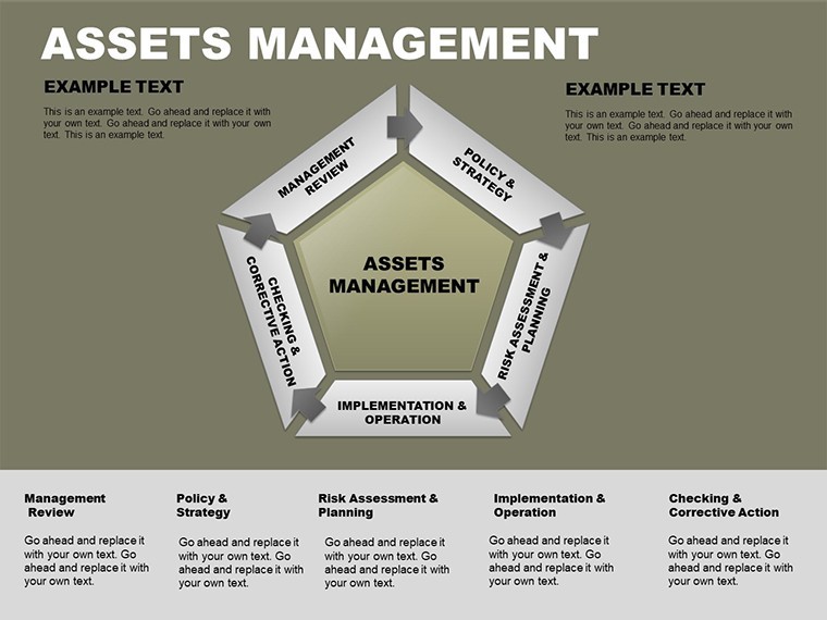
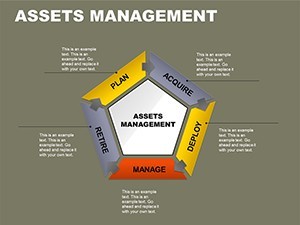
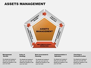
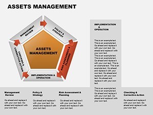
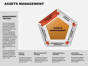
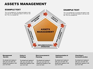
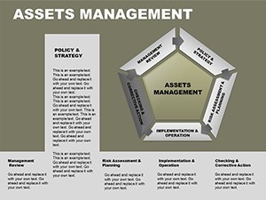
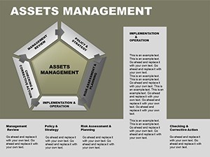
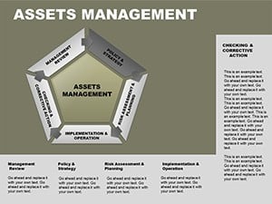
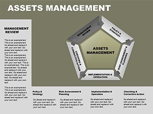
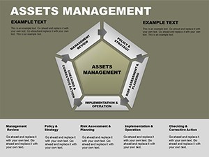
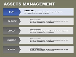
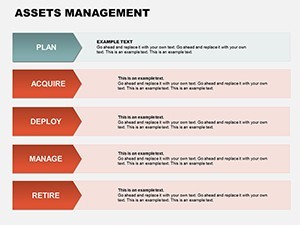
Drawing from principles in financial modeling (think CFA standards), this template offers pie charts for allocation breakdowns, line graphs for performance trajectories, and bar comparisons for risk assessments. Each slide is vector-precise, ensuring scalability without pixelation - crucial for large-screen displays.
Aesthetics meet functionality: Neutral palettes with accent pops highlight key metrics, like ROI spikes or asset diversifications, making dense info digestible. In boardrooms, this professionalism signals expertise, much like how firms such as BlackRock use polished visuals to underscore portfolio health.
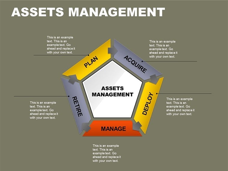
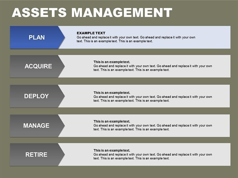
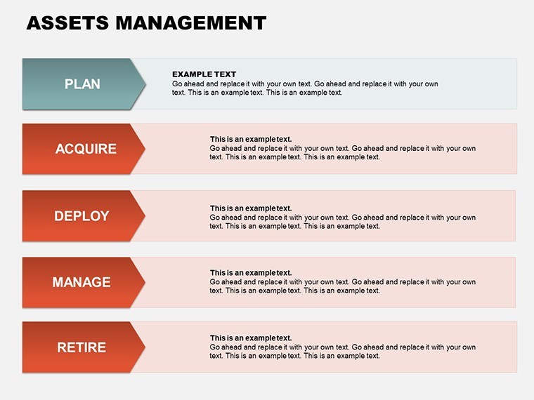
Masterclass: Deploying Asset Charts Effortlessly
- Acquire and Open: Purchase the .key file and launch in Keynote; review the dashboard slide for overview.
- Input Data: Link to Excel imports or manually enter figures into placeholders for auto-updating visuals.
- Customize Views: Adjust scales for bull/bear markets, coloring assets by class (equities, bonds).
- Layer Insights: Add annotations for trends, like "Q3 Volatility Impact."
- Animate for Impact: Sequence reveals to build from aggregates to specifics, engaging viewers.
This workflow trumps generic PowerPoint templates, which falter on Mac rendering - Keynote's native edge preserves fidelity. A boutique advisory used it for client portfolios, enhancing retention by clarifying diversification benefits.
Premier Features for Financial Finesse
- 16 Comprehensive Slides: Covering balance sheets, growth projections, and comparative analyses.
- Dynamic Data Tools: Formulas for real-time calculations, syncing with external sheets.
- Extensive Customization: Tailor icons for asset types, fonts for compliance legibility.
- Responsive Layouts: Adapts to portrait/landscape for iPad pitches or desktop decks.
- Integrated Metrics: Built-in KPIs like Sharpe ratios, with editable benchmarks.
Responsiveness extends to mobile, vital for on-site investor meets - outshining static alternatives that require reformatting.
Strategic Applications: Assets in Focus
Investment managers chart portfolio evolutions, linking returns to market events; akin to Vanguard's transparent reporting, it demystifies volatility for clients.
Entrepreneurs pitch funding: Visualize asset growth post-investment, with scenarios for scaling - boosting pitch success rates per startup accelerators.
Consultants audit corporate assets, using heat maps for underperformers; one firm aligned with IFRS standards, streamlining audits.
Executives forecast budgets, breaking down capital allocations - enhancing board approvals through visual foresight.
Pro Strategies: Optimizing Financial Charts
Infuse authority with citations from Bloomberg data. Use subtle transitions to pace revelations, avoiding overload. Sync with QuickBooks for live pulls, elevating from static to interactive.
Why Invest in This Template?
At $22, it offers ROI through time savings - users report 40% faster prep than DIY designs. Keynote exclusivity ensures premium quality over diluted multi-tool options. Its financial specificity provides depth absent in general charts.
Secure your edge - purchase the Asset Management Keynote Charts Template now with code for instant access. Explore free variants for broader needs.
Chart your financial future: Acquire today and illuminate opportunities.
Frequently Asked Questions
What financial chart types are featured?
Pies for allocations, lines for trends, bars for comparisons, and specialized asset trackers.
Can I integrate live data?
Yes, via Keynote's table links to spreadsheets for automatic updates.
Is it compliant for professional use?
Designs support standard fonts and colors for regulatory clarity.
How does it handle large datasets?
Scalable vectors and filtering options manage extensive info without lag.
What's the return policy?
Instant digital delivery; contact support for satisfaction guarantees.
Compatible with older Keynote?
Optimized for recent versions, with export options for legacy.