Free Keynote Charts Template: Professional Data Visuals


Type: Keynote Charts template
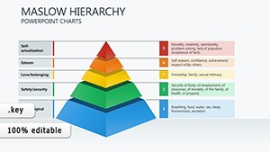
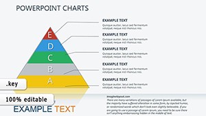
Category: Free Templates, Hierarchy, Tables
Sources Available: .key
Product ID: KC00064
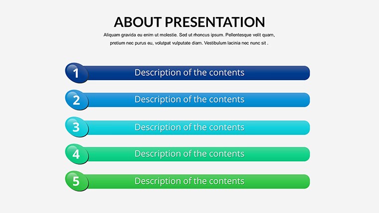
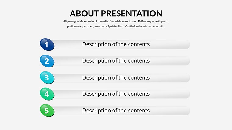
Template incl.: 16 editable slides
Why settle for subpar slides when you can harness the full potential of data visualization for free? The Free Keynote Charts Template is your entry point to polished, audience-captivating presentations without the hefty price tag. Tailored for beginners and pros alike, this collection of 16 editable slides covers essential chart types - bars for comparisons, lines for trends, pies for distributions - empowering you to convey complex ideas with simplicity and style. Whether you're a student prepping for a thesis defense, a marketer outlining campaign results, or an educator simplifying stats, this template democratizes high-quality design.
Compatible natively with Keynote on Mac (and convertible to PowerPoint), it features drag-and-drop ease and high-resolution graphics that scale perfectly on any screen. Inspired by timeless principles from data viz leaders like Alberto Cairo, it prioritizes accuracy and aesthetics, ensuring your charts not only inform but inspire action. Say goodbye to clunky defaults; hello to a toolkit that fits seamlessly into your creative process, turning hours of manual design into minutes of strategic storytelling.
This free gem addresses the universal challenge of making data accessible: In boardrooms, it clarifies financials; in classrooms, it demystifies science; in marketing huddles, it spotlights opportunities. With customizable colors, fonts, and layouts, it's adaptable to any theme, from corporate blues to vibrant educational pops, fostering trust through professional polish.
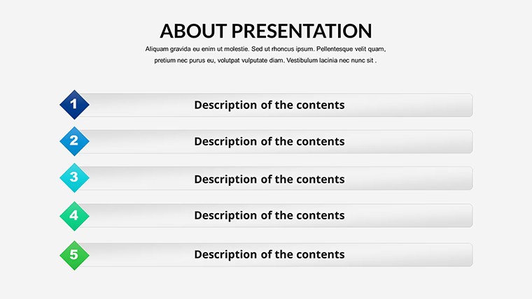
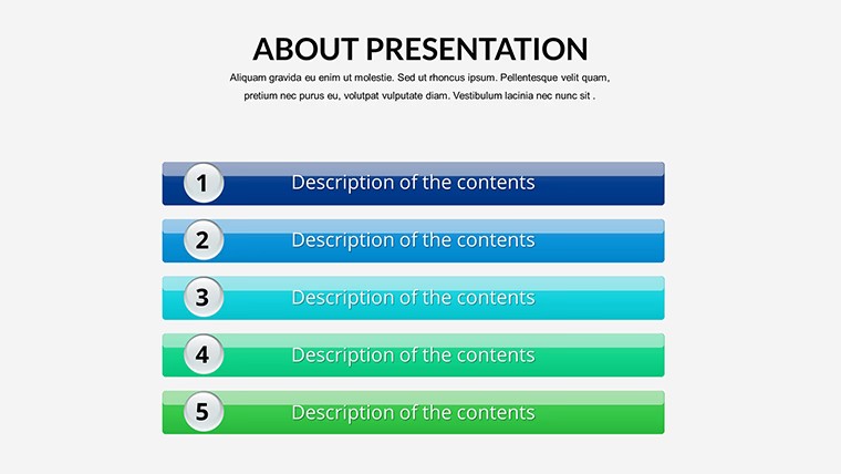
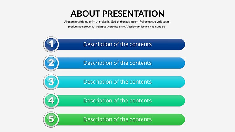
Standout Features of the Free Keynote Charts
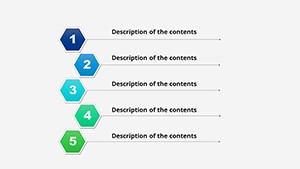
Diving deeper, this template's strength lies in its variety and user-friendliness. Slide 5's multi-bar chart, for example, allows side-by-side category analysis, perfect for budget breakdowns with stacked segments for sub-details.
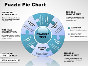
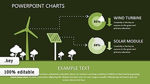
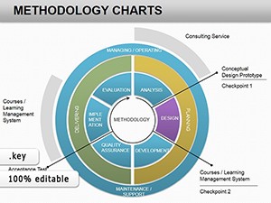
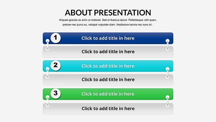
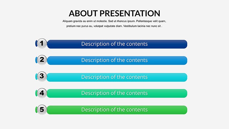
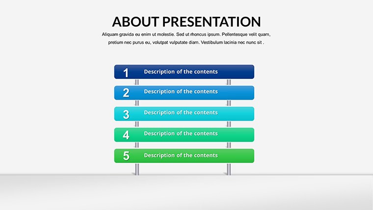
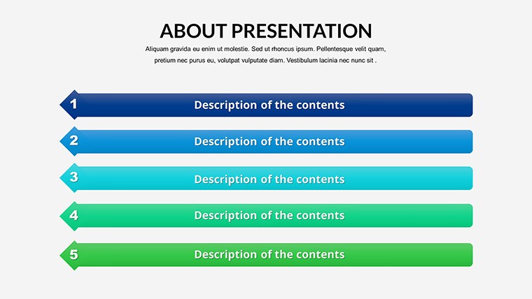
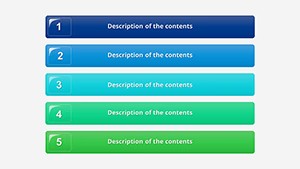
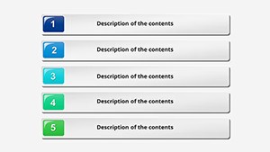
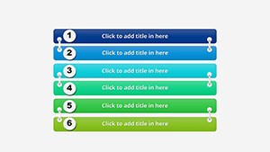
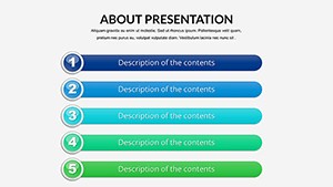
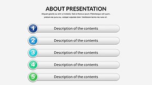
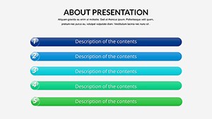
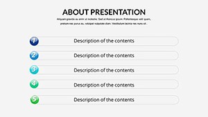
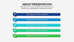
- Diverse Chart Arsenal: From pie slices for quick shares to line graphs for progression tracking, covering all bases without overwhelming options.
- Effortless Customization: Edit data, swap palettes, and rearrange elements via intuitive controls - no coding or advanced skills required.
- High-Quality, Scalable Assets: Vector icons and crisp lines ensure sharpness in prints or projections, maintaining professionalism.
- User-Centric Design: Drag-and-drop functionality speeds up workflows, with built-in guides for alignment and balance.
Having worked with educators and startups on visual strategies, I've witnessed how accessible tools like this level the playing field - one nonprofit used its pie charts to illustrate impact metrics, securing grants that transformed their outreach.
Targeted Applications: Charts That Connect
Put it to work across scenarios. For business pros, leverage Slide 12's line chart for sales forecasting: Input monthly figures, add trendlines for predictions, and annotate peaks to discuss drivers. This mirrors techniques from Harvard Business Review case studies, where clear visuals sway investor confidence.
Students and educators can utilize Slide 9's bar graph for comparative stats, like population growth across regions - customize labels for context, animate bars to build suspense, enhancing interactive learning as supported by edtech research.
Marketers, try Slide 14's pie with exploded segments for audience segmentation: Visualize channel contributions, tweak percentages for accuracy, and integrate logos for branded appeal. Real example: A small agency applied similar charts to refine targeting, increasing engagement by 25%.
- Initial Download and Open: Unzip the .key file in Keynote; preview slides to select your starting point.
- Data Entry and Tweaks: Replace placeholders with your info - charts recalculate instantly; adjust scales for emphasis.
- Final Polish and Share: Add transitions, rehearse, and export for versatility across devices.
Its broad appeal extends to non-profits for impact reports or freelancers for client proposals, always emphasizing ethical data representation to build credibility.
Advantages That Make It Essential
Over free alternatives, this template excels in cohesion and quality - no mismatched styles or low-res issues. It weaves in terms like "bar graphs," "pie chart templates," and "editable Keynote visuals" for natural relevance. Integrate with free tools like Numbers for data prep, creating an efficient ecosystem.
Pro advice: Use white space generously and limit data points to avoid cognitive overload, per Nielsen Norman Group guidelines. Download your Free Keynote Charts Template immediately and craft presentations that resonate. Explore our premium graphs for advanced needs.
Frequently Asked Questions
Q: Is this template truly free?A: Yes, download it at no cost and use commercially or personally without restrictions.
Q: What chart types are included?A: A mix of bar, line, pie, and more, with 16 slides covering various formats.
Q: How compatible is it?A: Optimized for Keynote; exports well to PowerPoint and other formats.
Q: Can I customize everything?A: Fully - colors, data, layouts, and fonts are all editable.
Q: Who is the ideal user?A: Business folks, teachers, students, and marketers seeking quick, pro visuals.
Q: Are there usage instructions?A: Yes, included notes guide editing and best practices.