Stacked Column Volume Charts for Keynote


Visualizing multifaceted data doesn't have to be a chore. Envision stacking layers of information into coherent, volume-rich columns that reveal patterns and comparisons instantly. Our Stacked Column Volume Keynote charts template delivers exactly that with 13 editable slides, crafted for analysts, researchers, and executives who demand precision in their presentations. Falling under graphs and analysis categories, this tool transforms numerical data into volumetric representations, making abstract figures tangible and understandable.
Ideal for scenarios where you need to show parts-to-whole relationships, like budget breakdowns or sales by category, these charts add depth to your narrative. Simply input your numbers, and watch the template handle the rest, ensuring accuracy and visual appeal. Step into a realm where data speaks volumes, empowering you to communicate insights with authority and flair.
Core Features and Customization Options
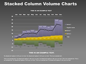
This template shines through its stacked design, where columns build upon each other to represent cumulative values, enhanced by volume effects for a 3D-like perception. The 13 slides provide progressive complexity, from basic stacks to multi-category volumes, all editable for seamless adaptation.
Comprehensive Slide Overview
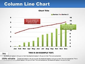
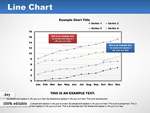
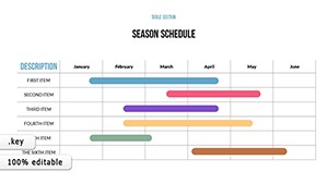
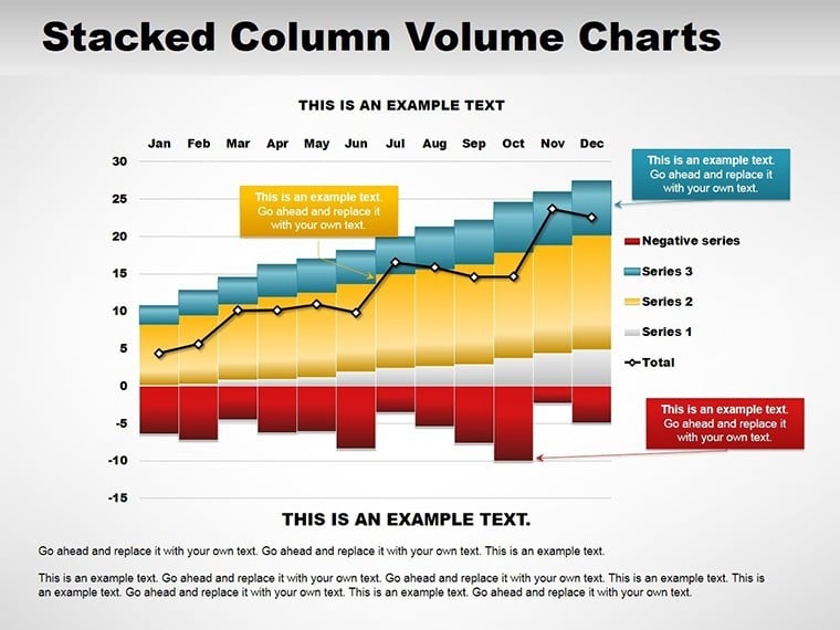
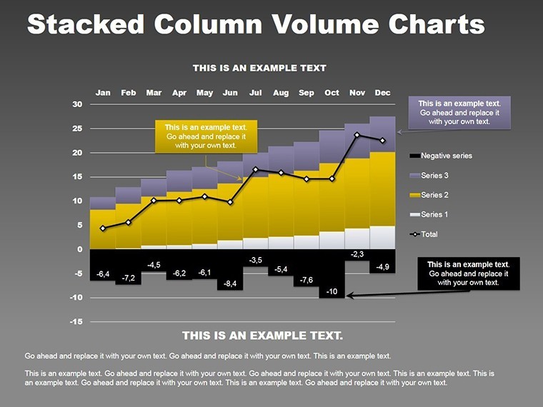
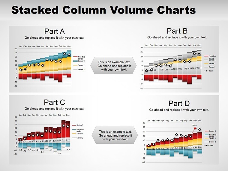
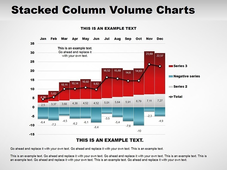
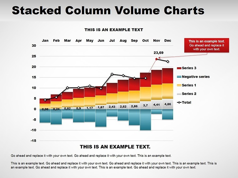
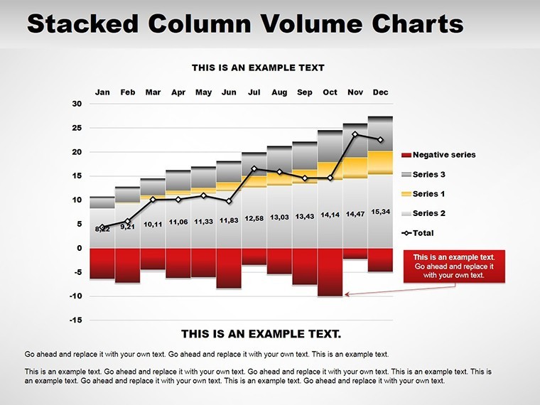
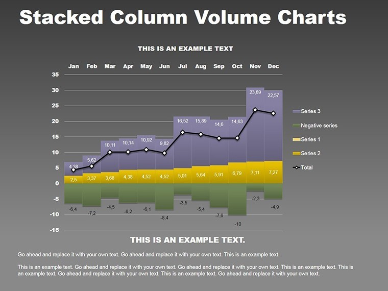
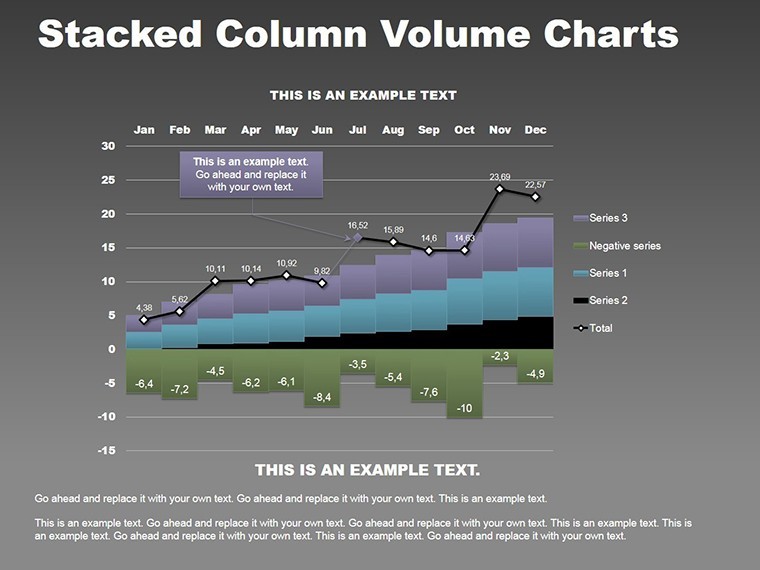
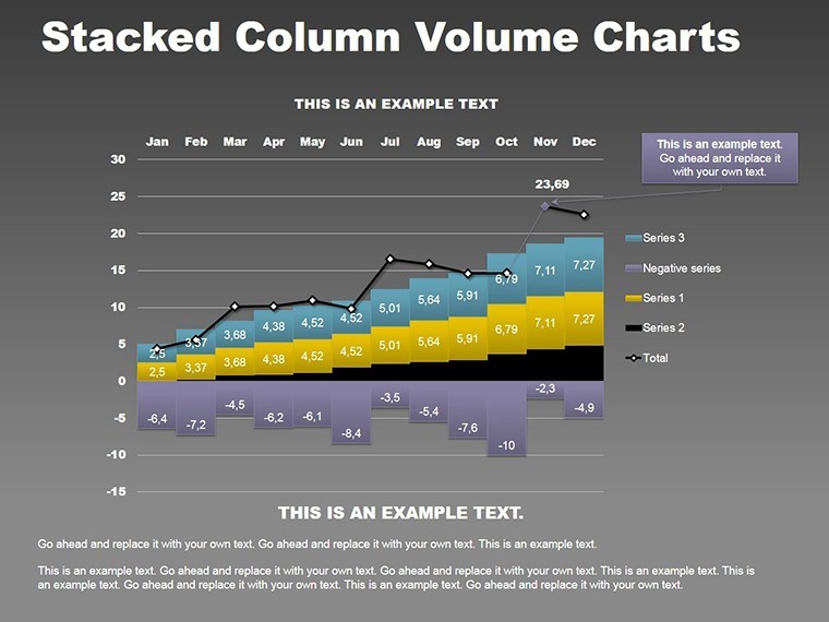
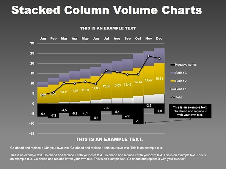
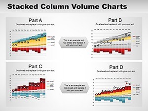
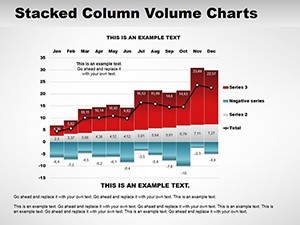
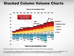
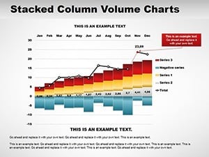
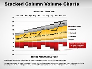
Slide 1 introduces a simple stacked column for baseline comparisons, such as departmental expenses. Slides 2-4 expand to multi-stack volumes, ideal for quarterly performance across products. Slide 5 incorporates percentage stacks, showing proportional contributions without raw numbers.
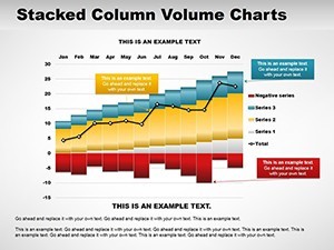
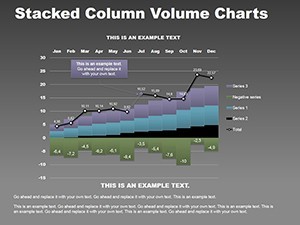
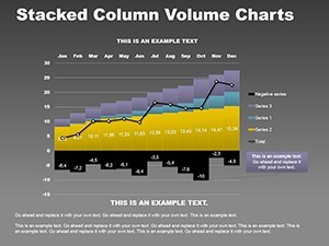
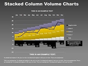
Slides 6-8 delve into advanced volume charts with gradients for depth, perfect for market segmentation analysis. Slide 9 offers a comparative stack across time periods, highlighting growth or declines. The remaining slides, 10-13, include annotated versions with labels and legends, facilitating detailed explanations during presentations.
Built with Keynote's scalability in mind, these slides maintain clarity even when zoomed or projected, adhering to data visualization standards from experts like Edward Tufte.
Applications in Professional Settings
In corporate finance, use stacked columns to depict revenue streams: layers for different sources accumulating to total income, revealing dependencies clearly. Researchers might apply them to survey data, stacking responses by demographics for nuanced insights.
For executives, these charts excel in board meetings, illustrating resource allocation volumes to justify strategies. The value lies in simplification - complex datasets become digestible, fostering informed decisions. Unlike flat bar charts in standard Keynote, the volume aspect adds perceptual weight, making larger segments visually dominant for intuitive understanding.
Tips to Optimize Your Charts
Choose contrasting colors for stacks to differentiate layers easily. Limit categories to four or five to prevent overcrowding. Add data labels strategically for precision without clutter. Test color-blind friendliness using Keynote previews.
This approach mirrors techniques in influential reports from Gartner, enhancing your presentation's credibility and demonstrating analytical expertise.
Workflow Integration and Long-Term Benefits
Link your data sources directly, updating stacks dynamically for real-time relevance. This template supports iterative refinement, ideal for evolving analyses. Professionals note improved audience retention, as volumetric visuals make data memorable and discussions productive.
Elevate your data game - secure this template and stack success in your presentations.
Frequently Asked Questions
How do stacked columns differ from regular bars?
They show cumulative totals with layered segments, ideal for part-to-whole views.
Can I adjust the volume effects?
Yes, tweak gradients and shadows in Keynote for customized depth.
Is this suitable for large datasets?
Absolutely, but focus on key categories to maintain clarity.
What animation options work best?
Build animations that reveal stacks layer by layer for dramatic effect.
How to export for sharing?
Save as PDF or video directly from Keynote.
Does it support data import?
Yes, paste from spreadsheets for quick population.