3D Volume Keynote Charts: Bring Data to Life in Three Dimensions


Type: Keynote Charts template
Category: Cycle, 3D, Illustrations, Pyramids
Sources Available: .key
Product ID: KC00049
Template incl.: 9 editable slides
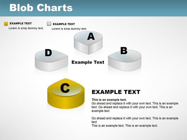
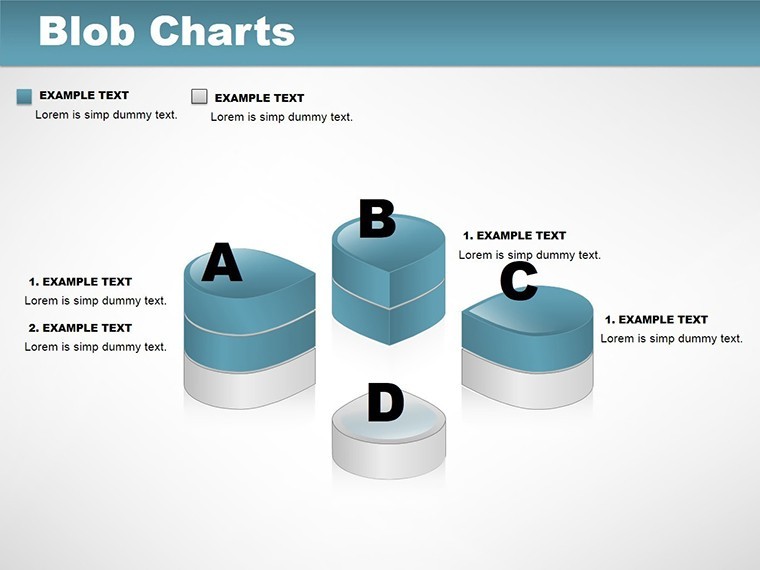
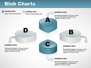
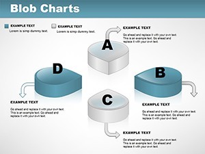
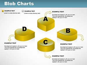
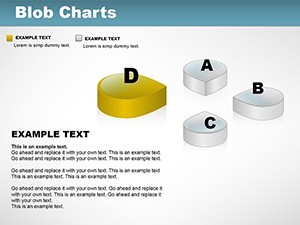
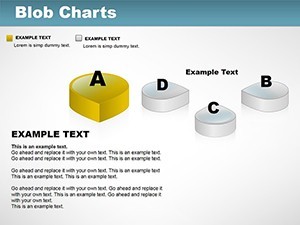
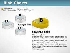
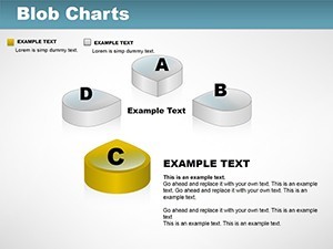
Step away from mundane 2D graphs and embrace the depth of our 3D Volume Keynote Charts template, featuring 9 editable slides that transform flat data into immersive visuals. Crafted for presenters who demand attention, this template is your gateway to captivating audiences with charts that pop off the screen. Whether dissecting sales figures in a quarterly meeting, outlining project timelines for stakeholders, or analyzing market trends for executives, these 3D designs make complex information accessible and engaging. Fully customizable, you can tweak colors, fonts, and datasets with minimal effort, even if design isn't your forte. Drawing from illustration and pyramid structures, it adds layers of meaning - perfect for hierarchical data or volumetric comparisons. Available in .key format for seamless Keynote use, this tool not only elevates your content but also positions you as a visual storyteller. Start creating presentations that leave a lasting impression, turning data points into persuasive narratives.
Exploring the Depth of 3D Visualization
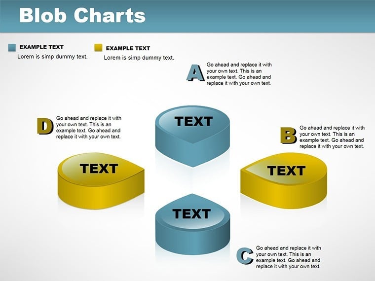
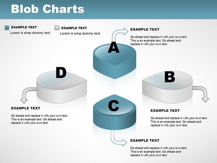
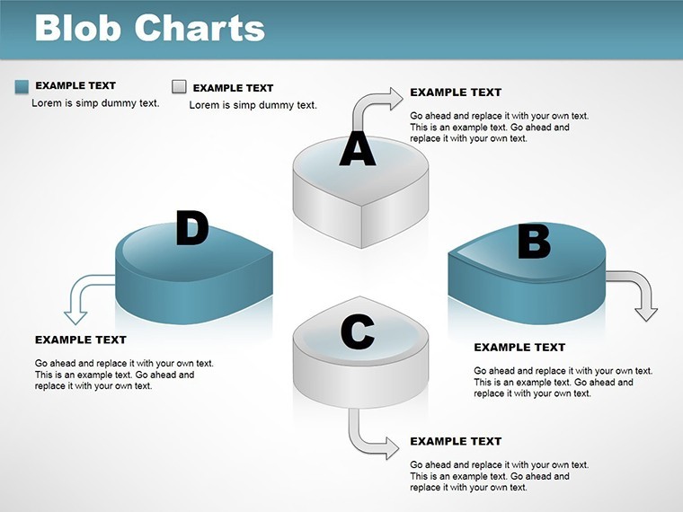
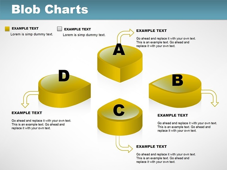
3D charts aren't just eye candy; they're strategic assets that enhance comprehension. By adding volume, this template allows for multi-dimensional analysis, such as showing growth over time with height variations. Inspired by design principles from experts like Edward Tufte, it minimizes chartjunk while maximizing insight. For example, in a financial report, use pyramidal volumes to represent revenue stacks, with cycles indicating seasonal fluctuations. The user-friendly interface democratizes advanced visuals, enabling quick iterations. Categories like illustrations ensure artistic flair, while 3D elements provide realism. Professionals in data-heavy fields will value how it integrates with analytical tools, fostering deeper discussions and better decisions.
Standout Features for Professional Polish
- 9 Dynamic Slides: Varied 3D configurations for diverse data needs.
- Full Customization: Alter dimensions, hues, and labels effortlessly.
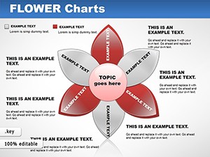
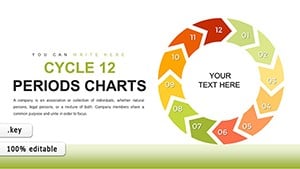
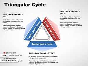
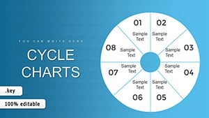
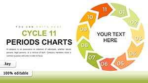
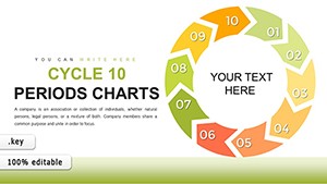
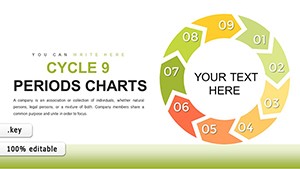
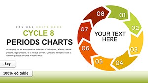
- Pyramid and Cycle Fusion: Ideal for layered or recurring data sets.
- High-Quality Rendering: Maintains clarity in any resolution.
- Illustration Library: Embedded graphics for enhanced storytelling.
- Intuitive Editing: No steep learning curve, just results.
Aligned with usability standards, these features ensure your charts are both beautiful and functional.
Practical Applications Across Industries
In healthcare, visualize patient volume trends with 3D bars, aiding resource allocation. Tech firms might use it for product lifecycle cycles, highlighting innovation phases. A marketing agency case study showed 3D charts boosting client retention by making proposals more vivid. Educators employ them for scientific models, like molecular volumes, sparking student interest. For corporate strategy, map competitive landscapes in 3D, revealing hidden opportunities. This template addresses visualization challenges, like abstract data representation, leading to more informed audiences.
Customizing 3D Charts: A Simple Workflow
- Import into Keynote and select your base slide.
- Input data via editable fields or imports.
- Adjust 3D perspectives using rotation tools.
- Apply custom styles and test visuals.
- Refine with feedback loops for perfection.
This approach integrates with collaboration platforms, enhancing team efficiency.
Choosing 3D for Unmatched Impact
Outshining basic tools, this template's volume adds persuasion power. Trusted by users, it delivers consistent excellence. Adopt it to redefine your presentation prowess.
Frequently Asked Questions
How do I rotate 3D elements?
Use Keynote's object inspector to adjust angles seamlessly.
Suitable for beginners?
Yes, with intuitive controls for all skill levels.
Can I add animations?
Built-in support for 3D transitions.
File compatibility?
.key format for Keynote exclusivity.
Integrate with data apps?
Easily link to Excel or Numbers.