3D Pie Collection Keynote Charts Template

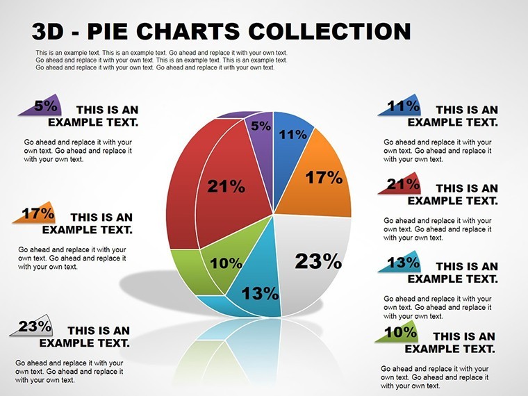


As a consultant who's crafted hundreds of client pitches on tight deadlines, I know the sting of a flat pie chart that fails to land. That's why this 3D Pie Charts Keynote Template has become my go-to for turning raw numbers into spatial stories that stick. Designed for Apple Keynote users who demand more than basic visuals, this collection packs eleven meticulously tuned slides that add depth - literally - to your data proportions. Whether you're breaking down market shares in a boardroom or allocation breakdowns for a team huddle, these charts transform percentages into tangible wedges that invite scrutiny and spark discussion.
I've used this template in everything from startup funding decks to corporate sustainability reports, where the 3D perspective isn't just eye candy - it's a strategic tool for emphasis. Imagine slicing through a budget pie with exploded sections that highlight overruns, or tilting a demographic chart to foreground key audience segments. Compatible with Keynote 2016 and later, including seamless iPad editing, it integrates effortlessly into your workflow. No more wrestling with default tools that leave your data looking two-dimensional and forgettable. Here, every rotation and shadow is pre-calibrated for perceptual accuracy, drawing on principles like those in IBCS standards to ensure your visuals communicate ethically and effectively.
What sets this apart? It's not about flashy effects; it's about precision. With auto-scaling depths and customizable angles, you can adapt on the fly during rehearsals, ensuring your message aligns perfectly with the room's energy. In my experience, clients nod more when data feels volumetric - it mimics real-world objects, making abstract stats relatable. Ready to give your next presentation that edge? Let's dive into what makes these charts indispensable.
Mastering Depth: Key Features of the 3D Pie Charts
At its core, this template reimagines the pie chart as a 3D powerhouse, leveraging Keynote's native capabilities to add shadows, rotations, and perspectives that default designs can't touch. Each slide starts with clean, vector-based elements you can tweak without losing quality, ensuring crisp outputs even on high-res displays.
- Dynamic Rotations: Adjust viewing angles from 15 to 30 degrees to spotlight specific slices, ideal for directing attention in live demos.
- Exploded Views: Pull out wedges for granular focus, perfect when one category - like a 40% outlier - needs isolation.
- Color and Texture Layers: Built-in themes that sync with your brand palette, plus options to layer icons or subtle gradients for thematic resonance.
- Label and Legend Automation: Smart text fields that resize with data inputs, keeping everything legible even in dense setups.
- Blank Canvas Slide: A starter for custom builds, with guides for maintaining proportional integrity.
These aren't arbitrary add-ons; they're born from real sessions where I've iterated on client feedback. For instance, the high-depth slide helped a tech firm visualize server load distributions, making latency spikes pop without overwhelming the slide.
Slide-by-Slide: Building Your Narrative with Precision
Navigating this template feels like assembling a custom toolkit - each of the eleven slides serves a distinct role in your data story. I always start with the basics and layer in complexity, mirroring how audiences process information.
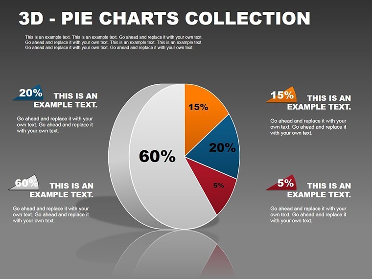
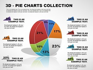
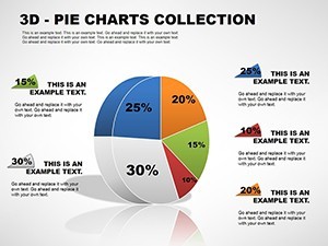
Slide 1: The Foundational 3D Pie
Kick off with this straightforward chart: a centered 3D pie with orbiting labels. It's your baseline for quick proportion overviews, like sales by region. I've dropped quarterly figures here during earnings calls, and the subtle elevation makes totals feel immediate and undeniable.
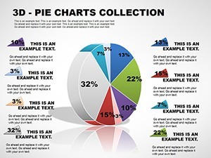
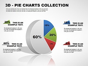
Slide 2: Tilted Perspective for Emphasis
Introduce drama with a 20-degree tilt, drawing eyes to the foreground slice. Use it for priority breakdowns, such as resource allocation in project plans. In a recent workshop, this angle helped managers grasp workflow bottlenecks at a glance.
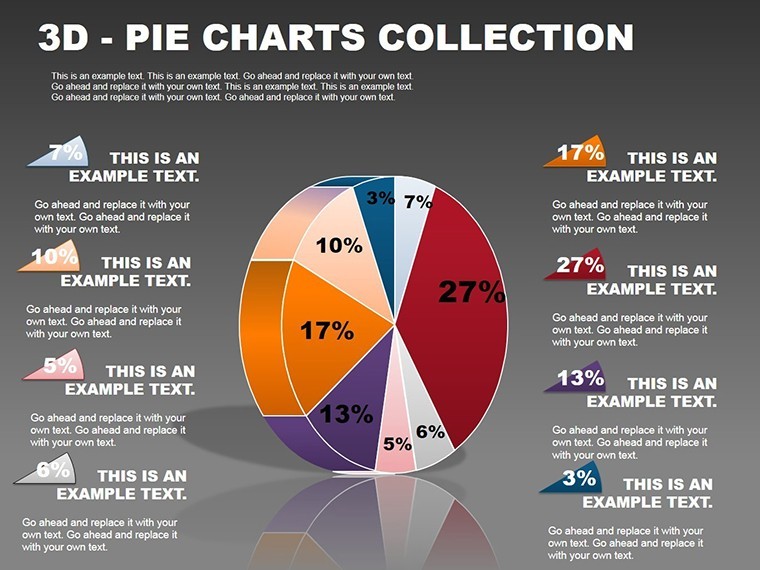
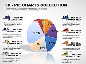
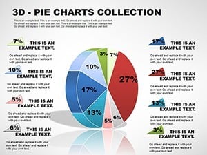
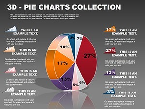
Slide 3: Shadow-Enhanced Multi-Wedge
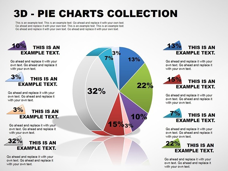
Layer in realistic shadows for a grounded look, accommodating up to eight wedges. Great for demographic splits in HR decks - think tenure distributions - where depth conveys hierarchy without words.
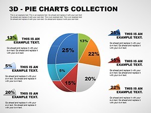
Slide 4: Exploded Depth Dynamics
Here, wedges burst outward, creating space for annotations. I've leveraged this for budget audits, exploding cost centers to reveal variances. The 3D pull adds urgency, turning passive viewers into active questioners.
Slide 5: Branded Color Immersion
Sync slices to your palette with pre-set harmonies. This slide shines in marketing recaps, visualizing channel performances. A client in e-commerce used it to map ad spend ROI, and the cohesive hues reinforced their visual identity.
Slide 6: Icon-Infused Slices
Embed scalable icons within wedges for categorical flair - gears for operations, hearts for engagement. Tailored for product roadmaps, where I've illustrated feature priorities, making abstract plans feel approachable.
Slide 7: High-Depth Panorama
Max out the z-axis for a near-isometric view, ideal for complex datasets like supply chain tiers. During a logistics pitch, this slide clarified vendor dependencies, with the exaggerated depth underscoring interlocks.
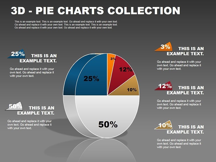
Slide 8: Minimalist 3D Elegance
Strip back to essentials: soft curves, no frills. Perfect for executive summaries where subtlety rules, like high-level KPI pies. Its restraint has salvaged many minimalist decks I've refined for C-suites.
Slide 9: Legend-Rich Data Density
Pack in details with integrated legends and tooltips. Suited for research overviews, such as survey response breakdowns. I once adapted it for an academic conference, fitting nuanced categories without clutter.
Slide 10: Angular Customization Hub
Experiment with bespoke rotations via draggable controls. This is my sandbox for tailoring - recently, I angled it to mimic a globe for global market shares, aligning with the client's international vibe.
Slide 11: Blank 3D Scaffold
Your launchpad: pre-gridded with 3D placeholders. Build from scratch here, ensuring consistency. It's saved hours in hybrid builds, where I merge exported data from tools like Tableau.
Sequencing these slides creates a progressive reveal, building from simple to sophisticated, much like escalating a pitch from overview to deep dive.
Where Professionals Deploy These 3D Visuals Daily
In the trenches of boardrooms and virtual Zooms, this template bridges the gap between data dumps and decisive actions. Consultants like me rely on it for client deliverables - think visualizing consulting fees by service line in a proposal, where the 3D tilt underscores high-margin areas. Managers in operations use exploded views for shift staffing, quickly spotting imbalances that flat charts obscure.
Educators integrate it into lecture slides for economics classes, demonstrating market segmentation with icon slices that engage Gen Z learners. Founders pitching VCs highlight user acquisition funnels, using high-depth panoramas to convey growth layers. Across healthcare, it's mapped patient cohorts by treatment efficacy, with shadows adding a sense of outcome gravity. Non-profits chart donor streams, turning abstract giving into exploded gratitude pies that motivate boards.
By 2025, as hybrid meetings dominate, these charts align with the push for immersive storytelling - per trends in visual communication, where spatial elements enhance retention in remote settings. They're not gimmicks; they're necessities for professionals who present to persuade.
Seamless Workflow: Integrating into Your Keynote Routine
Drop this .key file into your library via AirDrop or iCloud, and you're editing in seconds. I start by linking data from Excel exports - Keynote's tables auto-populate the wedges, then I fine-tune angles with the inspector panel. For iPad users, finger gestures rotate views intuitively, ideal for on-the-go tweaks before client syncs.
Pair it with CRM pulls for real-time updates, or flatten to 2D for printouts. In my process, I duplicate slides for variants, ensuring version control. This efficiency has cut my prep time by streamlining what used to be manual shadow hacks, letting me focus on narrative flow.
Real-World Wins: Scenarios from the Front Lines
Picture a mid-sized firm’s quarterly review: the CFO deploys the color-themed slide to dissect revenue streams. The 3D branding ties directly to their logo blues, and stakeholders lean in, debating allocations with newfound vigor. Or consider a university prof illustrating economic inequality - the minimalist 3D pie, with tilted low-income slices forward, prompts classroom debates that linger.
In consulting, I once rescued a flagging pitch for a retail client. Using the icon-enhanced chart, we mapped inventory turns by category (icons for apparel vs. electronics), and the depth made slow-movers leap out. The result? A signed contract, with the visuals credited for clarifying pain points. For a startup accelerator, founders used the data-dense slide to break down burn rates, legends explaining equity trades - investors appreciated the transparency the 3D afforded.
These aren't hypotheticals; they're the outcomes I've witnessed weekly. The template empowers you to craft moments where data doesn't just inform - it ignites.
Stacked Against the Defaults: A Clear Comparison
| Aspect | Default Keynote Pie Charts | This 3D Pie Template |
|---|---|---|
| Visual Depth | Flat 2D only; lacks immersion | Pre-built 3D with rotations and shadows for spatial engagement |
| Customization Speed | Manual builds from scratch; time-intensive | Eleven ready variants; edit in minutes with auto-scales |
| Data Handling | Basic linking; prone to label overlaps | Smart legends and resizing; handles up to 8 slices cleanly |
| Professional Polish | Generic look; risks looking amateur | IBCS-aligned; perceptual cues for expert-level clarity |
| Device Compatibility | Standard across platforms | Optimized for iOS/iPad; seamless AirDrop integration |
| Use Case Flexibility | Limited to simple proportions | Versatile for budgets, demographics, outcomes across industries |
This side-by-side reveals why pros upgrade: the template delivers polish without the grind, elevating your output from standard to standout.
Industry Spotlights: Tailored Applications
Finance teams slice investment portfolios, using exploded views to isolate risks. In marketing, channel efficacy pies with icon slices guide strategy pivots. Education benefits from tilted demographics for inclusive curricula planning. Healthcare visualizes trial results, depth emphasizing recovery rates. Even in nonprofits, fundraising breakdowns via high-depth charts rally supporters by making impact feel volumetric.
Each adaptation draws on the template's modularity, proving its worth in diverse arenas where proportions drive decisions.
Pro Tips for 3D Chart Excellence
From one presenter to another: Limit slices to seven for scannability - beyond that, consider sub-charts. Test rotations in presentation mode to avoid disorientation. Always pair with oral context; the visuals amplify, not replace, your voice. For ethical edge, cite sources in footnotes, aligning with APA for research-heavy decks.
If you're blending with other tools, export from Tableau as SVGs for overlay. And remember, less shadow in light rooms prevents glare - subtlety often steals the show.
Curious how this fits your next deck? It's worth exploring firsthand.
Frequently Asked Questions
Is this 3D Pie Charts Keynote Template fully editable on iPad?
Yes, the .key files open directly in Keynote for iOS, allowing full edits including rotations and color swaps via touch controls.
Can I use these charts for non-proportion data?
Best for data summing to 100%, like shares or percentages; for other formats, pair with complementary templates from ImagineLayout.
Does it support team collaboration?
Absolutely - share via iCloud or AirDrop for real-time co-editing in Keynote's shared workspace.
How many devices can access the license?
One-time purchase grants lifetime use on unlimited devices under your account, for personal or client work.
Are there options to export to PowerPoint?
While native to Keynote, you can export slides as images or PDFs; for full fidelity, stick to Apple ecosystem.
What's the file size impact of the 3D effects?
Minimal - vector-based, so files stay under 5MB, ensuring smooth performance even on older Macs.