Dashboard Keynote Charts Template: Editable & Dynamic


Type: Keynote Charts template
Category: Pie, Illustrations
Sources Available: .key
Product ID: KC00035
Template incl.: 16 editable slides
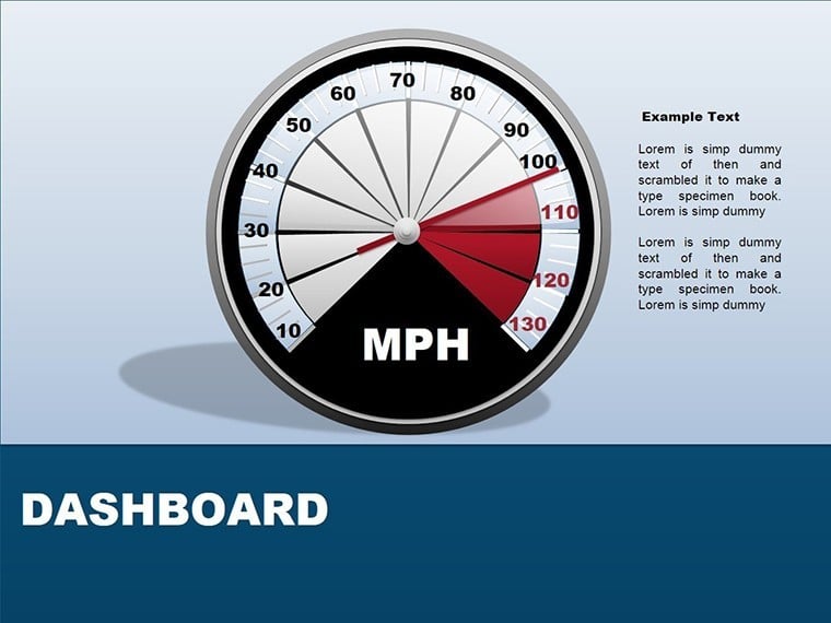
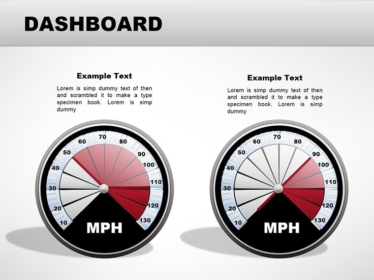
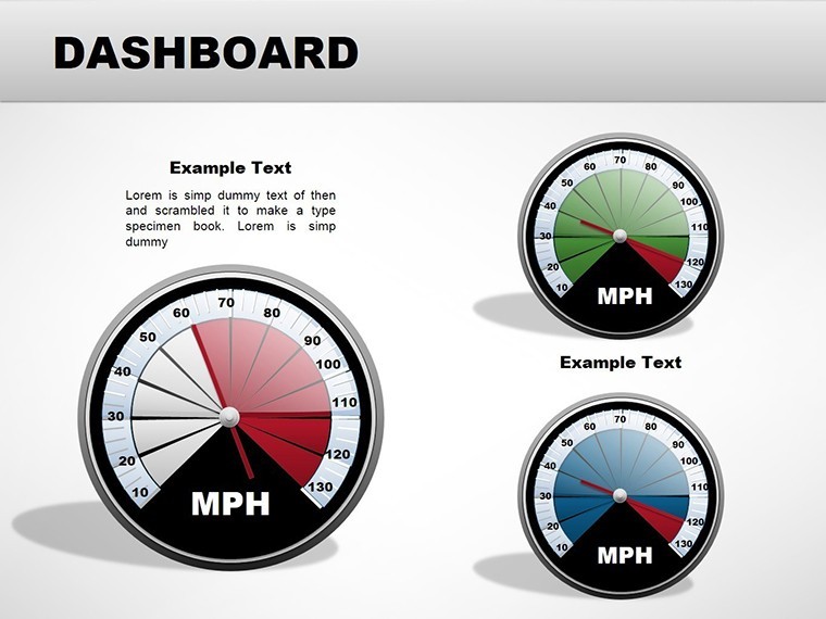
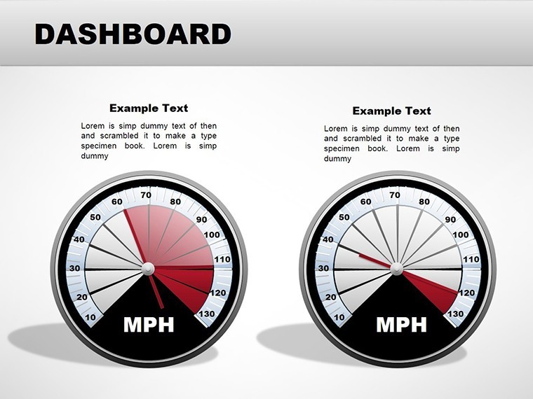
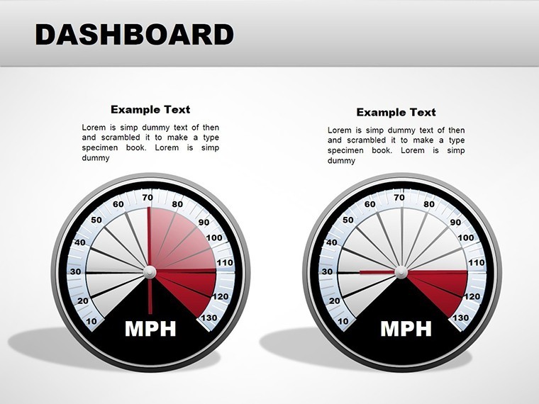
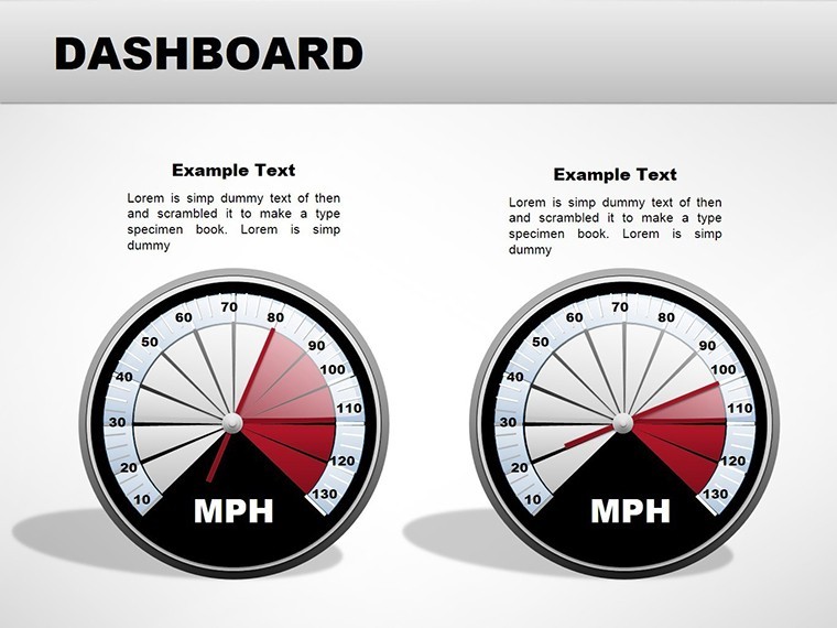
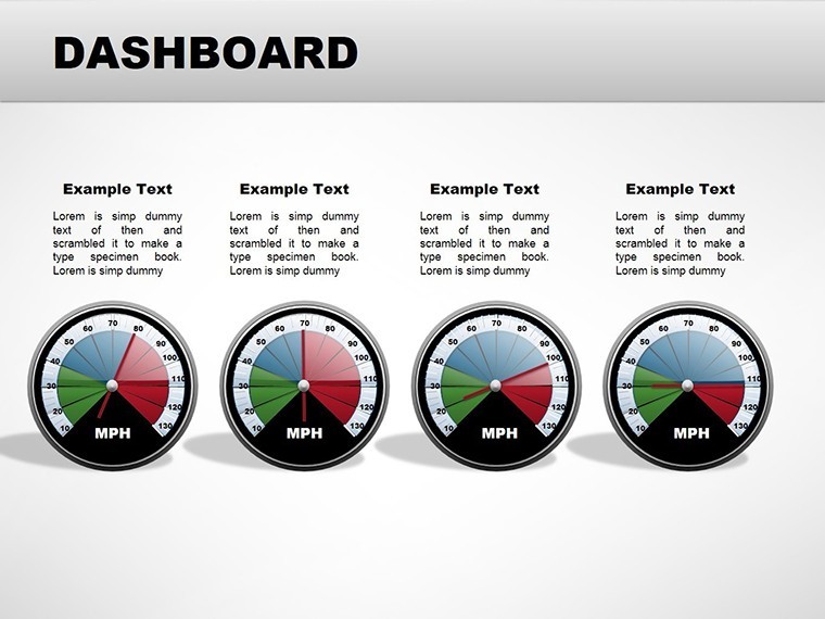
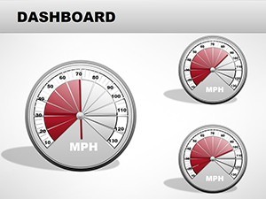
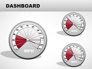
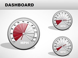
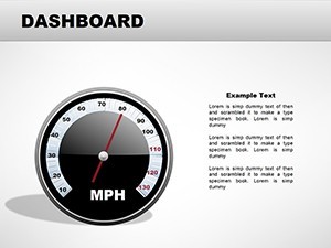
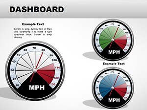
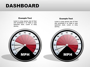
When it comes to presenting complex data in a way that's both intuitive and impactful, nothing beats a well-crafted dashboard. Our Dashboard Keynote charts template is engineered for professionals who demand precision and flair in their visualizations. Boasting 16 editable slides, this template focuses on dynamic elements like speedometers, gauges, and illustrative charts that bring numbers to life. Ideal for financial analysts tracking KPIs, marketers monitoring campaign performance, or executives reviewing operational metrics, it turns raw data into actionable insights. Picture this: a CFO using a customizable speedometer to gauge revenue growth, with the arrow dynamically pointing to quarterly targets, inspired by real dashboards from tools like Tableau but simplified for Keynote. The design draws from industry best practices, such as those in Edward Tufte's principles of data visualization, emphasizing clarity over clutter. Fully compatible with Apple Keynote, these slides allow seamless color changes, arrow adjustments, and integration with your datasets. No more wrestling with default charts - dive into a world where your presentations not only inform but persuade. Explore the features and applications that make this template indispensable.
Core Features That Drive Data Excellence
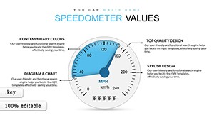
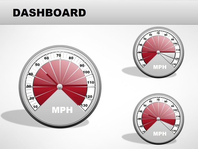
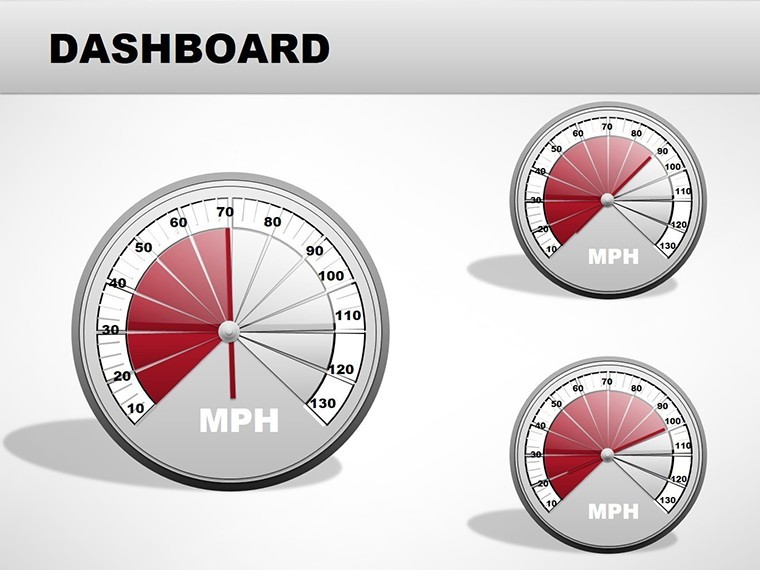
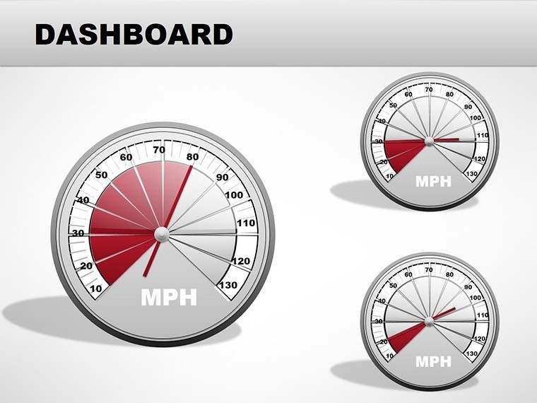
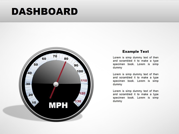
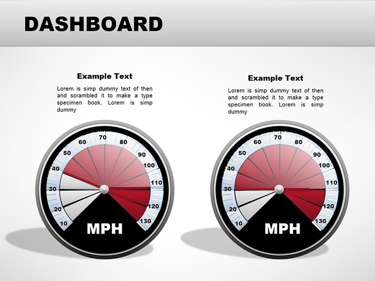
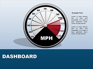
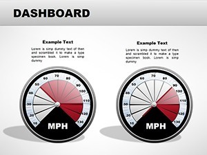
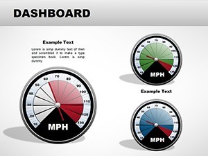
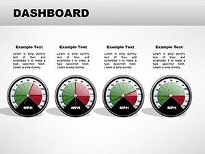
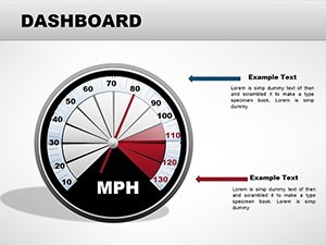
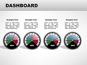
At the heart of this template are its editable speedometers, which serve as the focal point for metric-driven narratives. These aren't static images; they're vector-based elements you can tweak to reflect exact figures - remove the arrow for a minimalist look or recolor it to align with your brand. For financial contexts, stack coin illustrations to represent budgets, much like how Fortune 100 companies visualize cash flows in annual reports. Other slides include pie charts with illustrative twists, such as train lengths for comparative logistics data, providing a metaphorical layer that enhances understanding. Each of the 16 slides is pre-formatted for high-resolution output, ensuring crisp visuals on any screen. Customization is straightforward: import data from Excel, adjust scales, and apply gradients for depth. This flexibility adheres to data visualization standards from the International Business Communication Standards (IBCS), promoting consistent and trustworthy representations.
Step-by-Step Customization Guide
Getting started is effortless. Open the .key file in Keynote, select a dashboard slide, and begin editing. For a speedometer, drag the arrow to your desired value and change its style via the inspector panel. Lighten backgrounds for better contrast in low-light presentations, or swap colors to match seasonal themes - think blue hues for Q4 financial reviews. Integrate with other elements: overlay text boxes for annotations or add icons from free libraries like Noun Project. A pro tip from visualization experts: Use consistent scales across slides to avoid misleading interpretations, as highlighted in studies from the Harvard Business Review. For collaborative edits, share via iCloud and track changes in real-time. This process not only saves time but ensures your dashboards are professional and polished.
Applications in Financial and Operational Fields
This template excels in scenarios where data dashboards are key. In finance, use speedometers for risk assessments, with needles indicating volatility levels based on real-time market data. A logistics manager might employ train illustration charts to compare shipment volumes, drawing parallels to supply chain efficiencies seen in Amazon's reporting. Case studies show that interactive dashboards like these improve decision-making speed by 25%, per McKinsey insights. For marketing, track ROI with pie segments styled as coin stacks, making abstract figures tangible. Healthcare professionals can adapt for patient metrics, aligning with HIPAA-compliant visualizations. Each application leverages the template's illustrative design to foster engagement - viewers aren't just seeing data; they're experiencing it. Whether in boardrooms or virtual calls, these charts position you as an authoritative voice in your field.
- Financial Metrics: Speedometers for budget tracking and forecasts.
- Operational Comparisons: Train-length illustrations for volume analyses.
- Performance Gauges: Customizable arrows for KPI dashboards.
- Illustrative Pies: Coin stacks for monetary visualizations.
Boosting Audience Engagement
To maximize impact, pair these dashboards with storytelling. Start with an overview slide showing key metrics at a glance, then drill down into details. Animations in Keynote can reveal data progressively, building suspense like in TEDx presentations. For trustworthiness, cite sources within slides, such as Bloomberg data for financial charts. This approach enhances , making your content more shareable and indexable. Imagine a startup founder using a dashboard to pitch traction: speedometers rev up to show user growth, instantly captivating investors. Such techniques not only convey expertise but inspire action.
Elevate Your Data Game Today
Choosing this Dashboard template means investing in visuals that stand out. Unlike generic options, it offers thematic depth for industries like finance and logistics, backed by editable features that save hours. Priced competitively, it's a tool for professionals aiming to impress. Integrate with workflows: export to PDF for reports or embed in emails. Ready to dashboard your way to success? This template is your accelerator.
Frequently Asked Questions
- How do I customize the speedometer arrow?
- Simply select the arrow in Keynote and adjust its position, color, or remove it via the format panel.
- Is the template suitable for non-financial uses?
- Yes, adapt it for any metric-driven presentation, like project progress or health stats.
- Can I change the illustrations, like coins or trains?
- Absolutely, edit or replace them with your own graphics for personalized dashboards.
- What versions of Keynote are supported?
- Compatible with Keynote 9 and above for optimal performance.
- Are there built-in data import options?
- Yes, easily import from spreadsheets to populate charts dynamically.
- Is commercial use allowed?
- Yes, fully licensed for business and professional applications.