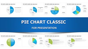
5 Segment Pie Chart Keynote Template - Fully Editable Instant Download


Transform Your Data Visualizations with Professional Pie Charts
Creating effective pie charts in Keynote can be time-consuming if starting from scratch. Our specialized 5 segment pie chart Keynote template solves this by providing pre-designed, high-quality slides ready for your data. With 27 editable slides, you can quickly adapt the designs to communicate proportions effectively in any presentation. This template helps you maintain a consistent professional appearance across all your materials while saving significant time.
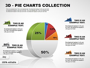
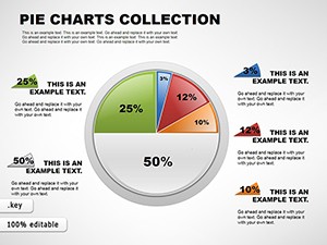
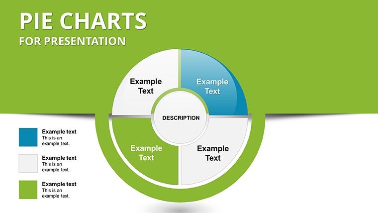
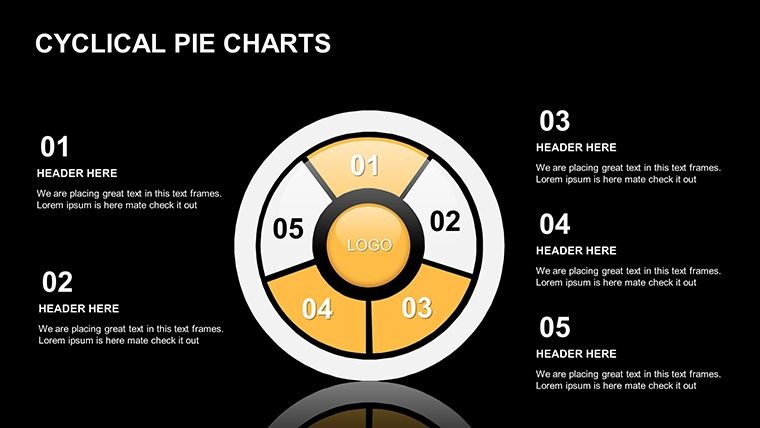
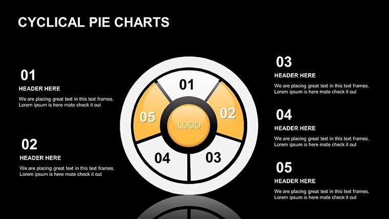
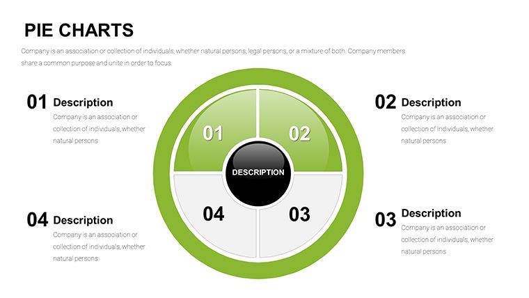
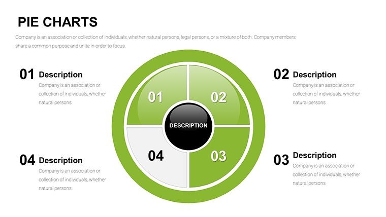
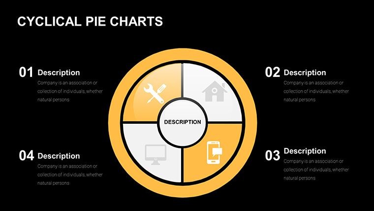
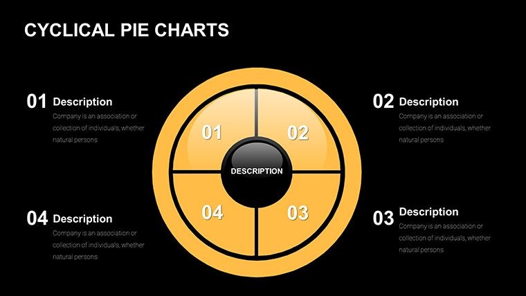
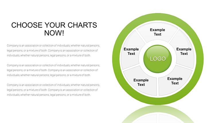
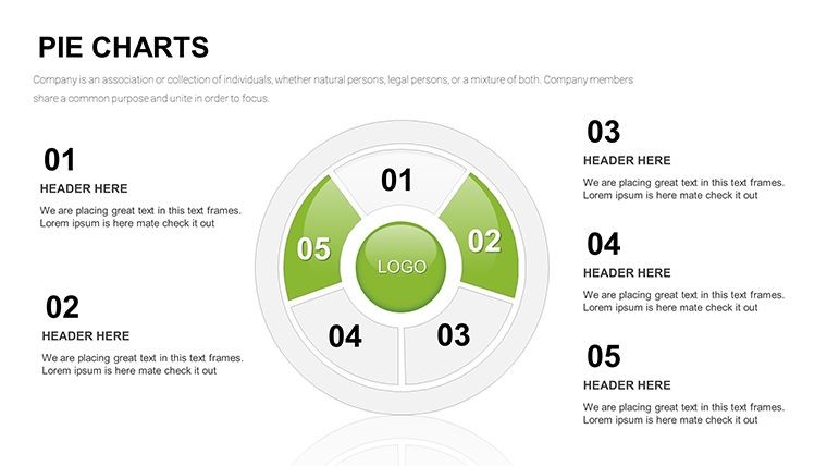
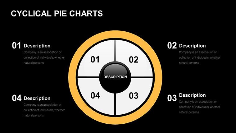
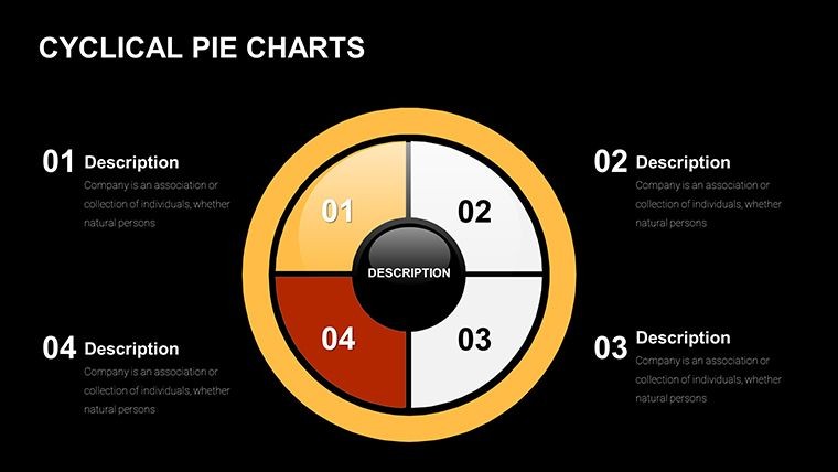
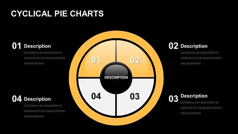
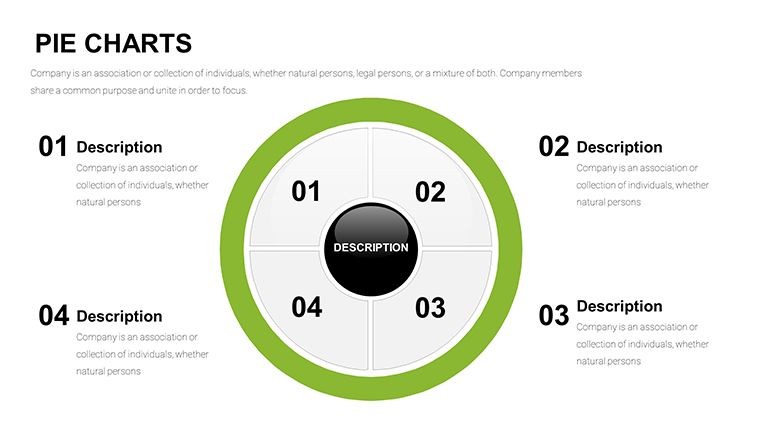
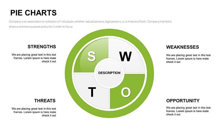
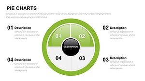
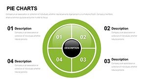
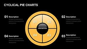
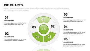
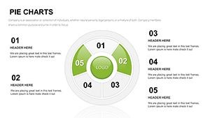
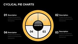
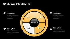
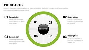
The 5 segment approach prevents information overload while allowing meaningful category breakdowns. It is particularly effective for data sets that naturally divide into five key parts.
Key Features
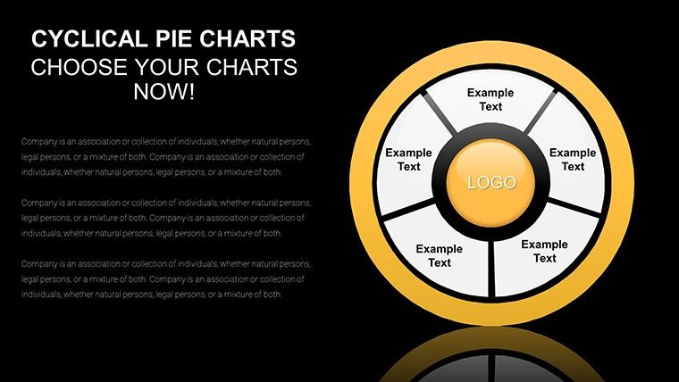
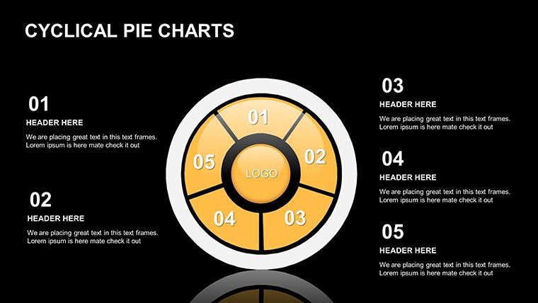
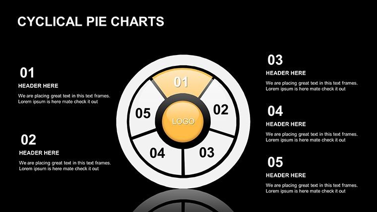
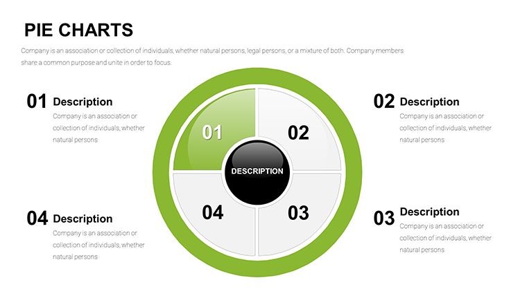
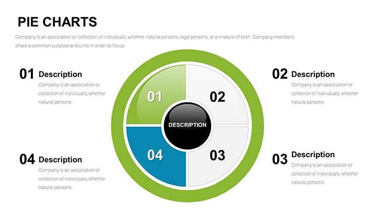
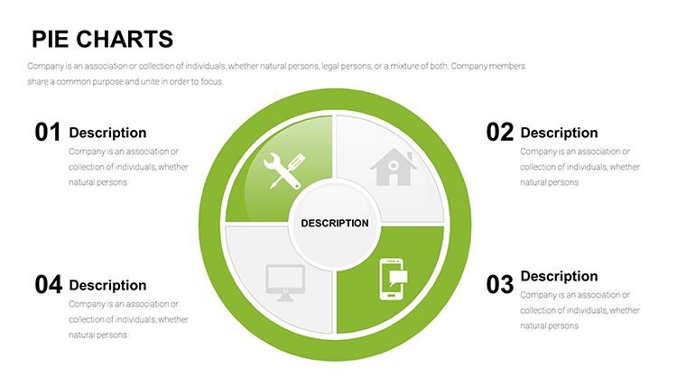
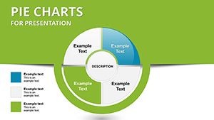
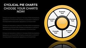
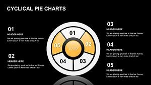
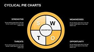
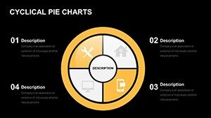
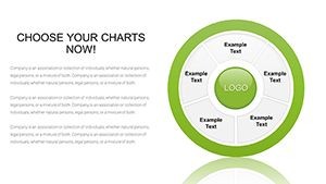
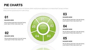
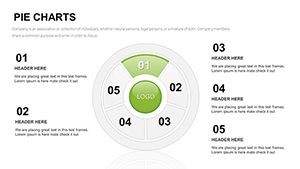
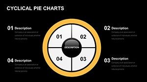
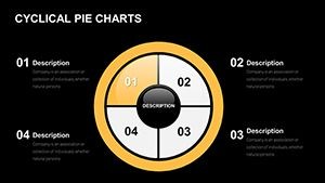
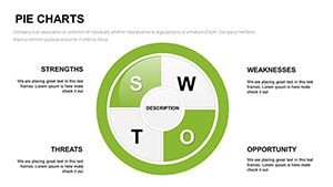
The template is packed with powerful tools for impactful data presentation. It includes core 5-wedge designs along with advanced options like exploded views, nested pies, and donut variants. You get full control over every visual element to ensure perfect alignment with your brand. All elements are scalable and maintain high quality.
- 27 fully editable slides with multiple variations
- Brand palette customization with auto-adjusting labels and legends
- Annotated, comparative, and hybrid infographic layouts
- Compatible with current Keynote versions
Professional Use Cases
Business and Operations
Perfect for illustrating departmental budget distributions, product performance shares, or resource allocations in executive briefings and team meetings. Professionals in internal operations rely on these clear visuals to drive better decisions.
Consulting and Analysis
Consultants can clearly communicate client market share data, investment breakdowns or performance metrics. The clean, professional design builds credibility and supports persuasive recommendations in client reports and strategy sessions.
Marketing and Education
Marketing teams use it for campaign budget allocation and audience segmentation visuals. In education, it helps present survey results or statistical findings in an accessible format for students and colleagues. Nonprofits also benefit from visualizing donation or program allocations.
How to Use the Template
Using this template is straightforward and efficient for any user level. Start by downloading the .key file and opening it in Apple Keynote. Input your data into the chart editor where proportions and labels update automatically. Customize colors, fonts, and styles to match your brand identity using simple tools. The entire process lets you focus on your narrative and insights rather than design work, typically taking only minutes.
Frequently Asked Questions
Is this 5 segment pie chart Keynote template fully editable?
Yes. All elements including the charts, text, colors, and layouts are fully customizable to fit your specific branding and content requirements.
How many slides and variations does it include?
The template includes 27 editable slides featuring core 5-segment pies, exploded views, donut variants, hybrids, and dashboard layouts.
Does the template include animations?
Yes, it features animated wedges that allow for sequential reveals, making your presentations more engaging and narrative-driven.
Is it compatible with the latest Keynote versions?
Yes, the template is fully compatible with current versions of Apple Keynote across Mac, iPad, and iPhone.
What is the process after purchase?
You receive instant access to the .key file download. Open it in Keynote and begin customizing immediately. No additional plugins or software needed.