Gauge Charts Keynote Template - Fully Editable | Instant Download
Type: Keynote Charts template
Category: Pie, Illustrations
Sources Available: .key
Product ID: KC01099
Template incl.: 25 editable slides
Download this 25-slide Gauge Charts Keynote template with fully editable KPI dials, performance indicators, and dashboard visuals. Vector-based, instant .key download, perfect for professional metric presentations in Apple Keynote.
What's Included
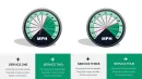
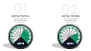
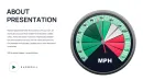
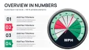
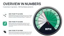
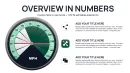
This Professional Gauge Charts Keynote Template delivers exactly 25 fully editable slides in .key format, designed exclusively for Apple Keynote. Every slide contains high-quality vector gauge elements including single-needle dials, multi-needle configurations, color-zoned arcs (green/yellow/red ranges), numeric scales, and placeholder labels. You also receive unlocked layers for text, icons, and background fills, plus basic animation presets for needle movement and arc highlighting. The package supports commercial use with no attribution required and works on Keynote 10+ across macOS, iPad, and iPhone. No hidden costs or additional software needed.
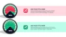
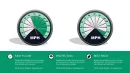
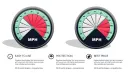
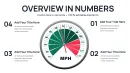
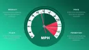
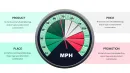
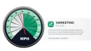
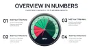
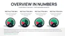
With 25 slides you get immediate variety: isolated single gauges for one KPI, side-by-side pairs for before/after comparisons, and full dashboard layouts combining 4-6 gauges on one slide. This eliminates the need to copy-paste or rebuild charts manually.
Key Features
Fully Editable Gauge Elements
Double-click any needle, arc segment, or scale label to change values instantly. Keynote's inspector panel lets you adjust min/max ranges, color stops, and thickness without breaking the design. All gauges remain perfectly circular and responsive when resized.
Professional Color Schemes
Pre-built palettes include corporate blue-gray for finance, vibrant green-to-red for performance reviews, and high-contrast WCAG-compliant versions for accessibility-focused decks. Change the entire palette in one click via global color overrides.
Comparison Table of Gauge Styles
| Style | Best For | Slides Included |
|---|---|---|
| Single Needle | One KPI focus | 8 |
| Dual Needle | Target vs Actual | 6 |
| Multi-Gauge Dashboard | Balanced scorecard | 7 |
| Icon-Enhanced | Industry-specific | 4 |
Professional Use Cases
Regional Sales Director - Logistics Expansion
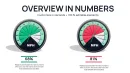
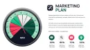
A regional sales director at a European logistics firm used slide 12's four-gauge dashboard to present Southeast Asia market entry to the executive board. The left gauge showed current 68% capacity utilization in red zone; the right gauge projected 92% post-expansion in green. The board approved the $4.2M investment in under 12 minutes because the gauges made the ROI instantly understandable without spreadsheets.
Healthcare Operations Manager
An operations manager tracked patient satisfaction scores across five departments using dual-needle gauges. One needle represented the department average, the second the hospital-wide target. Monthly reviews now take 30% less time and result in faster improvement actions.
How to Customize
1. Download the .key file and open in Keynote.
2. Select any gauge - Inspector - Chart pane - edit data values directly.
3. Change colors via Fill & Line - update all segments at once.
4. Add animation: select needle - Animate - Build In - Spin or Appear.
5. Replace placeholder text and export as PDF for print-ready handouts. The entire process takes under 10 minutes even for first-time users.
Why Choose This Template
Building gauge charts from scratch in Keynote takes 45-90 minutes per slide and rarely looks professional. This template gives you 25 polished variations ready in seconds. You avoid misalignment issues, inconsistent shadows, and poor mobile scaling that plague custom builds. The design decisions - thick needles for visibility, subtle glows for depth, and perfectly centered labels - were chosen specifically to keep audience attention on the numbers, not the design.
FAQ
Is this compatible with older versions of Keynote?
Yes, the template opens cleanly in Keynote 9 and all later versions (including Keynote 10+ on macOS Sonoma/Ventura and iPadOS). We tested on Keynote 6.0 and newer. If you use very old versions, the inspector panel still allows full editing of data and colors. Export to PDF or images works perfectly for sharing with Windows users.
Can I change the gauge colors and ranges?
Absolutely. Every arc segment is individually colored via the Fill panel. You can set custom min/max values, add or remove color stops (e.g., 0-40% red, 40-70% yellow, 70-100% green), and Keynote automatically updates the needle position. Global color themes let you match your company brand in one click across all 25 slides.
What licensing do I get with purchase?
Full commercial license included. Use the template in client presentations, internal reports, investor decks, or sell derived works without royalties or attribution. Unlimited projects, no time limit. The only restriction is not reselling the original .key file as-is on marketplaces.
How does this differ from the Speedometer templates on the site?
This template focuses on classic KPI gauge dials with multiple needles and dense dashboard layouts (25 slides total). The Speedometer collection uses a more automotive needle-sweep aesthetic with 12 slides and stronger motion emphasis. Gauge charts here provide better side-by-side comparison capabilities while Speedometers excel at single-metric dramatic reveals.
Do you offer refunds?
Yes. If the template does not meet your needs within 14 days of purchase, contact support with your order number for a full refund. We stand behind every file and want you to be 100% satisfied with your purchase.