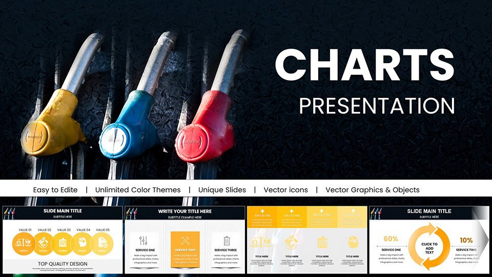
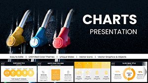
Gas Prices Keynote Charts: Visualize Fuel Trends


Type: Keynote Charts template
Category: Graphs, Illustrations
Sources Available: .key
Product ID: KC01000
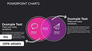
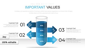
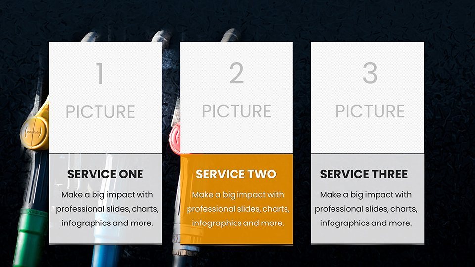
Template incl.: 59 editable slides
Imagine standing in front of a room full of stakeholders, your screen lighting up with clear, compelling visuals that turn raw fuel data into a narrative of opportunity and caution. That's the power of the Gas Prices Keynote Charts template - a meticulously crafted set of 59 editable slides designed specifically for professionals who need to make sense of volatile energy markets. Whether you're an analyst poring over quarterly fluctuations or a marketer crafting a campaign around consumer spending shifts, this template transforms complex datasets into digestible stories that resonate.
At its core, this Keynote template shines in its ability to handle everything from historical price timelines to predictive modeling, all while maintaining a sleek, professional aesthetic compatible with Keynote 2016 and later versions. No more wrestling with clunky defaults; instead, dive into pre-built charts that adapt seamlessly to your data inputs. Picture a line graph tracing gasoline costs over the past decade, overlaid with economic indicators - suddenly, your audience sees the big picture without the overwhelm. And for those in education, it's a gateway to interactive lessons on supply chain dynamics, where students can tweak variables in real-time to explore "what-if" scenarios.
What sets this apart? It's not just about pretty pictures; it's about precision. Each slide is built with vector-based elements, ensuring scalability without pixelation, and includes thematic icons like pump stations and global maps to ground your data in context. Tailored for the energy sector's fast pace, it helps you spotlight correlations - say, between crude oil spikes and retail pricing - that might otherwise get lost in spreadsheets. Ready to fuel your next presentation? Let's explore how this template can accelerate your workflow.
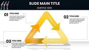
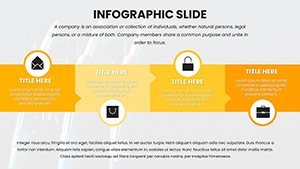
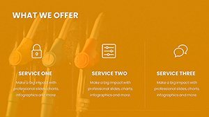
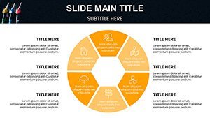
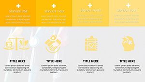
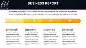
Core Features That Drive Data Home
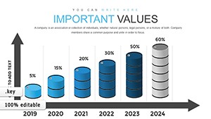
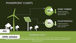
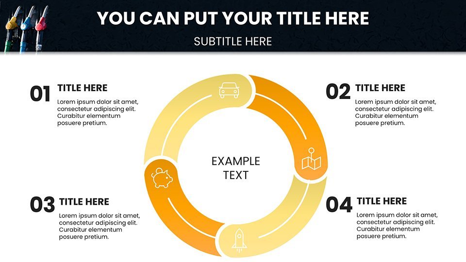
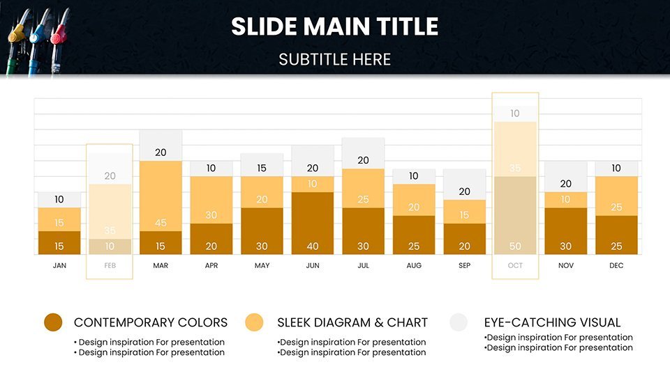
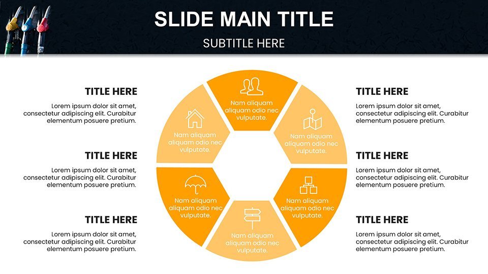
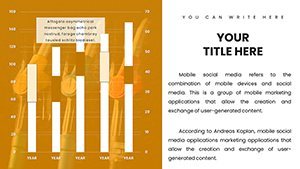
The beauty of these Gas Prices Keynote Charts lies in their thoughtful design, where every element serves a purpose. Start with the dashboard slide: a customizable overview that pulls in key metrics like average U.S. pump prices, regional variances, and year-over-year changes. Drag and drop your CSV data, and watch as pie charts redistribute effortlessly, color-coded for quick scanning - greens for stability, reds for alerts.
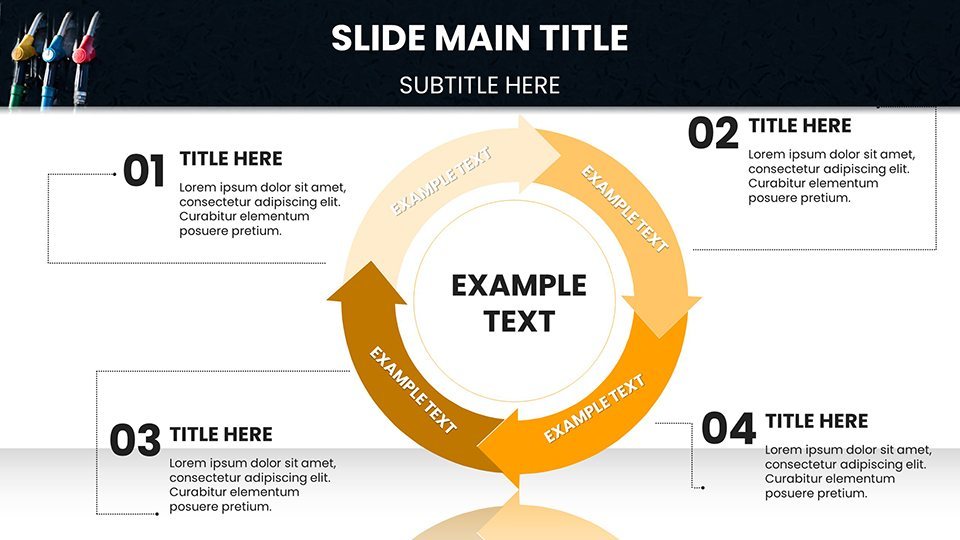
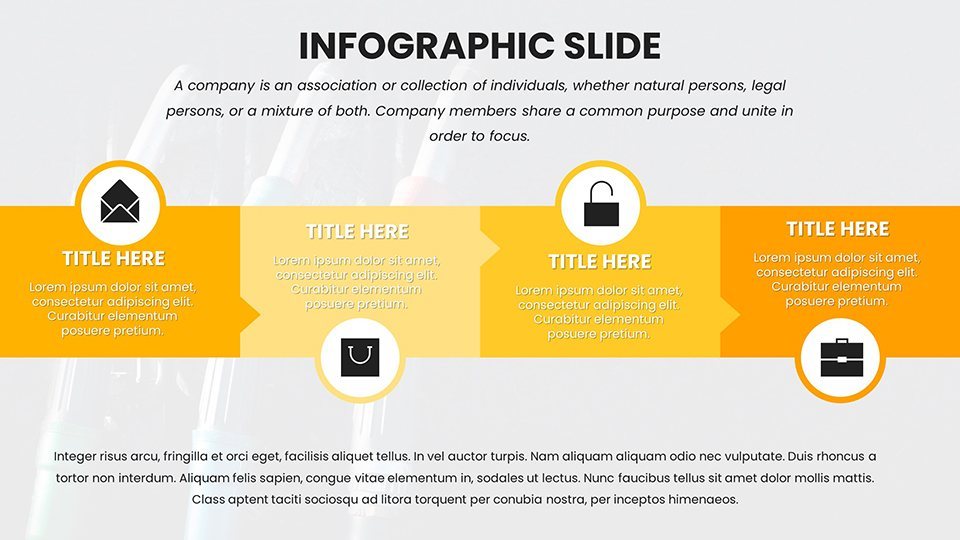
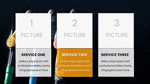
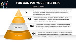
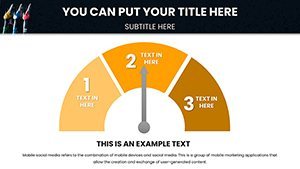
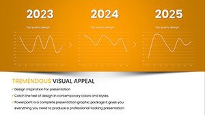
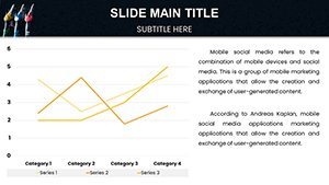
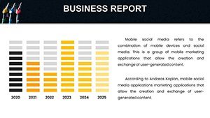
Dive deeper into specialized visuals: bar graphs for seasonal trends, where summer driving seasons pop against winter lulls, complete with animated transitions that reveal layers of insight slide by slide. Or consider the scatter plot for outlier detection - perfect for highlighting anomalies like post-hurricane surges, with built-in annotations that let you add notes without cluttering the view. All 59 slides are fully editable, from font tweaks in Helvetica Neue to recoloring schemes that match your brand palette, ensuring cohesion across your deck.
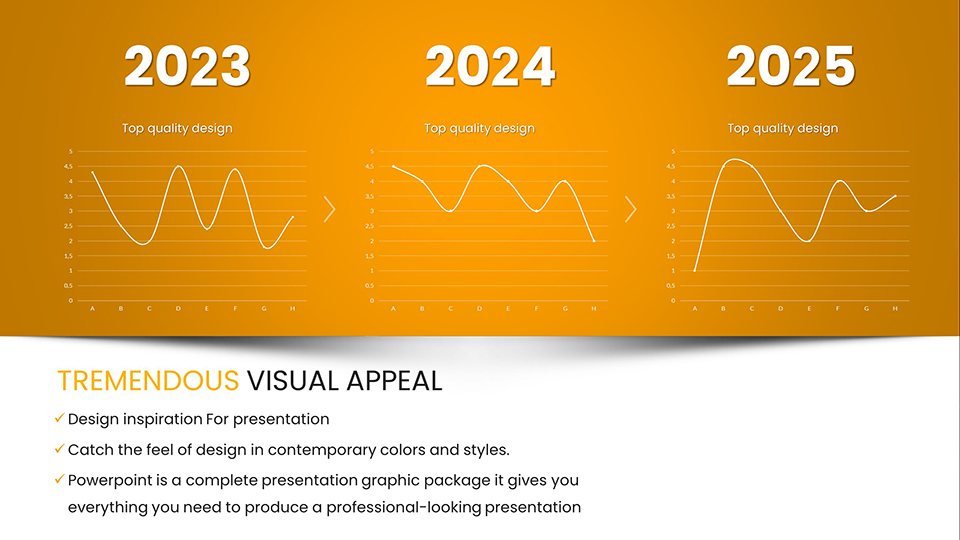
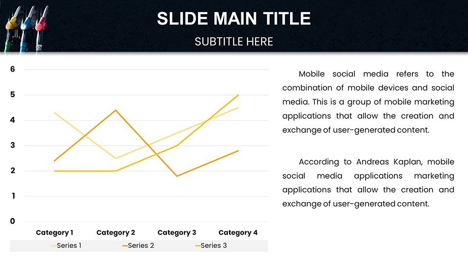
- Trend Line Mastery: Smooth curves for historical analysis, with gridlines and legends that adjust automatically to your scale.
- Forecast Projections: Area charts that layer optimistic and conservative scenarios, ideal for boardroom debates.
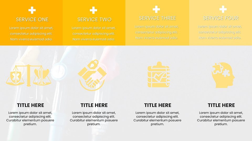
- Comparative Tables: Side-by-side grids for global vs. domestic pricing, with conditional formatting for at-a-glance differences.
Integration is a breeze too - import from Excel or Google Sheets directly into Keynote, preserving formulas for live updates during your talk. This isn't generic graphing; it's energy-focused, drawing from real-world reporting styles seen in outlets like the EIA, where clarity trumps complexity every time.
Real-World Applications: From Analysis to Advocacy
Empowering Analysts in High-Stakes Reports
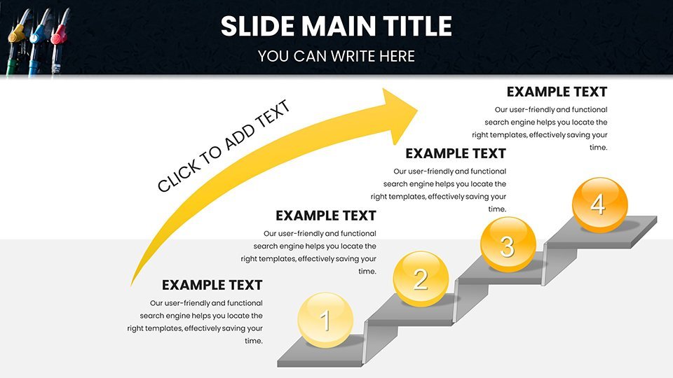
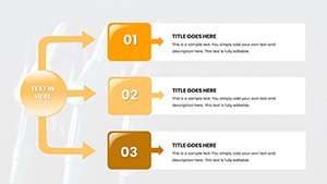
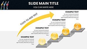
For the data cruncher in a consulting firm, this template is a lifeline. Take a recent project simulating fuel cost impacts on logistics: Load your variables into the multi-series line chart on slide 23, and voila - interactive toggles let you switch between diesel and unleaded views. Step one: Paste your time-series data. Step two: Fine-tune axis labels for precision (e.g., dollars per gallon). Step three: Animate the reveal to build suspense, ending with a callout box for key takeaways. The result? A report that not only informs but persuades, much like those used in federal energy briefings.
Marketers Crafting Compelling Consumer Narratives
Marketing teams, think beyond the numbers - use these charts to weave emotional threads. Slide 41's infographic-style radial chart breaks down price elasticity, showing how a 10-cent hike sways buyer loyalty. Customize with your brand's earthy tones, add subtle icons of road trips, and pair it with bullet-point drivers like inflation or geopolitics. In one campaign refresh, a team layered competitor pricing data here, turning a dry comparison into a visual battle map that boosted engagement in stakeholder reviews.
- Gather audience-specific data: Survey responses on fuel budgets.
- Map to doughnut charts for share-of-wallet visuals.
- Export as PDF for handouts, retaining hyperlinks to sources.
Educators Sparking Classroom Discussions
In academia, engagement is key. Leverage slide 15's heatmap for geographic price variances - color-code U.S. states to illustrate urban-rural divides, then invite students to edit live. It's hands-on learning: Adjust for electric vehicle adoption rates, and discuss policy ripple effects. Compatible with group projects, this fosters critical thinking without the setup hassle of building from scratch.
Compared to Keynote's native tools, this template saves hours by pre-loading layouts, eliminating the trial-and-error of alignment and spacing. It's podium-ready, with widescreen and standard formats baked in, ensuring your visuals scale across devices.
Customization Tips to Make It Yours
Unlock the full potential with these pro moves. First, layer in your logo on the master slide for instant branding - drag it to the footer, set opacity to 20% for subtlety. Next, experiment with the built-in theme switcher: Swap to a dark mode for late-night editing or evening presentations, where midnight blues highlight upward trends without glare. For data-heavy slides, use the smart guides to snap elements perfectly, avoiding the floaty frustrations of ad-hoc designs.
Pro tip: Embed hyperlinks in chart legends linking to appendices - clickable during rehearsals to verify facts on the fly. And for that extra polish, animate data points sequentially; a gentle fade-in mimics the gradual build of market pressures, keeping eyes glued. These touches, drawn from presentation best practices in high-stakes fields like energy trading, elevate your delivery from informative to unforgettable.
Whether forecasting for investors or teaching supply economics, this template equips you to navigate data deluges with confidence. It's more than slides; it's your edge in a fuel-fickle world.
Ready to Chart Your Course?
Don't let another presentation fall flat on flat data. Download the Gas Prices Keynote Charts template now and turn volatility into victory - your audience will thank you with nods of understanding and applause.
Frequently Asked Questions
What software do I need to use this template?
This template is optimized for Apple Keynote version 2016 or later, ensuring smooth performance on macOS and iOS devices.
How editable are the charts?
All 59 slides are fully editable, allowing changes to data, colors, fonts, and layouts without losing design integrity.
Can I use this for non-energy topics?
Absolutely - adapt the charts for any trend-based data, like retail pricing or stock fluctuations, thanks to its versatile structure.
Does it support animations?
Yes, built-in transitions and animations are included, customizable to match your presentation pace.
Is there customer support?
Access quick-start guides and email support for any customization queries post-download.