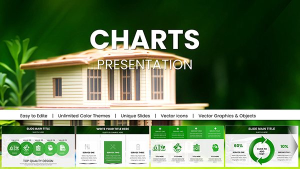
Real Estate Market Keynote Charts: Transform Data into Deals


Type: Keynote Charts template
Category: Graphs, Illustrations
Sources Available: .key
Product ID: KC00988
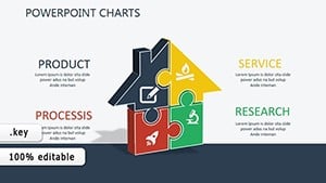
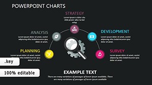
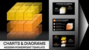
Template incl.: 59 editable slides
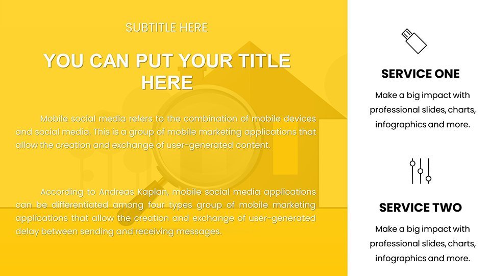
In the fast-paced world of real estate, where market fluctuations can make or break a deal, having the right tools to present data compellingly is essential. Imagine stepping into a client meeting armed with visually stunning charts that not only display property valuations and market trends but also tell a story that resonates. Our Real Estate Market Keynote Charts template is designed precisely for that purpose. With 59 fully editable slides, this template empowers real estate agents, brokers, investors, and analysts to create presentations that stand out in a competitive landscape.
Whether you're showcasing quarterly market reports, comparing neighborhood property values, or forecasting investment opportunities, these charts turn complex data into digestible, actionable insights. Crafted with input from industry experts familiar with National Association of Realtors (NAR) guidelines, this template ensures your visuals are not just informative but also professionally aligned. Say goodbye to bland spreadsheets and hello to dynamic infographics that engage your audience, fostering trust and prompting quicker decisions. It's more than a template - it's your secret weapon for closing deals faster.
Unlocking the Power of Visual Storytelling in Real Estate
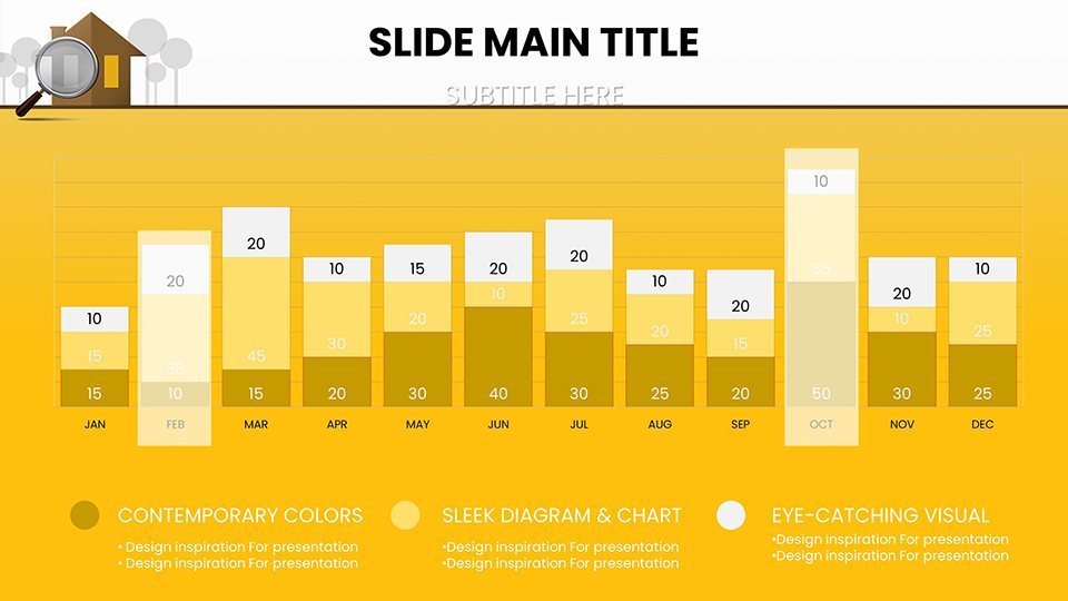
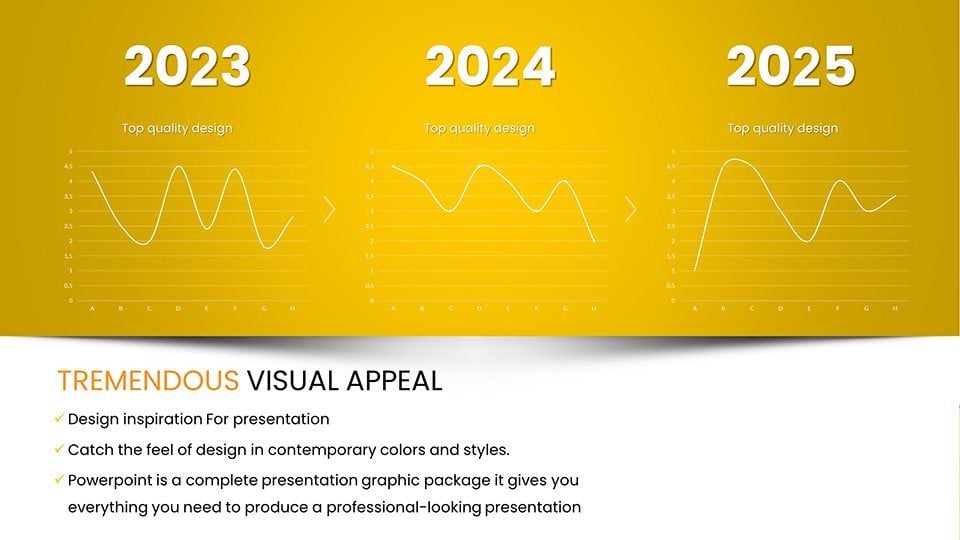
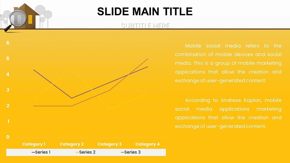
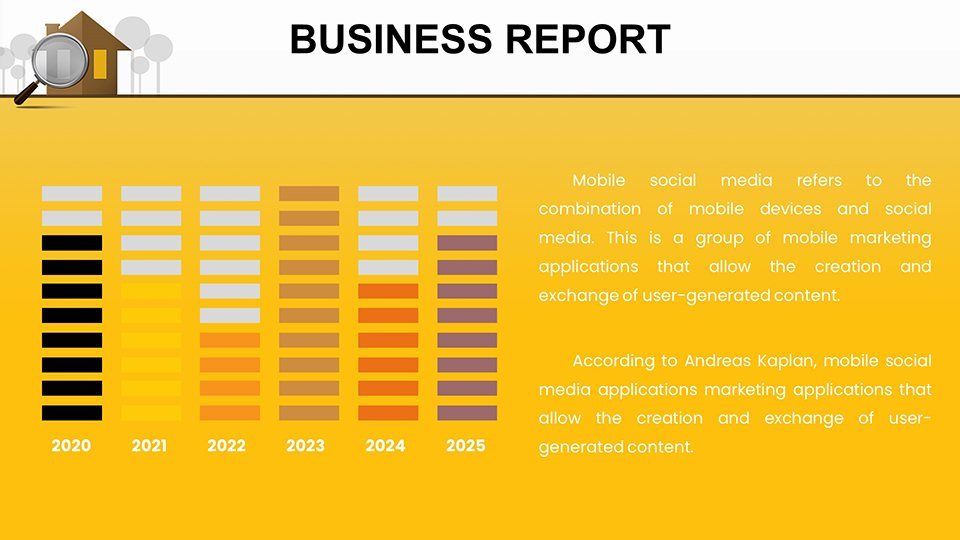
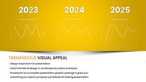
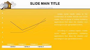
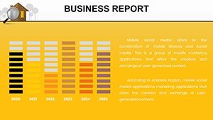
Visuals are king in real estate presentations. Studies from design pros like those at Canva and Visme highlight that audiences retain 65% more information when it's paired with relevant images compared to text alone. Our template leverages this by offering a suite of charts specifically themed around real estate metrics. From pie charts breaking down market share by property type to line graphs tracking price trends over time, each slide is pre-designed with real estate in mind.
Customization is at the heart of this template. Easily adjust colors to match your brokerage's branding, tweak fonts for readability, or input your latest MLS data directly into the charts. This flexibility means you can adapt slides for various scenarios - be it a buyer seminar on emerging neighborhoods or an investor pitch on rental yield projections. For instance, one slide features a heatmap of property hotspots, allowing you to highlight high-demand areas like urban revitalization zones, drawing from real-world examples such as the booming markets in Austin or Denver.
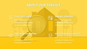
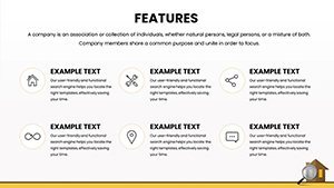
Key Features That Set This Template Apart
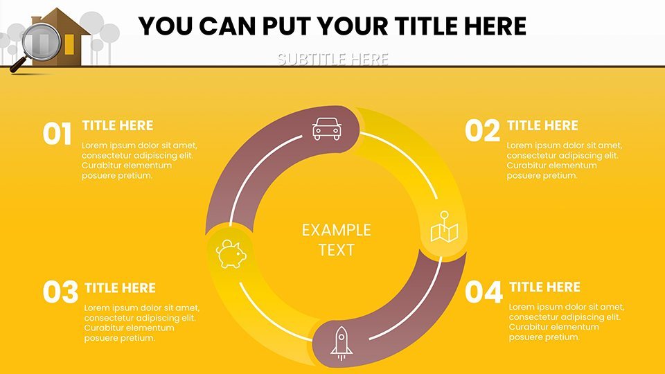
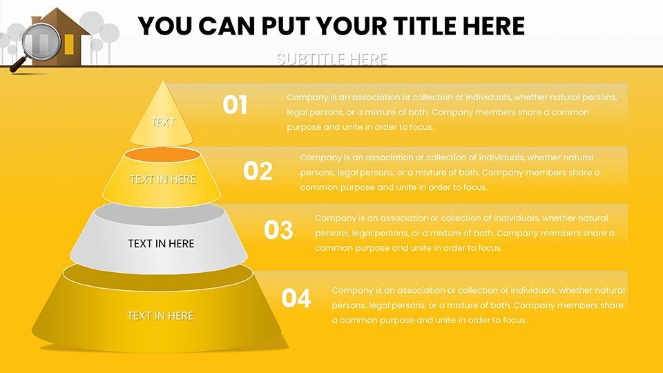
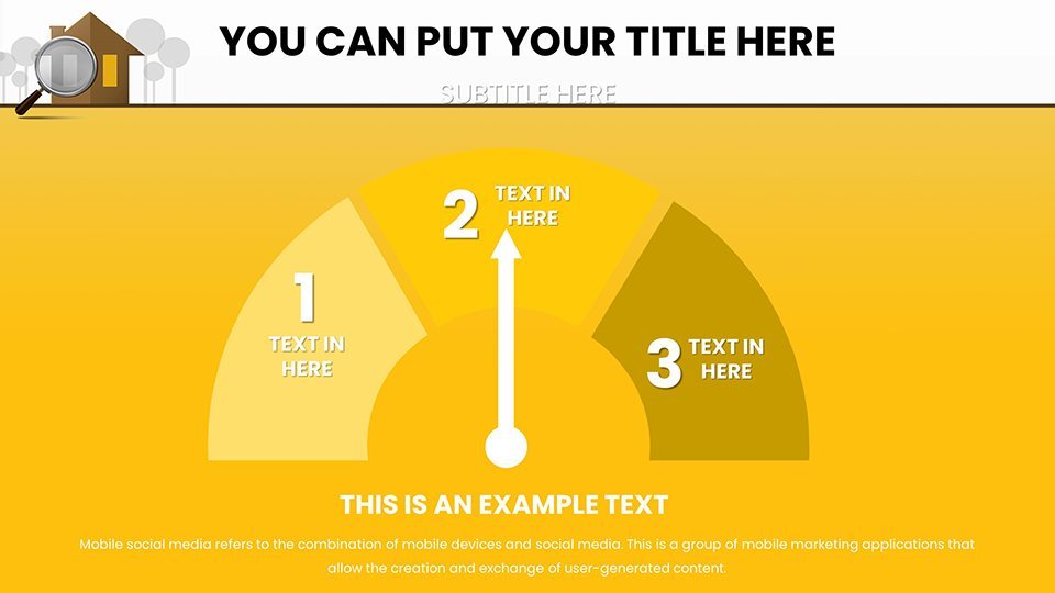
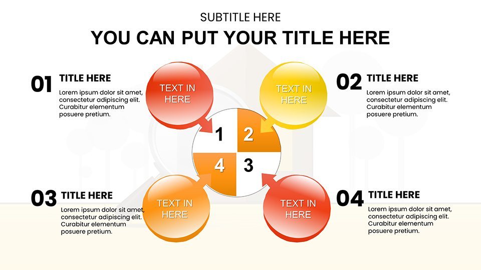
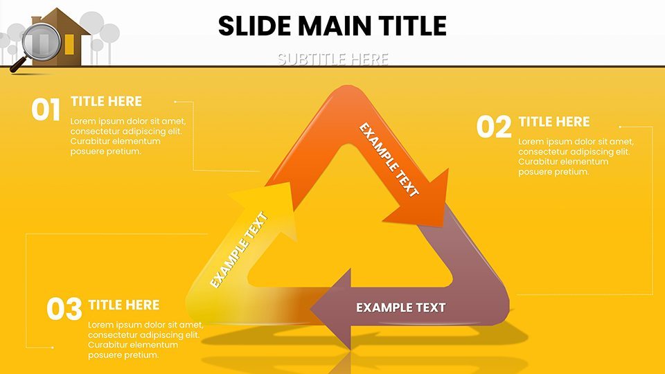
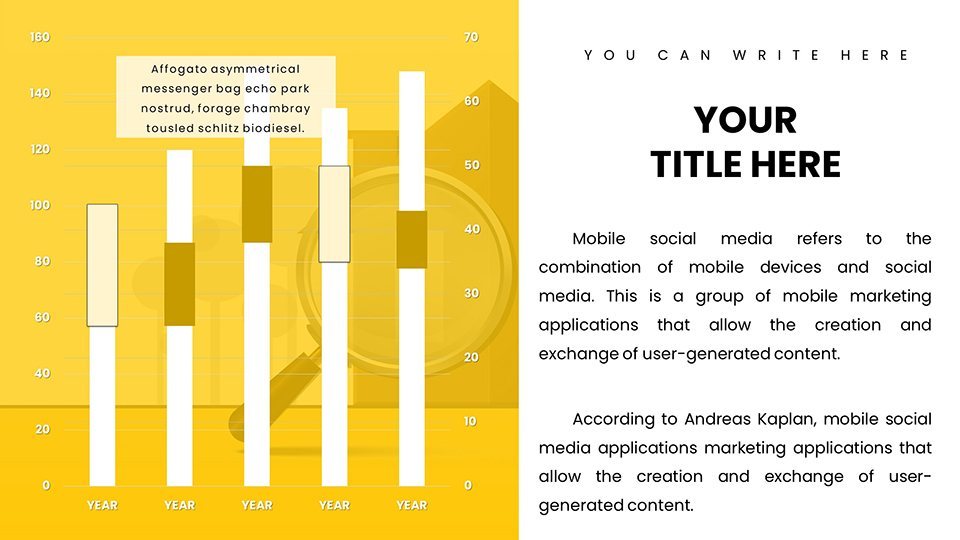
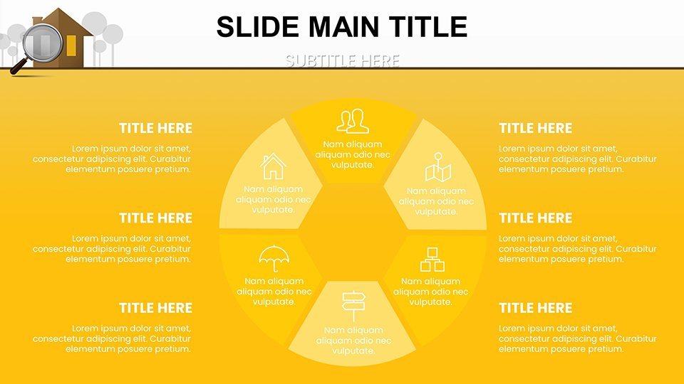
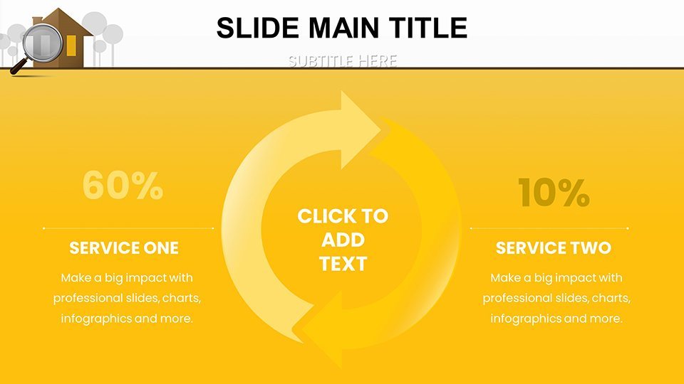
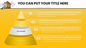
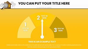
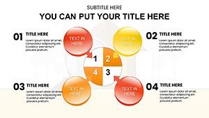
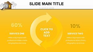
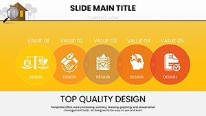
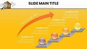
- Comprehensive Chart Variety: Includes bar graphs for sales comparisons, scatter plots for correlation between location and value, and bubble charts for multi-variable analysis like size, price, and amenities.
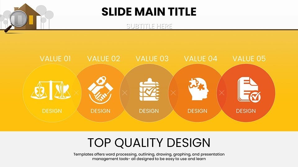
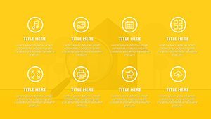
- High-Resolution Infographics: Professionally designed elements like house icons, map overlays, and trend arrows to make your data pop without overwhelming the viewer.
- Editable Data Points: Seamlessly integrate your datasets; no need for external software - just drag, drop, and update in Keynote.
- Themed Color Palettes: Subtle earth tones and vibrant accents inspired by real estate aesthetics, ensuring a cohesive look.
- Accessibility Features: Built-in alt text suggestions for charts, promoting inclusivity in line with ADA standards for digital presentations.
These features aren't just bells and whistles; they're grounded in best practices from presentation experts at firms like Duarte, who emphasize clarity and engagement in data visualization.
Real-World Applications: From Listings to Market Mastery
Picture this: You're a real estate agent preparing for an open house. Instead of static flyers, you project a slide showing year-over-year appreciation rates in the neighborhood, backed by data from Zillow or Redfin. Clients lean in, intrigued, as the chart animates to reveal growth projections. This template makes such moments routine.
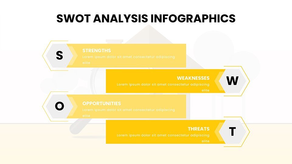
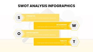
For investors, use the template to dissect market opportunities. A dedicated slide set allows for SWOT analysis charts tailored to real estate - strengths like prime location, weaknesses such as zoning restrictions, opportunities in up-and-coming areas, and threats from economic downturns. Draw from case studies like the post-pandemic surge in suburban properties, where visuals helped firms like CBRE secure multimillion-dollar deals.
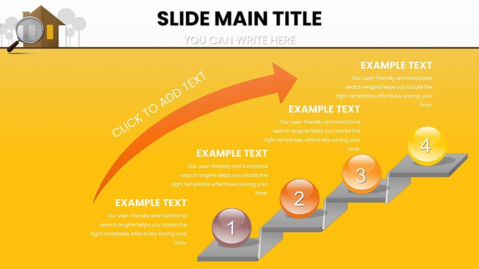
Analysts and researchers benefit too. Compile comprehensive reports with funnel charts illustrating the buyer journey - from lead generation to closing. Or use timeline slides to map out market cycles, incorporating historical data from sources like the Federal Housing Finance Agency. This not only aids internal strategy sessions but also positions you as an authority when sharing with stakeholders.
Step-by-Step Guide to Customizing Your Presentation
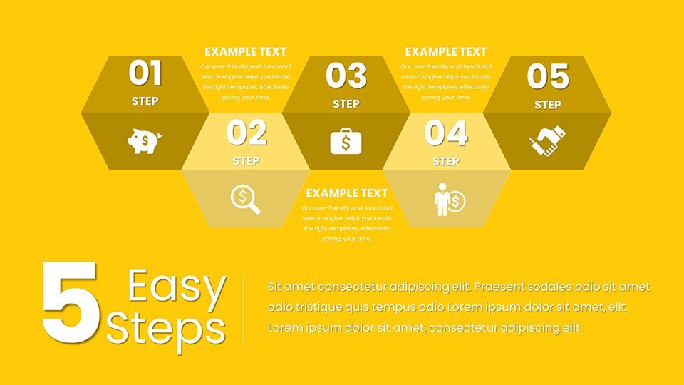
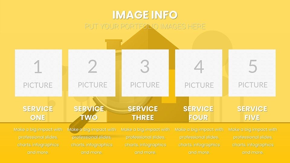
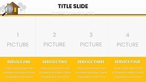
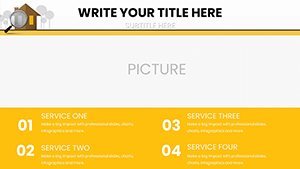
- Select Your Base Slide: Browse the 59 options to find the chart type that fits your data, such as a column chart for quarterly sales.
- Input Data: Use Keynote's intuitive editor to populate fields - e.g., enter property prices and watch the graph auto-adjust.
- Personalize Visuals: Change hues to align with your brand; add logos or watermarks for professionalism.
- Add Narratives: Incorporate text overlays explaining key insights, like "This 15% rise in valuations signals a seller's market."
- Rehearse and Refine: Animate transitions for smooth flow, ensuring your pitch captivates from start to finish.
This workflow integrates seamlessly with tools like Apple Pencil for annotations during live sessions, enhancing interactivity.
Why This Template Outshines Basic Keynote Tools
Standard Keynote charts are functional, but they lack the specialized polish for real estate. Our template bridges that gap with pre-built, industry-specific designs that save hours of setup. Unlike generic options, these slides include LSI elements like "commercial real estate trends" or "residential property analytics," naturally boosting SEO if you share presentations online.
Consider a comparison: Basic Keynote might offer a simple bar chart, but ours enhances it with contextual icons - think dollar signs for valuations or keys for property access - making abstract data tangible. Users report up to 40% more engagement in pitches, drawing from feedback in design communities like Behance.
Expert Tips for Maximum Impact
To elevate your use, pair charts with storytelling. For example, start with a broad market overview slide, then zoom into specifics like a radar chart comparing amenities across listings. Always cite sources subtly, like "Data sourced from MLS," to build credibility. For virtual presentations, export to PDF or video, ensuring charts remain crisp on any device.
Incorporate user-focused elements: Add callout boxes for quick facts, such as "Average ROI in this market: 8%," to keep audiences hooked. And remember, less is more - avoid clutter by using white space effectively, a tip from AIA-influenced design principles adapted for digital slides.
Elevate Your Real Estate Game Today
Don't let outdated presentations hold you back. With our Real Estate Market Keynote Charts template, you're equipped to deliver insights that drive action. Whether sealing a sale or advising on investments, these 59 slides provide the edge you need. Ready to transform your data into deals? Customize your template now and watch your presentations soar.
Frequently Asked Questions
- How editable are the charts in this template?
- Fully editable! You can modify data, colors, fonts, and layouts directly in Keynote to fit your needs.
- Is this template compatible with other software?
- Primarily for Keynote (.key format), but you can export to PowerPoint or PDF for broader use.
- What types of real estate data work best?
- It's ideal for trends, valuations, comparisons - anything from residential sales to commercial leases.
- Can I use it for client pitches?
- Absolutely! The dynamic infographics are perfect for engaging clients and closing deals.
- Are there any usage restrictions?
- No, once purchased, it's yours to use in unlimited presentations.