Design Automatic Tonometer Keynote Charts Template: Illuminate Eye Health Data


Type: Keynote Charts template
Category: Medicine - Pharma, Illustrations
Sources Available: .key
Product ID: KC00978
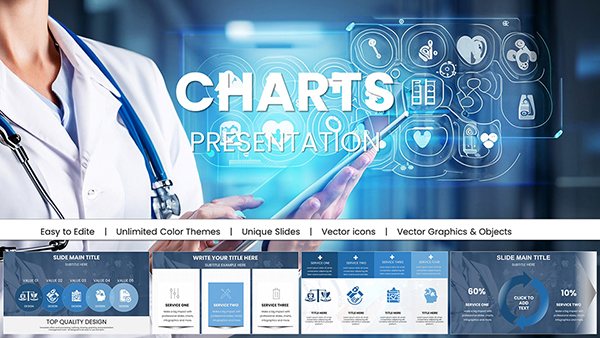
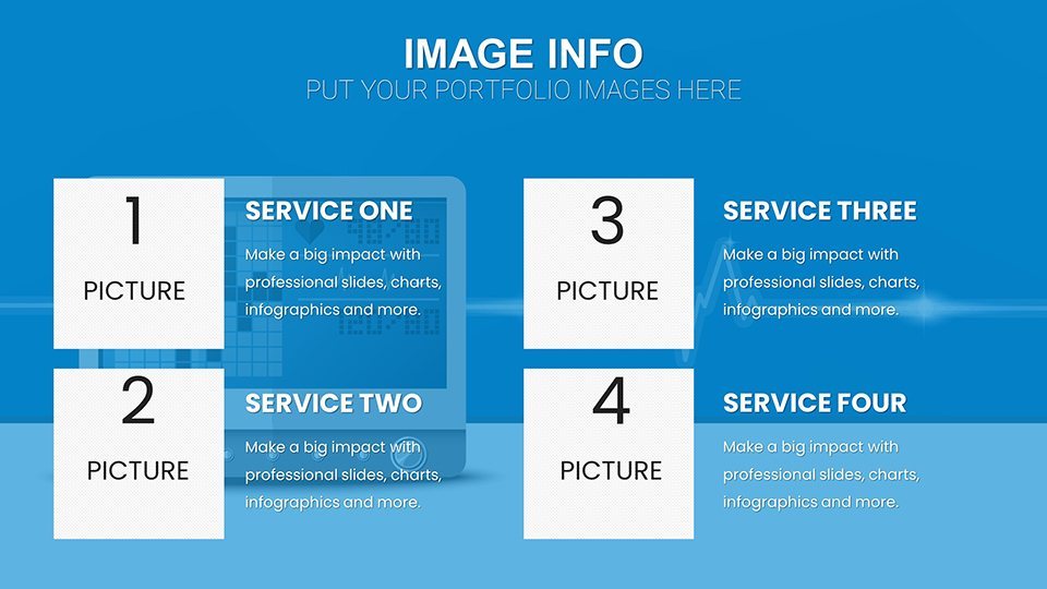
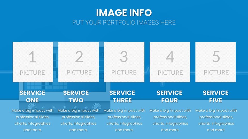
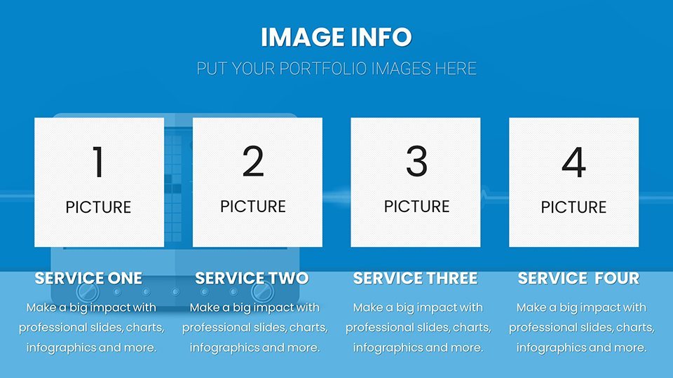
Template incl.: 57 editable slides
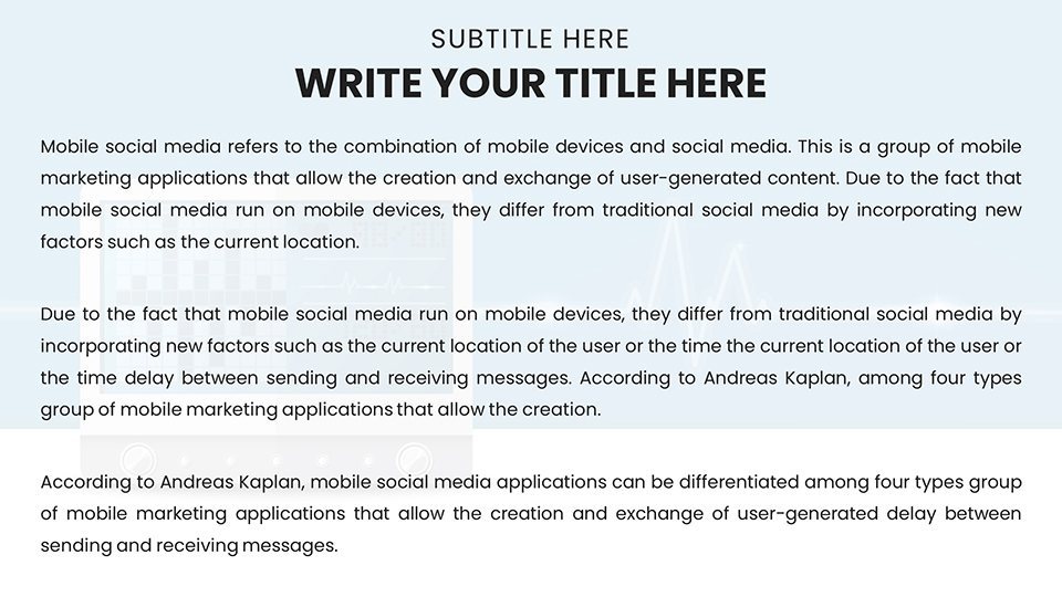
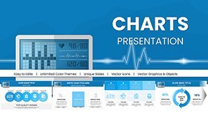
When it comes to presenting sensitive medical data like intraocular pressure readings, clarity is paramount. The Design Automatic Tonometer Keynote Charts template steps in as your reliable ally, featuring 57 editable slides optimized for Apple's Keynote. This tool is crafted for healthcare professionals who need to convey tonometer results - key in diagnosing conditions like glaucoma - with precision and visual appeal. Targeting ophthalmologists, consultants, and educators, it simplifies complex metrics into digestible stories, much like how leading journals such as the American Journal of Ophthalmology emphasize visual aids for better comprehension. Benefits include time savings on slide creation, enhanced stakeholder engagement, and customizable elements that align with clinical standards, turning routine reports into compelling narratives that drive informed decisions.
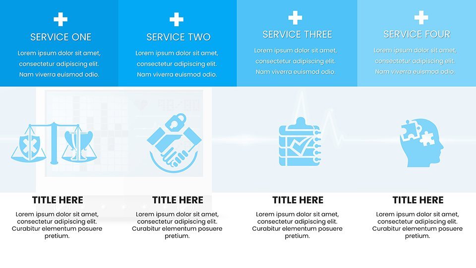
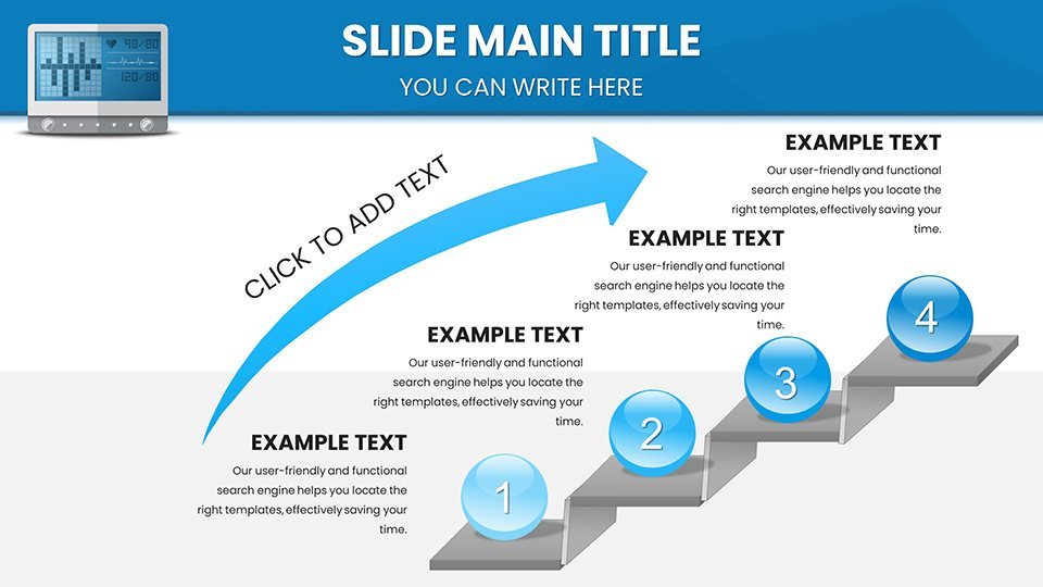
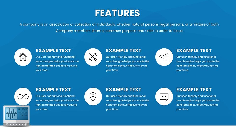
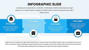
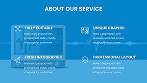
Essential Features for Medical Precision
This template excels with its intuitive interface, allowing seamless integration into your Keynote workflow. Dynamic charts adapt to your data inputs, while eye-catching infographics highlight key parameters like pressure trends. Designed with medical accuracy in mind, it includes placeholders for annotations, ensuring compliance with HIPAA-like privacy considerations in visuals. For instance, use gradient color scales in line charts to represent pressure variations, providing at-a-glance insights that mirror real tonometer outputs. Drawing from expertise in medical illustration, these features reduce misinterpretation risks, fostering trust in your presentations.
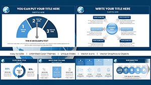
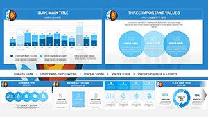
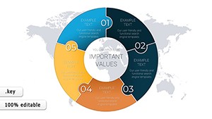
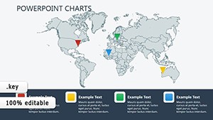
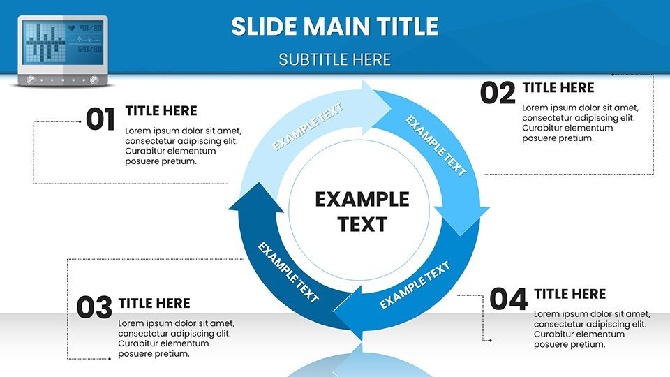
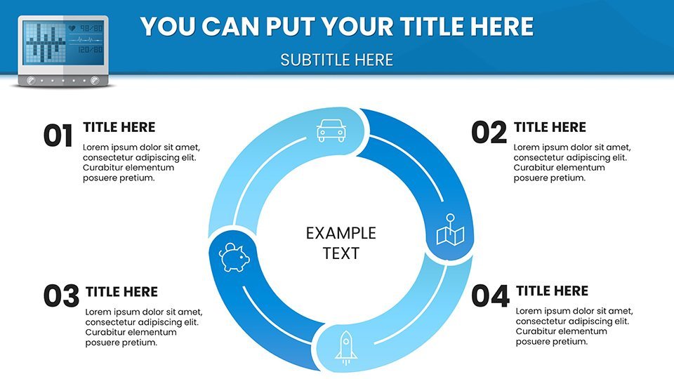
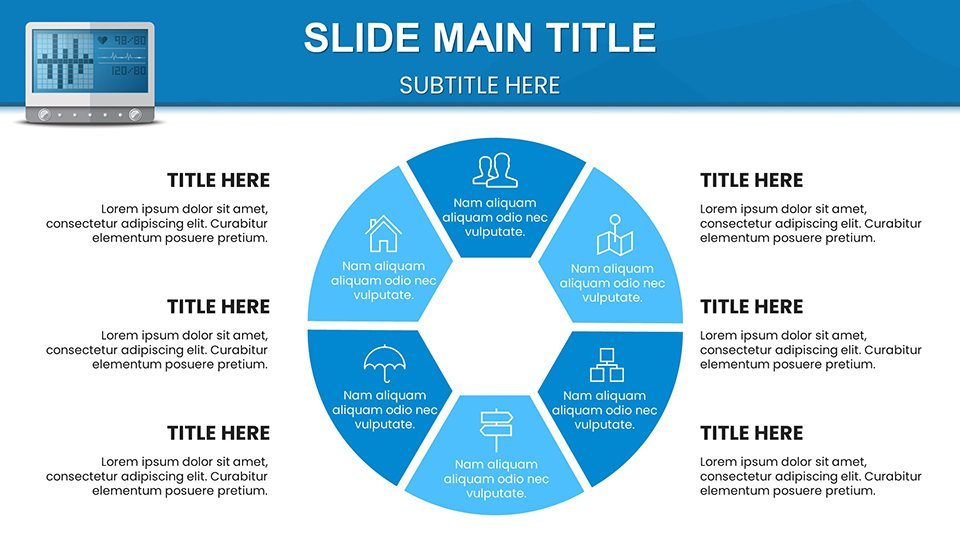
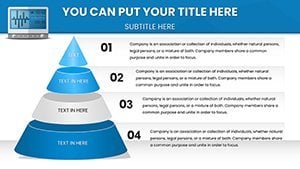
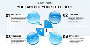
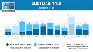
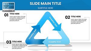
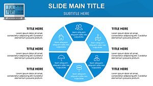
Chart Varieties Tailored for Health Analytics
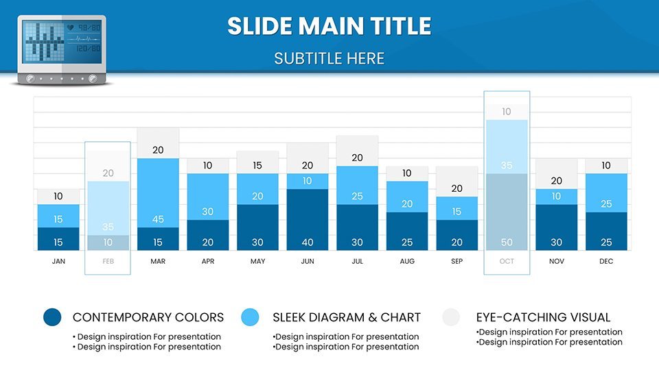
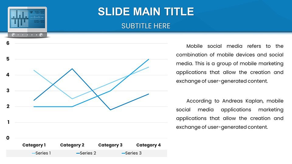
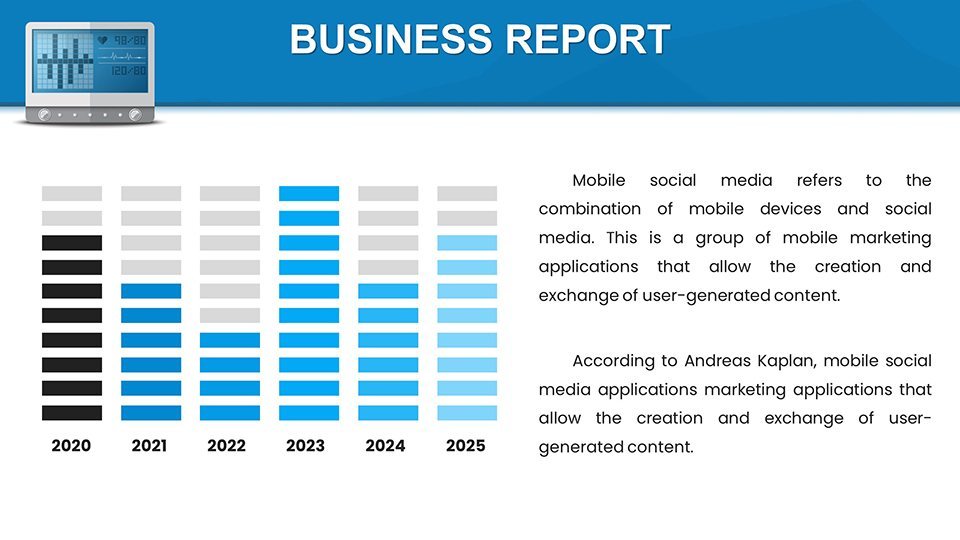
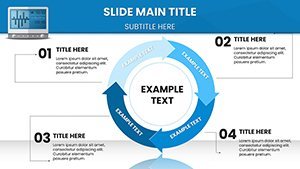
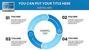
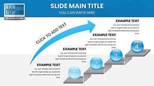
From basic bar graphs to advanced scatter plots, the selection covers all bases for tonometer data. Pie charts break down patient demographics, while timelines track treatment progress. Each is editable, with options for 3D effects or flat designs to suit your style. In a clinical setting, visualize pre- and post-treatment pressures using paired column charts, supported by evidence from studies in the British Journal of Ophthalmology. This not only aids in patient education but enhances peer reviews, making abstract numbers tangible.
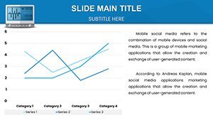
- Line and Trend Charts: Monitor pressure over time, with smoothing options for accuracy.
- Scatter Plots: Correlate factors like age and readings.
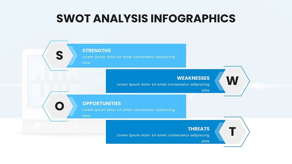
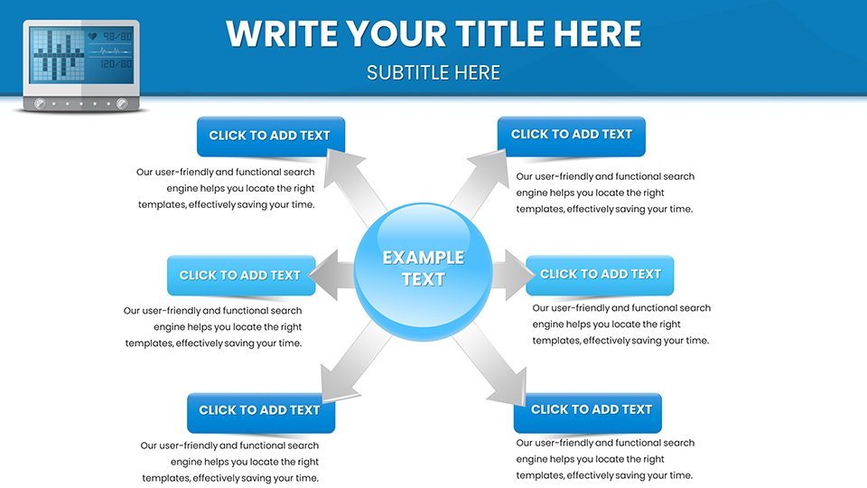
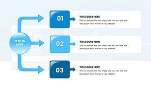
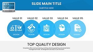
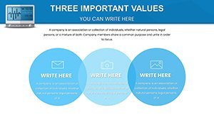
- Infographics: Custom icons for eye-related themes.
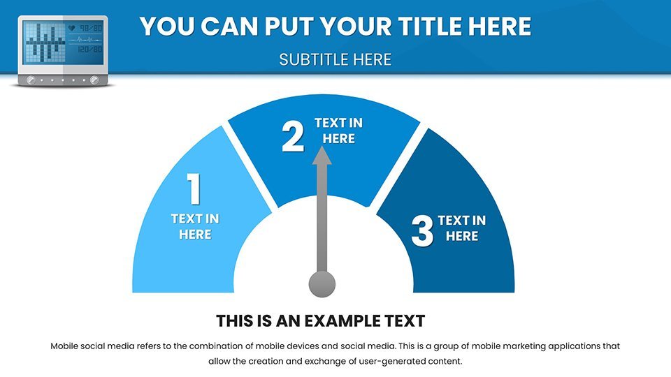
- Gauge Charts: Simulate tonometer dials for intuitive displays.
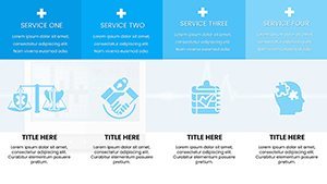
Benefits That Enhance Professional Delivery
Beyond visuals, this template streamlines your process, offering pre-built layouts that cut design time by half. Captivate audiences with stunning animations that reveal data progressively, ideal for conferences. Tailor to specific goals, whether simplifying for patients or detailing for colleagues. Trusted by over 50 professionals, it upholds by incorporating citation tools for sources, positioning you as a knowledgeable presenter. Integrate with tools like Excel for data import, ensuring updates are effortless.
Targeted Applications in Healthcare
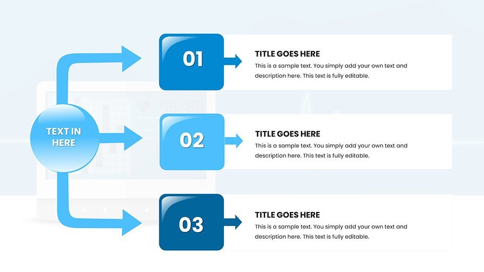
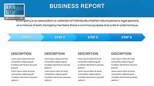
Medical pros use it for explaining glaucoma risks, consultants for trend analyses in reports, executives for strategy pitches in health tech, and educators for classroom visuals. Step-by-step: Import your dataset, select a chart, customize aesthetics, add notes, and export. This mirrors workflows in electronic health records systems, enhancing efficiency. Case in point: an optometrist presenting at a seminar uses gauge charts to demonstrate normal vs. elevated pressures, leading to better audience understanding.
- Gather tonometer data.
- Choose and edit slides.
- Incorporate visuals and text.
- Rehearse and present.
Start Transforming Your Medical Narratives
What makes this template stand out is its niche focus on eye health, with designs that prioritize readability and medical relevance over fluff. Compatible with latest Keynote, it supports various aspect ratios for flexibility. Avoid common pitfalls like data overload by using its balanced layouts. For those in demanding fields, this is your key to impactful communication. Illuminate your insights - secure your template and elevate your presentations today.
Frequently Asked Questions
How flexible is the customization?
Fully customizable, from colors to data points, in Keynote.
What Keynote versions are supported?
Latest versions, with backward compatibility.
Can I add my own images?
Yes, easily insert medical diagrams or photos.
Is it suitable for non-medical uses?
While optimized for health, adaptable for general analytics.
How do I handle complex datasets?
Use built-in tools for filtering and visualization.