Geothermal Energy Charts for Keynote: Illuminate Renewable Insights


Type: Keynote Charts template
Category: Illustrations
Sources Available: .key
Product ID: KC00969
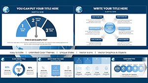
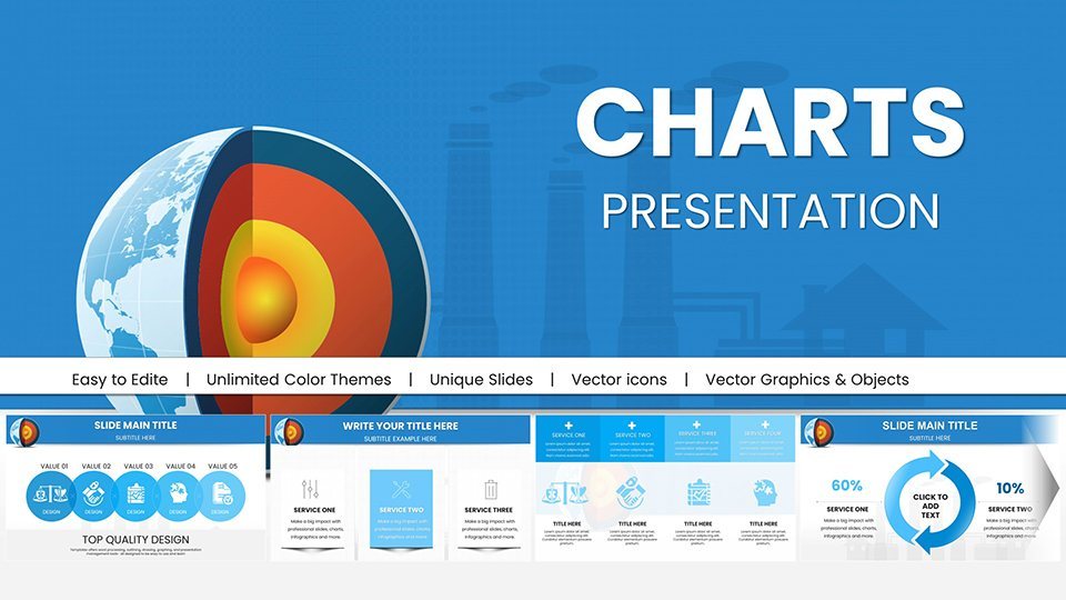
Template incl.: 59 editable slides
As the world shifts toward sustainable energy, effectively communicating geothermal advantages becomes crucial. Our Geothermal Energy Charts for Keynote template offers 59 meticulously crafted, editable slides to demystify this underground powerhouse. Designed for environmental scientists, policy makers, and educators, it turns technical data into accessible visuals, fostering understanding and advocacy for clean energy solutions.
Inspired by standards from the International Geothermal Association, these charts emphasize accuracy and engagement, compatible with Keynote, PowerPoint, and Google Slides. Bypass tedious design and dive into content that aligns with global sustainability goals, like those in the Paris Agreement.
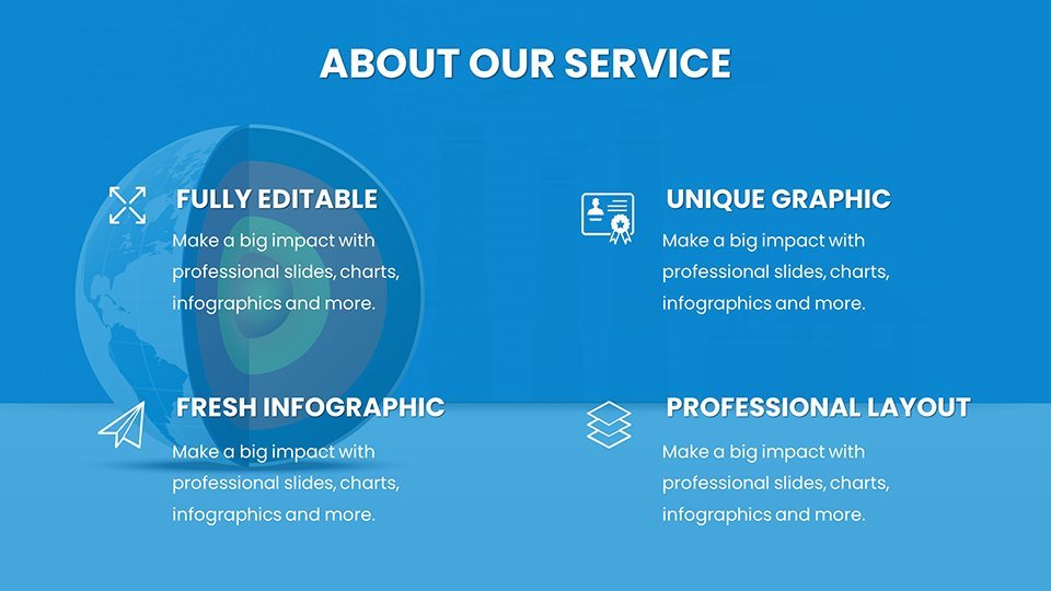
Core Features Driving Educational Value
Each chart is built for precision, with customizable elements to suit specific datasets on heat flow, reservoir mapping, and efficiency metrics.
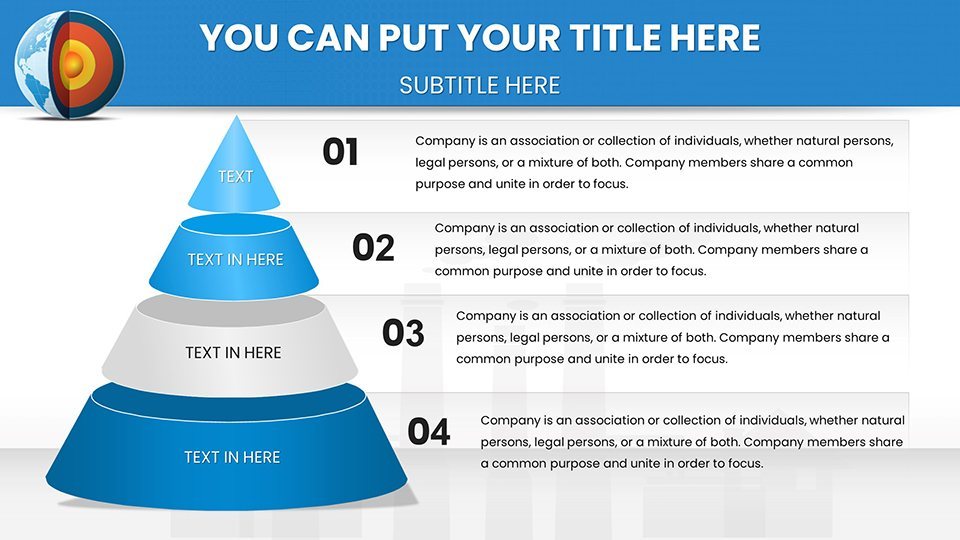
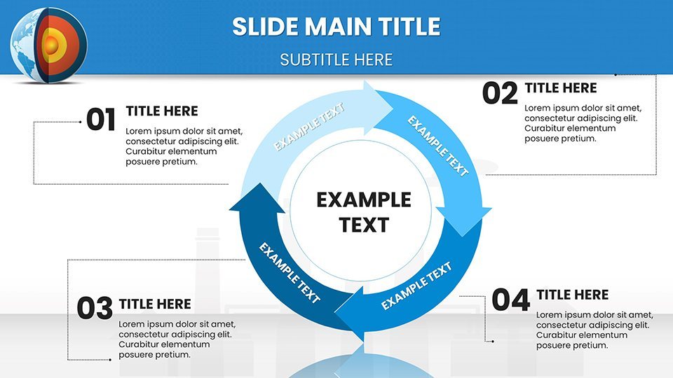
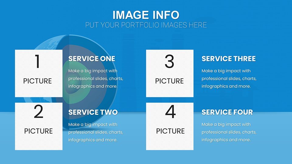
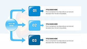
- Schematic Diagrams: Slide 10 details reservoir layers, using layered visuals for geological explanations.
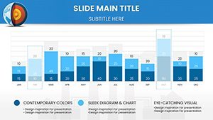
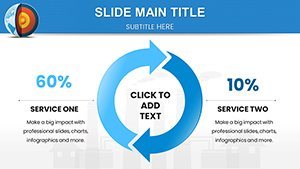
- Cost-Efficiency Bar Charts: Slide 20 compares geothermal vs. fossil fuels, highlighting long-term savings.
- Heat Flow Maps: Slide 28's color-coded maps show global potential, interactive for regional zooms.
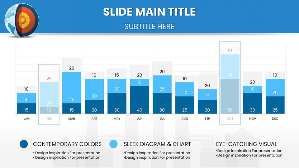
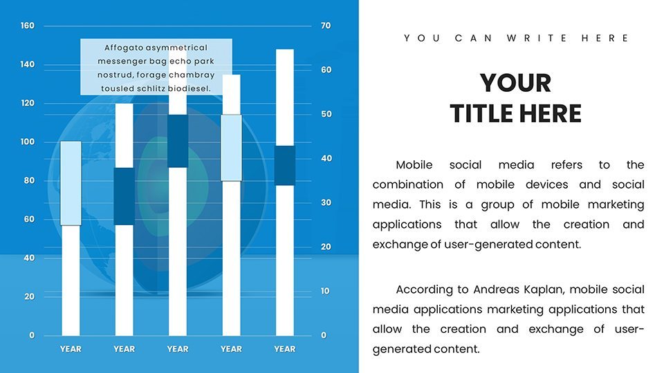
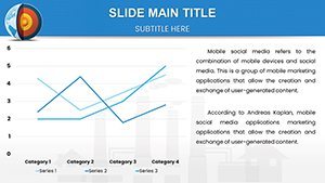
- Line Charts for Production Trends: Slide 35 tracks energy output over decades, with projections based on real models.
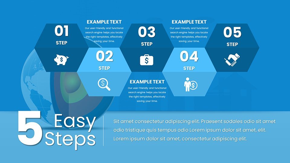
- Waterfall Charts for Process Breakdowns: Slide 45 outlines extraction steps, quantifying energy yields.
Incorporate animations for process simulations, like fluid circulation in binary cycles (slide 55), enhancing comprehension without overload.
Applications and Tangible Benefits
Renewable experts note that visuals boost retention by 65%, per DOE studies. For educators, align with STEM curricula by customizing schematics for classroom demos, as in projects mirroring Iceland's geothermal success. Corporate sustainability teams can use these for ESG reports; imagine a chart showing carbon reductions, impressing stakeholders like in Chevron's green initiatives.
Researchers benefit from data integration tools: Link to USGS databases for real-time updates. Tips include using logarithmic scales for wide-ranging data (e.g., temperature gradients) and color schemes evoking earth tones for thematic consistency. Avoid jargon by pairing charts with explanatory text boxes.
Implementation Steps for Impactful Use
- Assess Needs: Identify key metrics, like EGS viability.
- Data Entry: Import from specialized software like TOUGH2 simulators.
- Visual Tuning: Adjust for audience – simplify for public talks.
- Enhance Narrative: Add case studies, e.g., The Geysers field outputs.
- Present and Iterate: Gather feedback for refinements.
This template surpasses basics by including niche elements like enthalpy diagrams (slide 59), rare in free tools, ensuring authoritative presentations.
Superiority Over Alternatives
Default Keynote lacks geothermal specificity; this fills it with expert-vetted designs. Paid competitors may charge more for less customization. In advocacy, these charts aid policy influence, as seen in UN reports on renewables.
Natural integration: Renewable infographics, heat pump visuals, sustainable diagrams. Alts like "Geothermal reservoir schematic in Keynote."
Empower your green message – download and energize discussions now.
Frequently Asked Questions
- How accurate are the schematics?
- Based on industry standards, fully editable for precise data.
- Compatible with simulation software?
- Yes, import/export data easily.
- Suitable for academic papers?
- Ideal, with high-res exports for publications.
- Animation support?
- Yes, for dynamic process illustrations.
- Environmental focus?
- Exclusively on sustainable geothermal applications.