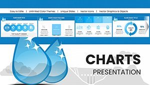
Hydropower Energy Keynote Charts Template for Presentation


Type: Keynote Charts template
Category: Tables, Illustrations
Sources Available: .key
Product ID: KC00965
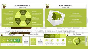
Template incl.: 58 editable slides
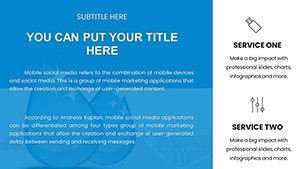
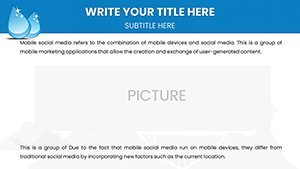
Dive into the dynamic realm of hydropower with a template that's engineered to make your presentations flow effortlessly. Our Hydropower Energy Keynote Charts Template equips energy professionals, environmental analysts, and educators with 58 editable slides that turn complex data on dam efficiencies, water flow rates, and sustainability impacts into visually compelling stories. Whether you're addressing stakeholders on hydroelectric projects or teaching about renewable resources, this tool helps you harness the power of clear communication, much like how turbines convert water's force into energy.
Built with insights from organizations like the International Hydropower Association (IHA), the designs emphasize accuracy and engagement, ensuring your audience grasps key concepts without drowning in details. Compatibility with Keynote means quick edits on Mac or iPad, and easy sharing across platforms. Say goodbye to bland slides and hello to presentations that generate buzz and drive informed decisions in the energy sector.
The Pinnacle Solution for Captivating Presentations
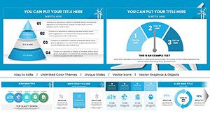
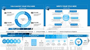
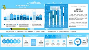
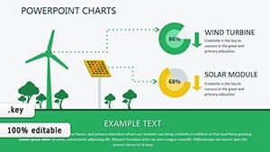
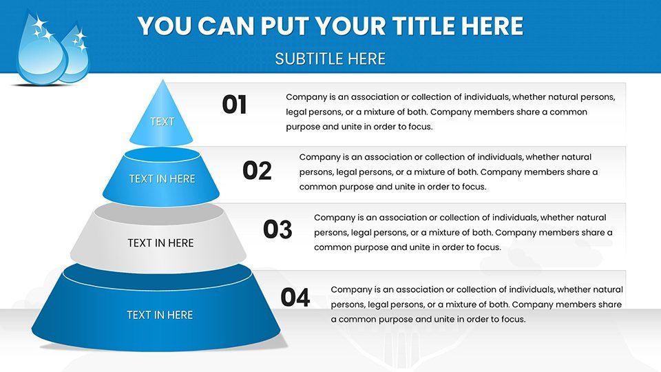
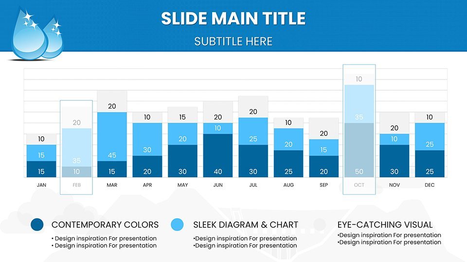
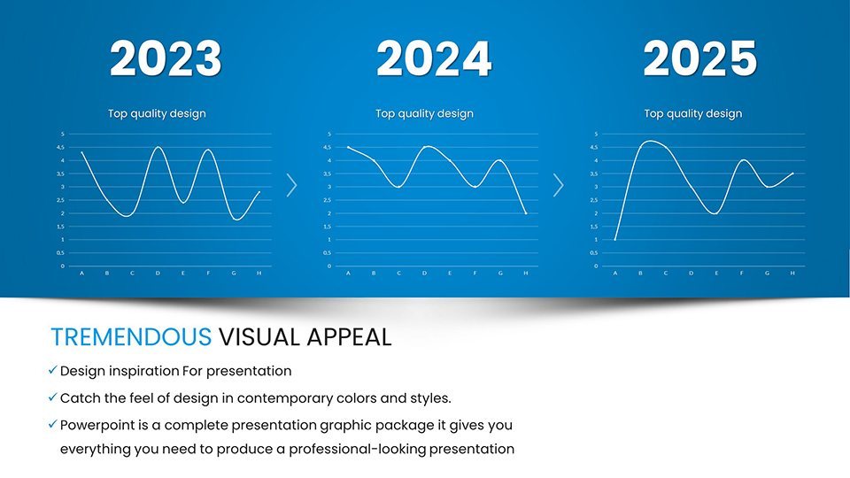
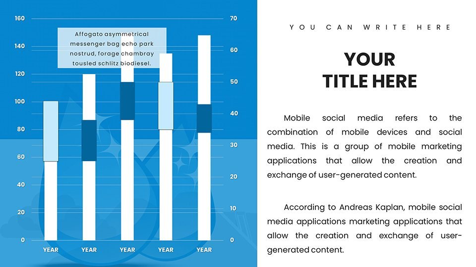
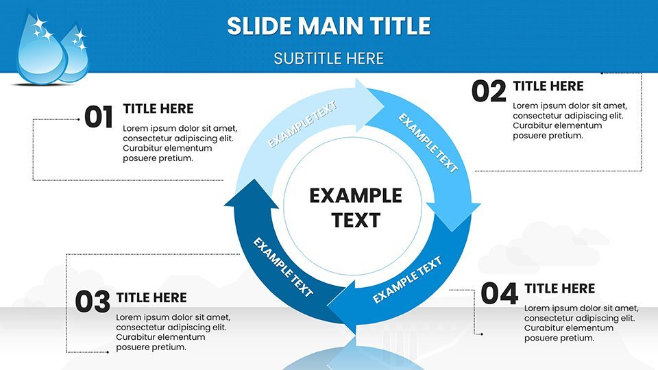
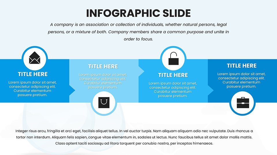
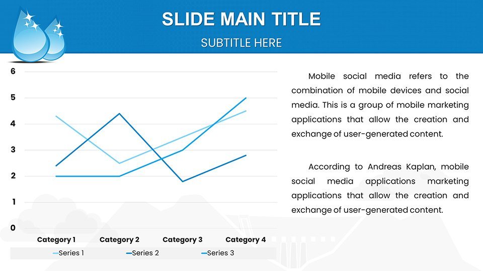
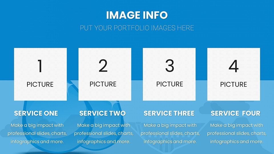
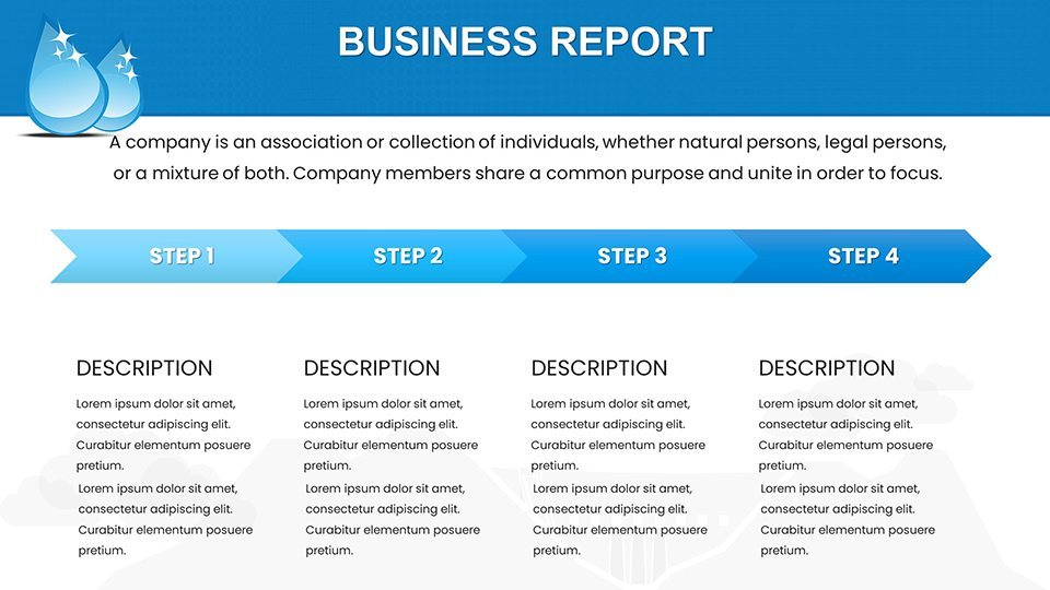
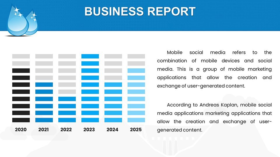
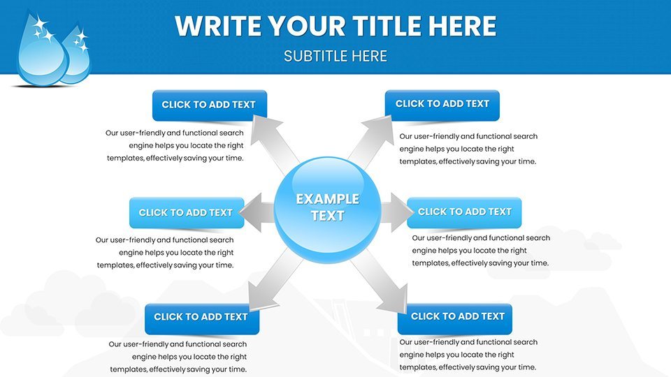
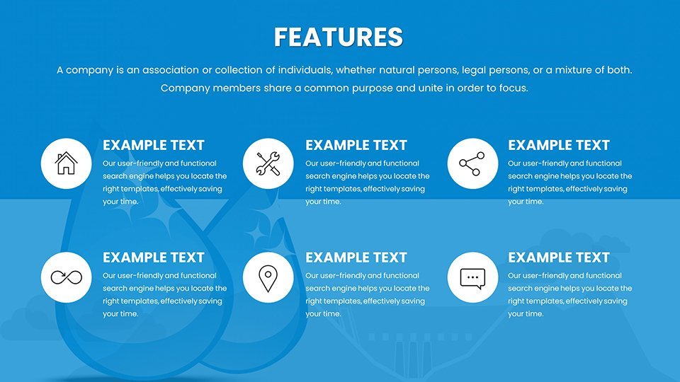
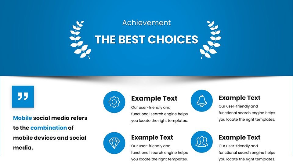
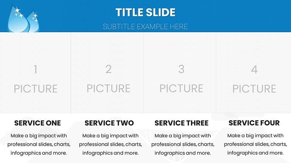
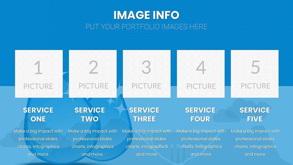
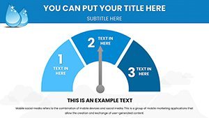
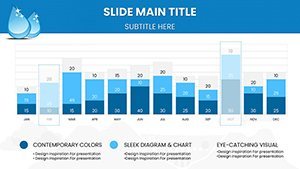
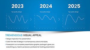
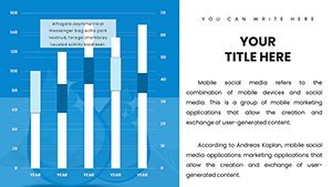
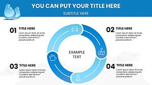
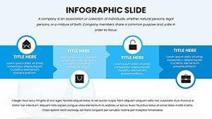
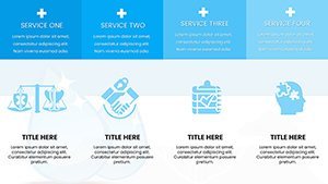
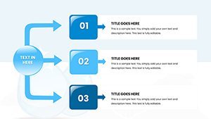
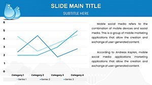
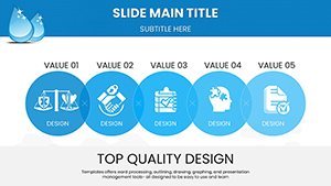
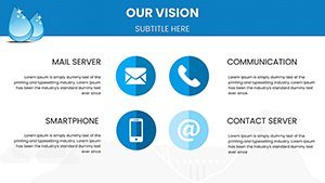
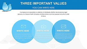
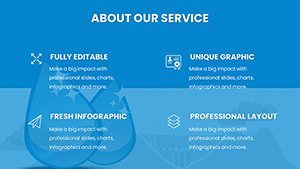
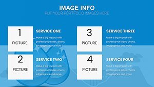
This template shines with its comprehensive array of charts, from line graphs tracking seasonal water levels to bar comparisons of hydropower vs. other renewables. Each slide is pre-formatted for high-impact visuals, such as waterfall diagrams - pun intended - that illustrate energy conversion processes. Imagine presenting a case study on the Three Gorges Dam: use our customizable maps to show geographical impacts, or pie charts to breakdown energy output contributions to national grids.
Customization is key; tweak hues to reflect watery blues and greens, adjust fonts for emphasis on technical terms like "turbine efficiency," and rearrange elements to suit your narrative flow. This adaptability ensures alignment with brand guidelines or presentation themes, enhancing professionalism. For those new to design, the intuitive interface simplifies the process, allowing focus on content like LSI-rich discussions on "hydroelectric sustainability" or "reservoir management."
Why Opt for Our Hydropower Energy Keynote Charts Template?
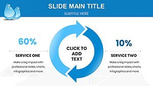
Stand out with features that address real challenges in energy communication. Unlike standard templates, ours includes specialized elements for trend analyses, such as scatter plots for correlating rainfall with power generation. Data comparison slides enable side-by-side views of pre- and post-project environmental metrics, drawing from standards like those in World Bank hydropower guidelines to bolster credibility.
- Comprehensive Charts: Cover everything from capacity factors to ecological footprints.
- Easy Customization: Drag-and-drop edits for colors, texts, and data inputs.
- User-Friendly: No design degree needed - intuitive tools speed up creation.
In practice, environmental analysts can use these to report on biodiversity effects, incorporating timelines that map project phases. Research scholars might integrate statistical charts for peer-reviewed findings, while advisors pitch to investors with ROI projections visualized in area charts. Students benefit from simplified overviews that make learning about pumped-storage systems accessible and fun.
Who Can Reap the Benefits of Our Template?
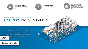
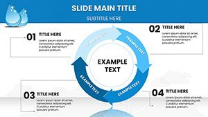
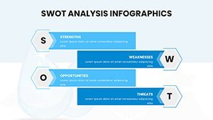
From conference rooms to classrooms, this template serves diverse users. Energy industry pros can craft compelling boardroom pitches, highlighting efficiencies with Gantt charts for construction timelines. Environmental consultants use it for client reports, employing Venn diagrams to show overlaps in sustainability goals. Academics enhance lectures with animated flows depicting water cycles, fostering deeper understanding among pupils.
Consider a workflow: Start with an intro slide summarizing global hydropower stats from sources like the U.S. Energy Information Administration. Build with detailed sections on technology types - run-of-river vs. reservoir - using flowcharts. Conclude with future outlooks, like pie charts on market shares by 2030. Tips include using subtle animations for data reveals, ensuring accessibility with alt text for images, and testing on different devices for consistency.
Compared to basic Keynote offerings, our template provides depth with pre-loaded icons like dam symbols and water droplets, saving time on asset searches. It excels in handling large datasets, preventing crashes during edits, and offers better scalability for high-res prints. Users often note increased retention rates, as visuals make abstract ideas concrete, like visualizing sediment management in bar graphs.
Seize this opportunity to elevate your hydropower narratives. With its blend of expertise and ease, this template empowers you to make waves in your field. Download today and let your ideas flow powerfully.
Frequently Asked Questions
- How do I customize the hydropower charts?
- Simply edit text, colors, and data directly in Keynote for personalized results.
- Is the template suitable for beginners?
- Yes, its intuitive design makes it accessible even without prior experience.
- Can I add my own data to the slides?
- Absolutely, import from Excel or CSV for instant updates.
- What makes this template unique for hydropower?
- It includes sector-specific charts like flow diagrams and efficiency graphs.
- Does it support collaboration?
- Yes, share via iCloud for team edits in real-time.
- Are there any usage restrictions?
- No, use freely for personal or professional presentations.