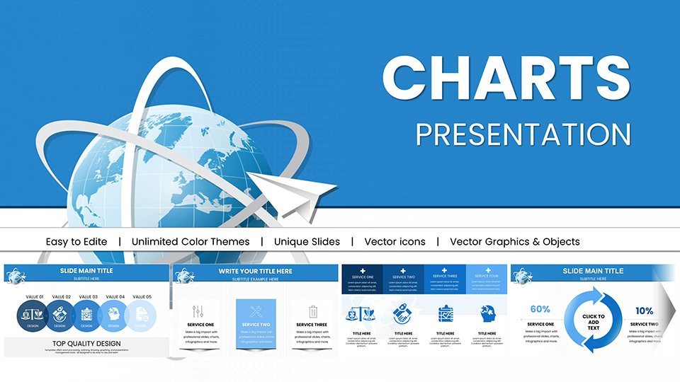
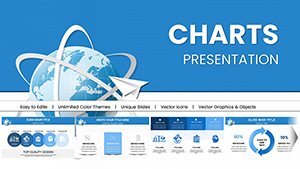
Air Delivery Logistics Keynote Charts Template


Type: Keynote Charts template
Category: Illustrations, Analysis
Sources Available: .key
Product ID: KC00959
Template incl.: 59 editable slides
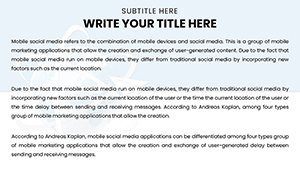
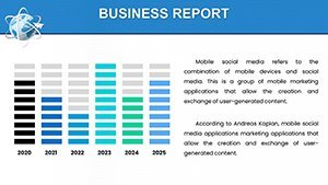
Navigating the complexities of air delivery and logistics demands more than just data - it requires a narrative that soars. Our Air Delivery Keynote Charts template is engineered for supply chain managers, logistics coordinators, and business strategists who need to present freight trends, route optimizations, and expansion plans with unparalleled clarity. With 59 fully editable slides, this template turns raw logistics metrics into captivating visuals, helping you illustrate everything from cargo throughput to global supply chain efficiencies. Picture this: you're pitching to stakeholders about reducing delivery times via aerial routes, using dynamic maps and graphs that highlight cost savings inspired by real-world successes like those from FedEx or DHL. This tool aligns with industry standards from the International Air Transport Association (IATA), providing authoritative backing to your insights. Beyond mere slides, it's a strategic asset that addresses common challenges like data overload, enabling you to foster informed decisions and drive operational excellence in an ever-evolving logistics landscape.
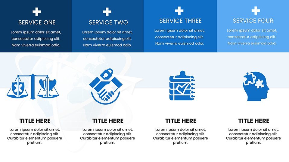
Essential Features for Logistics Mastery
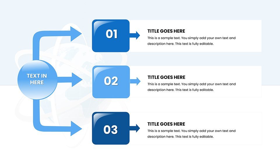
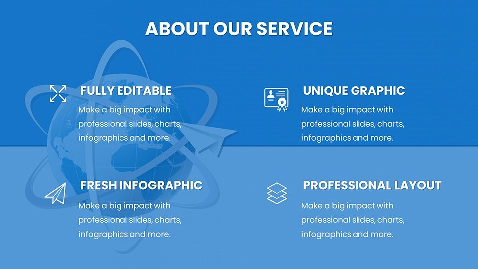
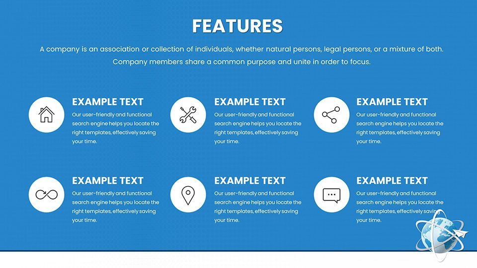
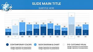
At the heart of this template are features tailored for the logistics sector. Full customization lets you adapt charts to your company's palette, incorporating logos or specific data sets effortlessly within Keynote's intuitive interface. Compatible across Apple devices, it supports real-time edits during travel or meetings. The assortment includes radar charts for comparing delivery speeds across carriers, Gantt charts for timeline planning in air freight operations, and bubble charts to visualize risk factors in supply chains. High-resolution elements ensure crisp visuals on any screen, while integrated icons - think airplanes, cargo boxes, and route arrows - add thematic relevance without clutter. Drawing from best practices in logistics visualization, such as those outlined in Supply Chain Management Review, these features not only enhance aesthetics but also amplify your message's trustworthiness, positioning you as an expert in the field.
In-Depth Slide Exploration
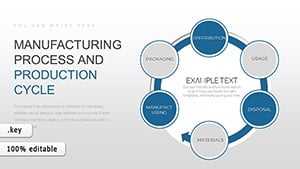
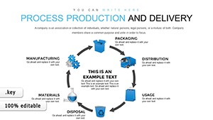
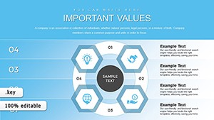
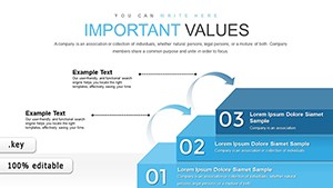
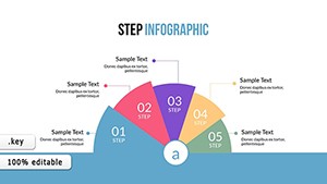
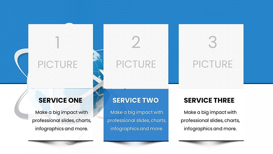
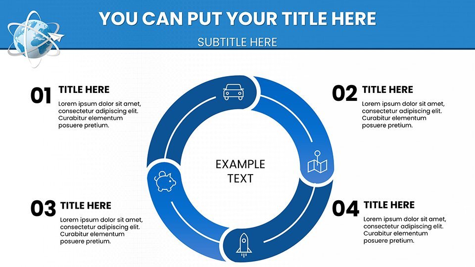
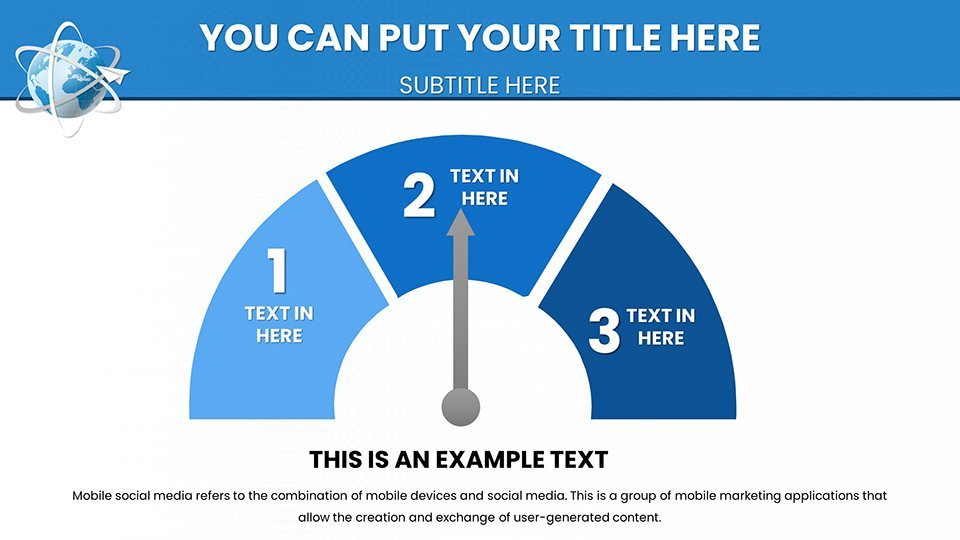
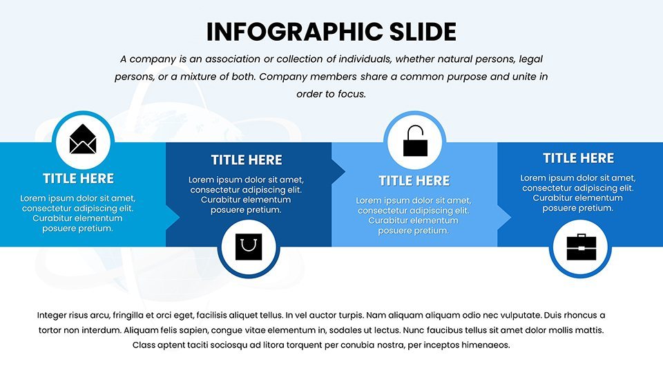
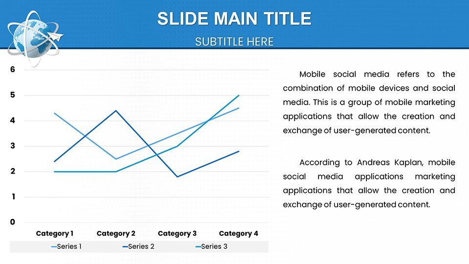
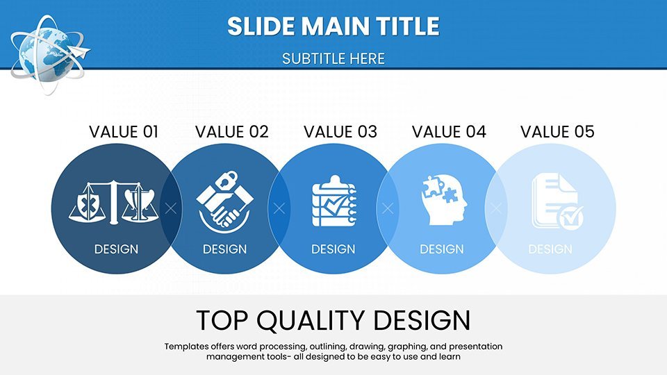
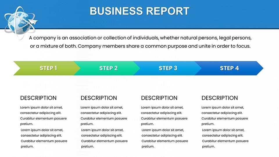
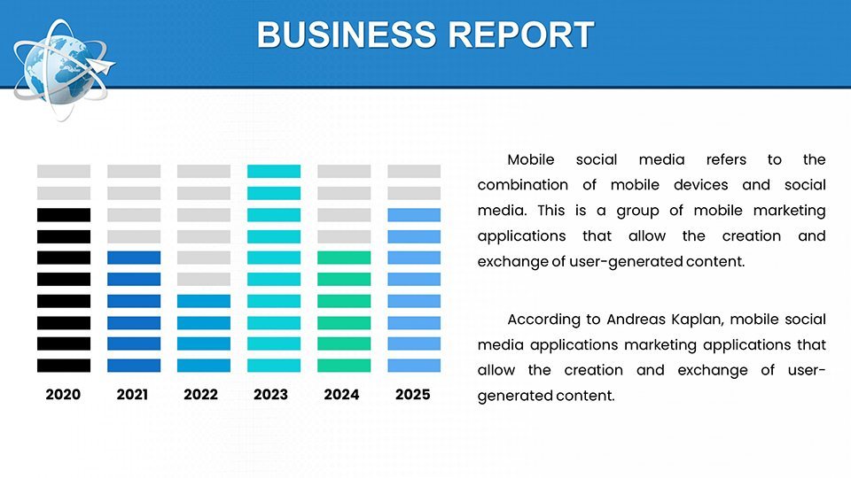
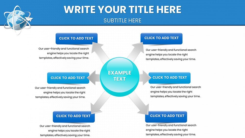
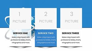
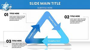
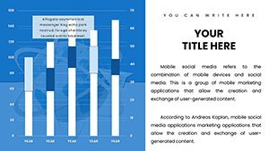
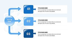
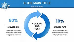
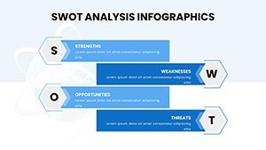
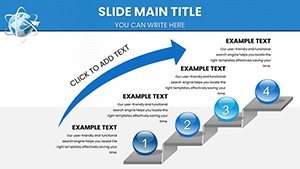
The 59 slides are segmented for logical flow. Initial slides (1-15) focus on overviews, with world maps plotting air delivery networks and column charts showing volume growth, perfect for executive summaries. Mid-section slides (16-35) delve into analytics: area charts tracking fuel efficiency trends, pivot tables for cost breakdowns, and flowcharts depicting end-to-end delivery processes. For strategic use, slides 36-50 offer scenario modeling, like SWOT analysis diagrams adapted for air logistics challenges, referencing case studies from IATA reports on sustainable aviation. Concluding slides (51-59) include interactive elements such as progress trackers and summary dashboards, ideal for wrapping up with actionable insights. Animations are subtle, revealing data layers to maintain audience focus, and each slide supports data import from tools like Excel for up-to-date accuracy.
Practical Use Cases and Value Propositions
This template excels in real-world scenarios. Supply chain managers can use it to demonstrate how air delivery integrations reduced inventory holding costs by 20%, as seen in Amazon's aerial strategies. Consultants might employ the charts to advise on route optimizations amid disruptions like those from the 2020 pandemic, citing authoritative sources from the World Economic Forum. For business expansion, visualize market entry via air freight with treemap charts showing regional potentials. Compared to basic Keynote defaults, this template offers themed consistency and advanced layouts, saving design time and elevating professionalism. Its integration with collaboration apps like Slack or Microsoft Teams streamlines team reviews, ensuring alignment before high-stakes presentations. Ultimately, it empowers users to not just present data but to tell compelling stories that influence decisions and propel business growth.
Pro Tips for Effective Utilization
- Data Synchronization: Link charts to live feeds from logistics software like SAP for dynamic updates during presentations.
- Visual Harmony: Balance text and graphics to avoid overload, following IATA's guidelines for clear communication.
- Engagement Boost: Embed videos of air delivery operations via Keynote's media tools for immersive experiences.
- Sustainability Angle: Highlight eco-friendly routes with dedicated green-themed slides, appealing to modern stakeholders.
- Cross-Functional Use: Adapt for training sessions by adding quiz elements on logistics best practices.
These strategies, informed by industry leaders, help you leverage the template for maximum impact.
Secure Your Logistics Edge Now
Why wait to transform your air delivery presentations? This template is your ticket to clearer, more persuasive communications that drive results. Embrace the future of logistics visualization - grab it today and watch your ideas take flight.
Frequently Asked Questions
What types of charts are included for logistics data?
The template features radar, Gantt, and bubble charts, among others, tailored for analyzing air delivery metrics like speed and costs.
Can I integrate this with other software?
Yes, easily import data from Excel or logistics platforms, and export to PDF for sharing beyond Keynote.
Is it suitable for international presentations?
Absolutely, with customizable maps and multilingual support options in Keynote.
How does it compare to free templates?
It offers professional, themed designs with 59 slides, far surpassing basic options in depth and customization.
Are updates available for industry changes?
While static, you can edit freely; check our site for new versions aligning with IATA updates.