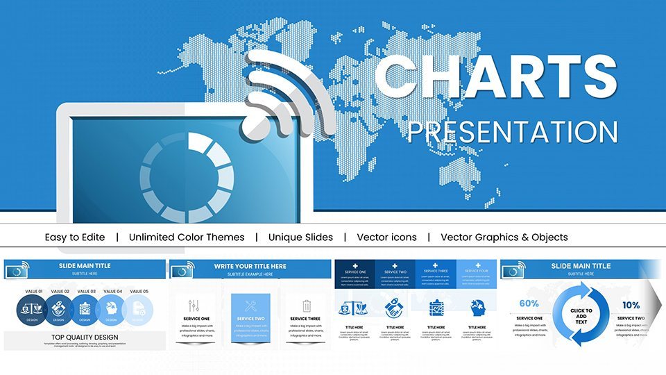
WiFi Internet Connection Keynote Charts Template


Type: Keynote Charts template
Category: Illustrations, Analysis
Sources Available: .key
Product ID: KC00958
Template incl.: 59 editable slides
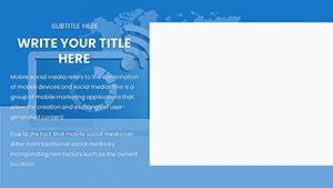
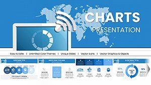
In an era where connectivity defines progress, our WiFi Internet Connection Keynote Charts template emerges as a beacon for tech enthusiasts, business leaders, and educators alike. This innovative collection of 59 editable slides harnesses the essence of wireless networks to make your presentations not just informative but immersive. Whether you're a network engineer explaining bandwidth optimizations, a startup founder pitching IoT integrations, or a teacher illustrating digital ecosystems, these charts turn abstract concepts like signal strength and data flow into tangible visuals. Envision engaging your audience with waveform graphs that mimic WiFi signals, or network diagrams that showcase connectivity hubs, all while referencing standards from the Institute of Electrical and Electronics Engineers (IEEE). This template goes beyond basics, addressing pain points like explaining complex protocols in simple terms, and draws from real successes, such as Cisco's deployments in smart cities, to add credibility and spark innovation in your narratives.
Standout Features for Tech-Driven Presentations
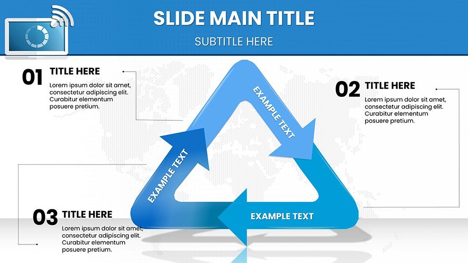
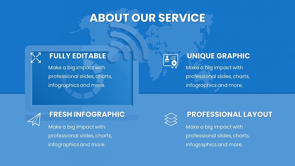
Customization is king here: adjust every chart's aesthetics to fit your theme, from vibrant signal-inspired colors to sleek modern fonts, all within Keynote's user-friendly environment. Compatibility extends to the latest Keynote versions, ensuring smooth performance on Macs and iPads. The template boasts diverse chart styles - waveform lines for signal analysis, node maps for network topologies, and donut charts for bandwidth allocation - each optimized for clarity and impact. Thematic icons like routers and cloud symbols enhance relevance, while high-fidelity resolutions prevent distortion in virtual or in-person settings. Backed by insights from IEEE 802.11 standards, these features establish your authority, making presentations trustworthy and expert-level.
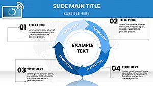
Comprehensive Slide Overview
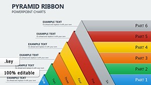
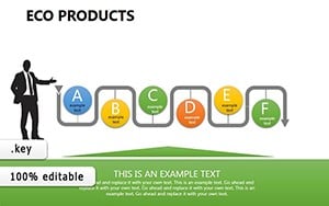
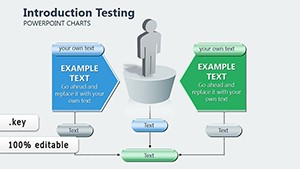
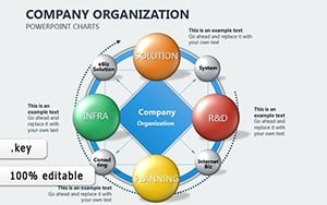
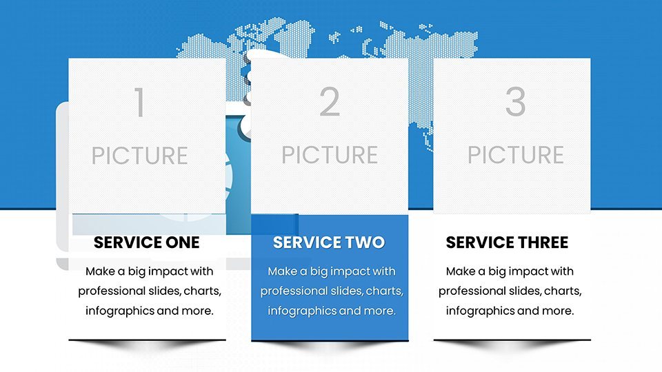
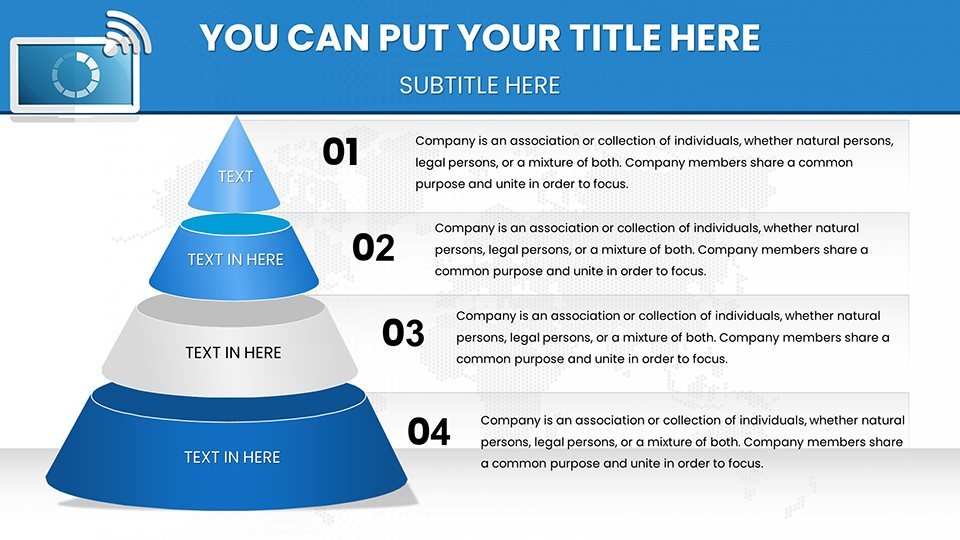
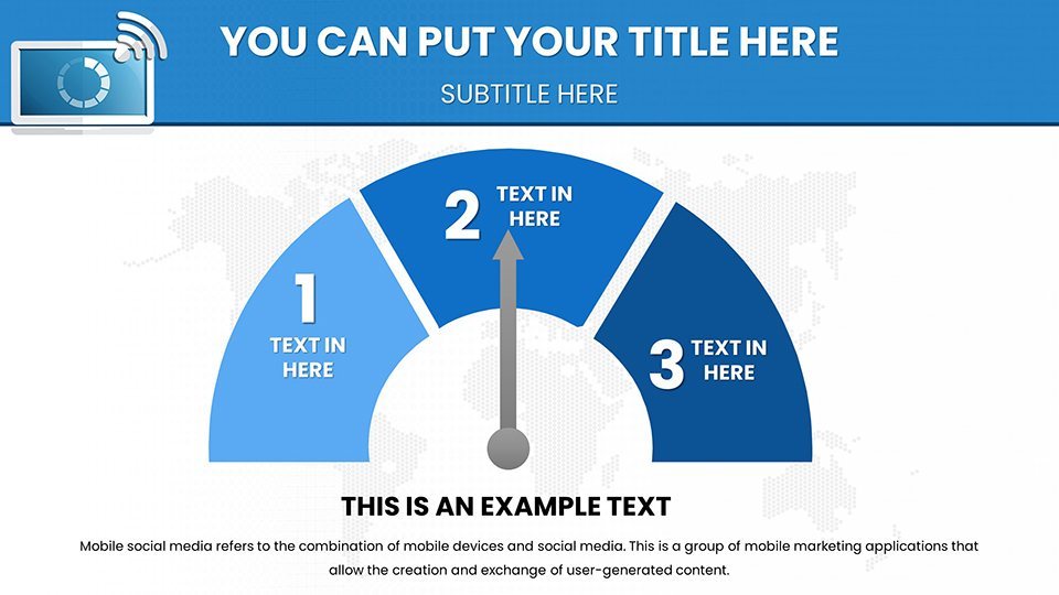
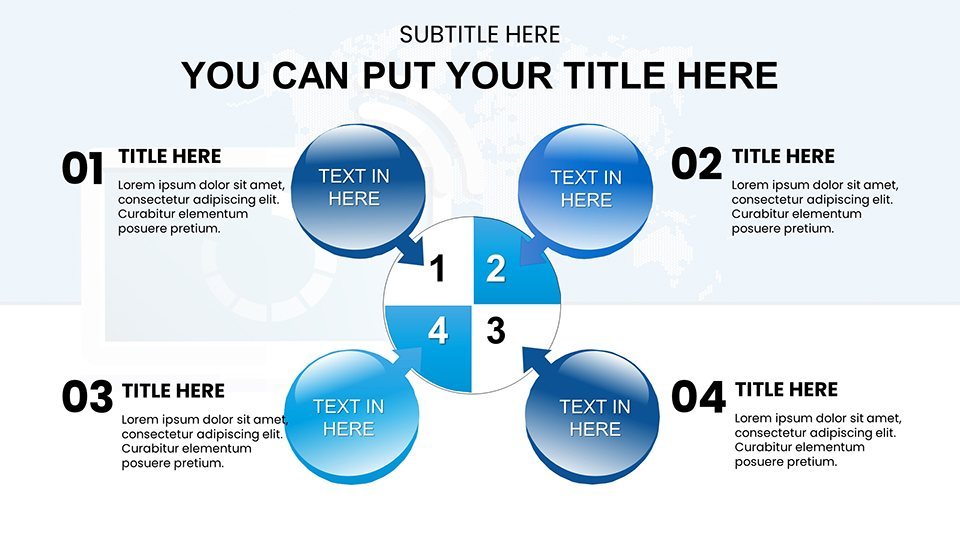
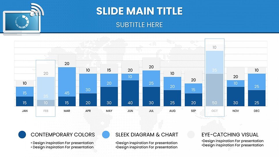
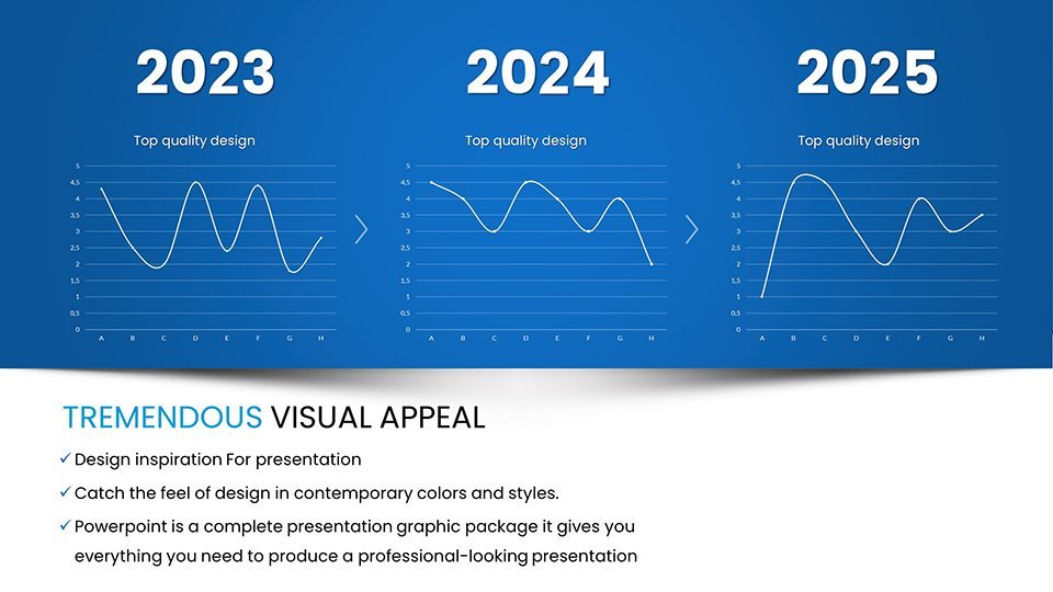
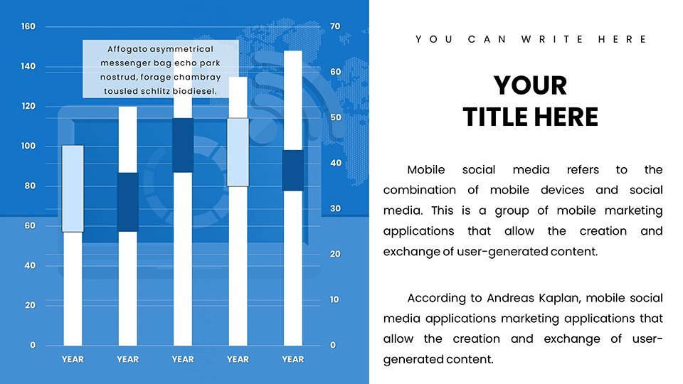
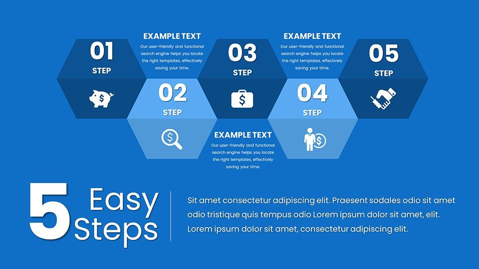
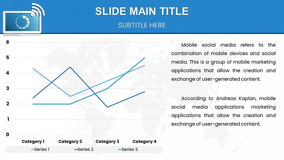
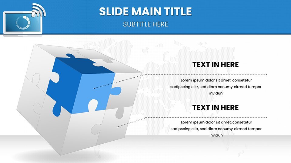
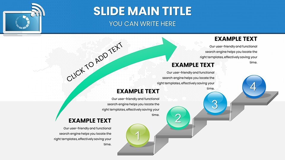
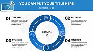
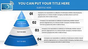
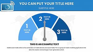
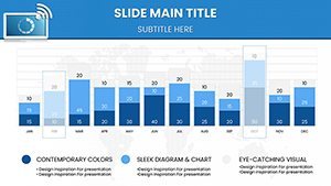
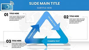
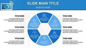
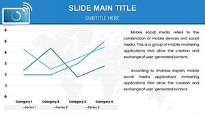
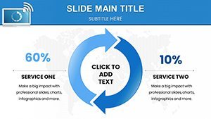
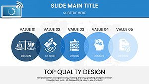
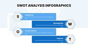
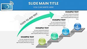
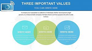
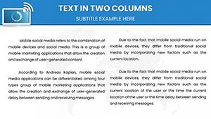
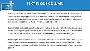
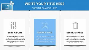
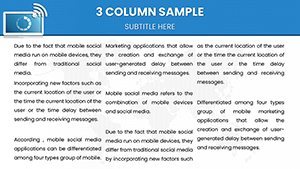
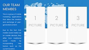
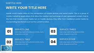
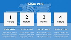
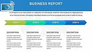
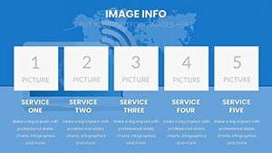
Organized for efficiency, the slides begin with foundational concepts (1-12): basic WiFi architecture diagrams and bar charts comparing connection speeds. Core content slides (13-30) feature advanced visuals, such as Sankey diagrams for data traffic flows and radar plots for security assessments. Application-focused slides (31-45) include case study layouts, perfect for detailing implementations like Google's WiFi mesh systems. Innovation sections (46-55) offer futuristic charts, like predictive trend lines for 6G transitions. Closing slides (56-59) provide recap tools and interactive prompts. Gentle animations guide viewers through data reveals, fostering better comprehension.
Applications That Connect and Inspire
Apply this template to diverse scenarios: marketers can visualize campaign reach via connectivity metrics, educators simplify lessons on internet history with timeline charts, and executives forecast network expansions using projection graphs. Unlike standard slides, it offers thematic cohesion that resonates, saving time and boosting engagement - as evidenced by TED Talks on technology that use similar visuals. Integration with tools like Wireshark for data imports or Zoom for delivery enhances workflows, turning solitary prep into collaborative triumphs.
Customization Strategies from the Pros
- Theme Adaptation: Infuse your brand's colors to make WiFi themes feel personal.
- Data Dynamics: Pull in live metrics from network tools for real-time relevance.
- Interactive Elements: Add hyperlinks to IEEE resources for enriched discussions.
- Inclusivity: Ensure color-blind friendly palettes per web accessibility guidelines.
- Hybrid Use: Blend with AR apps for augmented reality network demos.
These tips elevate your use, drawing from tech conference best practices.
Link Up with Excellence Today
Don't let your ideas stay wired - unleash them with this template. It's your key to presentations that connect deeply. Acquire it now and redefine digital storytelling.
Frequently Asked Questions
Are the charts fully customizable for tech data?
Yes, edit data points, styles, and elements to fit specific WiFi metrics seamlessly.
Does it support virtual presentation tools?
Perfectly, with high-res exports for Zoom or Teams integration.
Can educators use it for online classes?
Sure, simplify complex topics like bandwidth with engaging visuals.
What about security-themed slides?
Included, with charts for vulnerability assessments and protocols.
Is IEEE compliance referenced?
Visuals align with standards, but customize with your data for accuracy.