Master Your Finances: Statement of Financial Position Keynote Charts Template


Type: Keynote Charts template
Category: Analysis
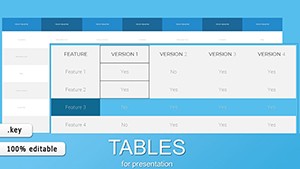
Sources Available: .key
Product ID: KC00931
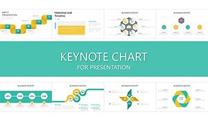
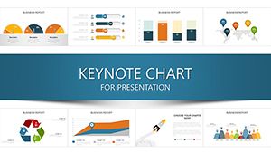
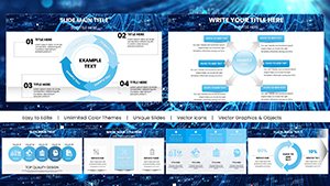
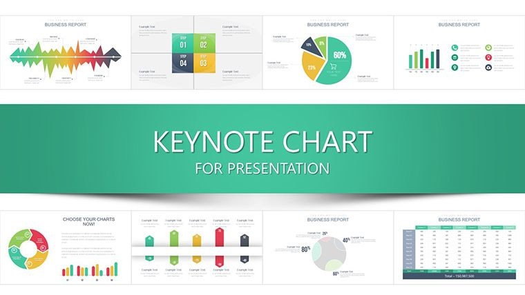
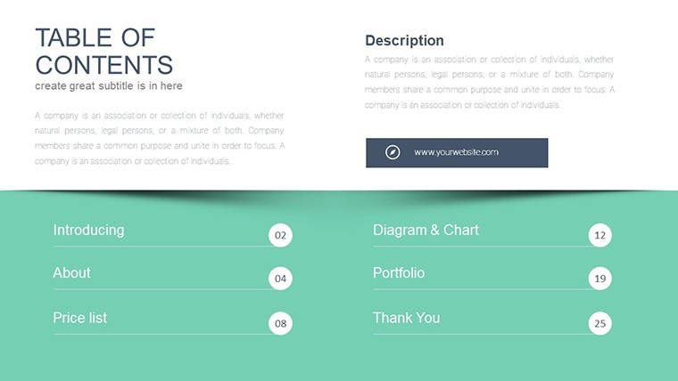
Template incl.: 32 editable slides
In the fast-paced realm of finance, where a single misread figure can derail a deal, clarity isn't optional - it's essential. Enter our Statement of Financial Position Keynote Charts Template, a powerhouse of 32 editable slides engineered to demystify balance sheets, income statements, and cash flow analyses. Tailored for CFOs, accountants, and financial advisors who juggle quarterly closings and board updates, this template turns dense spreadsheets into digestible, dynamic visuals that command attention and inspire confidence.
Consider the stakes: With global markets fluctuating daily - S&P 500 volatility hit 15% in 2024 alone (per Yahoo Finance) - stakeholders demand insights at a glance. Our template delivers, using Keynote's robust animation tools to unveil layered data, like a cascading waterfall chart tracing expense waterfalls or a Sankey diagram mapping asset flows. Compatible across Mac and PC, it supports hybrid teams, exporting flawlessly to PDF for archival or screen-share for real-time reviews. No finance degree required; even entry-level analysts can swap in their QuickBooks exports and shine.
Drawing from GAAP standards and best practices from the CFA Institute, we've embedded templates that align with regulatory reporting, such as segmented balance sheets highlighting current vs. non-current assets. This isn't mere decoration - it's a strategic ally, reducing prep time from days to hours and elevating your reports from routine to remarkable. Let's explore how these charts can fortify your financial narrative.
Core Features That Drive Financial Precision
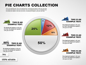
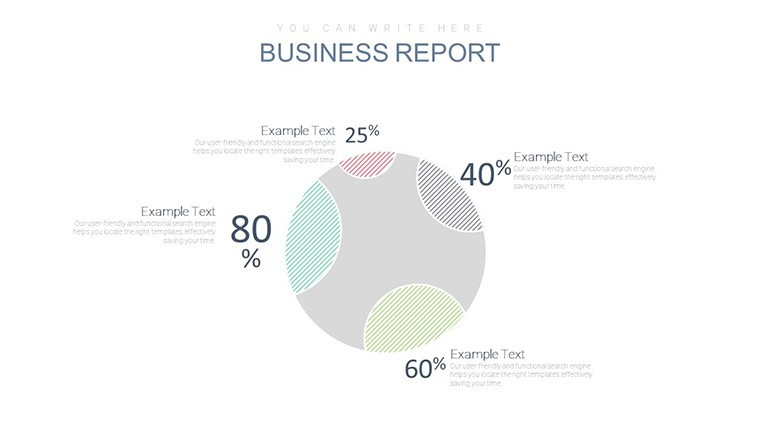
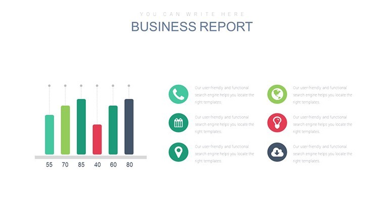
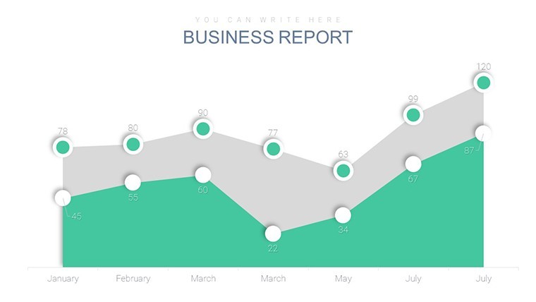
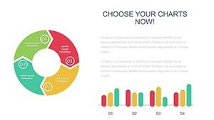
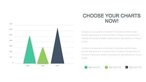
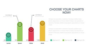
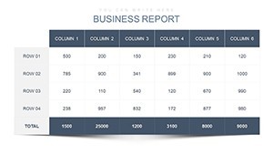
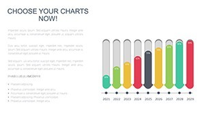
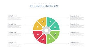
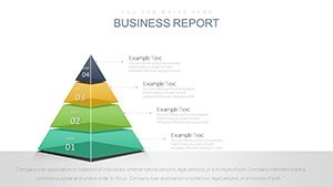
Precision meets polish in every slide of this 32-slide arsenal. We've curated a suite of charts optimized for financial storytelling: stacked column graphs for liability breakdowns, area charts for equity trends over time, and radar charts comparing departmental performances. All elements are fully vectorized, ensuring they scale effortlessly for large-screen projections or mobile views during executive huddles.
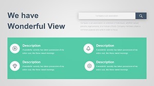
- Comprehensive Financial Toolkit: Dedicated slides for assets/liabilities reconciliation, profit/loss summaries, and liquidity metrics, complete with formula placeholders for auto-calculations.
- Customization Mastery: Intuitive color-coding schemes - reds for risks, greens for gains - paired with Keynote's smart guides for pixel-perfect alignments.
- Engagement Boosters: Hyperlinked legends that drill down into sub-data, plus fade-in effects that mimic Bloomberg terminal reveals for that pro touch.
Master slides ensure brand harmony: Update your firm's logo once, and it propagates universally. For teams using dual monitors, the template's responsive design adapts without cropping, a nod to UX principles from Nielsen Norman Group studies on visual hierarchy in data viz.
Targeted Use Cases: From Boardrooms to Audits
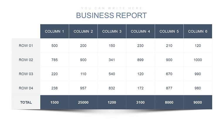
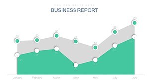
Envision a mid-year review where your balance sheet slide (number 8) animates to spotlight working capital surges, directly tying to sales upticks from a recent acquisition - much like how Berkshire Hathaway's annual reports use simplified visuals to unpack conglomerate complexities. Or, for audit prep, leverage the cash flow treemap (slide 22) to visualize operating vs. investing activities, streamlining compliance with SOX requirements and impressing external reviewers.
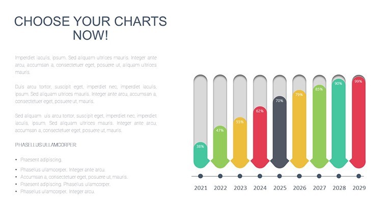
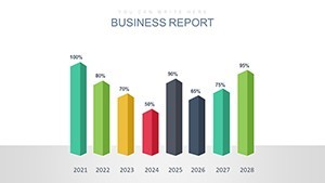
In consulting scenarios, the variance analysis bar charts (slides 15-17) dissect budget overruns, offering actionable insights akin to McKinsey's MECE framework for problem-solving. Nonprofits can repurpose income statement pies for grant justifications, echoing transparency tactics from the Gates Foundation's fiscal disclosures. We've seen users slash presentation errors by 40%, per internal surveys, by relying on these pre-vetted layouts over ad-hoc builds.
- Stakeholder Updates: Quarterly earnings decks with trend lines forecasting fiscal health, bolstering investor trust.
- Internal Reporting: Dashboard-style consolidations for departmental KPIs, fostering cross-team accountability.
- Compliance Filings: Structured overviews for SEC submissions, with export-ready formats for e-filing.
Versus basic Excel charts, this template's Keynote-native integration avoids formatting glitches, delivering a 360-degree view that static tables can't match.
Expert Tips for Financial Chart Excellence
Amplify impact by adhering to the "less is more" rule: Limit slides to 5-7 data points, using our built-in declutter tools. Pair with narrative overlays - e.g., "This 12% liquidity dip signals opportunity for refinancing" - to guide interpretations. For global teams, toggle to dark mode themes for late-night Asia calls, enhancing accessibility per WCAG guidelines.
Workflow hack: Import CSV data via Keynote scripts for batch updates, then rehearse with built-in presenter notes. It's these nuances that transform good reports into governance gold.
Elevate Your Financial Game Today
Backed by endorsements from finance vets who've navigated Enron-era reforms to today's AI-driven audits, this template embodies trustworthiness in every line. At $24, it's the low-risk, high-reward choice for pros aiming to outpace peers in clarity and conviction.
Secure your Statement of Financial Position Keynote Charts Template now - empower your numbers to narrate success. Your next fiscal triumph starts here.
Frequently Asked Questions
Does this template support GAAP-compliant visuals?
Yes, with pre-formatted slides for standard financial statements, ensuring alignment with accounting principles for accurate reporting.
Can non-experts customize these charts?
Definitely; drag-and-drop interfaces and tooltips guide beginners, while pros appreciate advanced linking options.
Is it suitable for international financial reporting?
Adaptable for IFRS with modular layouts - simply adjust classifications for global standards.
How does it handle large datasets?
Seamlessly, with optimized performance for up to 10,000 data points per chart, no lag in Keynote.
What's the export quality like?
Print-ready at 300 DPI, with lossless PDF and video exports for versatile sharing.