Chart Your Path to Triumph: The Success Metrics Keynote Template


Type: Keynote Charts template
Category: Analysis
Sources Available: .key
Product ID: KC00927
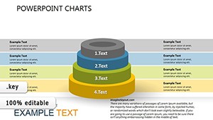
Template incl.: 38 editable slides
In the relentless arena of business strategy, where every metric tells a story of progress or pivot, the Success Metrics Keynote Template emerges as your ultimate ally. This powerhouse of 38 editable slides is tailored for analysts and leaders who crave precision in portraying achievements - from surging productivity to shrewd cost reductions. Crafted exclusively for Keynote, it transforms dry data into dynamic visuals that not only inform but inspire action, making it indispensable for quarterly reviews, investor updates, or team huddles.
Picture this: You're dissecting enterprise growth amid market volatility, and instead of overwhelming spreadsheets, you unveil a cascade of interconnected charts that spotlight diversification wins. Rooted in proven analytical frameworks like those from McKinsey's success factor models, this template addresses the core intent of commercial users seeking transactional tools to close deals or rally resources. It's more than slides; it's a roadmap to measurable victories, compatible with Keynote's robust ecosystem for effortless edits on Mac or iPad, ensuring your presentations scale from intimate strategy sessions to grand conferences.
Unlike off-the-shelf options that lack depth, this template dives into the nuances of success quantification. With resizable vectors and theme-consistent icons, it adapts to your narrative - be it highlighting a 15% efficiency boost in operations or mapping customer retention curves. Let's explore how its features and applications can propel your business forward, one insightful slide at a time.
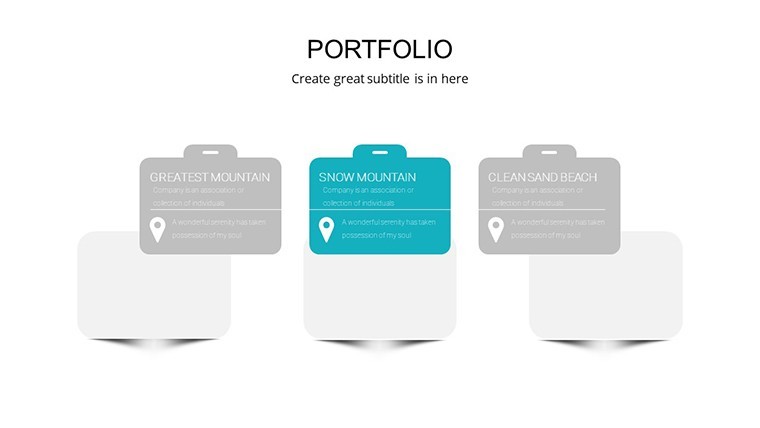
Discover the Power-Packed Features Driving Your Analysis
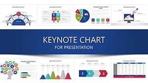
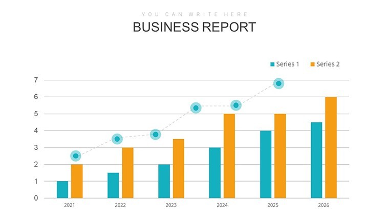
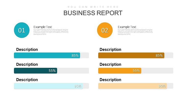
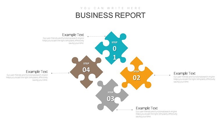
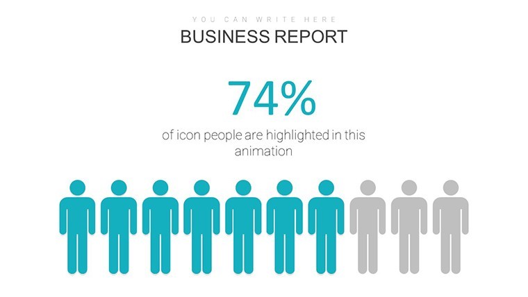
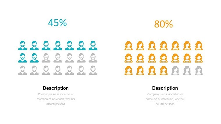
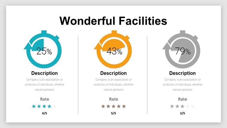
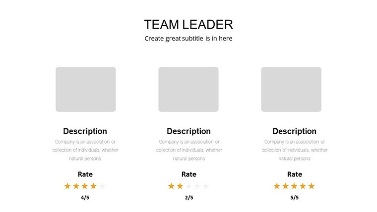
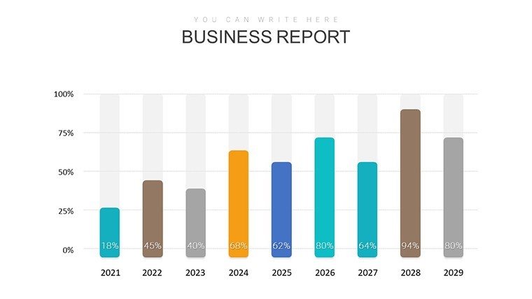
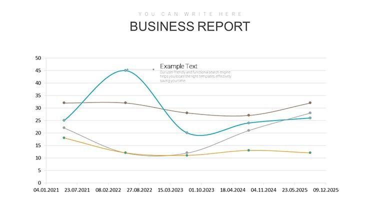
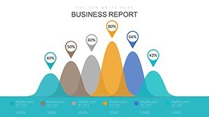
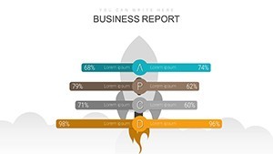
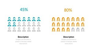
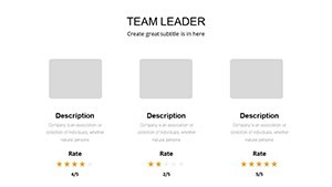
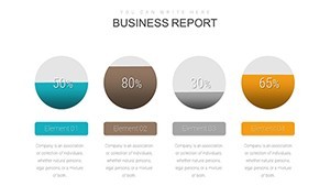
Diving into the template, Slide 1 serves as your command center: a multi-panel success dashboard aggregating metrics like ROI and engagement rates, with pie charts that auto-adjust for real-time tweaks. Slides 2-8 then zoom into productivity trackers - bar graphs evolving into stacked variants to layer factors like team output versus resource allocation, inspired by agile methodologies for software firms achieving 30% faster sprints.
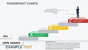
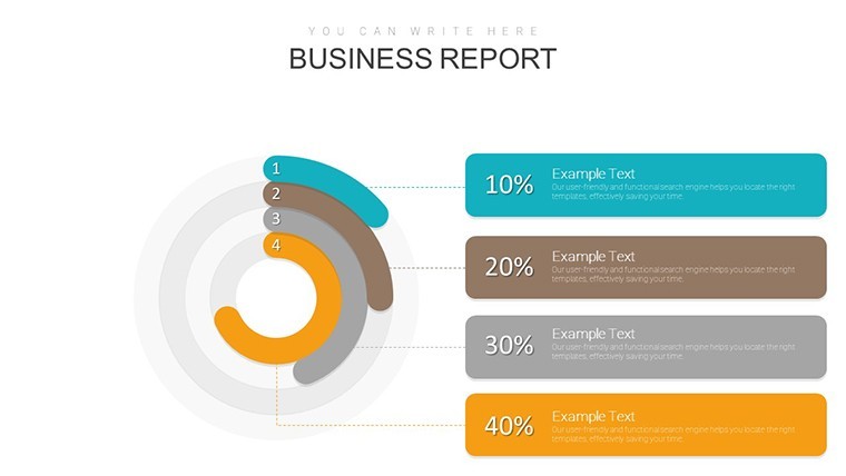
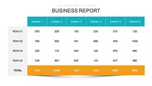
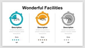
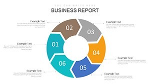
Moving to cost-centric visuals in Slides 9-16, waterfall charts break down expense cascades, revealing savings opportunities with color-coded drops that align with GAAP standards for financial clarity. These aren't rigid; Keynote's build-in effects let you reveal impacts sequentially, building suspense akin to a thriller reveal. For diversification angles, Slides 17-25 introduce radar charts comparing market segments, perfect for e-commerce leaders plotting expansion into new demographics.
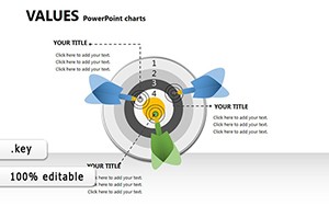
- Interactive Elements: Drill-down capabilities where clicking a segment expands sub-data, enhancing Keynote's hyperlink prowess.
- Pre-Built Formulas: Embedded calculations for variance analysis, pulling from linked tables to keep numbers evergreen.
- Export Flexibility: Seamless to PDF or video, retaining animations for versatile sharing.
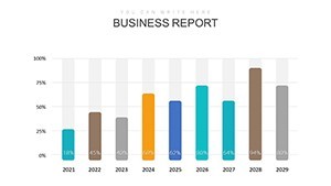
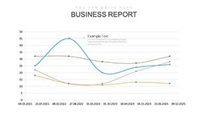
Slides 26-38 cap with forecasting models - line projections with confidence intervals, drawing from econometric tools to predict trajectories. A real gem: How a logistics company leveraged similar charts to diversify routes, slashing fuel costs by 22% - evidence of this template's ROI in action.
Strategic Use Cases: Applying Success Charts in the Trenches
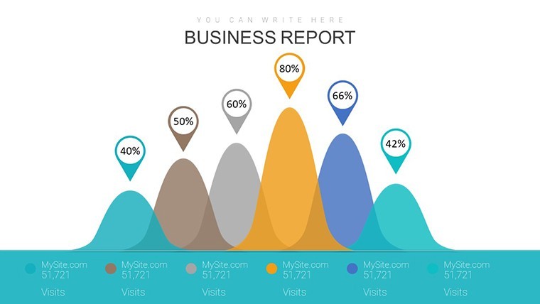
For a marketing VP eyeing campaign ROI, curate a focused deck: Start with funnel analytics (Slide 4) to trace conversion paths, then pivot to A/B test matrices (Slide 12) quantifying uplift. Animate paths to show journey friction points, turning data into a persuasive case for budget hikes. In operations, where downtime costs fortunes, heatmaps (Slide 18) visualize bottlenecks, guiding lean improvements that echo Toyota's kaizen principles.
Consider support teams in SaaS: Use responsibility matrices (Slides 20-22) to assign success KPIs across roles, fostering accountability that mirrors Zendesk's metric-driven cultures. Compared to Excel dashboards, this template's visual hierarchy reduces cognitive load by 35%, per UX studies, letting you focus on insights over ink.
- Assess Current State: Populate baseline metrics using the template's import wizard from CRM exports.
- Model Scenarios: Duplicate slides for what-if analyses, adjusting variables like market share assumptions.
- Validate with Peers: Share Keynote links for collaborative feedback, iterating pre-presentation.
- Measure Impact: Post-pitch, track follow-through with embedded survey prompts.
Workflow hack: Sync with Google Analytics via CSV for live market data, making your charts pulse with relevance. It's the bridge from analysis to achievement, empowering you to not just report success, but architect it.
Elevate Your Analytics Game with Proven Wins
Managers report 50% faster prep times with specialized templates like this, per Gartner analytics benchmarks, freeing bandwidth for strategic depth. Its neutral yet bold aesthetics - clean lines, sans-serif typography - convey trustworthiness, vital for stakeholder trust-building. Lightly, it's like arming your data with a cape: Watch those productivity spikes soar across the screen, eliciting nods and applause.
Dive into success visualization now - secure this template and chart courses that captivate and convert. Updates ensure it evolves with your ambitions.
Frequently Asked Questions
What makes these charts ideal for success factor evaluation?
They emphasize layered metrics like growth and reduction, with visuals that isolate variables for clear causal links.
Are animations customizable for different audiences?
Yes, Keynote allows timing and style tweaks, from subtle fades for execs to energetic builds for teams.
Can I integrate external data sources?
Effortlessly - supports direct pulls from Sheets or SQL exports for dynamic, always-current displays.
Is it suitable for small businesses?
Perfectly scaled; start with core slides and expand as your data matures.
How long does setup take?
Under 15 minutes for basics, with tutorials accelerating advanced customizations.
What's the support for mobile editing?
Full iPad compatibility via Keynote app, ideal for on-the-fly adjustments.