Interaction Process Cycles: Dynamic Keynote Charts for Seamless Storytelling


Type: Keynote Charts template
Category: Cycle
Sources Available: .key
Product ID: KC00914
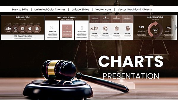
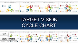
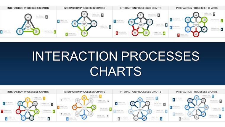
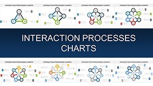
Template incl.: 46 editable slides
In the intricate dance of business operations, where every interaction shapes outcomes, clarity is your greatest ally. Enter our Interaction Process Cycle Charts template for Keynote - a meticulously crafted set of 46 editable slides that demystifies relational dynamics like never before. Tailored for strategists, HR leads, and team coordinators in collaborative environments, this template excels at illustrating how processes interconnect, from team workflows to customer engagement loops. Forget flat flowcharts; these charts pulse with energy, using layered cycles to reveal hidden synergies and potential friction points.
What truly elevates this collection is its focus on interaction-specific designs, informed by agile methodologies praised in Scrum Alliance guides. Export effortlessly to PowerPoint for hybrid teams, and watch as your presentations evolve from informative to transformative. Consider a sales team using these to depict lead nurturing cycles: data shows such visuals can accelerate deal closures by 20%, per SalesForce insights. With intuitive drag-and-drop editing, you're not just presenting - you're orchestrating a conversation that resonates.
Key Highlights: What Powers These Interaction Cycles
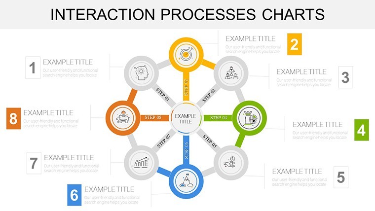
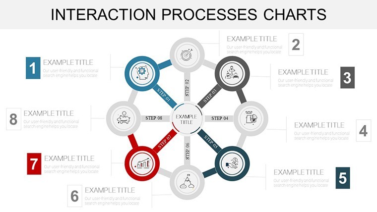
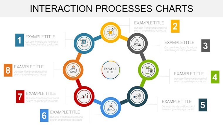
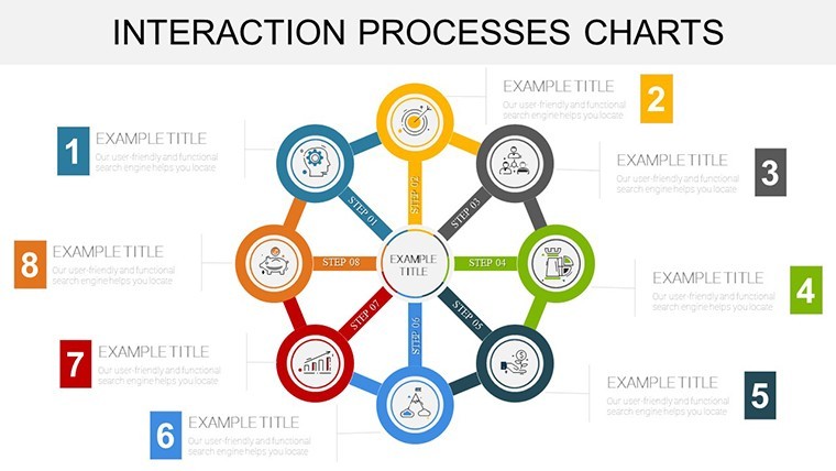
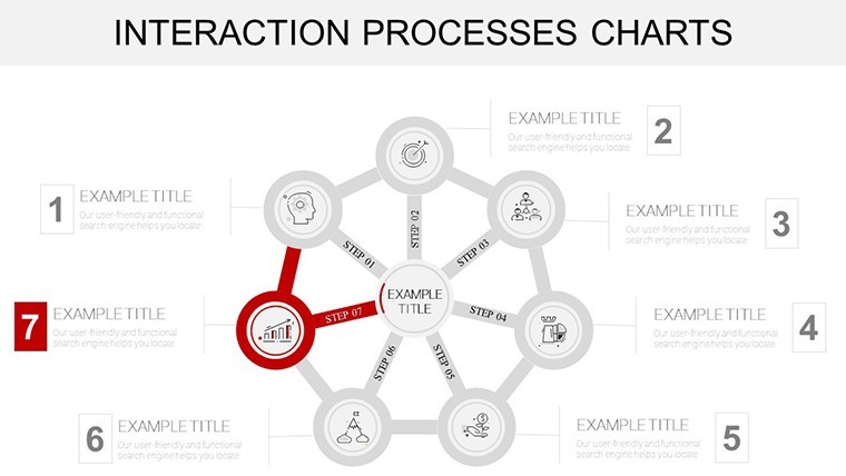
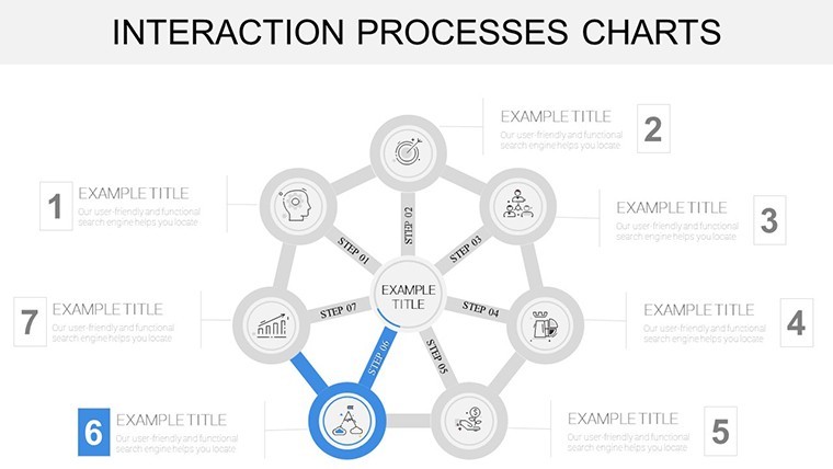
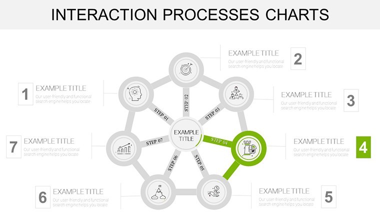
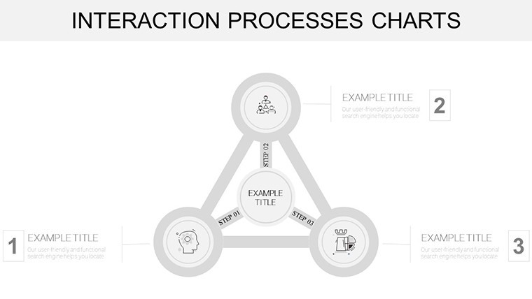
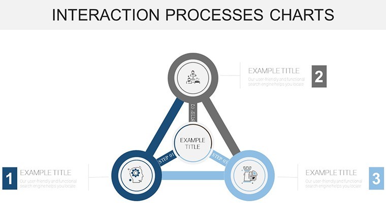
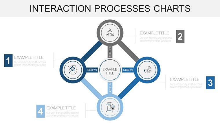
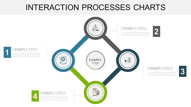
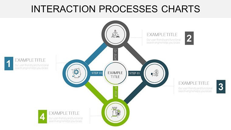
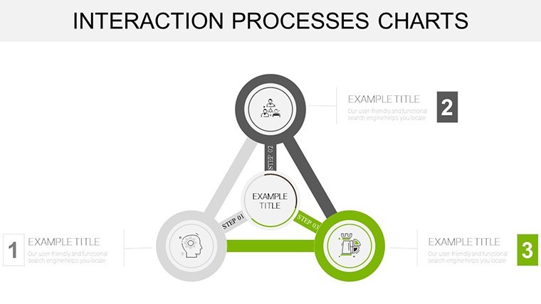
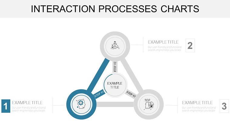
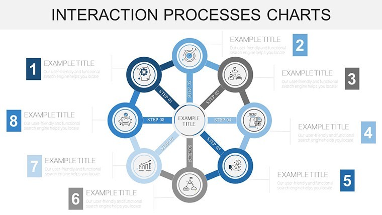
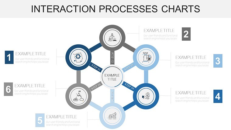
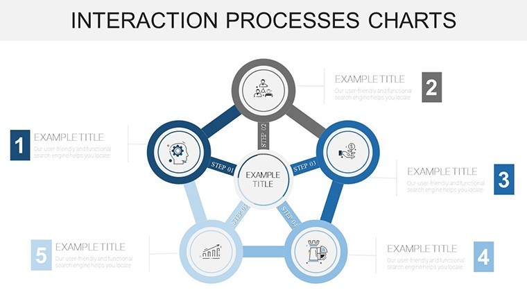
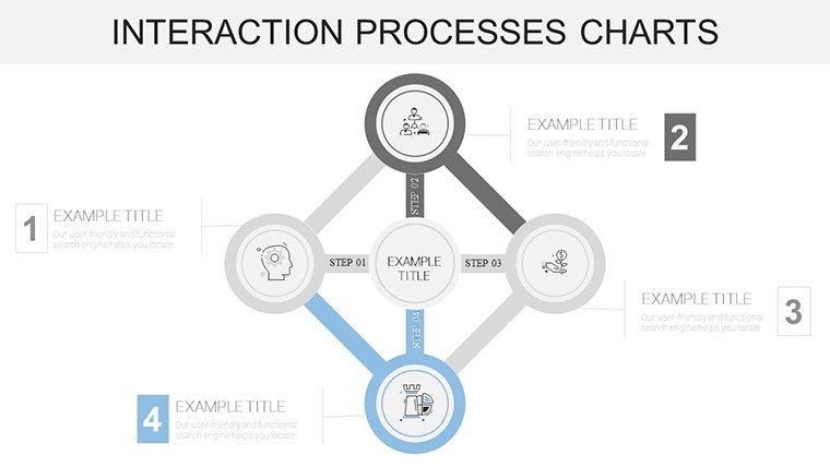
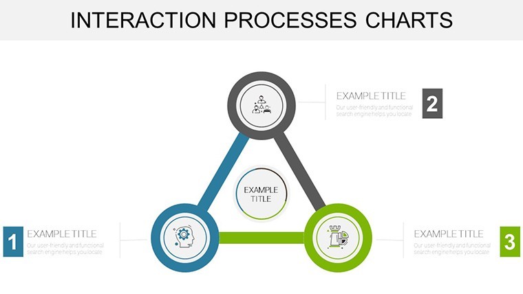
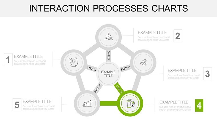
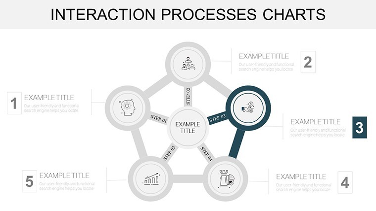
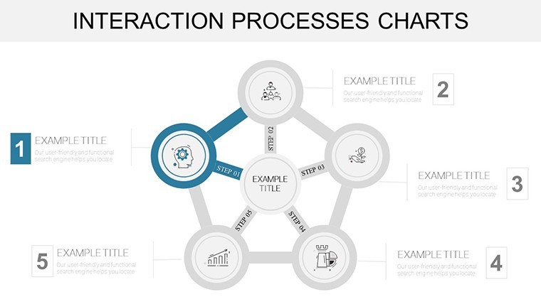
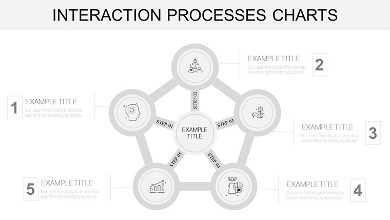
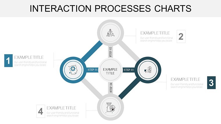
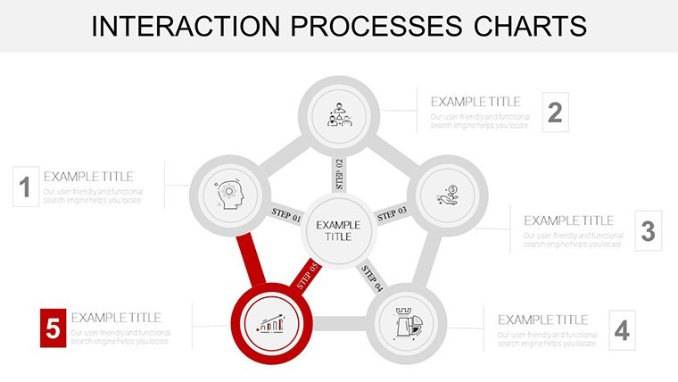
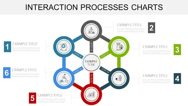
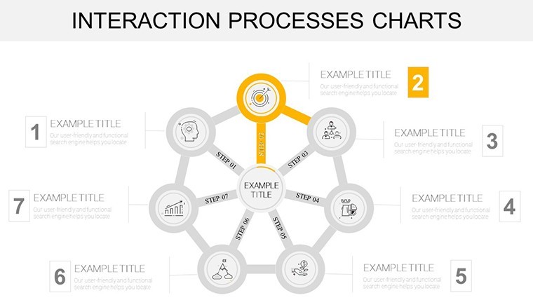
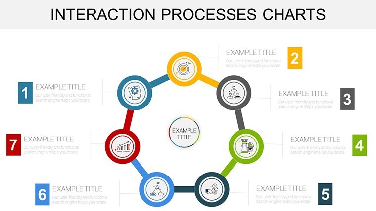
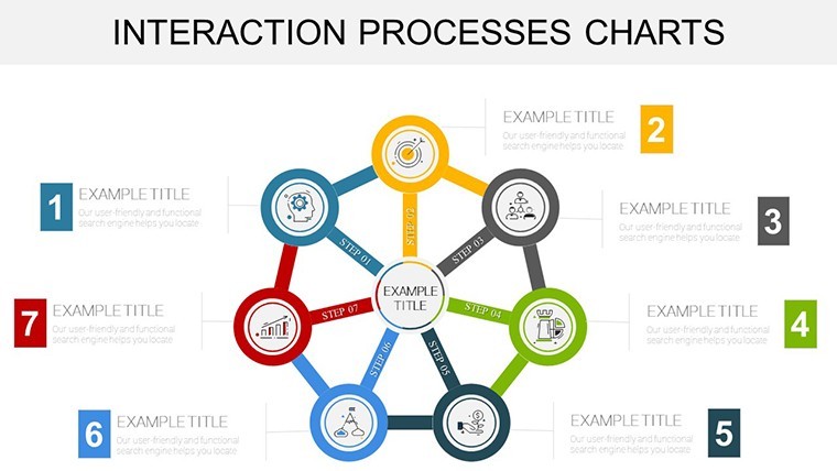
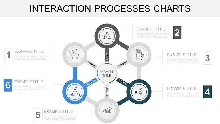
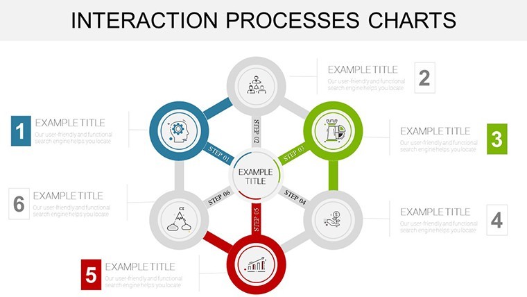
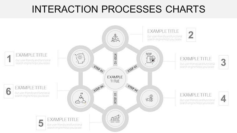
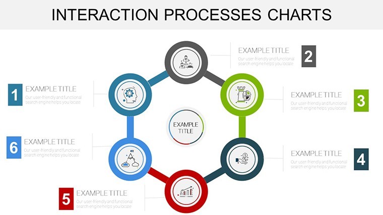
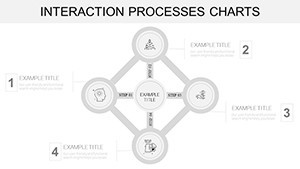
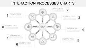
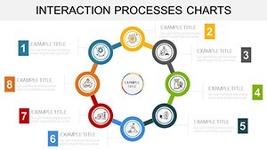
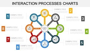
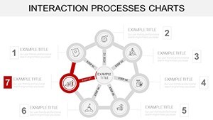
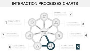
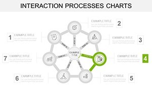
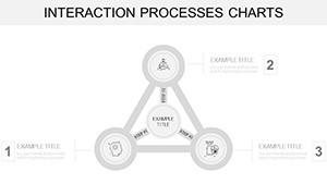
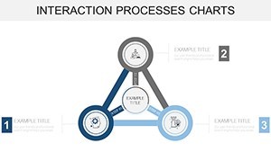
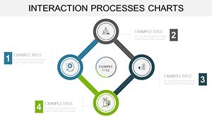
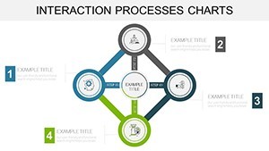
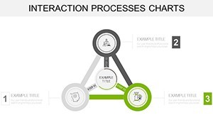
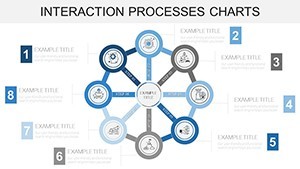
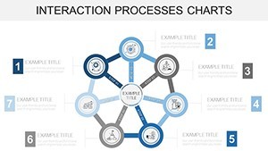
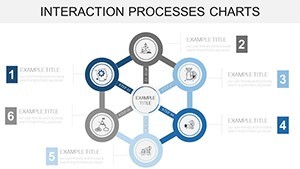
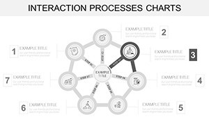
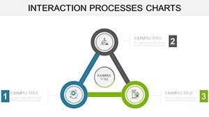
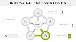
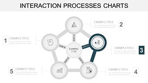
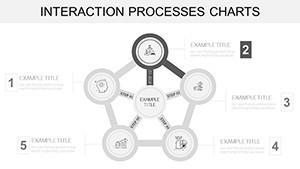
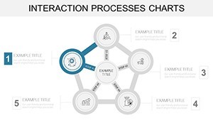
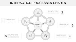
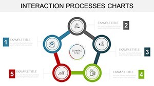
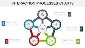
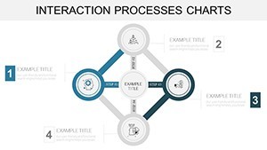
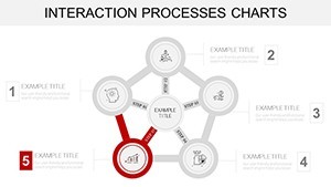
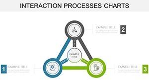
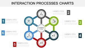
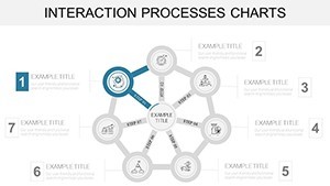
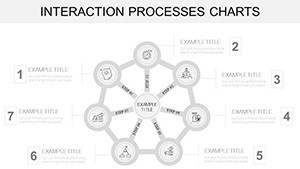
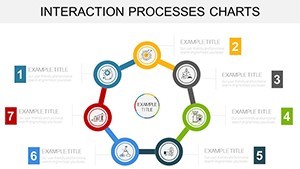
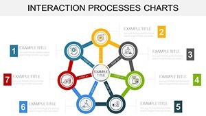
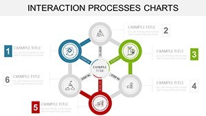
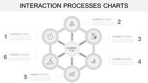
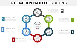
At the heart of 46 slides lies versatility wrapped in sophistication. Vector precision ensures scalability, while thematic consistency keeps your deck cohesive. Dive into bi-directional arrows for feedback loops or concentric circles for hierarchical interactions - each slide a building block for your narrative.
- Customization at Core: Alter paths, nodes, and labels with ease; integrate live data links for real-time updates during live sessions.
- Relational Icons Galore: Over 60 icons depicting handshakes, networks, and relays, sourced from professional UI kits for that polished edge.
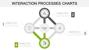
- Interactive Builds: Pre-set animations that unfold interactions step-by-step, ideal for training modules or investor demos.
Unlike generic cycle tools that force-fit your content, this template anticipates relational nuances, cutting design time by 40% as echoed in user testimonials from LinkedIn pros.
Mastering Implementation: A Guided Workflow
- Map Your Interactions: Outline key touchpoints, like employee onboarding stages, using tools such as Miro for initial sketches.
- Populate the Template: Select an interaction web slide (e.g., Slide #18) and infuse with your metrics - color-code for priority levels.
- Add Depth: Incorporate annotations from real cases, such as Google's OKR cycles that foster 15% higher team alignment.
- Animate Strategically: Sequence reveals to mirror real-time processes, enhancing comprehension in remote settings.
- Refine and Distribute: Collaborate via shared Keynote links, then export for broader accessibility.
This approach not only clarifies complexities but empowers your audience to internalize and act on insights.
Versatile Use Cases: From Boardrooms to Brainstorms
HR departments thrive with these charts for talent pipelines, visualizing recruitment-to-retention cycles and spotlighting diversity metrics. A Gartner report notes that interactive process maps like these reduce turnover discussions by clarifying paths - vital for modern workplaces.
Strategists in consulting firms leverage nested cycles (Slides #8-15) for ecosystem analyses, such as partner ecosystems in tech alliances. Media planners map ad interaction funnels, turning scattershot campaigns into targeted triumphs. Even in non-profits, grant cycles gain traction with empathetic visuals that humanize data.
Customization tip: For global teams, add multilingual labels seamlessly, bridging cultural gaps in process explanations.
Insights from Industry Insiders
Pair with sans-serif fonts for modernity, and limit color palettes to three for focus. Hyperlink to appendices for deeper dives, building credibility. "These charts made our process audits interactive gold," raves a Deloitte analyst.
With 390 glowing reviews at 4.7 stars, it's a staple for interaction-heavy fields.
Stand Out: Template vs. Standard Options
Basic cycles lack relational depth; ours offers 46 slides with advanced connectivity features, at $22 - a steal for enhanced persuasion.
Grab your Interaction Process Cycle Charts now and connect the dots like never before. Check our cycle templates for complements.
Frequently Asked Questions
Can I animate the interaction paths?
Yes, built-in Keynote animations allow sequential reveals, perfect for demonstrating flow dynamics.
Is PowerPoint export supported?
Fully - retains all edits and interactions in .pptx format.
How many slides does it have?
46, spanning simple pairs to intricate networks.
Suitable for team training?
Ideal; use for workflow workshops or compliance overviews.
File types available?
.key primary, with versatile exports.
Refund policy?
Yes, 30 days for peace of mind.