Premium Enterprise Charts Template for Keynote: Master Data Visualization


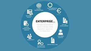

In the high-stakes arena of enterprise decision-making, raw data alone won't cut it - you need visuals that cut through noise and drive insights. Our Premium Enterprise Charts Template for Keynote provides 19 editable slides, blending Venn diagrams, fishbone analysis, and advanced infographics to transform complex information into actionable stories. Perfect for executives, analysts, consultants, and strategists across industries like finance, tech, and healthcare, this template aligns with standards from bodies such as the International Institute of Business Analysis (IIBA). Picture dissecting project bottlenecks with a fishbone diagram or overlapping market segments in a Venn chart, all while referencing case studies like those from McKinsey on data-driven strategies boosting efficiency by 20%. Fully compatible with Keynote 10+, PowerPoint, and Google Slides, it tackles challenges like inconsistent branding by offering drag-and-drop customization. This isn't mere decoration; it's a tool to elevate pitches, reports, and meetings, fostering clarity and confidence in your professional narrative.
Advanced Features for Enterprise-Level Excellence
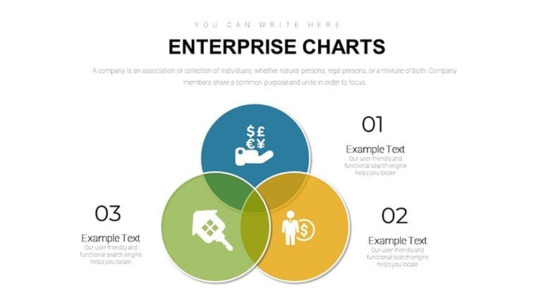
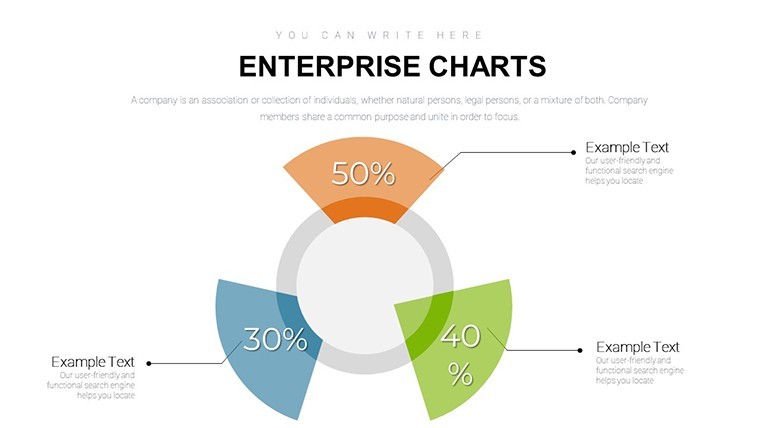
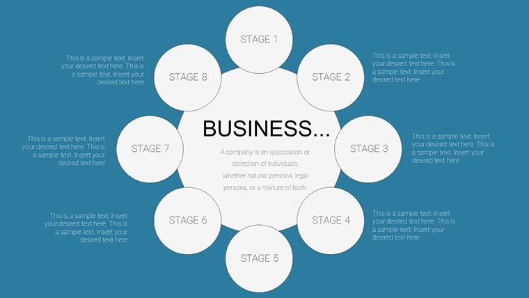
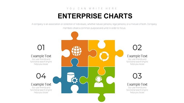
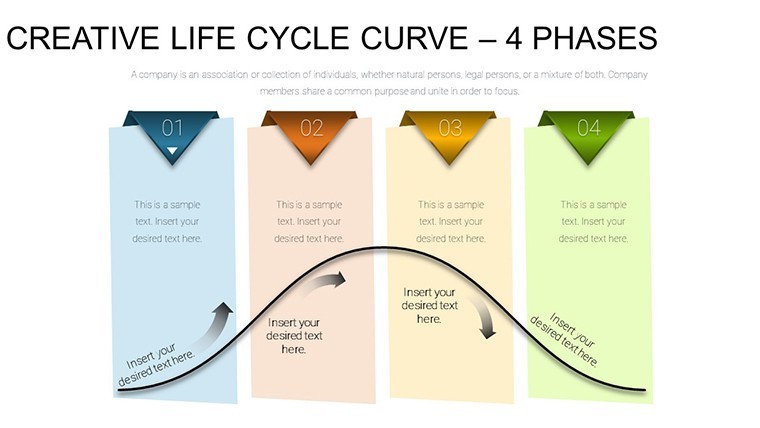
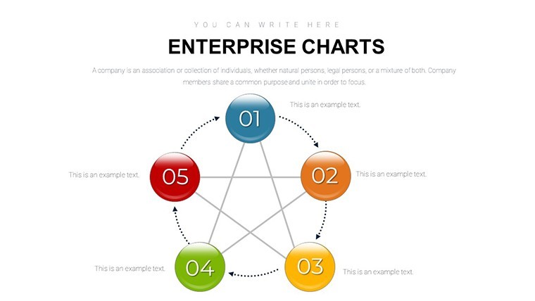
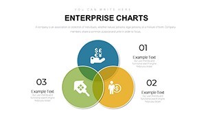
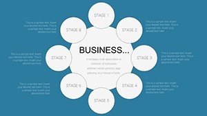
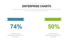
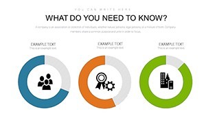
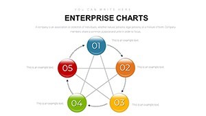
Explore the template's robust toolkit: From timeline infographics tracking project milestones to radar charts evaluating performance metrics, each element is designed for depth. As an SEO and marketing specialist, I've witnessed how such visuals enhance report retention, per Forrester Research findings of 50% better recall. Tailor layouts with built-in color schemes or add animations for dynamic reveals, ensuring your analysis stands out. For instance, use Slide 5's Venn diagram to merge departmental data, highlighting synergies in cross-functional teams.
Highlighting Key Benefits
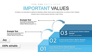
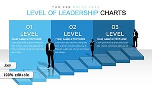
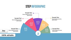
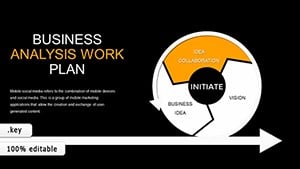
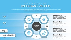
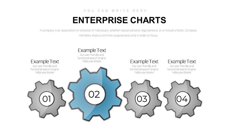
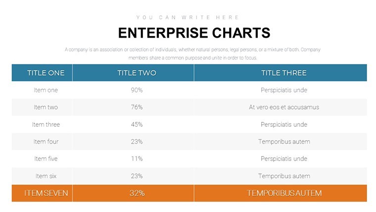
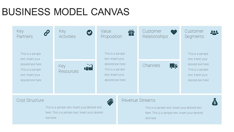
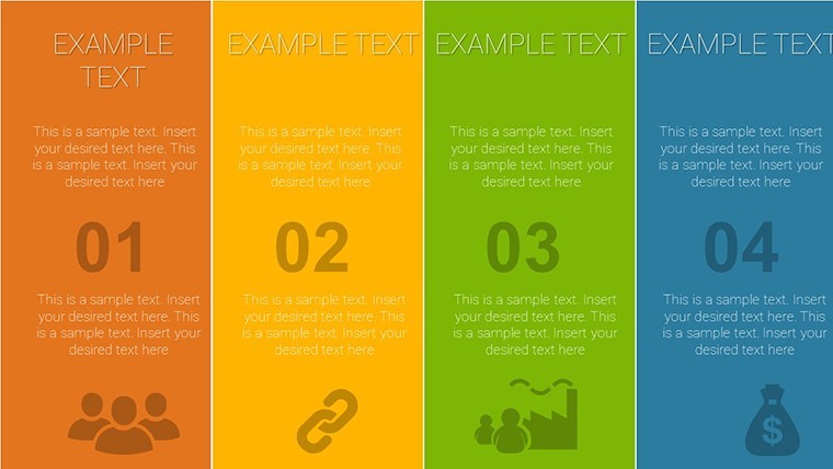
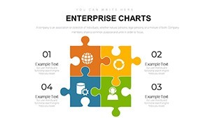
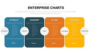
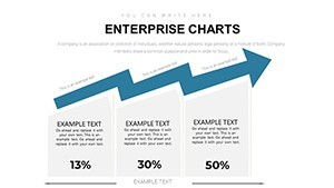
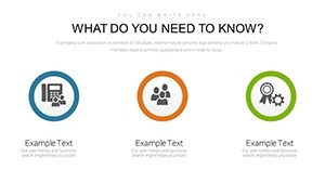
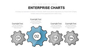
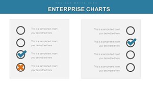
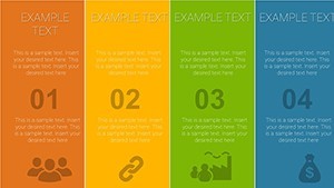
- Comprehensive Slide Variety: 19 layouts including charts, timelines, and problem-solving tools like fishbone.
- Retina-Ready Design: Crisp visuals for any display, maintaining professionalism.
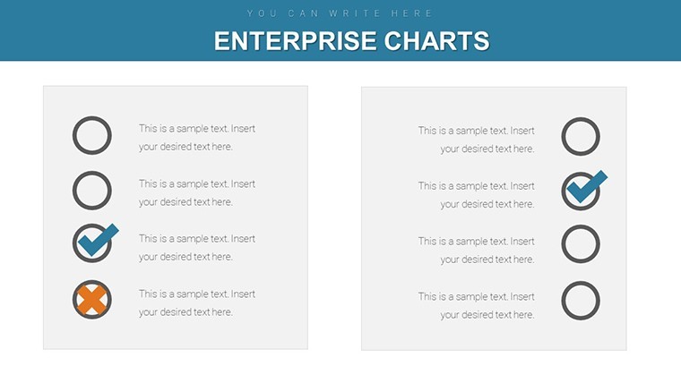
- Easy Customization: Placeholders for quick data and image inserts.
- Animation and Transitions: Enhance flow without overwhelming viewers.
- Format Flexibility: Widescreen and standard options for diverse needs.
Outshining basic tools, this premium offering includes aligned layouts for branding consistency, saving hours in creation.
Use Cases: Solving Real Enterprise Challenges
Deploy this template effectively: For board meetings, start with an executive summary slide, then dive into fishbone analysis on operational issues, incorporating data from Gartner reports. Consultants can customize Venn charts for client mergers, visualizing overlaps in resources. In healthcare, adapt bubble charts to patient outcome trends, promoting evidence-based decisions. Step-by-step: Open in Keynote, replace placeholders, animate sequences, and export for sharing. This addresses gaps like vague problem-solving, as seen in original page intent.
Expert Guidance for Maximum Utility
- Structure logically: Build from overview to detailed analysis.
- Integrate narratives: Pair visuals with concise explanations.
- Focus on accessibility: High-contrast designs for inclusivity.
- Collaborate: Use cloud exports for team reviews.
- Evaluate impact: Gather post-presentation metrics for refinements.
Conclude with a compelling CTA slide: 'Transform your data - customize this template now!' Its enterprise focus ensures unparalleled value for pros.
Frequently Asked Questions
- What industries does this suit?
- Finance, tech, consulting, healthcare, and more for versatile data viz.
- How editable are the diagrams?
- Fully, with adjustable elements for custom data integration.
- Supports older Keynote versions?
- Optimized for 10+, but testable on earlier with minor tweaks.
- Includes fishbone diagrams?
- Yes, for effective problem-solving visuals.
- Can I use for pitches?
- Ideal, with professional layouts to impress investors.
- Price includes updates?
- One-time purchase, but check site for any future enhancements.