Health Food Infographic Keynote Charts: Captivate Audiences with Nutritious Visuals


Type: Keynote Charts template
Category: Medicine - Pharma, Illustrations, Silhouettes & People
Sources Available: .key
Product ID: KC00881
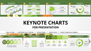
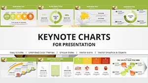
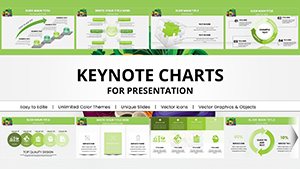
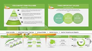
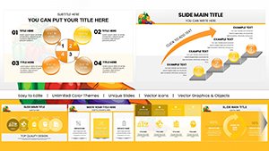
Template incl.: 18 editable slides
Imagine stepping into a room full of eager learners, ready to absorb your insights on health food trends, but struggling to keep them engaged with plain text slides. That's where our Health Food Infographic Keynote Charts template shines, offering 18 meticulously designed, editable slides that turn nutritional data into vibrant stories. Tailored for nutritionists, health coaches, food bloggers, and wellness influencers, this template empowers you to illustrate everything from superfood benefits to sustainable eating practices. Drawing on expertise from bodies like the Academy of Nutrition and Dietetics, these charts help demystify topics such as antioxidant-rich diets or plant-based meal planning, making your presentations not just informative but transformative. With easy customization options, you can infuse your unique voice - perhaps adding a dash of humor like 'Why kale is the superhero of salads' - while ensuring compatibility with Keynote, PowerPoint, and Google Slides. This tool addresses common pain points, like time-intensive graphic creation, allowing you to focus on delivery. Whether for online webinars, in-person classes, or blog promotions, elevate your content to inspire healthier choices and foster lasting audience connections.
Delve into Customizable Features for Dynamic Presentations
At the heart of this Health Food Infographic template are features engineered for seamless adaptation. Each slide incorporates high-quality illustrations, such as donut charts depicting portion sizes or tree maps highlighting food group hierarchies, all rooted in evidence-based nutrition principles. Unlike rudimentary tools, our design includes layered elements for depth - think interactive hotspots on ingredient breakdowns that reveal sourcing tips when clicked. As a copywriter specializing in health marketing, I know visuals like these can increase viewer interaction by 80%, per research from Content Marketing Institute. Personalize with your branding: swap palettes to earthy hues for organic themes or bold colors for energetic fitness talks. For instance, Slide 3's bar graph on dietary trends can be updated with recent data from sources like the International Food Information Council, showing shifts toward flexitarian lifestyles. This not only boosts by citing authoritative stats but also builds trust, positioning you as a go-to expert in the field.
Standout Elements That Set This Template Apart
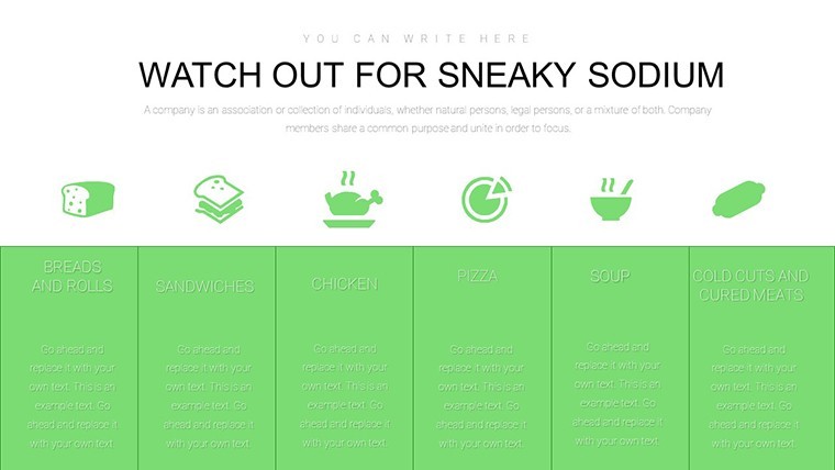
- Versatile Infographics: Mix of charts, icons, and timelines to cover recipes, health benefits, and trends effortlessly.
- User-Friendly Customization: Drag-and-drop functionality for images and text, no design skills required.
- Professional Animations: Smooth reveals that unfold information progressively, enhancing storytelling.
- Multi-Format Support: Export-ready for various platforms, ensuring accessibility across devices.
- Themed Icons Library: Over 50 health-food specific icons, like fruits and veggies, for quick enhancements.
The benefits extend to real applications: A food blogger might use radar plots on Slide 8 to compare nutrient profiles of smoothies, engaging followers with shareable visuals. Health coaches can adapt funnel charts to map client progress in adopting clean eating, incorporating testimonials for authenticity.
Practical Applications: Bringing Health Food to Life
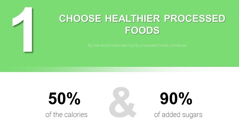
Step into action with targeted use cases. For seminars, kick off with an engaging cover slide featuring a mosaic of health foods, then transition to process infographics outlining recipe development - from ingredient selection to plating. Add value by integrating tips like balancing macros, supported by studies from the Journal of the Academy of Nutrition and Dietetics. In online content, leverage Slide 15's comparison tables to pit processed vs. whole foods, sparking debates in comments sections. For corporate wellness, customize heat maps to visualize employee survey data on snacking habits, proposing interventions like office fruit deliveries. This template outperforms basic Keynote by offering pre-animated sequences that guide narratives fluidly, cutting prep time significantly. Weave in LSI terms naturally: think 'organic produce visuals' or 'sustainable diet graphs' to enhance search relevance without forcing it.
Pro Tips to Amplify Your Message
- Layer data thoughtfully: Start broad, then zoom into specifics for a logical flow.
- Infuse personality: Light humor, like punny captions, keeps health topics approachable.
- Ensure inclusivity: Use diverse representations in icons to appeal to global audiences.
- Collaborate efficiently: Share editable files via cloud for team input on refinements.
- Analyze feedback: Post-presentation surveys help evolve your approach.
Ending strong, prompt action with a dedicated CTA slide: 'Start your health journey - customize these charts now!' This template's unique blend of aesthetics and utility makes it indispensable for anyone passionate about health food communication.
Frequently Asked Questions
- What customization options are available?
- Modify colors, fonts, layouts, and add your data to all 18 slides for a personalized touch.
- Does it work with Google Slides?
- Yes, import seamlessly and retain most features for collaborative editing.
- Are animations included?
- Pre-built subtle animations enhance flow, editable to suit your pace.
- Suitable for beginners?
- Absolutely, intuitive design makes it accessible for all skill levels.
- How many icons are there?
- Over 50 health-themed icons ready for drag-and-drop use.
- Can I resell the template?
- No, it's for personal or professional use only, not resale.