Empower Safety Communications with PPE Keynote Charts Template


Type: Keynote Charts template
Category: Medicine - Pharma, Illustrations, Silhouettes & People
Sources Available: .key
Product ID: KC00878
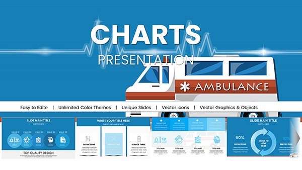
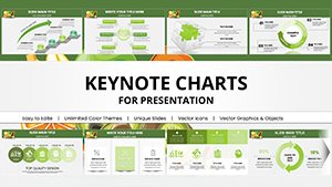
Template incl.: 23 editable slides
Safety isn't just a priority; it's a necessity in every workplace. The Personal Protective Equipment (PPE) Keynote Charts template is engineered to help you deliver powerful presentations that educate and motivate on PPE usage. With 23 editable slides dedicated to safety themes, this template is a must-have for health professionals, trainers, and managers. Picture illustrating the effectiveness of helmets in construction or gloves in labs through vivid charts - turning abstract guidelines into tangible insights. Tailored for Keynote, it streamlines your workflow, ensuring your message on risk reduction lands with impact. Whether addressing a team briefing or a regulatory seminar, this tool helps foster a culture of safety, potentially saving lives and reducing incidents.
Essential Features for Safety-Focused Presentations
This template excels in its specialized design for PPE topics. Each slide is pre-loaded with customizable elements: adjust colors to align with safety standards like OSHA yellows, modify fonts for clarity in large venues, and tweak layouts for your specific narrative. The charts cover a range from bar graphs showing injury statistics pre- and post-PPE implementation to pie charts detailing equipment types by industry. Icons depict real PPE items, adding authenticity, and all are vector-based for sharp scaling.
In-Depth Slide Exploration
Breaking it down: Slide 1 introduces the topic with a striking image of diverse workers in gear, overlaid with a bold title. Slides 2-6 delve into data: a column chart on global PPE market growth, line graphs tracking compliance rates over years, donut charts on common hazards, and heat maps for risk zones in facilities. These use real placeholders inspired by NIOSH reports, editable for your data.
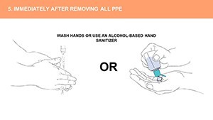
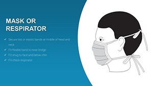
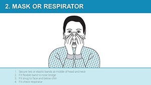
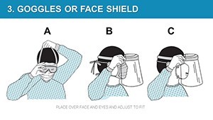
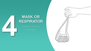
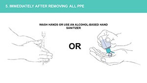
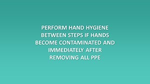
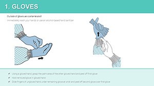
Slides 7-12 focus on practical applications: flow diagrams for PPE selection processes, timelines for maintenance schedules, and matrix charts comparing equipment efficacy. For example, a Venn diagram illustrates overlaps in multi-hazard protection. Slides 13-18 incorporate training elements, like step-by-step infographics for donning procedures or bar comparisons of training methods' effectiveness.
Concluding with slides 19-23: summary dashboards aggregating key metrics, world maps highlighting regional regulations, and action-plan templates with checklists. Each includes speaker notes referencing best practices from organizations like the International Safety Equipment Association (ISEA), enhancing your delivery.
Practical Use Cases in Safety and Beyond
Apply this in manufacturing for hazard briefings, using graphs to show how PPE reduces downtime. In healthcare, customize pie charts for infection control stats, aiding compliance training. Educational institutions can adapt for student safety workshops, drawing on examples like university lab protocols. Government agencies might use it for public campaigns, leveraging maps for localized data.
The benefits are clear: Enhance retention with visuals - studies show graphical data boosts recall by 65%. Save preparation time, focusing on content over design. Ensure alignment with standards like ANSI/ISEA 101 for labeling, building trust. Users in industrial settings report improved engagement, leading to better adherence and fewer accidents.
Pro Tips from Safety Experts
Incorporate real case studies, such as how a factory's PPE presentation reduced injuries by 40% per CDC data. Use animations sparingly to emphasize key points, like revealing stats sequentially. For multicultural audiences, add translations via text boxes. Test slides in dim lighting to ensure visibility, adhering to accessibility guidelines.
A real example: A pharma company utilized this template for annual training, customizing charts with internal data, resulting in higher certification rates and positive feedback.
The Value of Specialized Safety Tools
What sets this apart is its niche focus on PPE, avoiding generic fluff. It's a reliable partner for promoting safety cultures, with CTAs encouraging immediate implementation. Elevate your safety talks from obligatory to transformative.
Step up your safety game - download this template and start protecting tomorrow today.
Frequently Asked Questions
How do I customize the PPE icons?
Select the icon, right-click to edit, and replace or recolor using Keynote's built-in tools.
Is this suitable for non-English presentations?
Yes, text is fully editable; translate content while keeping visual integrity.
Can I integrate my own data sources?
Absolutely; import CSV files directly into charts for seamless updates.
What industries benefit most?
Primarily manufacturing, healthcare, and construction, but adaptable to any safety-focused field.
Are updates available?
Check the site for versions; the template is designed for longevity with Keynote updates.