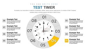
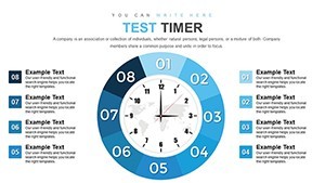
Test Timer Keynote Charts for Precise Time Management

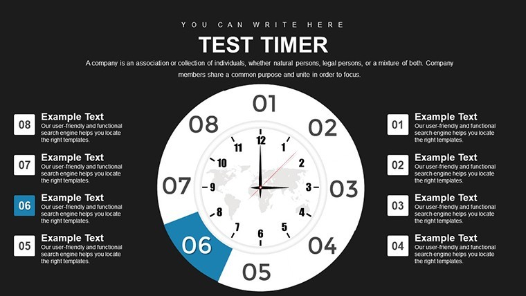


Navigating the complexities of time and events demands tools that clarify rather than confuse. Enter the Test Timer Keynote Charts Template, equipped with 42 editable slides dedicated to illustrating timelines, event sequences, and relational dynamics. This template is a boon for project managers, educators, historians, and planners who need to establish temporal contexts and interdependencies. By providing pie charts for proportional breakdowns and timelines for sequential narratives, it addresses the universal challenge of making time-based data intuitive. Inspired by chronological visualization techniques from sources like the Project Management Institute (PMI), it ensures your presentations convey progression and connections with authority. Benefits range from improved planning accuracy to heightened audience comprehension, ultimately facilitating better coordination and outcomes. Whether detailing project phases, historical events, or test schedules, this template transforms abstract timelines into concrete, engaging visuals, streamlining your communication in professional or educational settings.
Harnessing Timelines for Event Clarity
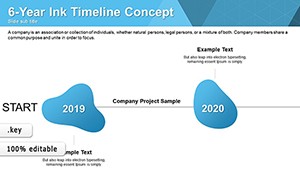
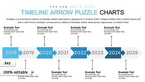
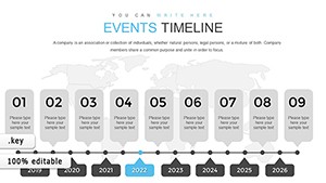
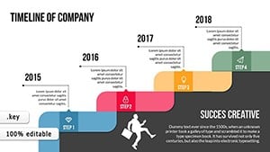
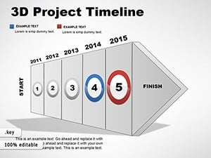
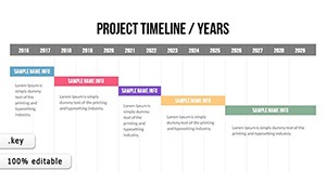
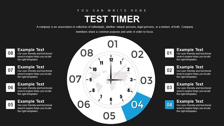
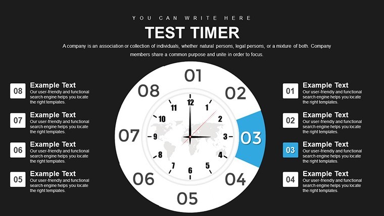
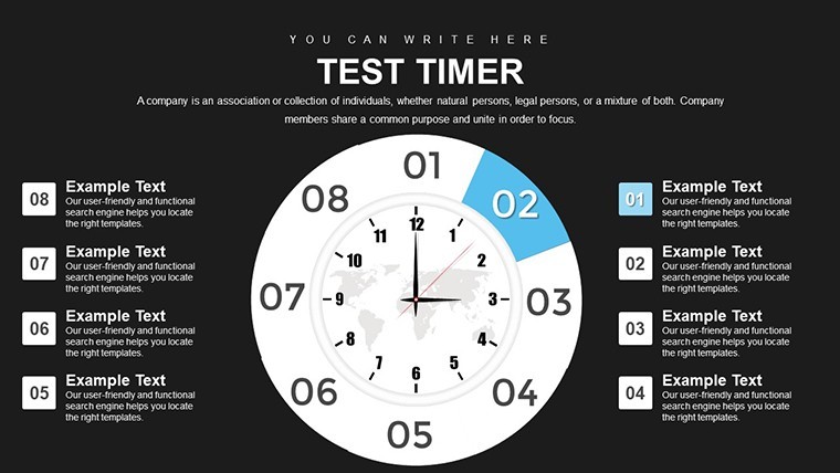
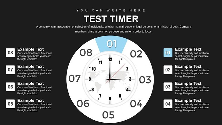
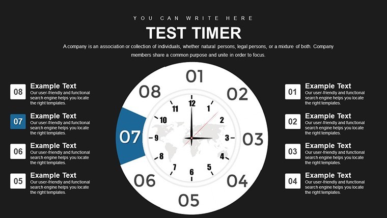
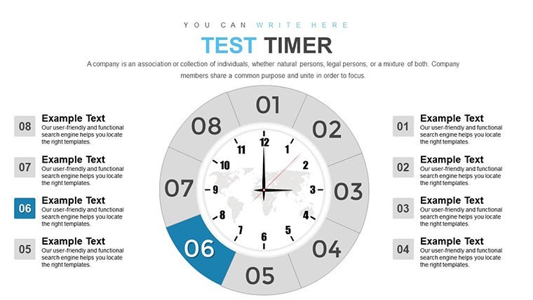
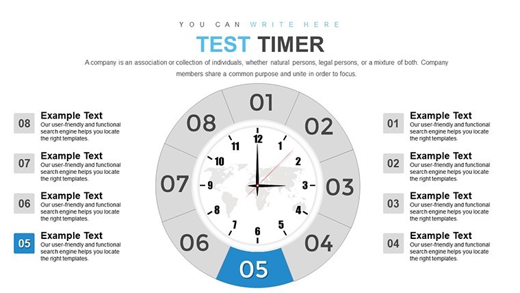
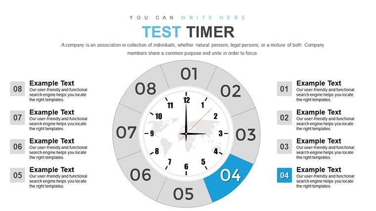
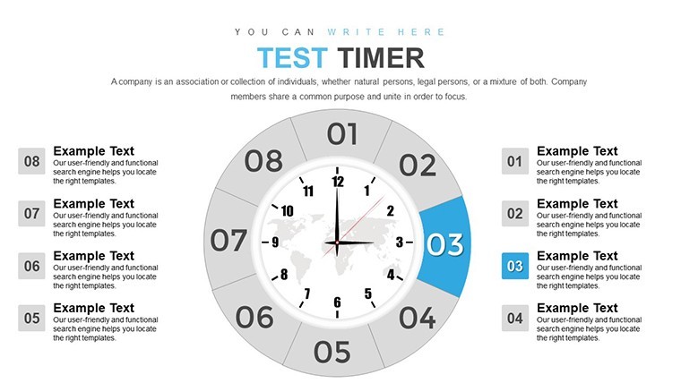
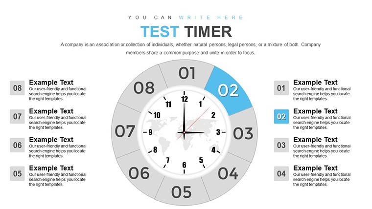
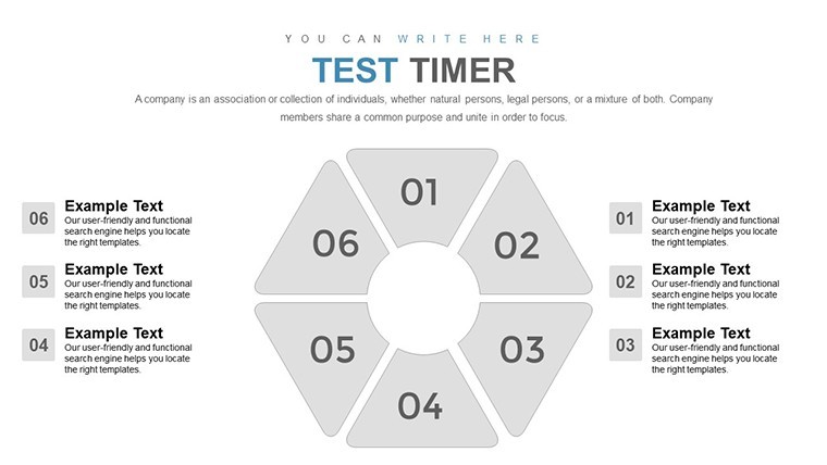
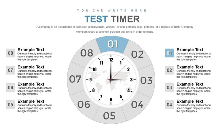
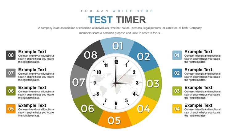
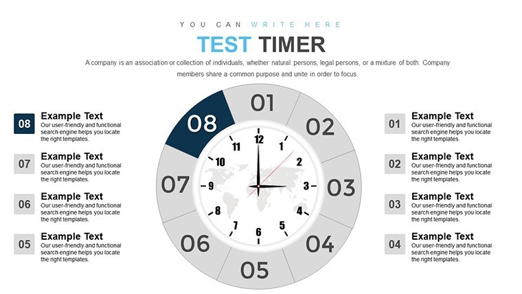
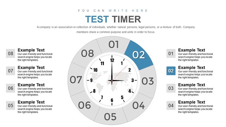
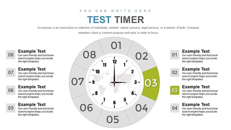
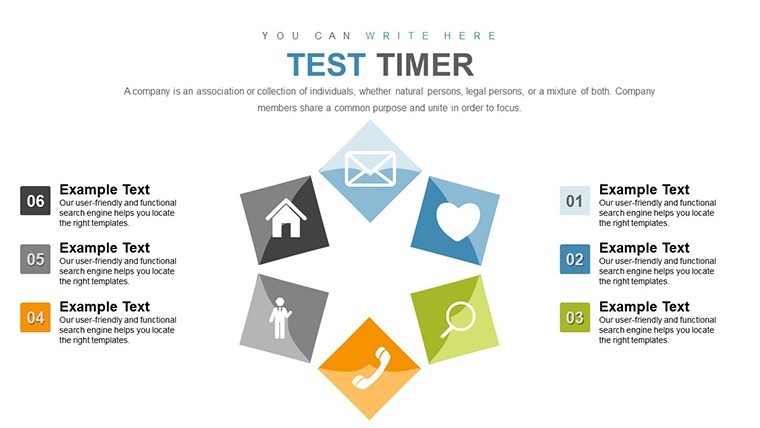
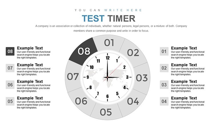
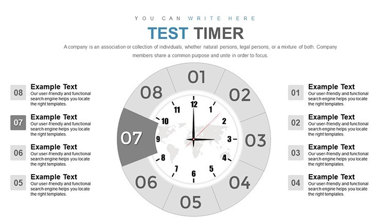
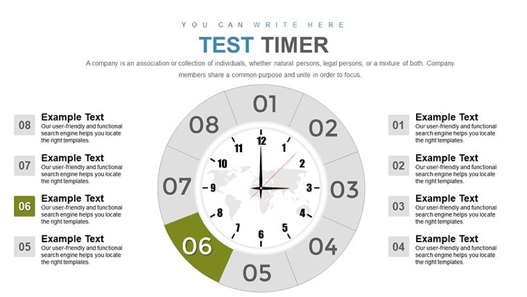
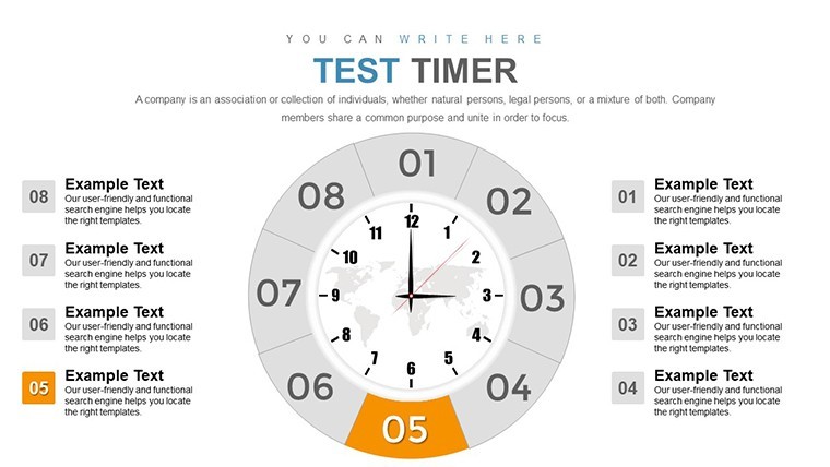
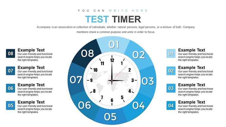
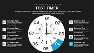
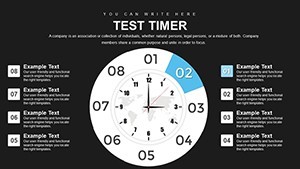
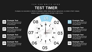
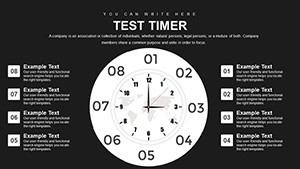
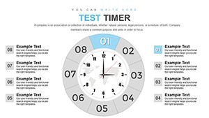
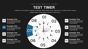
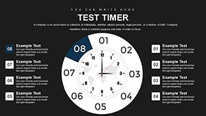
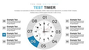
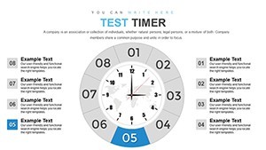
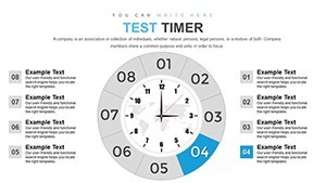
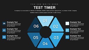
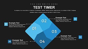
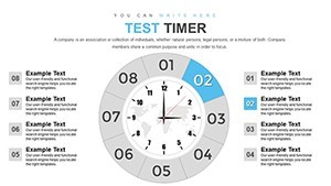
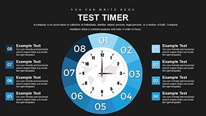
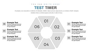
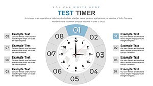
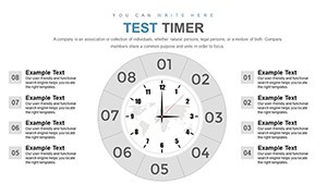
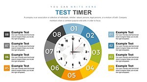
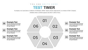
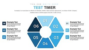
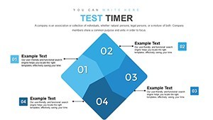
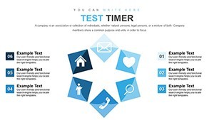
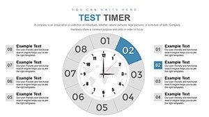
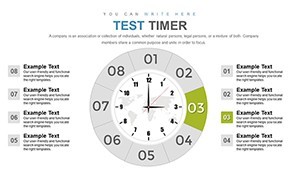
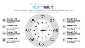
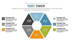
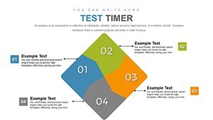
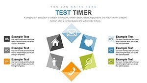
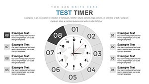
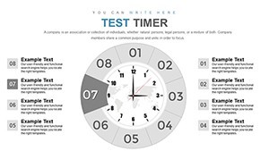
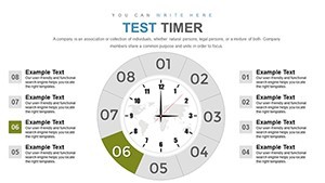
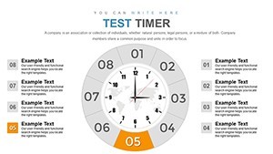
Timelines are more than lines; they're stories of progression. This template offers horizontal, vertical, and milestone-based timelines, adorned with customizable markers for key events. Pie charts complement by showing time allocations, like segments in a project pie. Color schemes in chronal gradients - fading from past blues to future oranges - aid intuitive understanding. As per PMI standards, such visuals reduce miscommunication in teams. For instance, in test planning, map phases from preparation to evaluation, highlighting dependencies.
Standout Features for Temporal Mastery
With editable elements throughout, adjust scales, labels, and icons effortlessly. Features include interactive timelines with clickable milestones, pie charts with percentage auto-calculations, and Gantt-like bars for overlaps. Vector quality ensures zoom-proof clarity.
Slide Structure Essentials
- Setup Slides (1-10): Basics for time scales and event setups.
- Timeline Slides (11-25): Various formats for sequences and milestones.
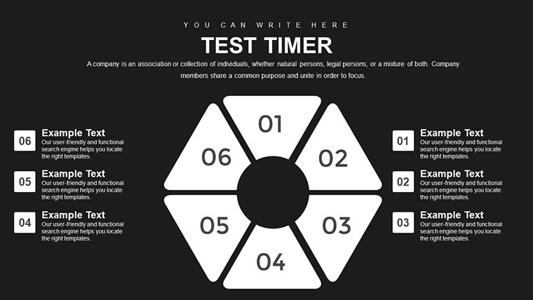
- Pie and Allocation Slides (26-35): Proportional views of time distributions.
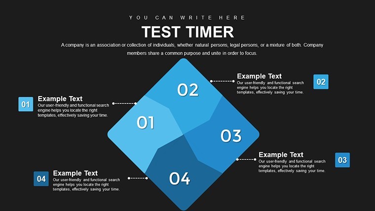
- Integration Slides (36-42): Combined views and summaries.
This setup supports comprehensive time narratives.
Applications and Case Insights
Project managers use these for sprint reviews, educators for history lessons - yielding clearer outcomes, as in PMI case studies showing 20% efficiency gains. Step-by-step: Define events, plot on timeline, allocate pies, refine visuals, present. Tips: Use arrows for causality, keep scales consistent.
Optimizing Your Time Visuals
- Open and select timeline type.
- Enter dates and events.
- Customize pies for breakdowns.
- Add annotations for depth.
- Test flow in slideshow mode.
These ensure robust representations.
Compatibility and Pro Strategies
Fully Keynote-compatible, it enhances basic tools with specialized time features. Strategies include syncing with calendars or using animations for progression reveals.
Organize Your Time Narratives Now
The Test Timer Keynote Charts Template is your ally in taming time. Download to craft precise, persuasive presentations that stand the test of time.
Frequently Asked Questions
What chart types focus on time?
Timelines and pie charts for sequences and allocations.
Fully editable?
Yes, adjust all elements in Keynote.
Best for whom?
Project managers, educators, planners.
Handles complex relationships?
Yes, with dependency markers.
Includes animations?
Options for dynamic reveals.
Vs. standard templates?
Superior time-specific designs.