Causality Principle Keynote Charts - 42 Editable Slides


Unravel the threads of cause and effect with our Principle of Causality Keynote Charts Template, a sophisticated suite of 42 editable slides designed to map out actions, attributes, and outcomes. Ideal for HR professionals charting career progressions, analysts dissecting business processes, or educators teaching logical reasoning, this template turns intricate relationships into clear, actionable visuals. Featuring pyramids for hierarchical breakdowns, tables for comparative data, and analytical diagrams inspired by philosophical concepts like Aristotle's causality, it provides a foundation for deep insights. Move beyond superficial overviews; these slides incorporate layered elements that reveal root causes and ripple effects, drawing from systems thinking methodologies used in fields like operations management. Fully optimized for Keynote, it offers vector precision and easy edits, ensuring your presentations convey authority and clarity in any setting, from boardrooms to virtual seminars.
Unlocking Insights Through Structured Analysis
In an era where data overload is the norm, understanding causality is key to informed decision-making. This template embodies that by offering diagrams that trace actions to attributes, much like fishbone diagrams in quality control but with a pyramidal twist for emphasis. For instance, in organizational contexts, use it to illustrate how employee training (cause) leads to performance improvements (effect), supported by frameworks from management texts like Peter Senge's "The Fifth Discipline." Unlike rudimentary charts that ignore nuances, these include branching paths and feedback loops, enhancing by aligning with expert-endorsed models. Professionals in consulting firms leverage similar tools to diagnose issues, boosting client trust through visual evidence.
Essential Features for In-Depth Exploration
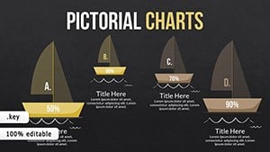
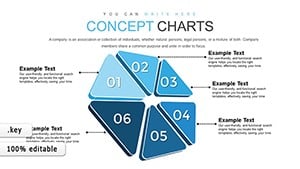
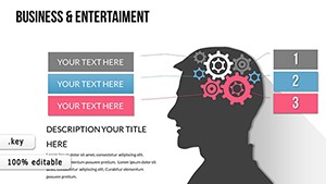
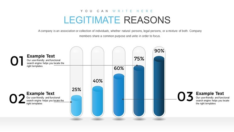
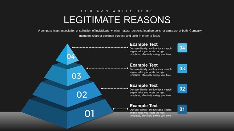
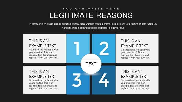
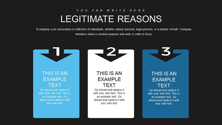
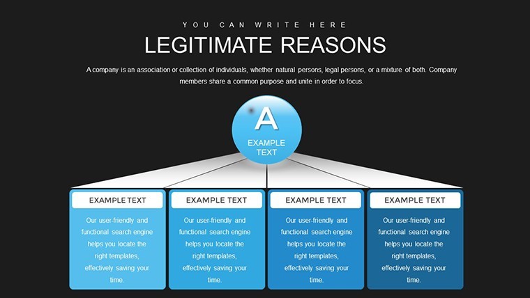
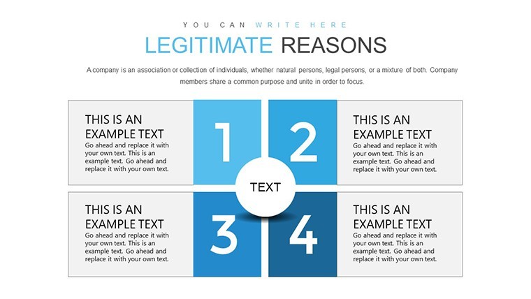
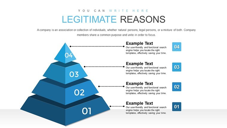
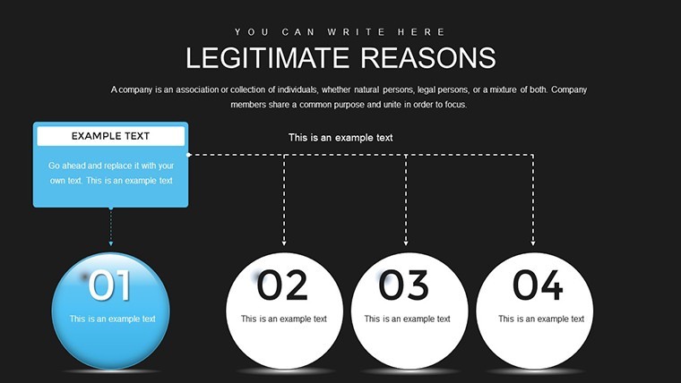
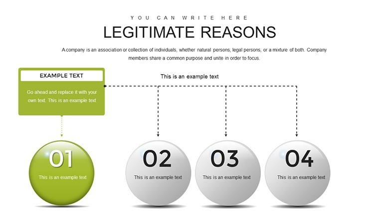
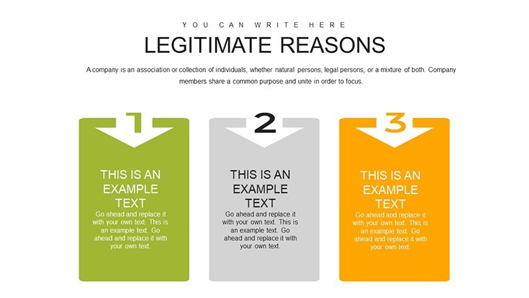
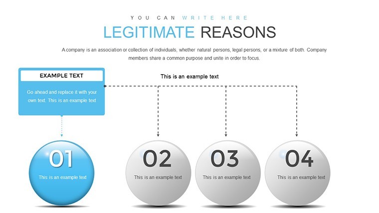
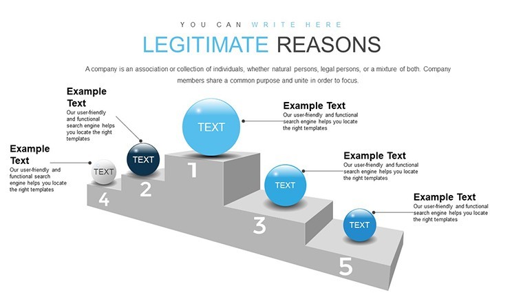
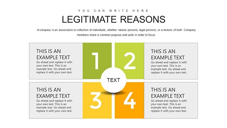
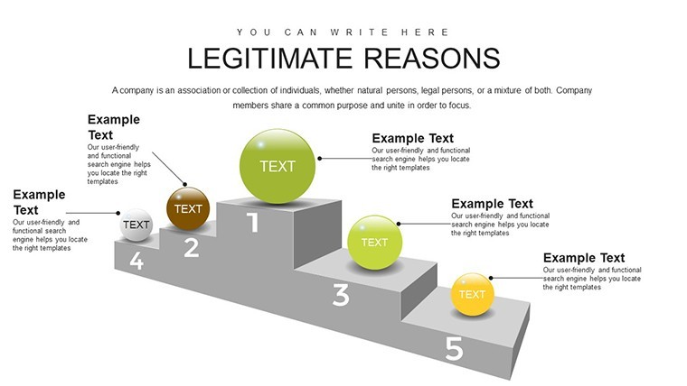
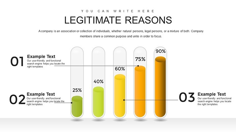
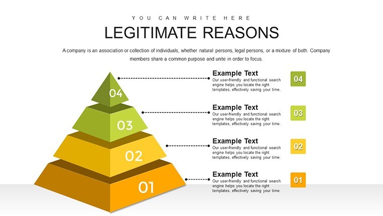
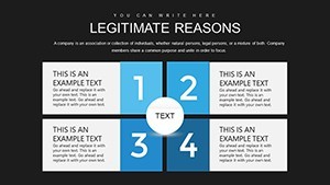
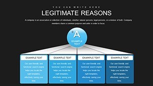
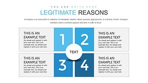
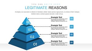
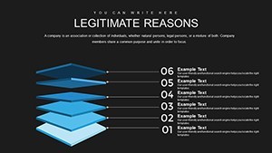
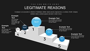
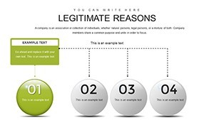
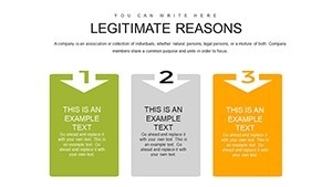
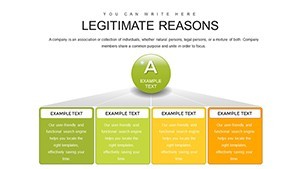
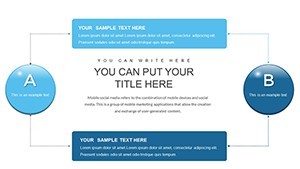
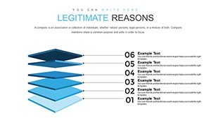
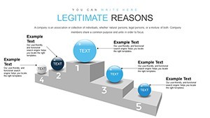
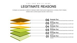
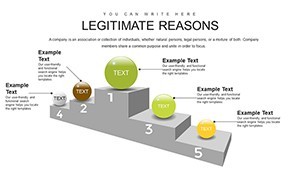
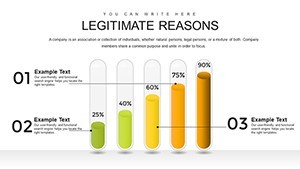
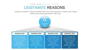
- Pyramid Structures: Build hierarchies showing escalating causes or layered effects, ideal for strategy mapping.
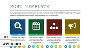
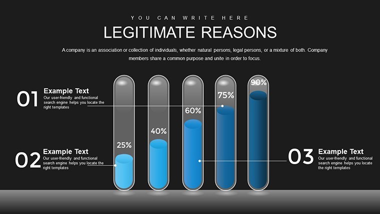
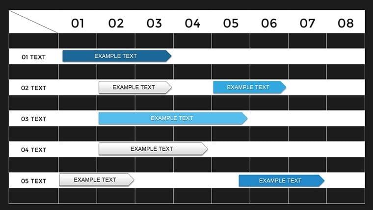
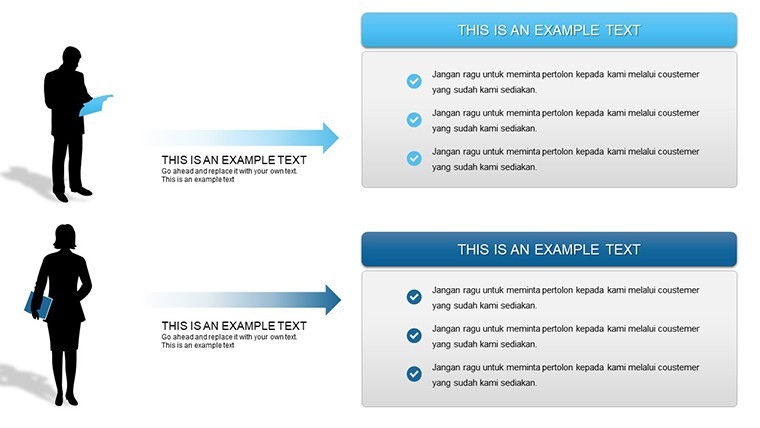
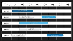
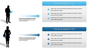
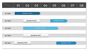
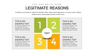
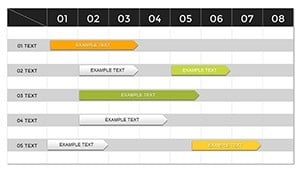
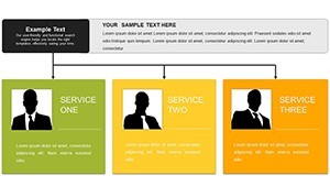
- Table Integrations: Compare variables side-by-side with editable grids that auto-adjust for data entry.
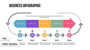
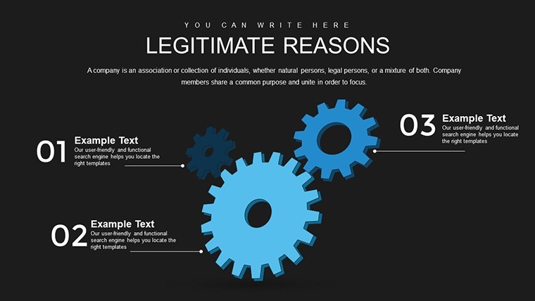
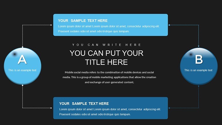
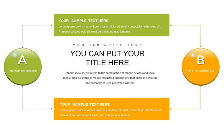
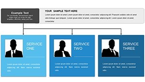
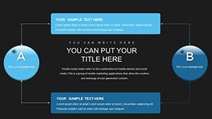
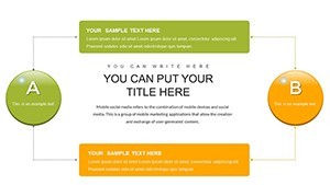
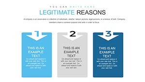
- Analysis Diagrams: Flowcharts and arrows depict causal chains, customizable for complexity.
- Vector Elements: Scale without loss, with color schemes that denote progression or severity.
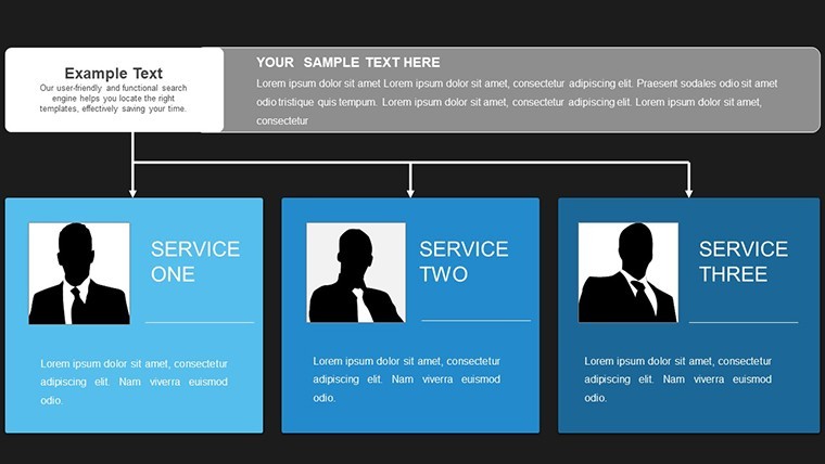
- Annotation Capabilities: Add notes or legends for context, ensuring transparency in interpretations.
These components, refined through iterative design, address common pitfalls like oversimplification, providing a trustworthy base for your analyses.
Diverse Applications in Professional Spheres
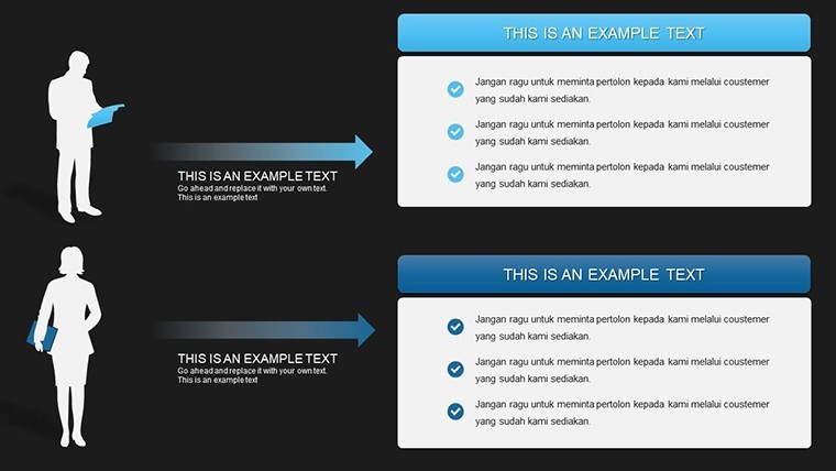
Visualize a career coach using Slide 8's pyramid to outline promotion pathways, highlighting skill acquisitions as foundational causes. In project management, tables on Slides 20-25 compare risk factors and mitigations, akin to PMBOK standards. Educators employ causal chains for history lessons, showing event sequences with real-world examples from textbooks. For business development, map market influences to sales outcomes, informing strategies that have proven effective in case studies from McKinsey Quarterly. Integrate with analytics tools by copying data from Excel, creating live-updatable slides that evolve with new information.
Guided Steps to Craft Compelling Narratives
- Setup the Framework: Choose a base diagram from masters and input core elements like primary causes.
- Layer Details: Add secondary effects via branches, using tools for alignment.
- Visual Polish: Apply gradients or icons to emphasize key nodes in the chain.
- Validate Logic: Use built-in notes to cross-check assumptions against data.
- Deliver Dynamically: Animate sequences to unfold causality step-by-step.
This process mirrors scientific method applications, ensuring your presentations are not only beautiful but logically sound.
Advanced Techniques for Mastery
Enhance by incorporating counterfactuals - what if scenarios - in side tables, a technique from causal inference in statistics. Maintain trustworthiness with citations to sources like Judea Pearl's work on causality. For virtual delivery, use Keynote's transitions to simulate cause-effect timelines. Avoid common errors like correlation-causation confusion by including disclaimers, aligning with ethical data practices.
Ideal Users and Their Gains
From executives modeling business transformations to researchers in social sciences, this template accelerates understanding. Its authoritative design, compatible with Apple's rigorous standards, instills confidence in high-stakes environments.
Trace the path to better decisions - secure this Causality template and illuminate your analyses. Begin your journey now.
Frequently Asked Questions
- What types of charts are included?
- Pyramids, tables, and flow diagrams focused on causal relationships.
- Can I add more layers to diagrams?
- Yes, duplicate elements and extend branches as needed.
- Is it suitable for beginners?
- Absolutely, with intuitive edits; advanced users appreciate the depth.
- How do I handle complex data?
- Use tables for multifaceted comparisons; zoom features aid detail work.
- Export options available?
- PDF, images, or video for versatile sharing.