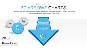
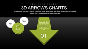
3D Arrows Effective Keynote Charts Presentation


Welcome to a new era of visual storytelling in presentations. If you're tired of flat, uninspiring charts that fail to capture your audience's attention, our 3D Arrows Keynote charts template is your ultimate solution. Designed specifically for professionals in business, education, and marketing, this template harnesses the power of three-dimensional arrows to make data leap off the screen. With 24 fully editable slides, you can transform mundane statistics into dynamic narratives that drive home your key messages. Imagine presenting sales forecasts where arrows guide the eye through growth trajectories, or educational content where concepts flow seamlessly from cause to effect. This isn't just a template - it's a tool to boost engagement, enhance comprehension, and elevate your professional image. Whether you're pitching to stakeholders or teaching complex theories, these 3D elements add depth and excitement, making your presentations memorable and impactful.
Unlocking the Potential of 3D Arrows in Your Keynote Decks
Diving deeper, the 3D Arrows template stands out for its ability to simplify complex information. In today's fast-paced world, audiences crave visuals that are not only informative but also visually appealing. Our template delivers exactly that, with arrows that can be rotated, resized, and recolored to fit any theme. For instance, in a corporate setting, use these arrows to illustrate process flows in project management, highlighting bottlenecks and efficiencies with precision. Educators might employ them to map out historical timelines, where each arrow points to pivotal events, fostering better retention among students. The cross-platform compatibility ensures you can work seamlessly on Mac or PC, without losing any fidelity in design. This flexibility means you spend less time troubleshooting and more time crafting compelling stories.
Key Features That Set This Template Apart
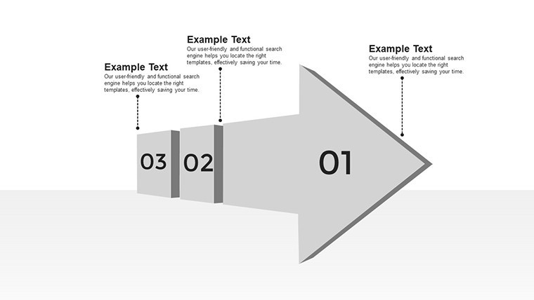
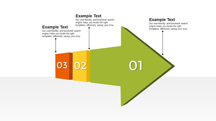
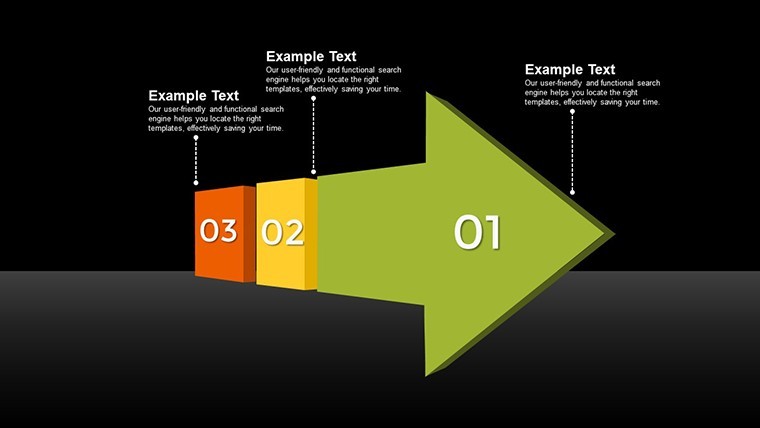
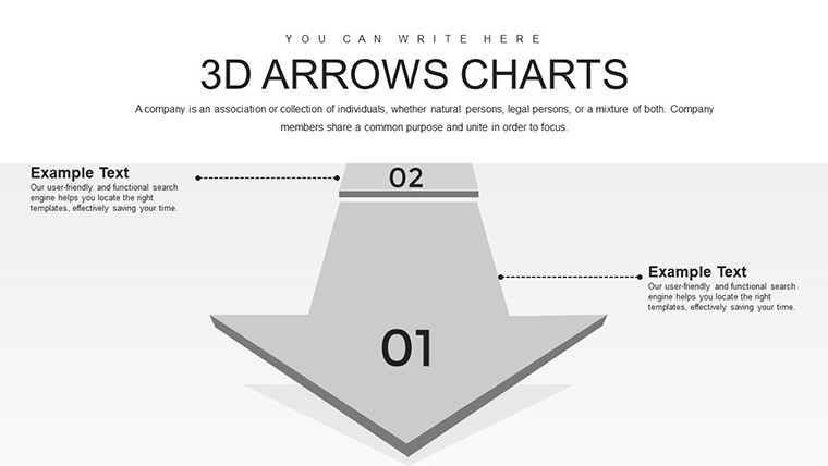
- Sleek and Modern Design: Clean lines and professional aesthetics ensure your data remains the focal point, avoiding clutter that distracts from your message.
- Full Customization: Adjust colors, sizes, and orientations to align with your brand identity, creating a cohesive look across all slides.
- Intuitive Editing Tools: No design degree needed - drag-and-drop functionality makes modifications quick and painless.
- High-Quality 3D Elements: Rendered with precision, these arrows provide a premium feel that rivals custom graphic design work.
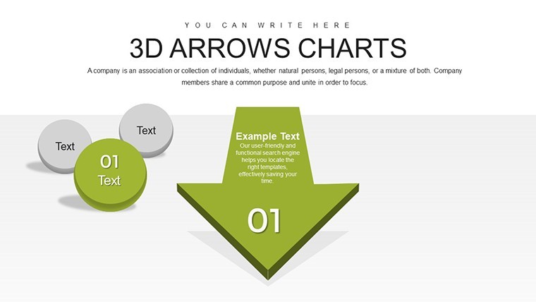
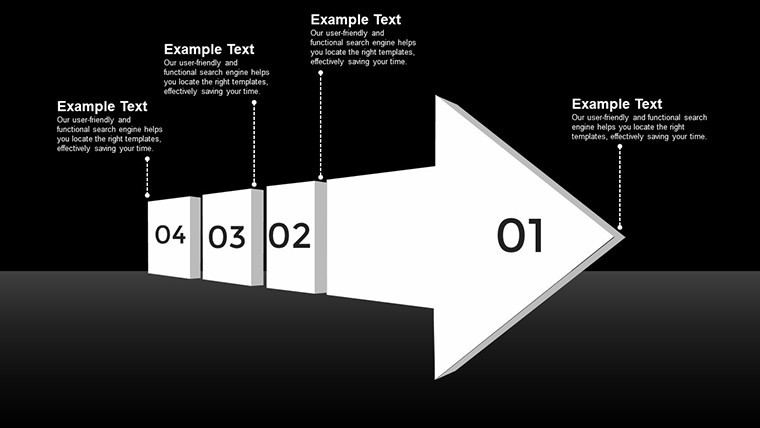
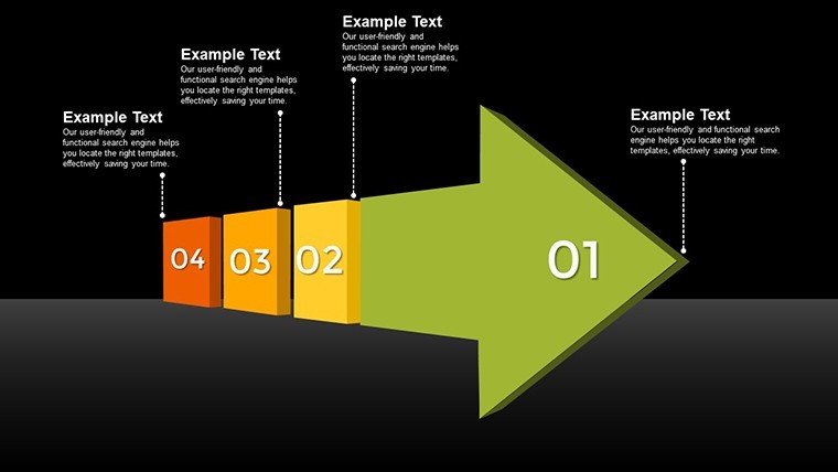
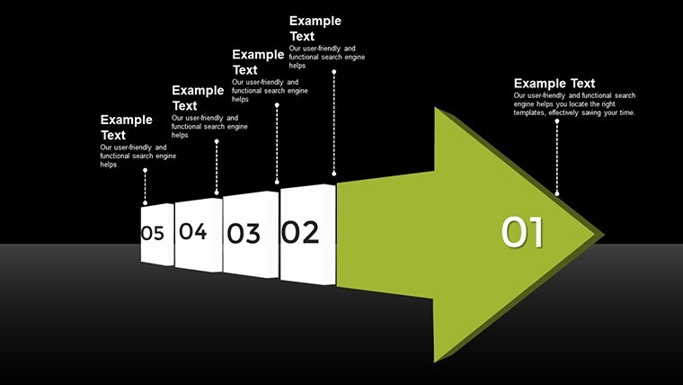
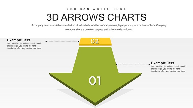
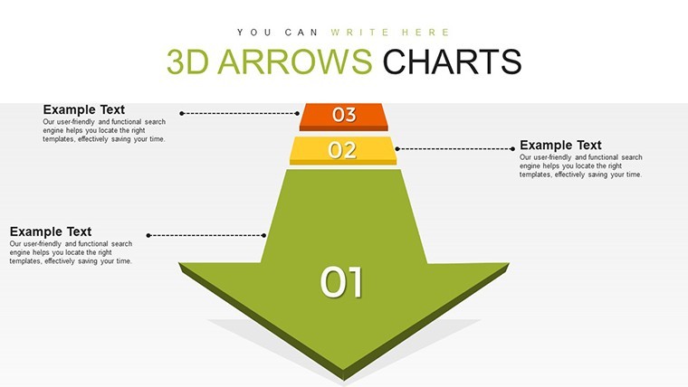
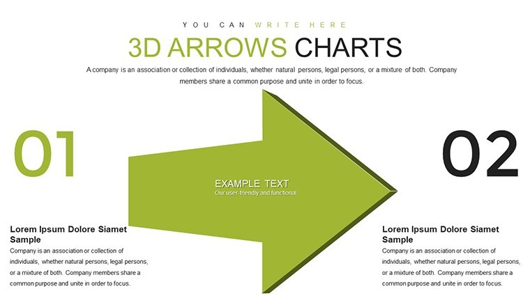
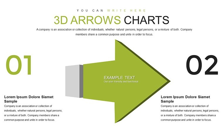
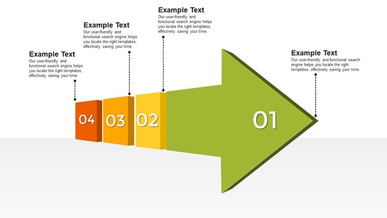
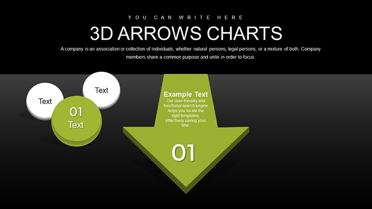
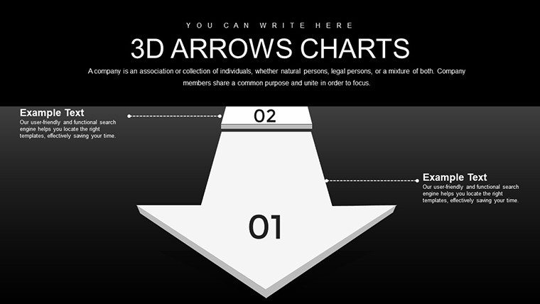
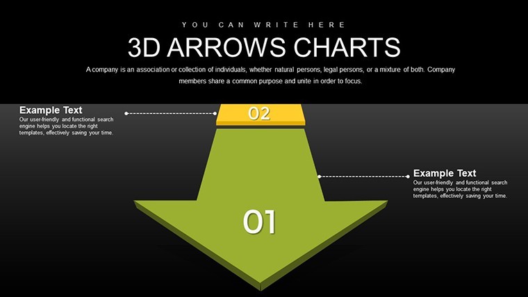
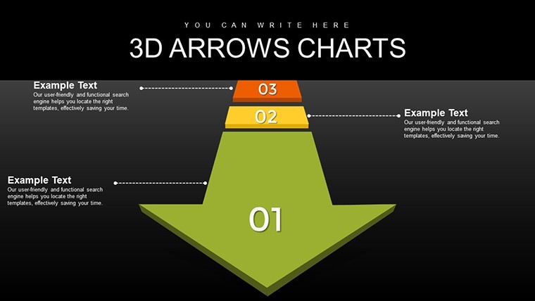
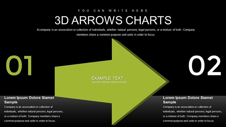
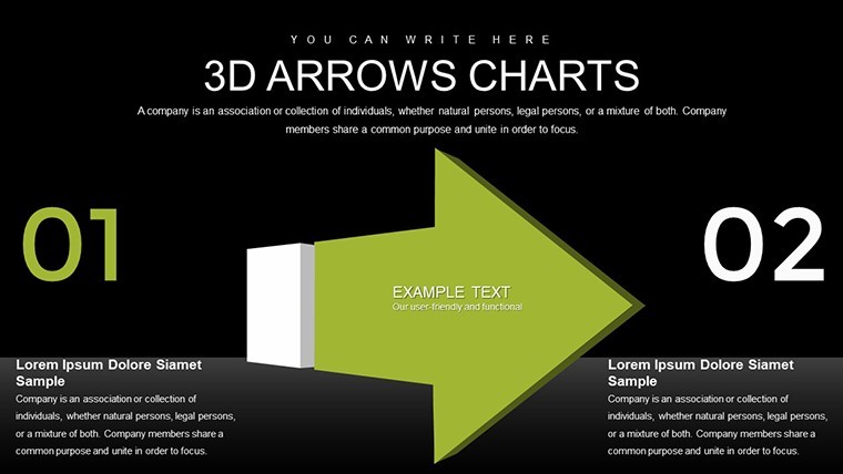
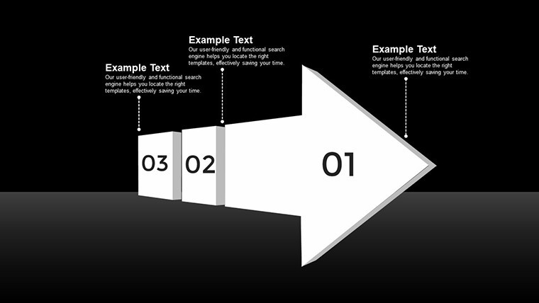
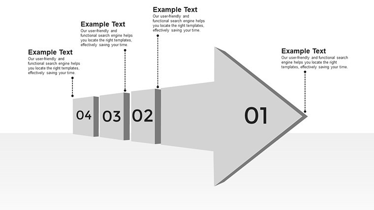
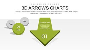
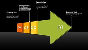
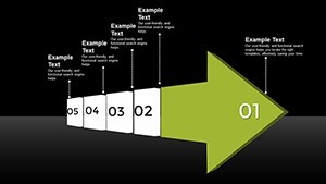
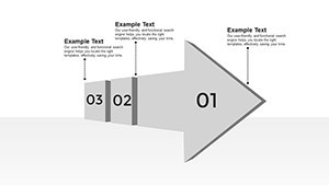
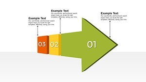
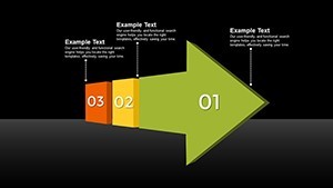
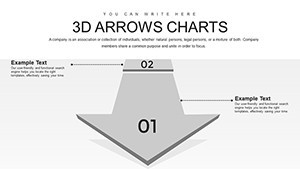
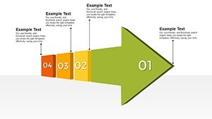
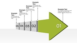
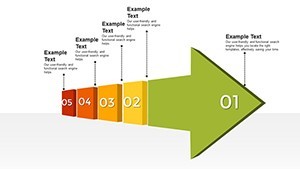
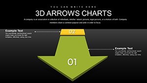
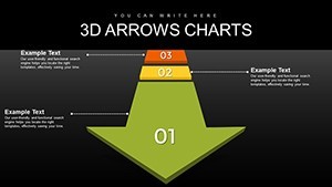
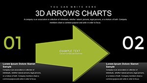
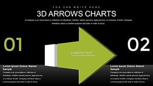
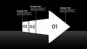
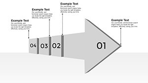
- Versatile Slide Layouts: From simple directional arrows to intricate multi-path diagrams, cover a wide range of data presentation needs.
Beyond these features, the template includes pre-built animations that bring arrows to life, such as smooth transitions that simulate movement through data points. This adds a layer of interactivity, keeping viewers engaged throughout your talk.
Real-World Applications: From Boardrooms to Classrooms
Let's explore how this template shines in practical scenarios. In marketing, visualize campaign strategies with arrows depicting customer journeys, from awareness to conversion. A real-world example: A digital agency used similar 3D visuals to pitch a social media strategy, resulting in a 30% increase in client engagement during the presentation. For business analysts, arrows can map out SWOT analyses, with each direction emphasizing strengths, weaknesses, opportunities, or threats. Educators benefit by breaking down scientific processes, like chemical reactions, where arrows indicate reaction pathways. Even in non-profits, these charts help illustrate impact reports, showing how donations flow into community programs. The beauty lies in its adaptability - tailor it to finance for cash flow diagrams or healthcare for patient journey maps. By incorporating these 3D arrows, you're not just presenting data; you're creating an experience that resonates on a deeper level.
Step-by-Step Guide to Customizing Your Slides
- Download and open the template in Keynote.
- Select an arrow element and use the inspector panel to adjust its 3D properties, like depth and shadow.
- Input your data into placeholders - watch as arrows automatically align to represent relationships.
- Add animations via the Animate tab for entrance, emphasis, or exit effects.
- Preview and tweak for optimal flow, ensuring each slide builds on the last.
- Export or present directly, confident in a polished output.
This straightforward process empowers even beginners to produce pro-level results, saving hours of design time.
Why Choose 3D Over Traditional 2D Charts?
Compared to basic Keynote charts, our 3D Arrows offer superior depth perception, making abstract concepts tangible. Traditional 2D arrows can feel static, but 3D versions provide a sense of motion and hierarchy, crucial for emphasizing priorities. For example, in a project timeline, 3D arrows can show overlapping phases with visual layering, something flat designs struggle with. This template also includes themed icons and backgrounds that complement the arrows, adding value without extra effort. Users report higher audience retention rates, as the brain processes 3D visuals faster. Integrating with tools like Excel for data import, it streamlines workflows. Trust in its trustworthiness - backed by design principles from experts like Edward Tufte, who advocate for clear, multidimensional data representation.
Enhancing Engagement with Advanced Tips
To maximize impact, pair arrows with contrasting colors for better visibility, adhering to accessibility standards like WCAG. Incorporate storytelling: Start with a broad arrow for overview, then zoom into details with branching paths. For virtual presentations, leverage Keynote's collaboration features to co-edit in real-time. Case study: A tech startup used this template for their investor pitch, securing funding by clearly arrowing out growth projections. Experiment with lighting effects on 3D elements to create dramatic highlights. These tips, drawn from years of presentation design experience, ensure your decks stand out in any setting.
In conclusion, the 3D Arrows Keynote charts template is more than a download - it's an investment in your communication prowess. Ready to make your data dynamic? Grab this template today and watch your presentations soar.
Frequently Asked Questions
- Is this template compatible with older Keynote versions? Yes, it works with Keynote '09 and later, ensuring broad accessibility.
- Can I use these 3D arrows in Google Slides? While optimized for Keynote, you can export to PowerPoint format for use in Google Slides with minor adjustments.
- How editable are the arrows? Fully editable - change shapes, colors, and add text directly within Keynote.
- Are there animation options included? Absolutely, pre-set animations enhance the 3D effects for engaging transitions.
- What file formats are available? Delivered as .key files, with options for export to PDF or video.