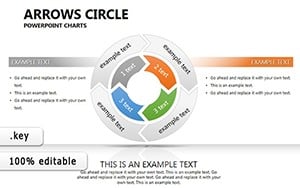
Different and Common 3D Arrows Keynote Charts Template


Navigating complex decisions requires tools that clarify paths to success. The Different and Common 3D Arrows Keynote Charts Template delivers just that, with 30 editable slides crafted to illustrate solution implementations, goals, and alternatives. Ideal for strategists evaluating efficiency, time factors, and risks, this template transforms abstract concepts into dynamic 3D visuals. Whether you're in business development charting growth strategies or in risk management assessing options, these arrows guide your narrative with precision. Fully compatible with Keynote, it offers easy customization to fit your scenario, saving design effort while amplifying impact. Embrace a presentation style that not only outlines routes but highlights the best ones, inspiring confidence in your audience and driving forward momentum in your initiatives.
Mastering Solution Pathways with 3D Depth
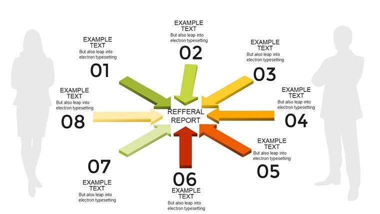
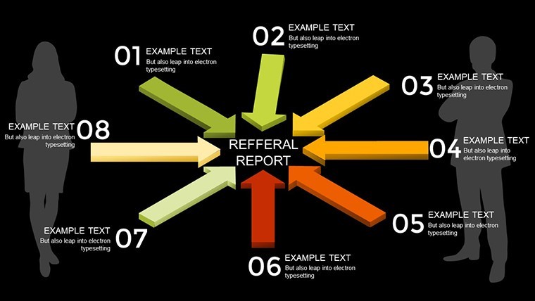
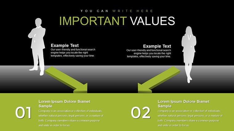
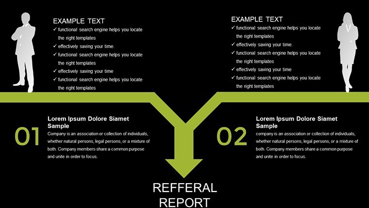
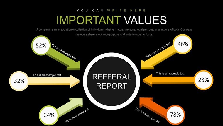
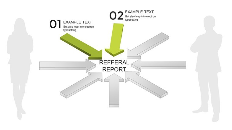
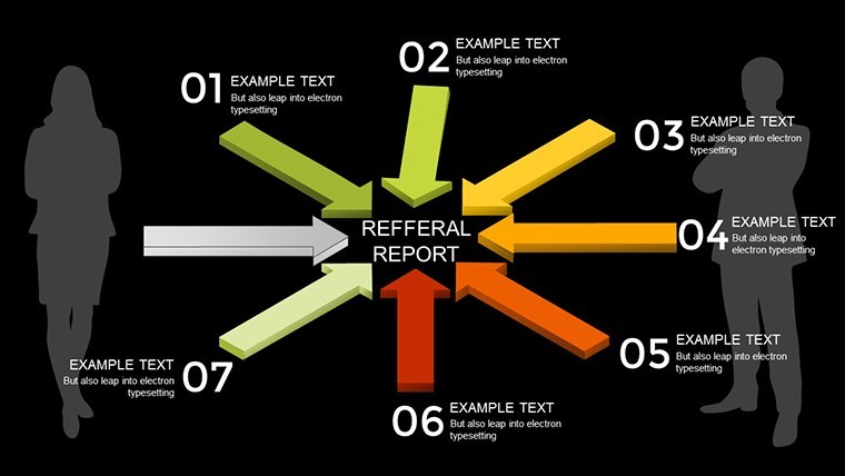
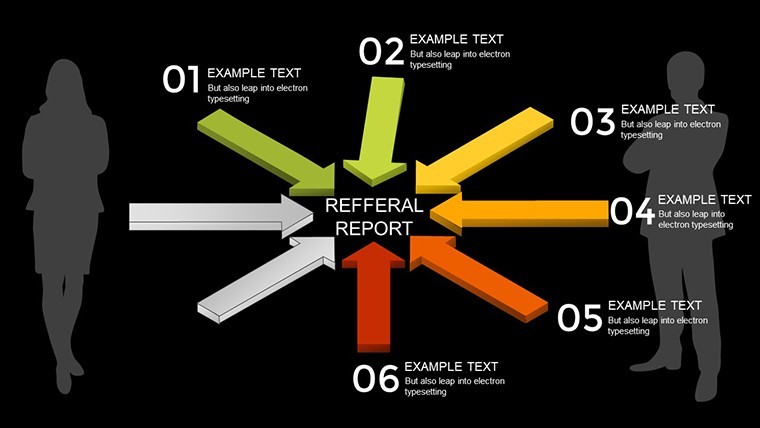
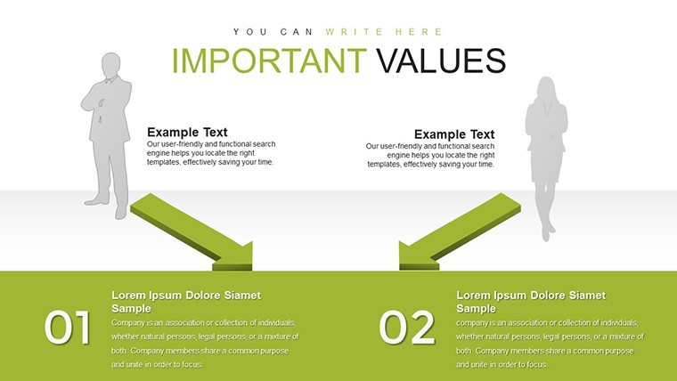
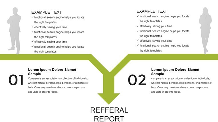
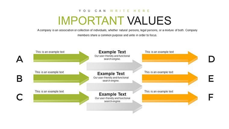
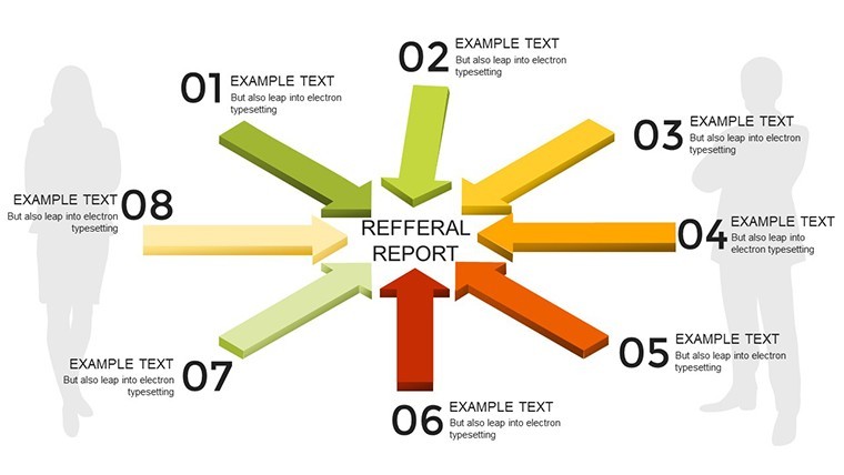
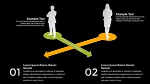
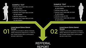
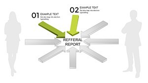
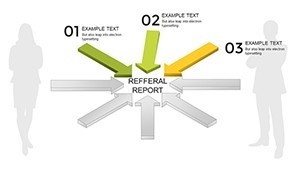
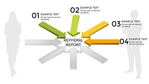
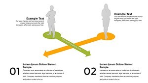
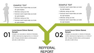
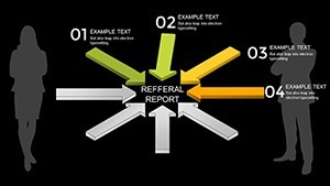
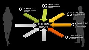
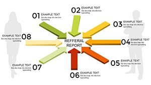
3D arrows add dimension to presentations, making processes leap off the screen. This template specializes in depicting divergent and convergent paths, perfect for showing how solutions branch to meet goals while respecting constraints. Referencing decision-making frameworks from the Decision Sciences Institute, it enables users to visualize trade-offs, such as in product development where arrows represent innovation paths evaluated by market risk and timeline efficiency.
Essential Features for Strategic Visuals
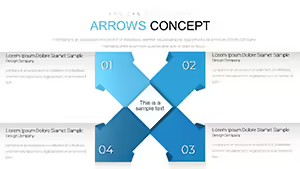
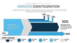
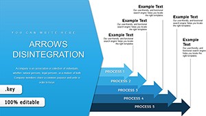
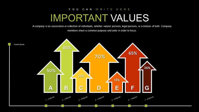
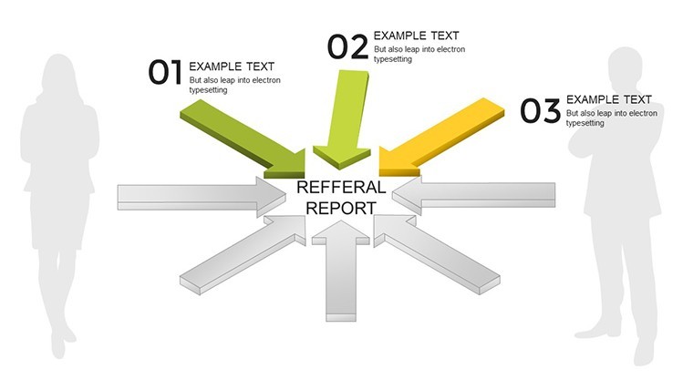
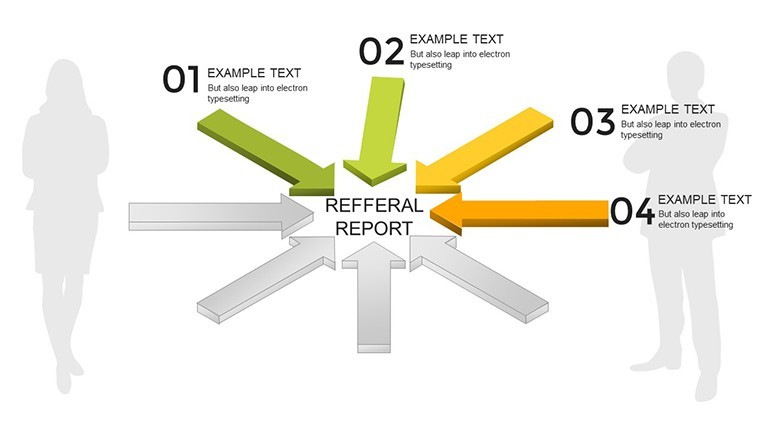
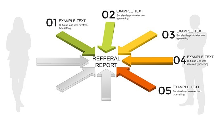
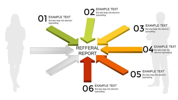
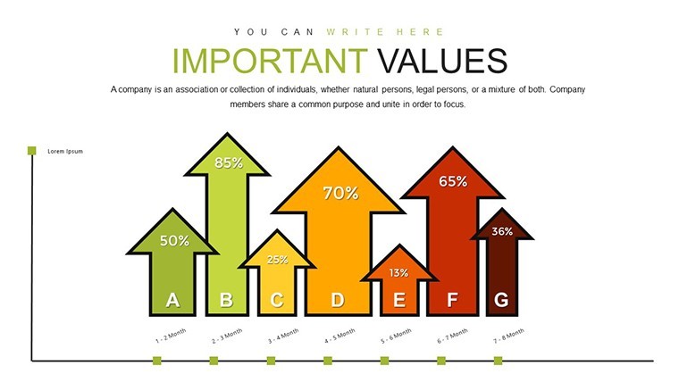
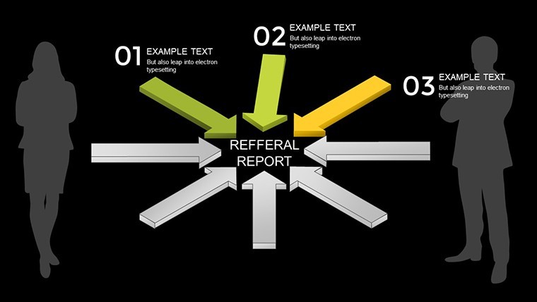
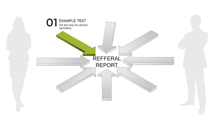
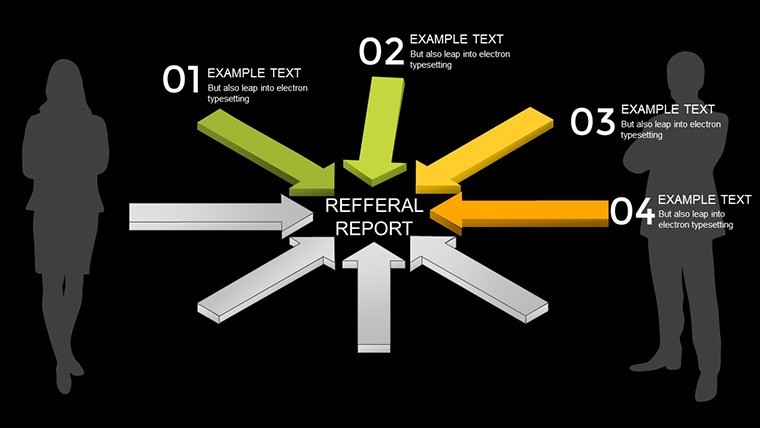
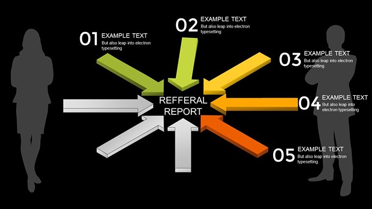
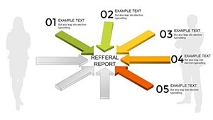
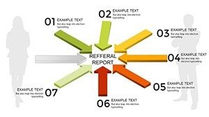
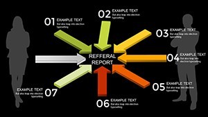
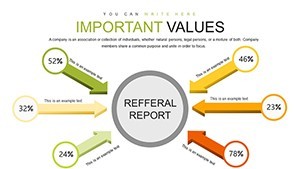
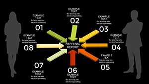
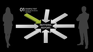
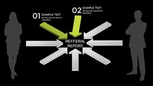
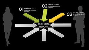
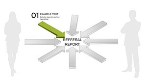
- 3D Realism: Arrows with depth and shading for immersive, professional looks.
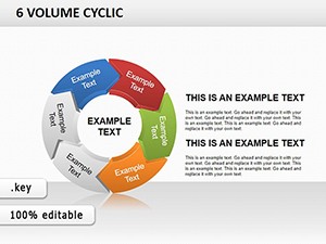
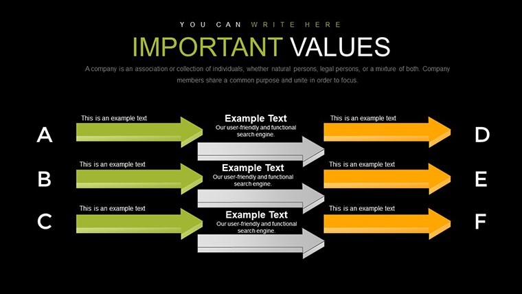
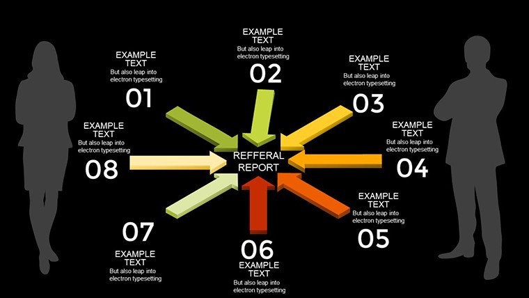
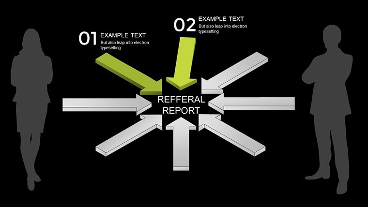
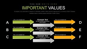
- Varied Designs: Mix of different and common arrow styles to suit simple or complex narratives.
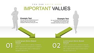
- Full Editability: Adjust directions, colors, and labels to align with your data.
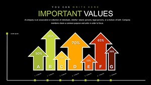
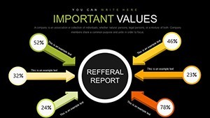
- Risk and Efficiency Focus: Built-in elements to incorporate metrics like probability scales.
- High-Quality Resolution: Sharp graphics for large screens or prints.
These attributes draw from authoritative design principles, ensuring your charts stand as credible tools in high-level discussions.
Diverse Applications in Decision-Driven Fields
In finance, use arrows to map investment alternatives, weighing returns against risks. For healthcare administrators, illustrate treatment protocols branching to outcomes based on patient factors. Tech innovators can depict software development forks, inspired by Git branching models, to communicate version controls effectively. Case studies from McKinsey highlight how visual aids like these have streamlined strategy sessions, reducing decision times significantly.
Guided Customization for Optimal Results
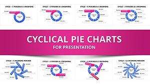
- Pick Your Arrow Type: Select from 30 slides - curved for fluid processes, straight for direct paths.
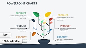
- Layer in Details: Add text for goals, icons for constraints, and data for evaluations.
- Customize Aesthetics: Match your brand's palette and add shadows for enhanced 3D effect.
- Incorporate Animations: Use Keynote features to animate arrow progressions, revealing paths step-by-step.
- Validate and Present: Simulate audience views to refine clarity and flow.
Rooted in cognitive psychology insights from experts like Daniel Kahneman, this process minimizes biases in visual decision aids.
Superiority in Visual Decision Support
Outshining flat diagrams, these 3D arrows provide perspective that aids comprehension of multi-faceted choices. They're invaluable in uncertain environments, like startups navigating market entries, where visualizing risks prevents costly oversights. The template's trustworthiness comes from its alignment with ethical visualization standards, avoiding misleading representations while promoting balanced views. Infuse a dash of wit - label an arrow "The Scenic Route" for longer but safer options - to keep engagements lively.
Seamlessly weave into workflows by linking arrows to spreadsheets for dynamic updates, ensuring your presentations remain current and compelling.
Pro Tips for Arrow Chart Mastery
Enhance with gradients for direction emphasis or group arrows for comparative analyses. In collaborative settings, share editable versions for team inputs. From strategy consultants, advice includes using arrows to storyboard scenarios, fostering innovative thinking. A venture capital firm noted improved pitch evaluations using similar visuals, per their annual reports, validating the template's efficacy in real stakes.
Chart Your Success Path Today
Step up your strategic presentations with this 3D Arrows Keynote Charts Template. Start visualizing smarter decisions now.
Frequently Asked Questions
How do the 3D arrows enhance presentations?
They add depth and realism, making complex paths easier to follow and more engaging.
Are all slides fully customizable?
Yes, every element from arrows to text can be edited in Keynote.
What's the best use for risk evaluation?
Use arrows to branch alternatives, labeling with efficiency and risk metrics.
Compatible with older Keynote versions?
It works with recent versions; check compatibility for specifics.
Can I add my own data?
Absolutely - integrate charts or numbers directly into the arrows.
Any templates for specific industries?
While general, it's adaptable for finance, tech, and more with custom tweaks.